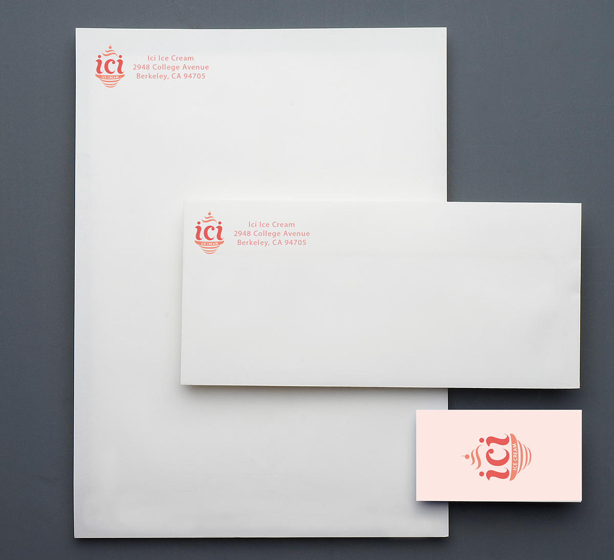
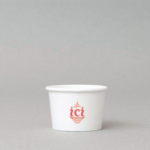
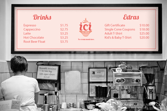
This project was a rebranding for an ice cream shop called Ici (ee see). The original project was for a typography class and we were assigned to create a new logo and menu, but I decided to revisit this project and push it further than just a menu design. I decided to create stationary, signage, website and collateral for the ice cream shop as well as a menu and logo.
My concept for the logo was to incorporate hand-drawn typography because the ice cream shop hand makes their ice cream in the store. I also created an simple icon with organic shapes and typography that symbolized a cup of ice cream. I decided to use organic shapes to resemble the ice cream and also resemble the organic ingredients they use to make their ice cream. The color palette I chose was bright and eye catching and also resembles some of the colors of the ice cream they make.