


Description of the concept
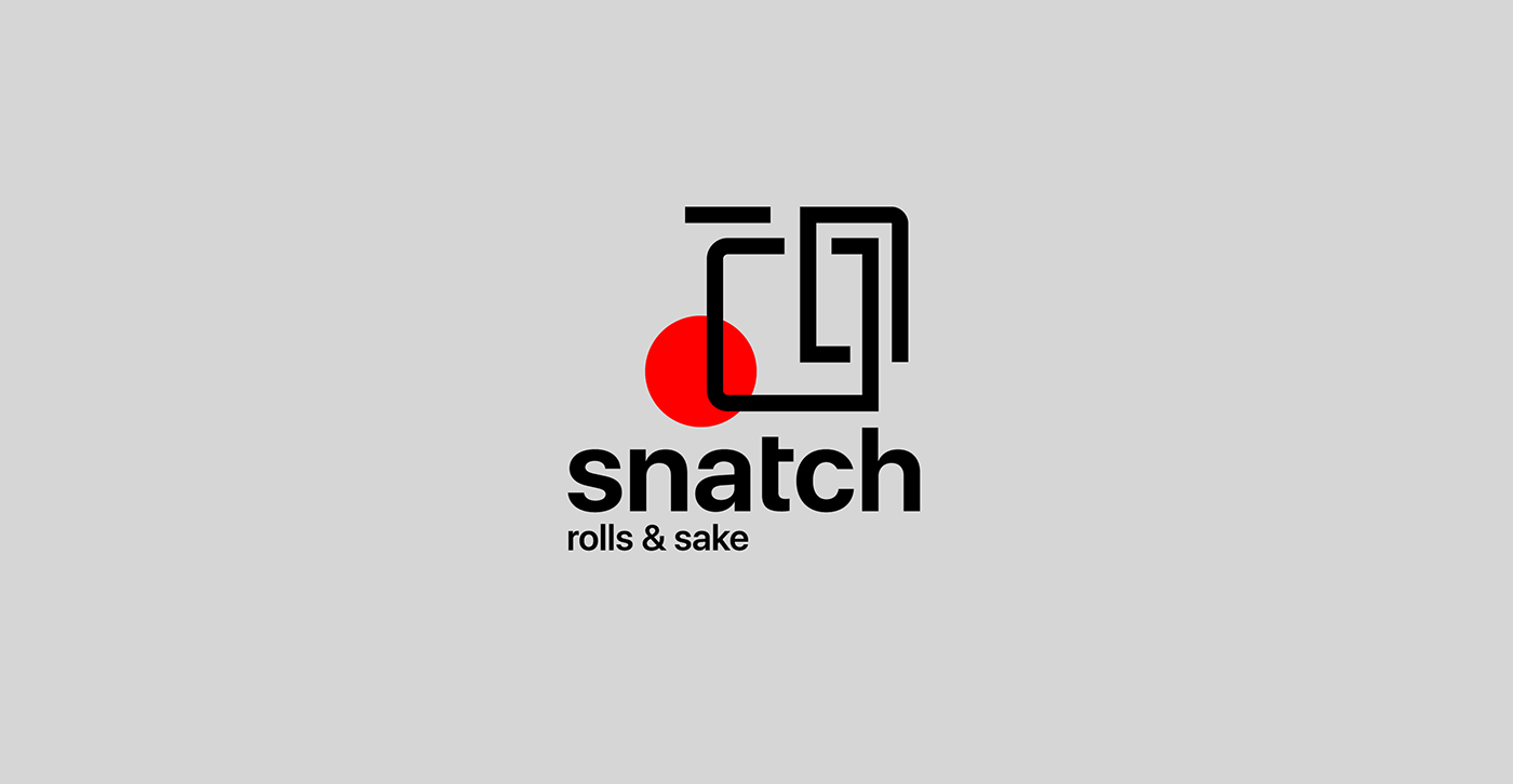
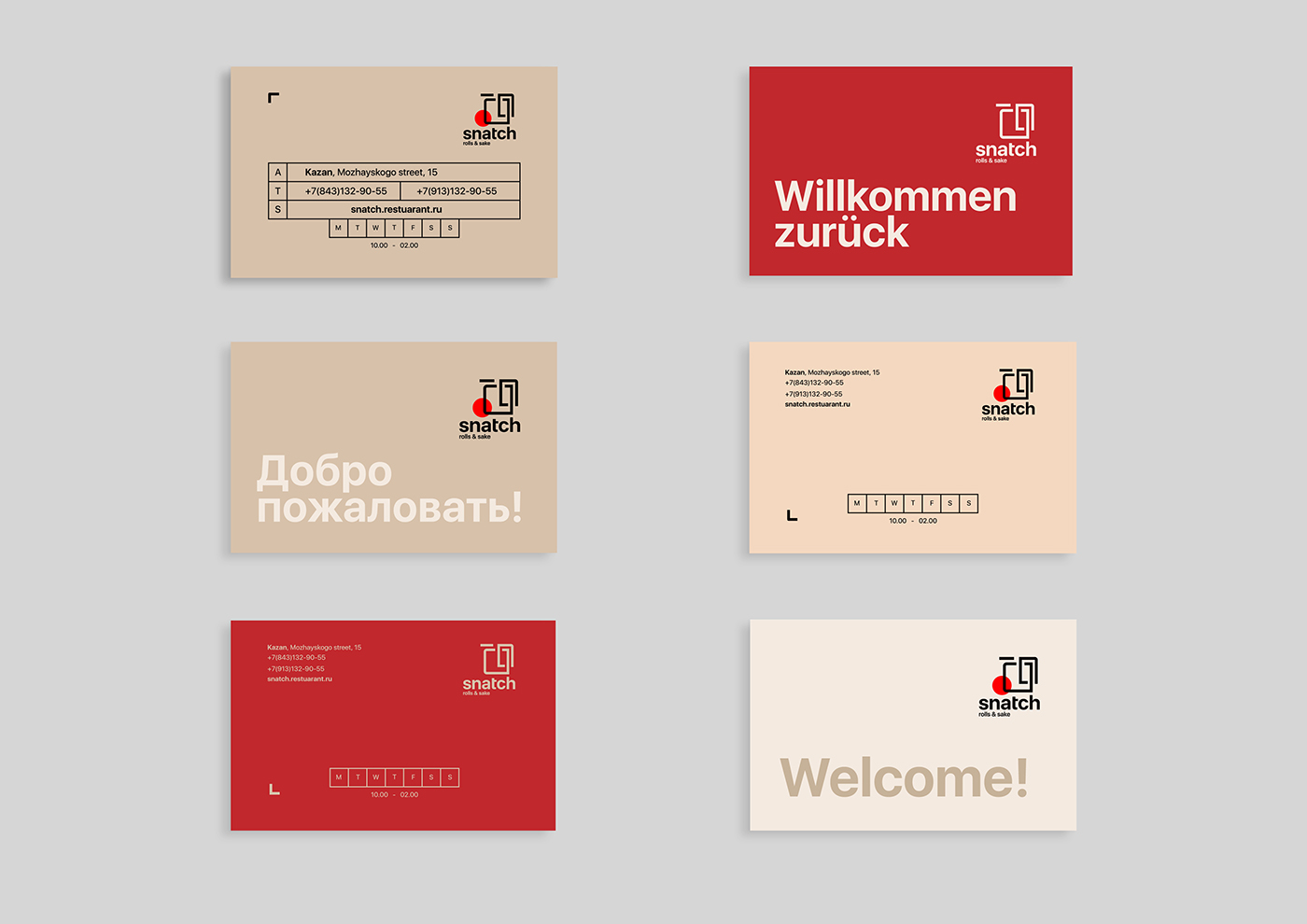
Snatch rolls & sake restuarant - Japanese restaurant in the center of Kazan for visitors with medium and high incomes. The menu features traditional Japanese food, as well as a large selection of elite alcohol, including sake. The main task in the development of the logo and corporate identity was locality and internationality, because The restaurant is designed for many foreign visitors. The final version of the logo is a combination of abstract forms that create imagery: first, the image of the products being sold - rolls; secondly, the image of a person of "Oriental origin"; and the red circle refers to the Japanese flag, also this element serves to generalize and communicate all components of the logo. Intermittent lineature of the sign creates dynamics, and the correct font, from the point of view of geometry, compensates it. The corporate identity is one with the logo and creates a unique balance of quality and efficiency to attract the target audience.
Enjoy watching!


Thank you for watching!


