


The DBU brand identification project was an opportunity to prepare a comprehensive implementation - starting from naming, ending with printed materials and conducting outdoor communication.
The name represents an individual approach of the brand to each client, a small piece of it that is present in every single implemented project. Due to the nature of this business (and willingness to go outside the native market with their offer) - DBU, and in full version - done by us, is a firm cut-off from the myth of the careless renovation team and promise of quality and professional approach to the customer. The "us" element in the name is a way of taking responsibility for the high level of provided services, and in its entirety is a specific signature under a well done job.
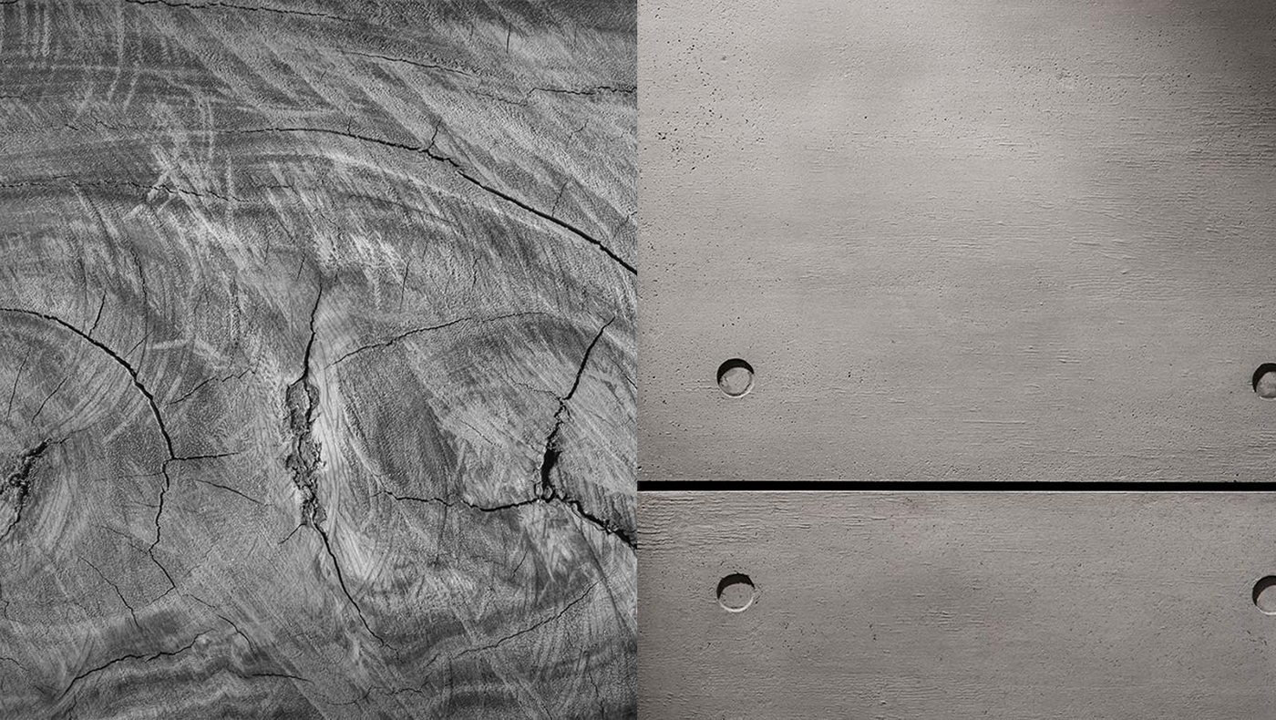
Due to the specificity of our client’s business we have decided to prepare the sign so that it can appear as an independent typographic record and typographic record supported by iconographic items. The elements that make up the sign are the interpretation of many textures, types of materials and their configurations in which they appear in a specific space (eg. paper format), it is a clear analogy to the interior design process.
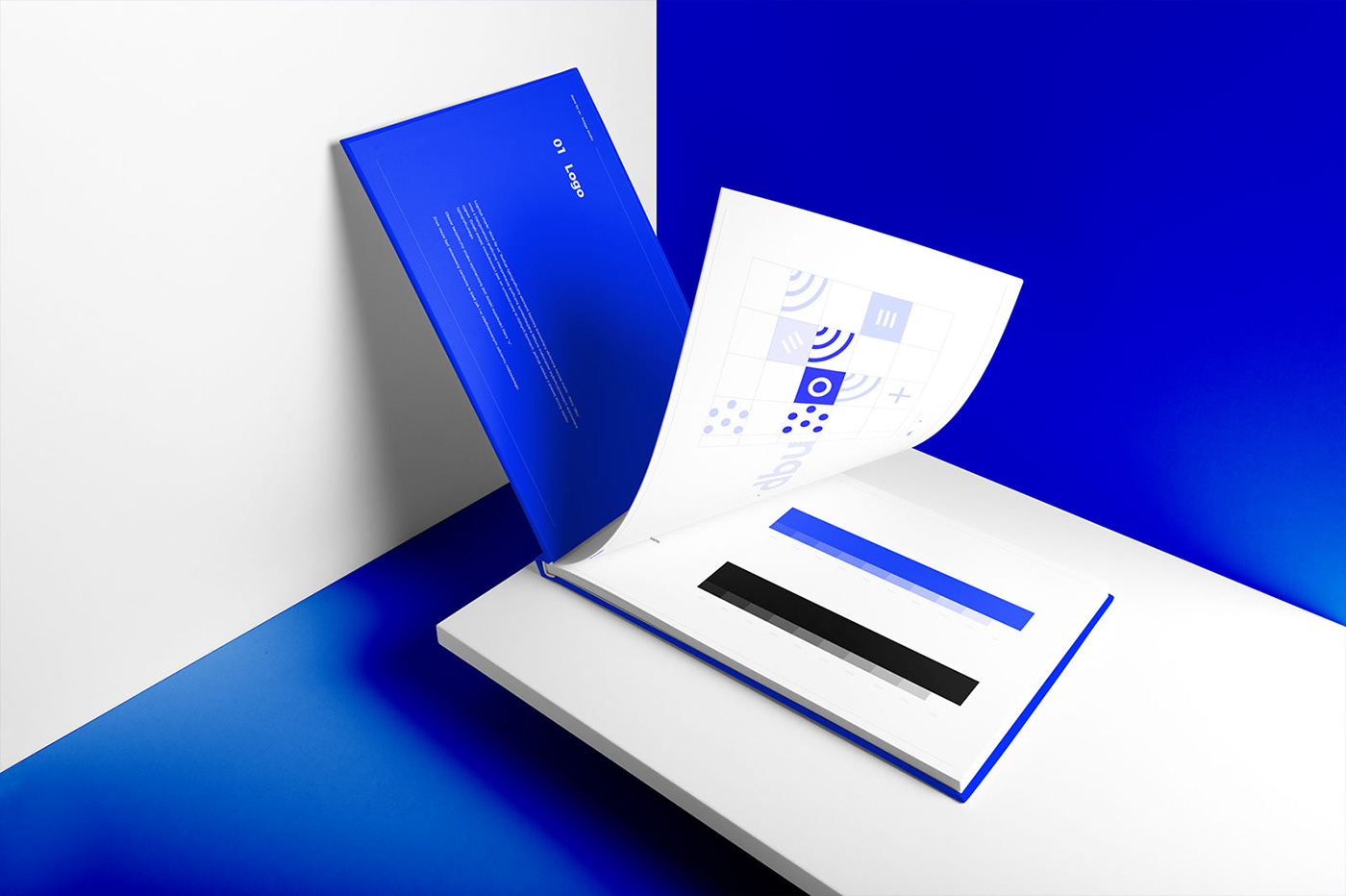
The presence of ultramarine in identification symbolizes a fresh look, dynamism, courage, modern and open approach to the customer and is a guarantee of visibility on the market.


Credits:
Graphic Design: Leszek Cielma
Project Management: Agata Kosturek
Creative Concept: Leszek Cielma, Agata Kosturek
Thanks for watching!


