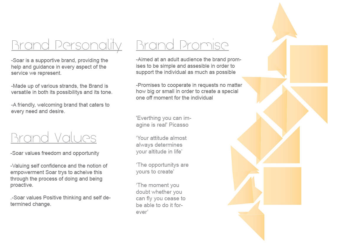
This project was a branding and packaging project. Originating from the word Possibility, Soar is a brand aimed at adults that provides the service to help support any goals and aspirations the individual desires. Whether it is education, adventure or learning new skills and hobbies, Soar provides the help.
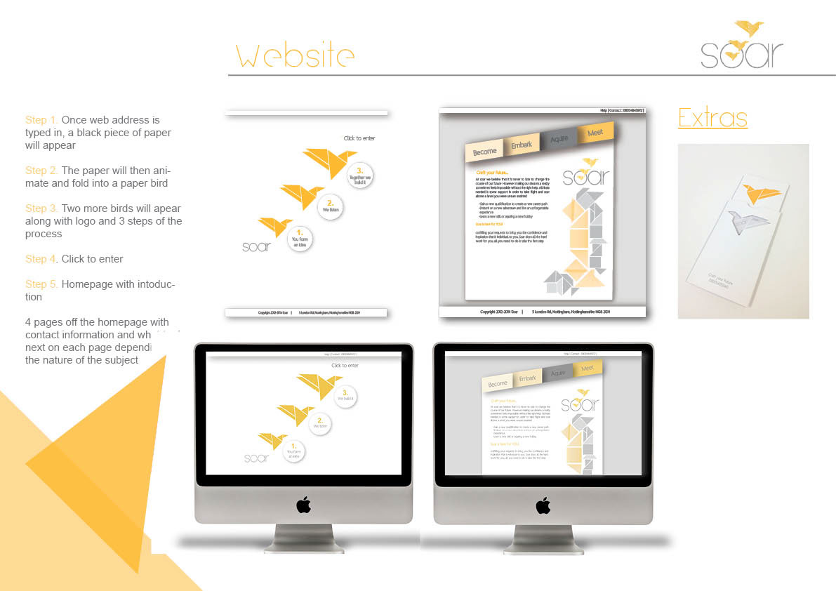
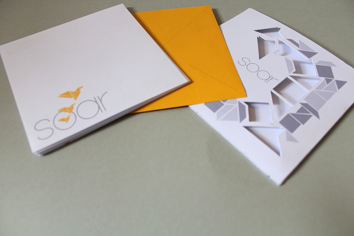
The main visual identity of the brand is an origami bird and its stages of folding and unfolding, this acts as a visual metaphor supporting the brand personality and values of creating something out of nothing and the idea that the possibility is in your hands. Using 3 birds in the logo represents unity and the separate strands of the brand. This also shows the idea of breaking out of comfort zones as the birds break out of the 'O'.
The main packaging for this service is online therefore I have designed a user friendly websites that breaks the traditions of other websites aimed at this age group showing depths of information and unimaginative format. The website would initially show an animated piece of paper folding into a bird to take you on to the main webpage.
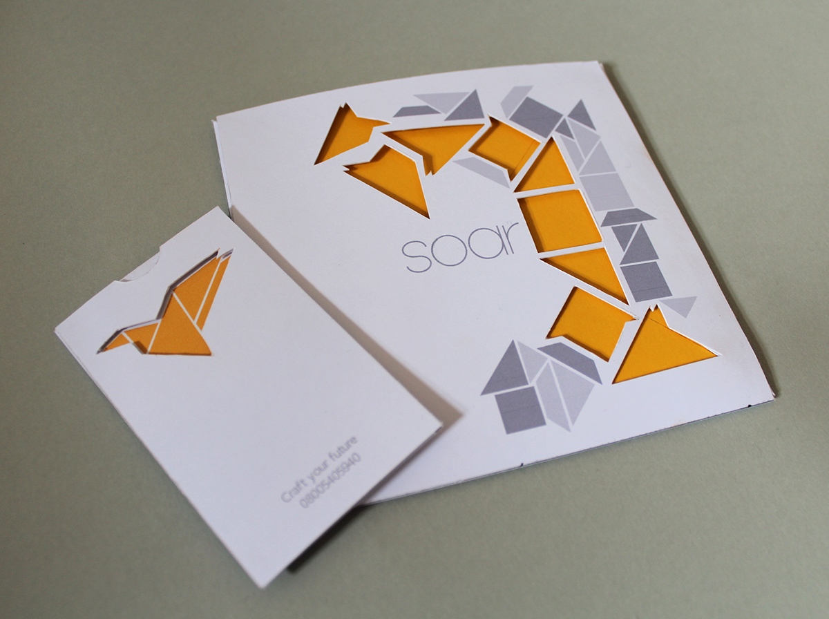
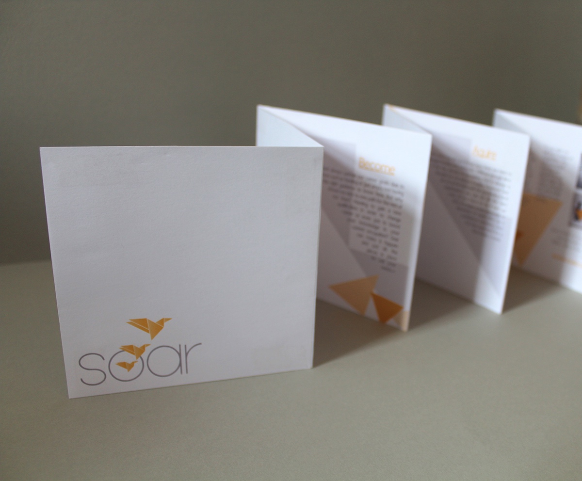
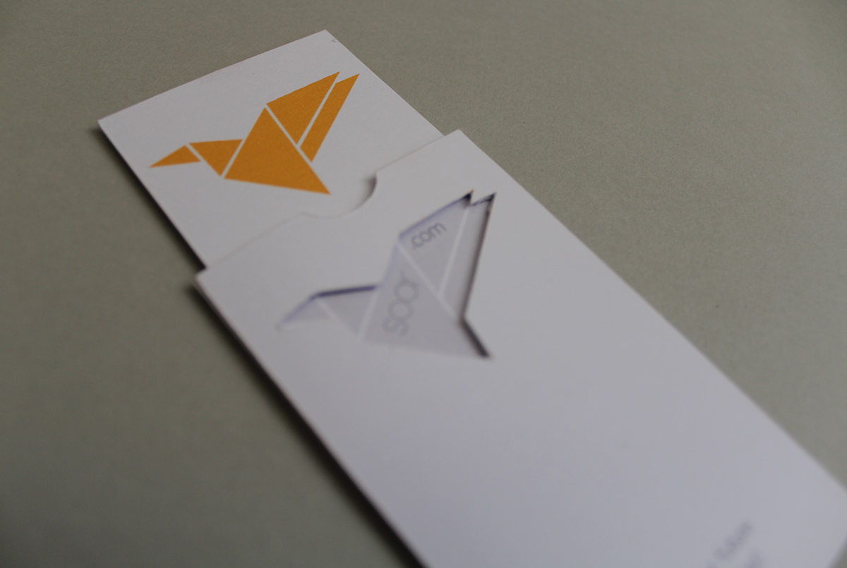
I have also created direct mail and business cards as a way of advertising the webpage, with a diy paper bird enclosed to allow the reciever to make it and keep it as a constant reminder of there own capabilitys and the brand.