Dashboard Redesign
Here are some UI & UX improvements that made the life of our users lot easier, that you can borrow some of them and also help me with some feedback!
Disclaimer : For obvious reasons all the data shown in the interfaces below is dummy 🤥

Standard Dashboard
Navigation
Our team plans to add more dashboards to the product which clearly means top nav would run out of space sooner or later. Instead of waiting for that to happen and then making a major structural change to the our products design.We implemented collapsable left navigation structure for the dashboard.

Collapsable Navigation
Introducing Shortcuts
“Tab” for navigating though fields. “Arrow keys” to select values under dropdown “Enter” key for selection. This made building reports lot faster by just using keyboards.

Dashboard Shortcuts
Overview Statistics
Pie charts helped highlighting relationships between numbers like Installs and Uninstalls, Recovery etc. Related metrics are also grouped visually with separators.

Overview Stats
Loaders
Progress bars :
Looping Gifs cant be everywhere! (specially when your request takes long time to process) Our users faced the similar issue, Progress bar helped users get a fair idea about
Looping Gifs cant be everywhere! (specially when your request takes long time to process) Our users faced the similar issue, Progress bar helped users get a fair idea about
the load time.

Progress Bar
Loading animation :
An interesting loader animation helped us manage wait times for the user. It gave us an opportunity to surprise and delight while still maintaining simplicity.
An interesting loader animation helped us manage wait times for the user. It gave us an opportunity to surprise and delight while still maintaining simplicity.

Date picker
Our solution was to help user set up the date range all in one place. We decided to introduce a time slider which can simply be dragged around by the user to select the right time range

Date Picker
Designing Visual data
A good visualisation of the data can give powerful insights to the users. On the other hand they can equally obscure the users vision if not presented properly. Below examples will cover some things we did for our graphs :
Vertical bar charts are best for time series they do not go well with longer labels we introduced horizontal bar charts that provide enough room for labels


Limiting Pie charts to maximum 6 values :
Vertical bar charts are best for time series they do not go well with longer labels we introduced horizontal bar charts that provide enough room for labels
Vertical bar charts are best for time series they do not go well with longer labels we introduced horizontal bar charts that provide enough room for labels

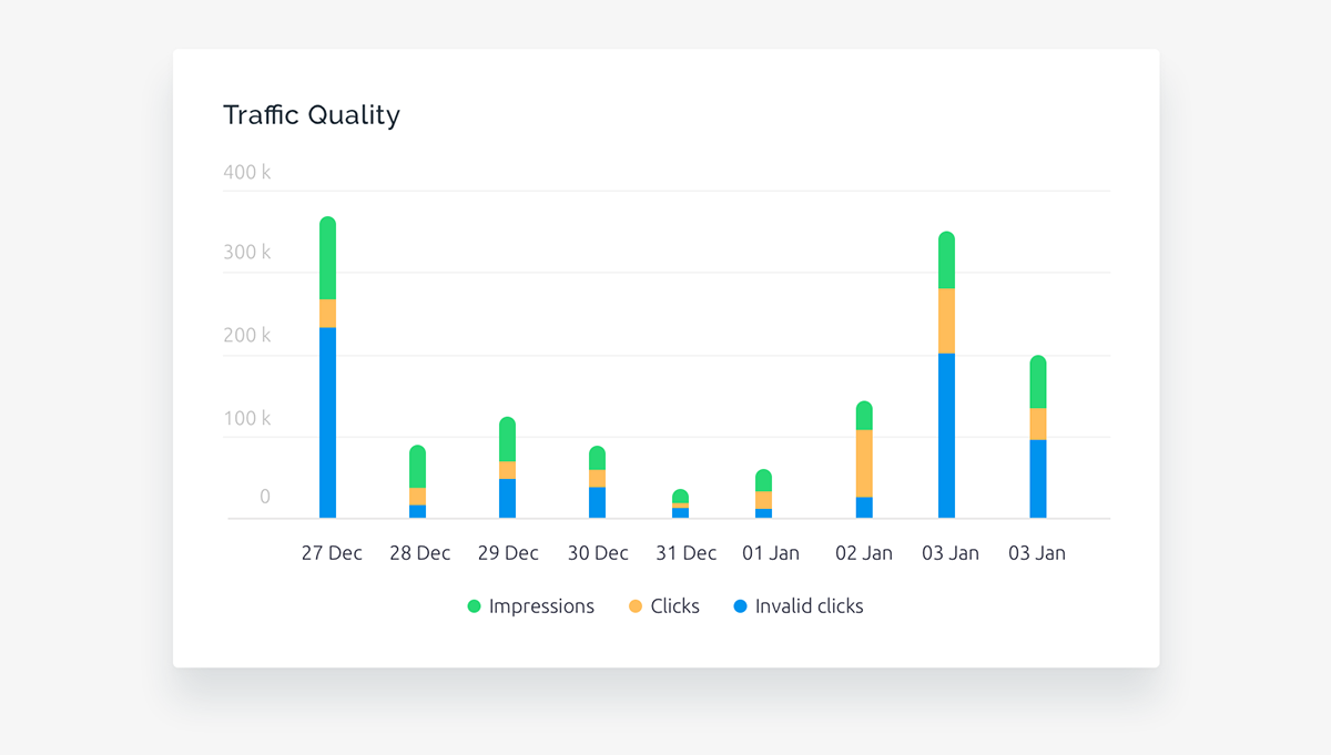
Stacked charts :
In order to see breakup of values over a time series we added Stacked charts to the interface
In order to see breakup of values over a time series we added Stacked charts to the interface
If you enjoyed watching this give it a Appreciation!
Read the full article over here :

