


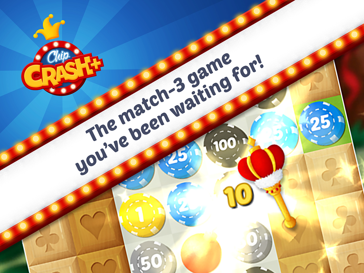
Chip Crash+
Chip Crash+ is a match-3 game produced by Dreams on Demand and released in 2016.
The game is inspired by the Casino universe, mostly Poker, but it is developed to be fun and casual.
I was responsible for the Art Direction and production of every asset and animation of this game, and I hope you will enjoy to take a look at some samples of my work process. Don't forget to play it yourself!
Free Download: Play Store
Map
The map, which you have seen above, represents a Chip Crash+ theme park, a place where the player can travel to different worlds, relax and have fun. It is not only filled with luck games but also other leisure activities for the guests. In the first edition of Chip Crash+ we prepared three worlds: Egypt, Dino World and Ice Kingdom. Unfortunately the game stopped being updated before the full implementation of Ice Kingdom.


In the figure above we can see some early development stages of the two first worlds. After I have done some sketch studies in paper I started establishing the final layout, and then the first color studies. With this setup in mind I chose an area to make the final graphic style tests.

Building the set
Some night features were also studied but not implemented:


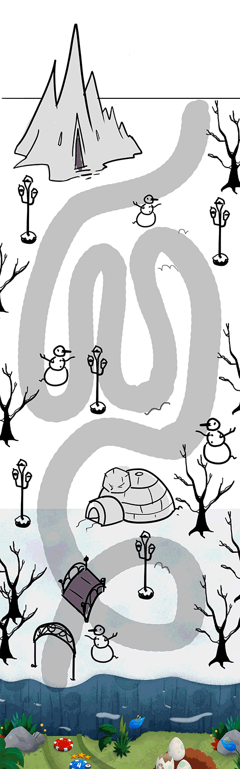
The third world started been developed after the completion of the previous ones. Ice Kingdom needed to fit more levels in a relatively small area, so I started planning the map pathway first:


After decided the pathway, I started studying set composition, with two main attractions as the previous worlds. Every world has a special parallax feature, something animated in the screen and moved according to user's screen scrolling, so the world may feel more real. In Ice Kingdom it would have been chair lifts!
Ice World Process


I made sure that the Casino inspirations were in almost all the details, that's why I designed light poles made of card suits, it's hard to see in the final prop because of the snow, but it's underneath.
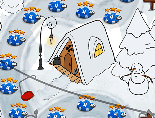
Cabin tests

Pine Trees tests

Final Color Concept, ready for start Production

Ingame
Chip Crash+ was designed to fit all kinds of mobile screens, in any orientation, as you can see below:

Landscape Mode

Portrait Mode
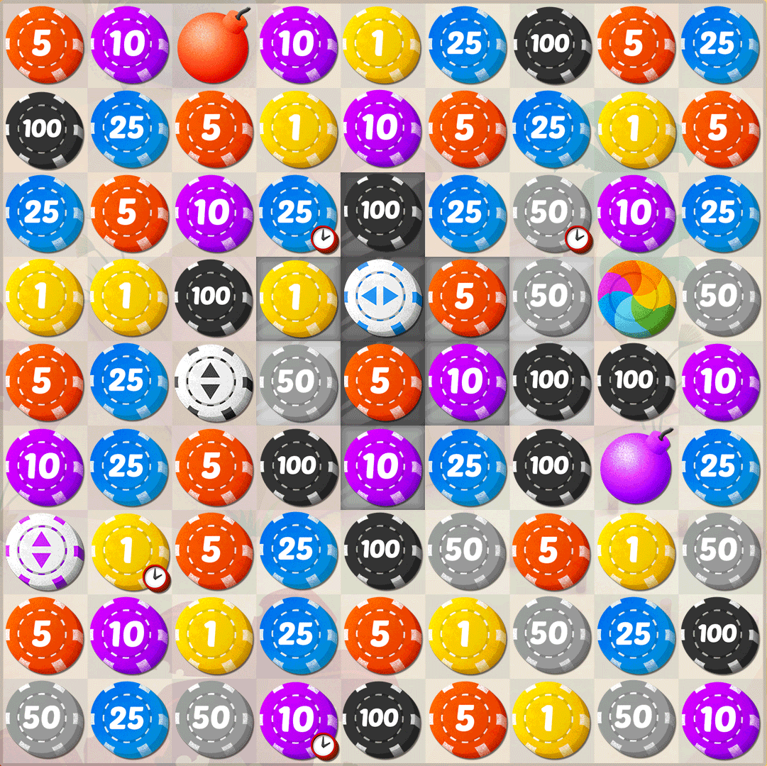
The grid was designed as tiles and intended to be very discrete so all the attention could go to the chips.
Grid Development
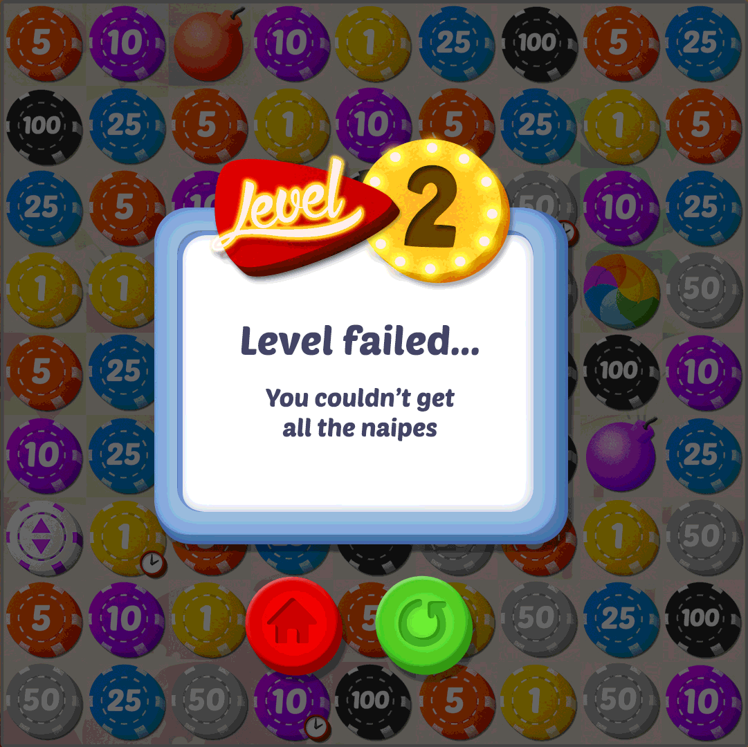
The chips for the matches are mostly inspired by Poker chips, but you can also find bombs in the gameplay!


As the level of the game starts getting harder some special features start showing up, like obstacle cells:


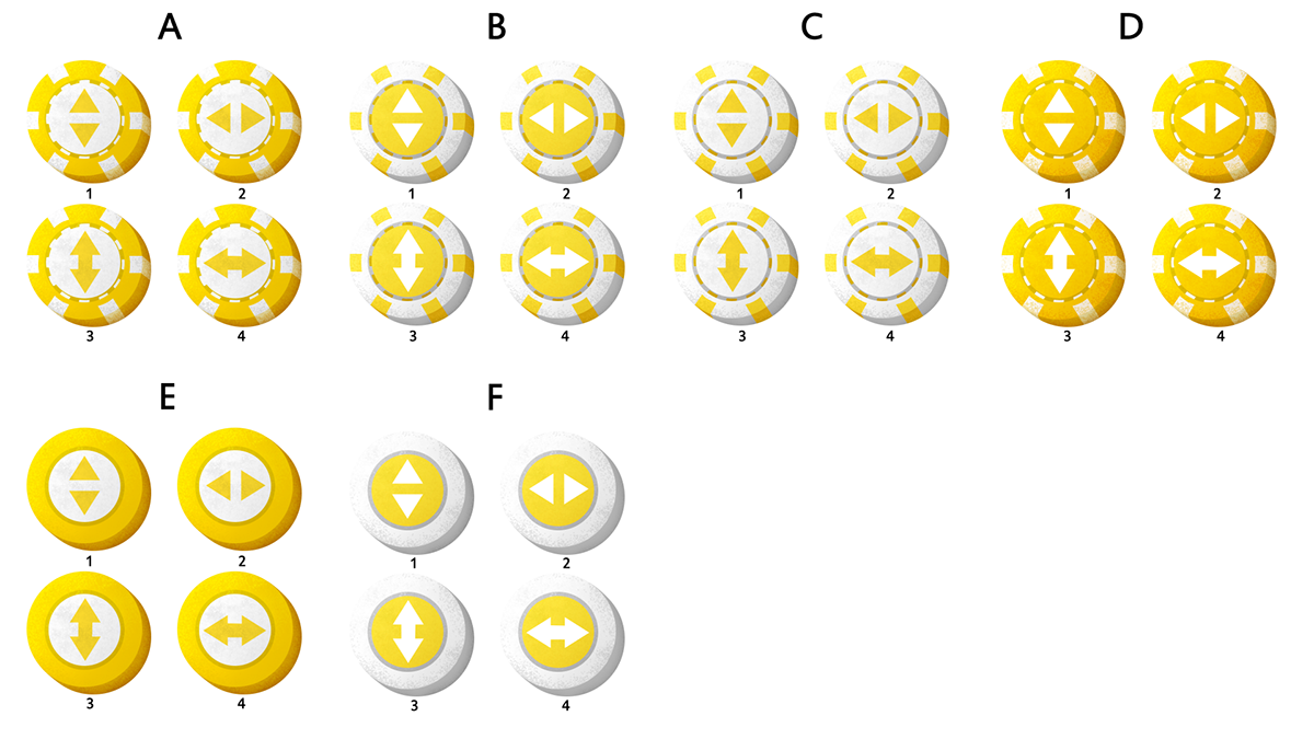
Above you can see the block cells that need to be broken in order to give space and passage for the chips. Below you can see some early concepts for this feature.

Block cells concepts

The color cells were inspired by the fabric we can find on top of Poker tables, and green was the chosen color because of the excellent contrast with the chips and the UI.
Color cells concept
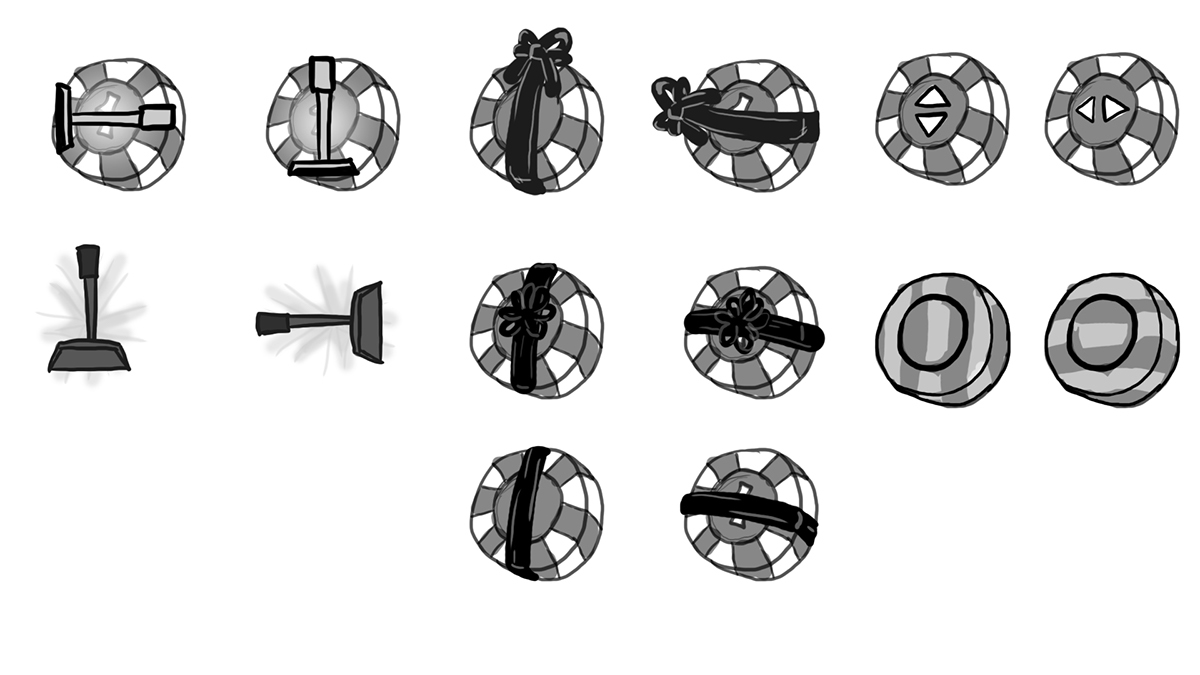
The game also allows the player to buy the power up items below:
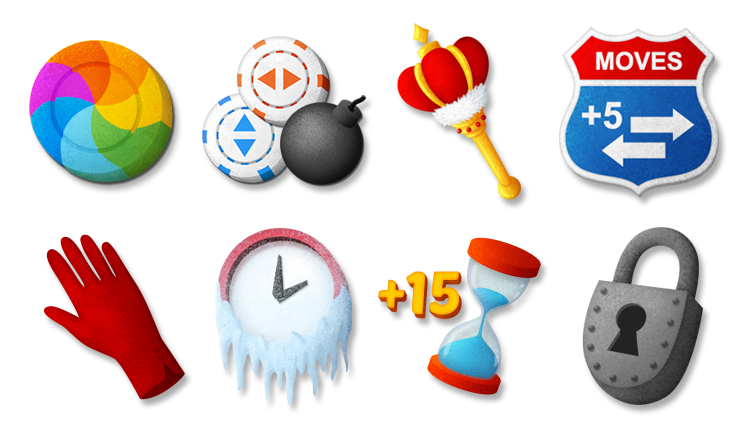
Rainbow Chip, Special Mix, King's Touch, Free Movements, Velvet Glove, Time Freeze, Extra Time and Locked Item
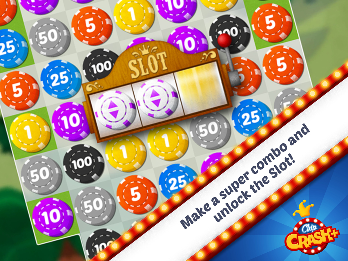
A very special feature in this game is the Slot Machine. Its appearance occurs when the player gets a high amount of match combos, then the machine starts and may bring better chips or even hits Jackpot and prize the player with a lot of Funyens, the Chip Crash+'s official golden coins.
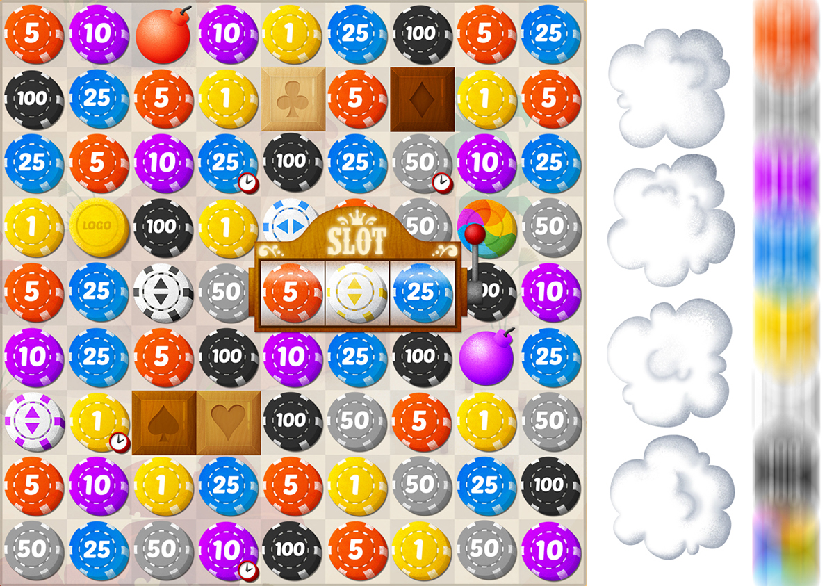
The Slot Machine and some special effect's assets
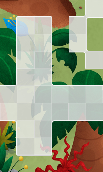
The game backgrounds represents the world which the level is situated. These were the background layouts for the released worlds:


The Home section of the game is where you can see the map. Its UI is very minimalist so the map can be the center of attention. In the bottom we can see two big buttons: Daily Bonus and Store.

Map UI
The daily bonus is called Daily Spin, and it is inspired by casual attractions we may find in amusement parks. The player can spin the wheel for free once everyday and get cool prizes.


Daily Spin wheel concepts

Popups
The game's popups were planned to be 9-sliced or tiled.
Sample of Chip Crash+'s popups

Concept of Pause Popup

Early concepts of Pause Popup based on Poker tables

Samples of Store Popups
Funyen Combos illustrations:


Loading Screen
Animation
Chip Crash+ has a lot of animations, some made frame by frame in Photoshop, some in After Effects and others in Unity. It is better to see them in action in the game, so I hope you play it! Here I show just a little bit of them:

Bomb explosion: final result above and concepts below.
Simple Chip match effect (final result and concept):

A simple spark test:


Planning the fireworks explosion of Big Cross:


Fireworks final assets
Block crashing animation:


Branding
I was also responsible for Chip Crash+ branding design. The deadline was very tight and challenging, but here are the results and some studies:


The inspirations and references came from those classic Vegas signs and also amusement parks logos.


The game was firstly written without the plus sign, and that was how the lettering was planned all the way.
The final game icon and some other ideas below:


Marketing
Some samples of the marketing materials developed for the apps stores:

Credits
Chip Crash+
Copyright Dreams on Demand
Todos os direitos reservados
Publicado por Dreams on Demand
Publicado por Dreams on Demand
Created and Directed by Otavio Lacerda
Game e Level Design Kleber Lopes da Silva
Elisa Baasch de Souza
Otavio Lacerda
Otavio Lacerda
Technical Direction Leonardo Lopes
Production Kleber Lopes da Silva
Publishing Management Daniela Lacerda
Programming Kleber Lopes da Silva
Graphic Design and Illustrations Elisa Baasch de Souza
Animation Elisa Baasch de Souza
Music and Sound Effects 7Sounds
QA Cauê Baasch de Souza
Vilson Moreno
Vilson Moreno
Portuguese Review Luana Dias
Spanish Translation Luana Dias
English Translation Regina Romano
Thank you!


