Moholy-Nagy University of Art and Design branding concept
In late 2016, we were invited to take part in our former university's rebranding tender, which was a great honour. We are friends and ex-classmates from MOME who live and work in two different countries. We needed to combine our forces and spend some days together working out something smart for this project, which was quite a delightful process and meant us a lot as alumni students.
—
Branding concept
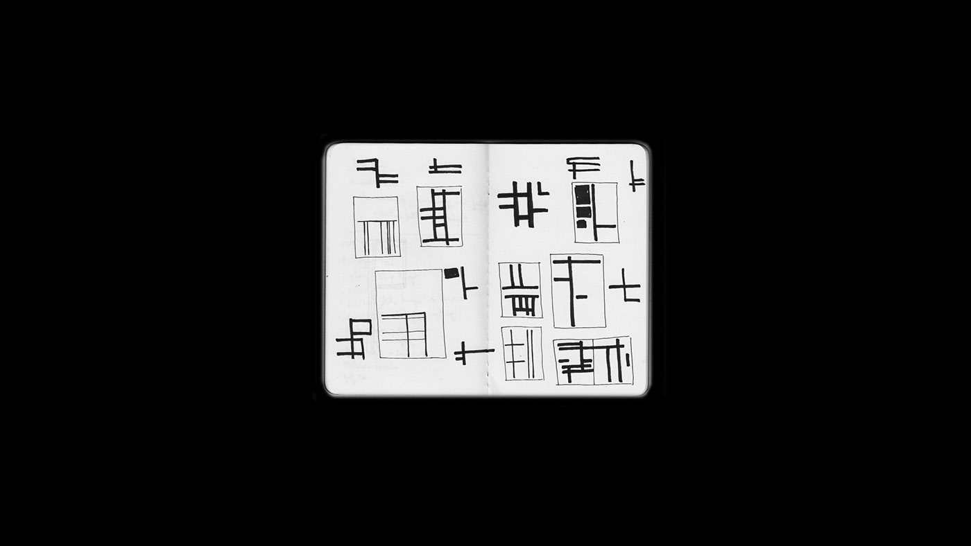
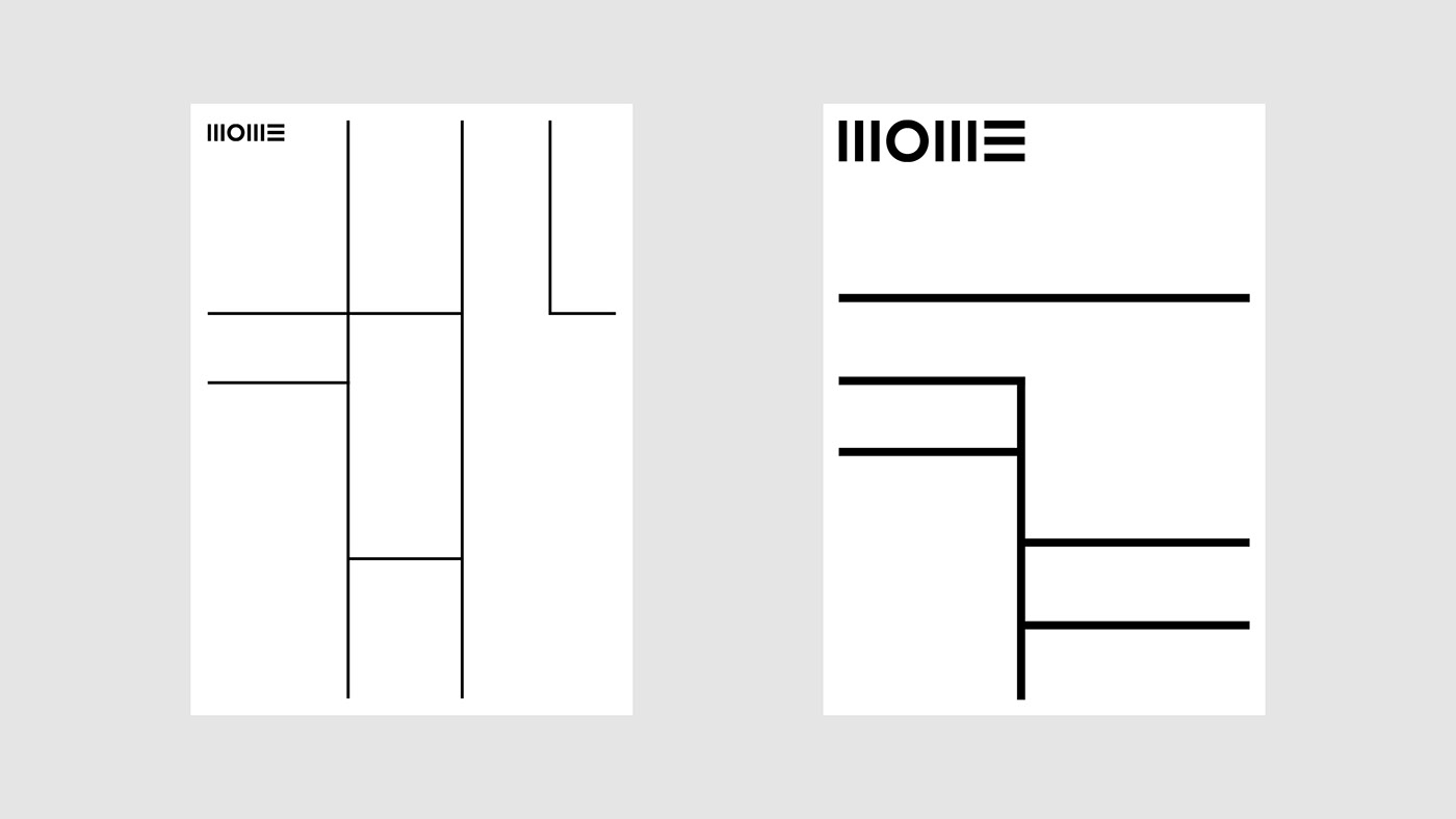
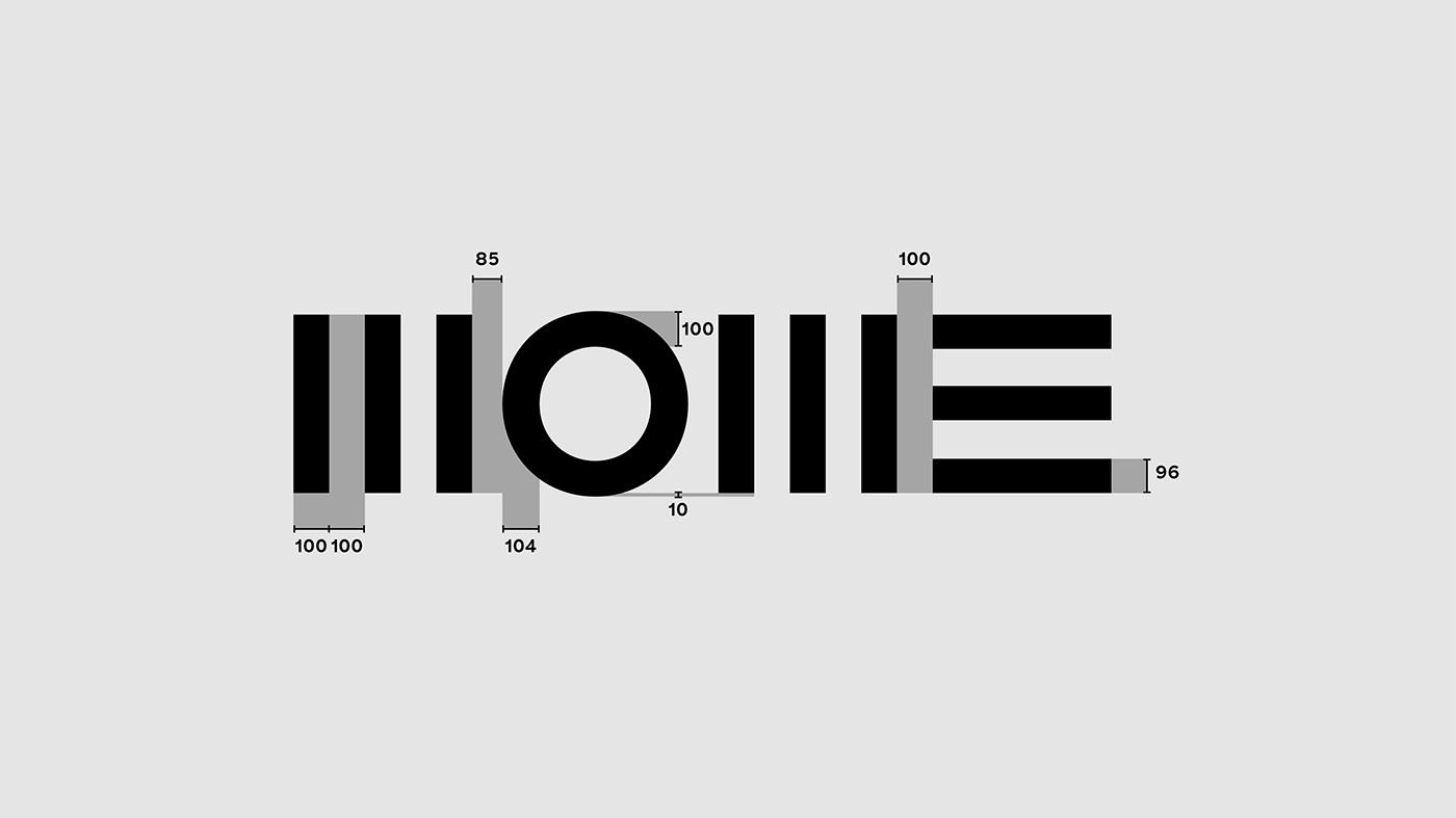
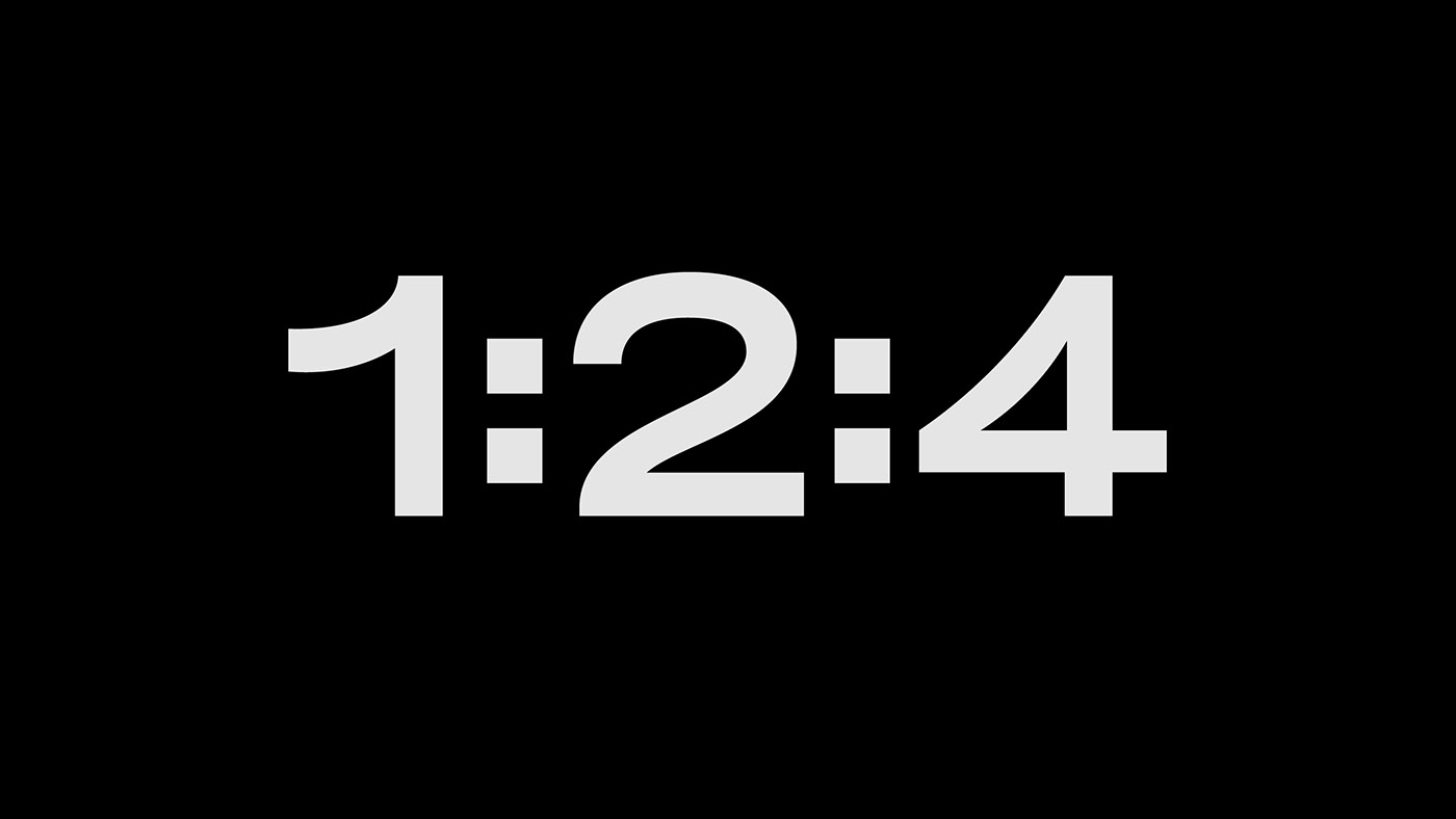
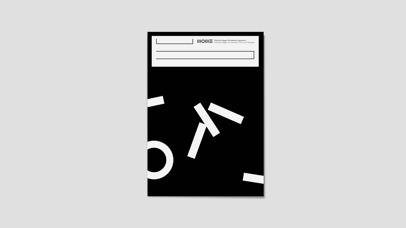
Our vision was to design an open-minded, steady and straightforward identity, which embodies the university’s main principles: the respect of conventions and progressive ambitions. The identity follows a specific proportional system and lacks any kind of redundant ornamentation. The goal was to design a very functional and rational system, which is easy to use. The graphic system was inspired by László Moholy-Nagy's layouts from the ’20s. Both the original and the updated logo are composed of basic shapes and the graphic layouts adopt the same principle. The system - made up of vertical and horizontal lines - structures the written and the visual content and modulates them into balanced visual compositions. Consequently the content is either concentrated or structured into clear geometric systems. This construction is designed in terms of functionality. A defined proportional system is also an important element of our concept, as it maintains the coherence in the visual identity: on the one hand 1:2:4 proportions are applied in the font sizes on different graphic surfaces. The weight of the line structure is adjusted to the stem weight of the logo, on the other hand. Light also had a crucial role in the art of László Moholy-Nagy. We use light as a tool in the visual identity, in respect of the inner and outer signage system.
Art direction and graphic design: Anna Bárdy, Ádám Katyi
Year: 2016
—
Layout
The line-weights of the visual system are adjusted to the line-weights of the logo appearing on a particular surface. The density of the lines is depends on the amount of the needed information. The more information is used, the more it will need to be structured by the lines. The definite margins on off/online surfaces originate from efficient local printability. No cropping is needed on printed letterheads if there is no bleed.
—
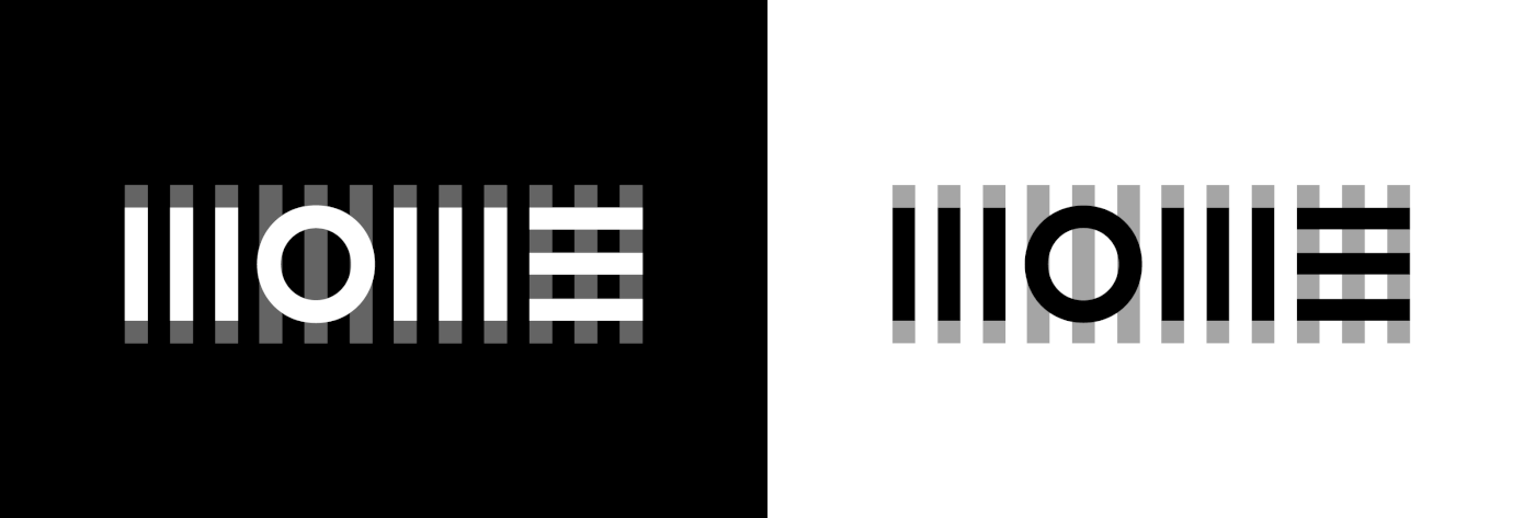
Logo update
Our task was to keep the existing logo’s specific character and apply only smaller updates. We did some important optical corrections: adjustment of the distances between stems and characters.
—
Typeface
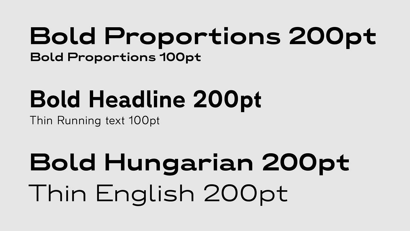
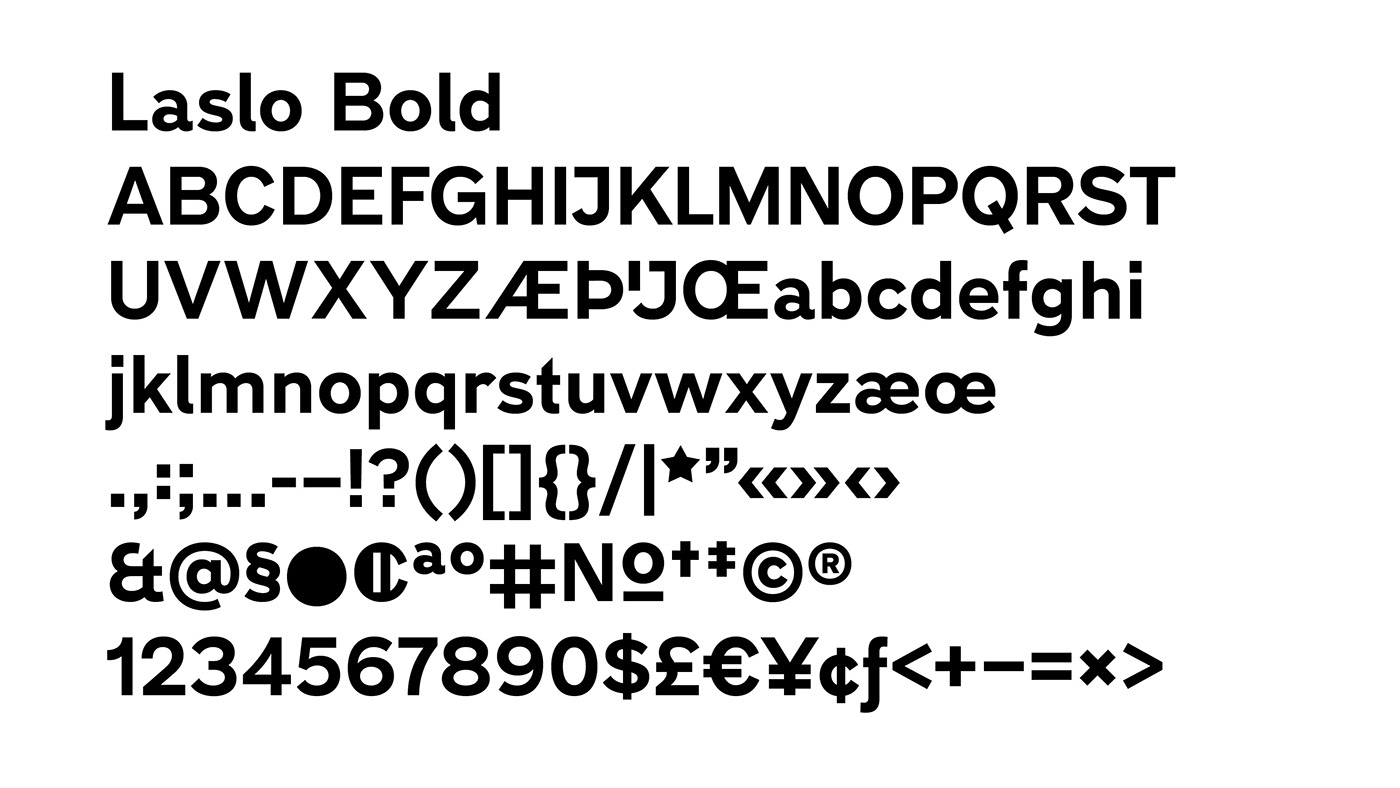
Laslo font family - designed by Ádám Katyi- was inspired by the typography of Bauhaus facing paper specimens from the ‘30s. Two weights and two widths of the font family are used in this project. Font sizes on graphic surfaces appear in 1:2:4 proportions, in order to get adequate and emphatic contrasts. The same proportion is applied in the design of the two styles (Thin and Bold) - the stem width of Bold characters is twice as wide than that of Thin characters.


—
Colours
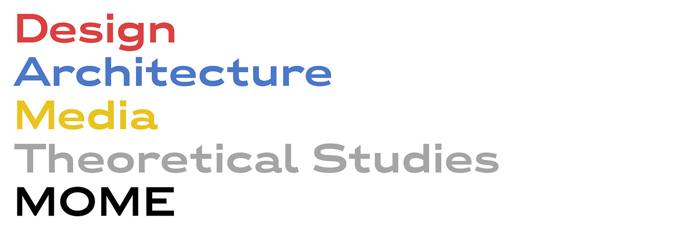
We also aim to get high contrasts by the choice of colours. Beside black and white, the certain departments get colour codes: primary Bauhaus colours and grey. Each of them works well on both black and white backgrounds.

—
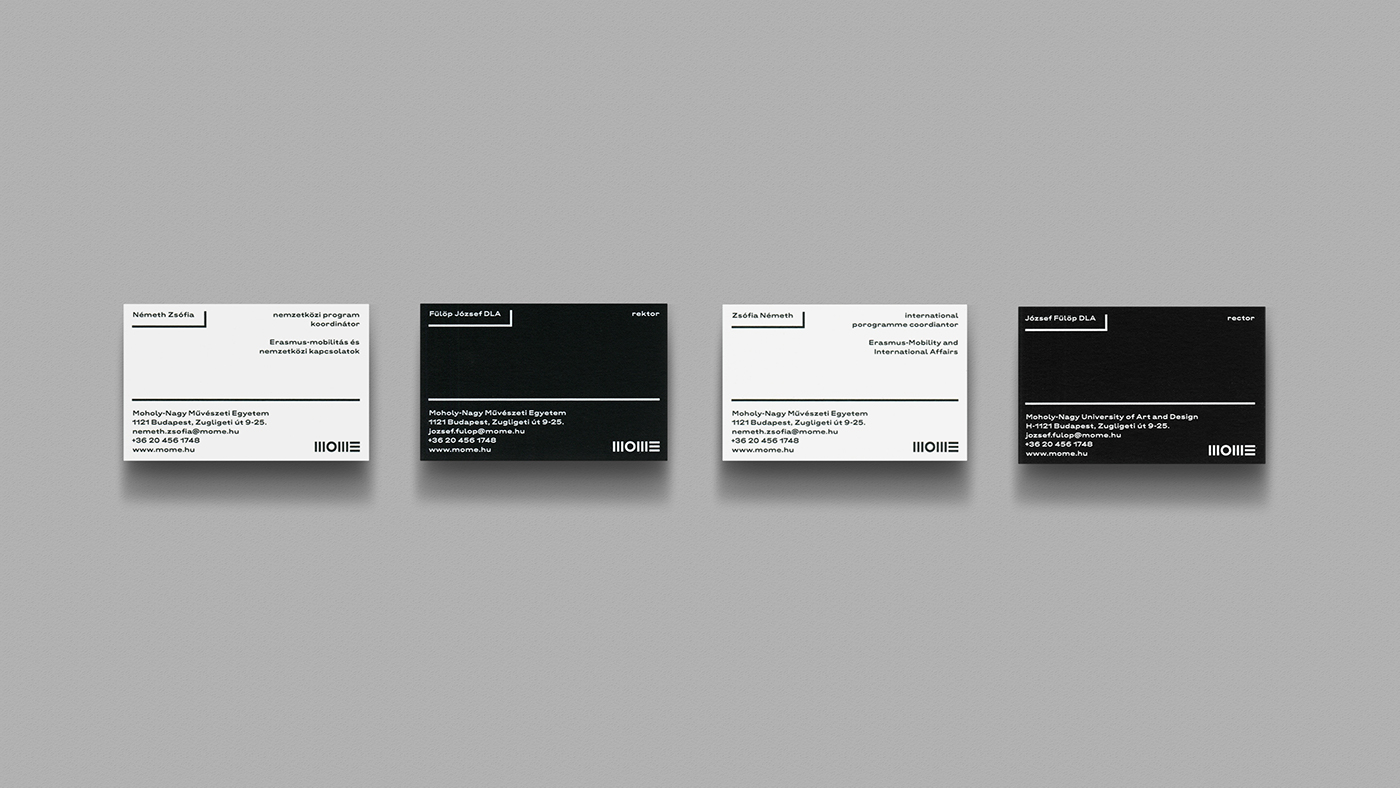
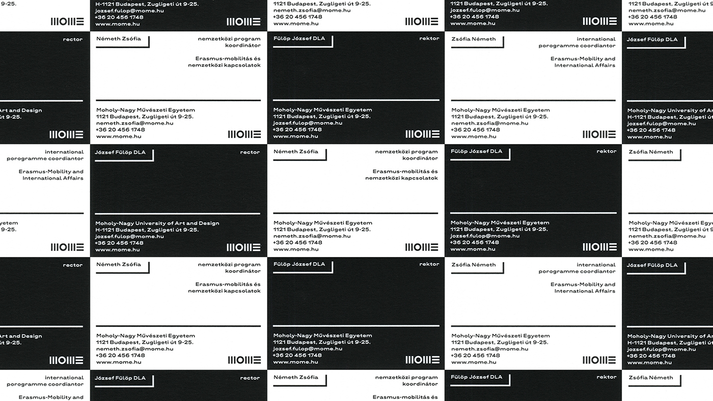
Prints
Each department has its own colour code and all the printed material of specific institutional units get the fitting ones. Red, blue, yellow and grey belong to educational units (the four departments of the university), white is for administration and black is the colour of direction/management.
We placed three markers on one side of the letterhead, which helps the administration fold or perforate it properly.
On prints, the length of the structuring lines varies depending on the length of the given information.

—
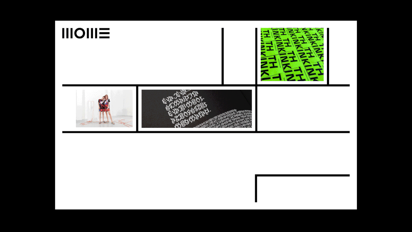
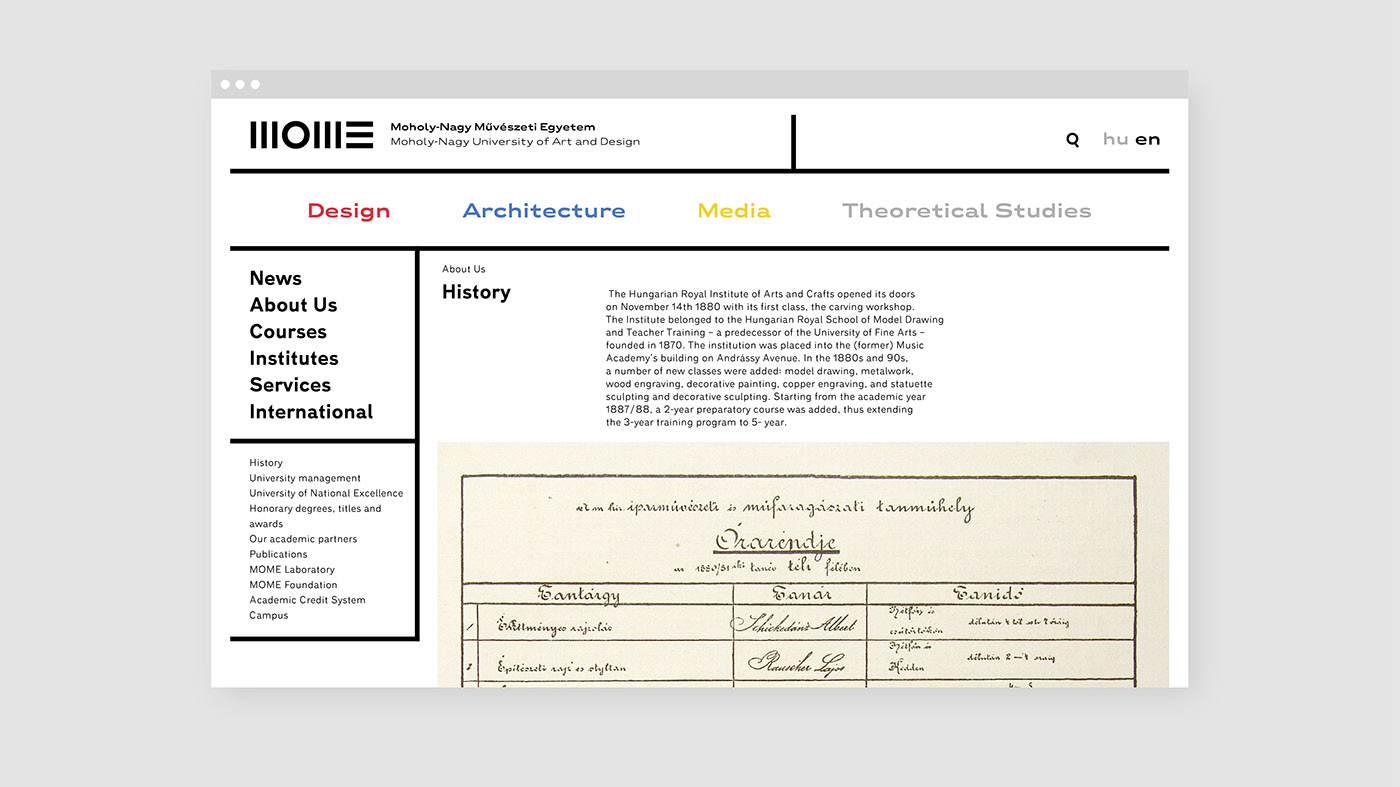
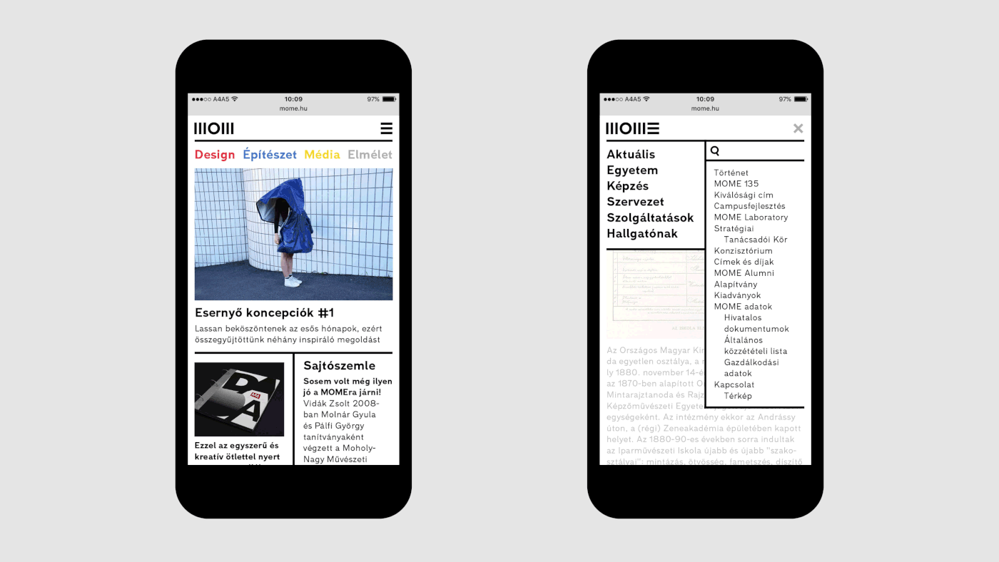
Responsive webdesign
The frame of the site is divided into five parts. This division is based on the structure of the logo’s M character.
On mobile view, the logo’s last letter E is separated from the rest and functions as a menu icon.
The site has responsive typography. While Laslo Wide Bold is used on desktop view, the typesetting of mobile typography is Normal Bold.


—
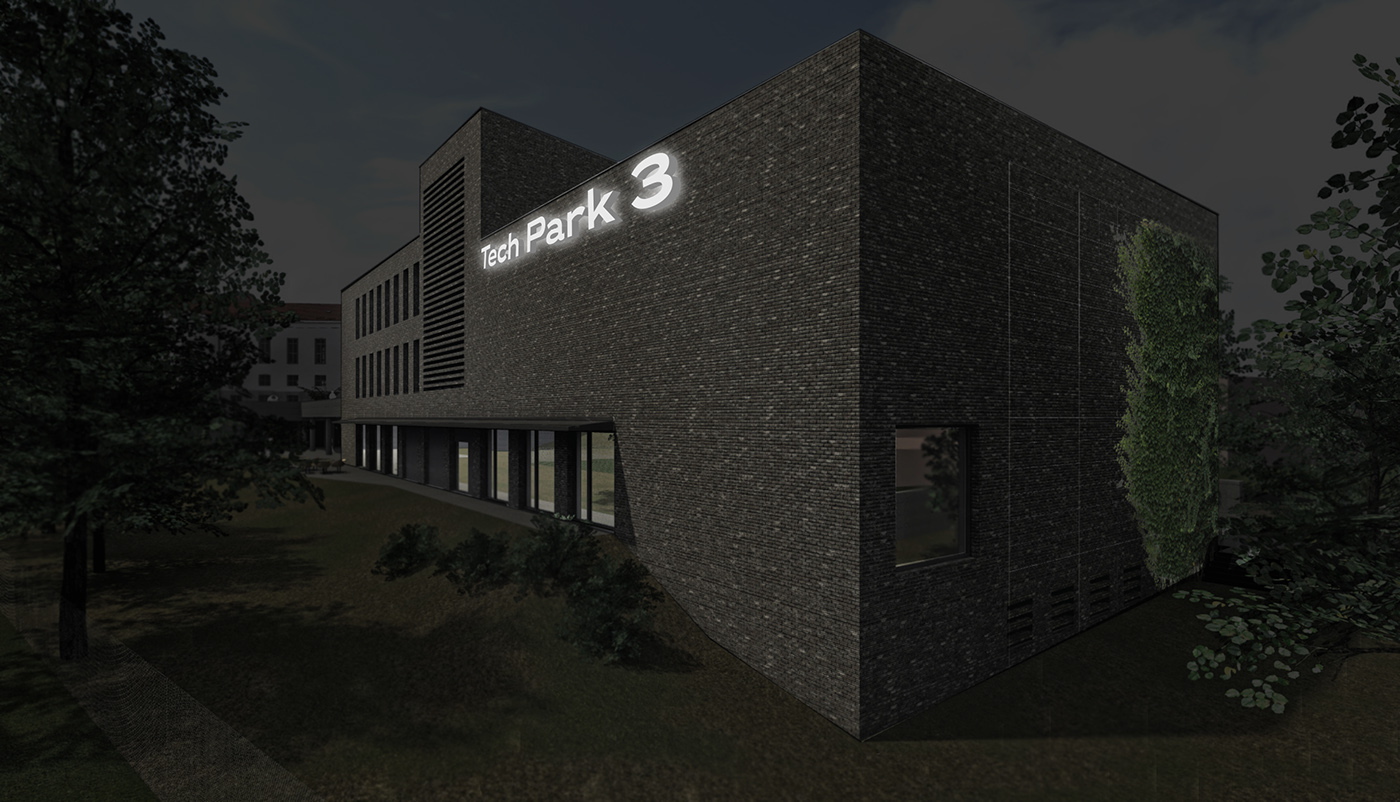
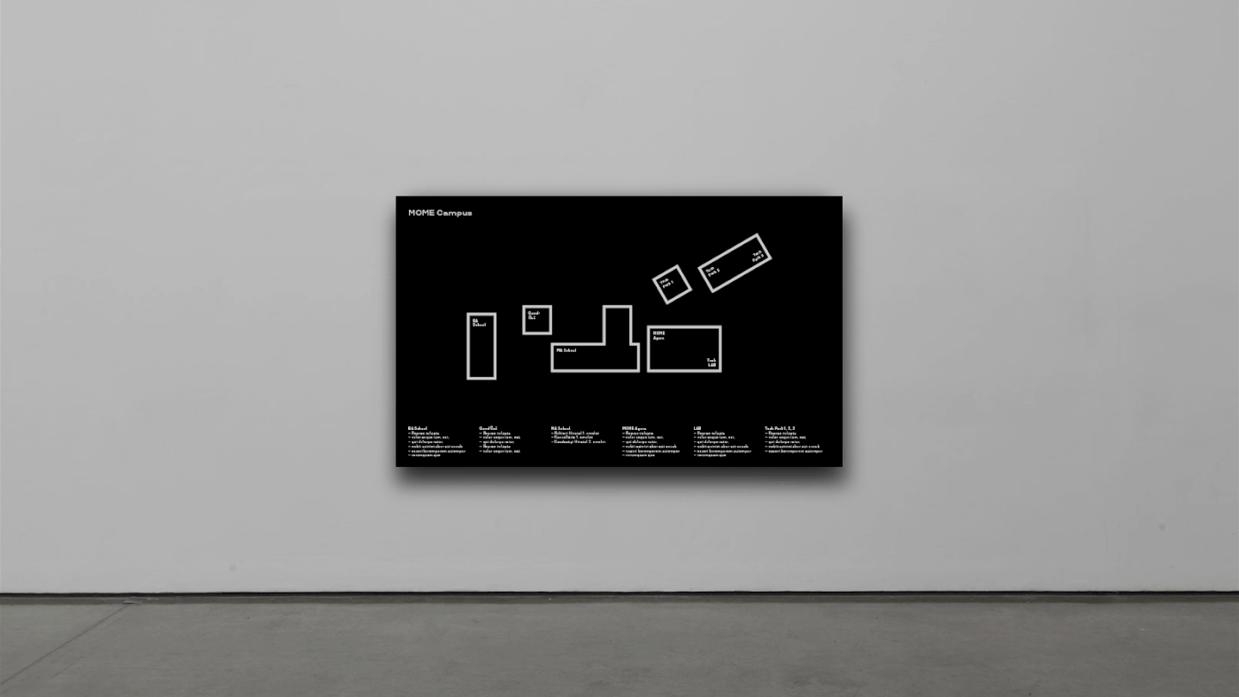
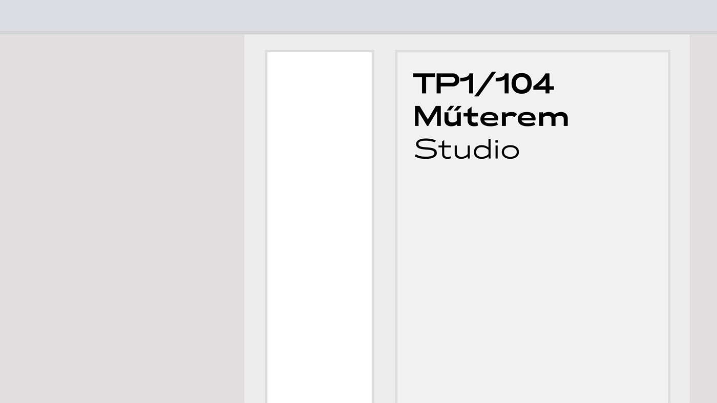
Signage
For the way-finding system we planned to design illuminating boxes uniformly. The use of large scale numbers is markable and functional solution for orientation. The inner signage consists of boxes of the same height.


—
Extras
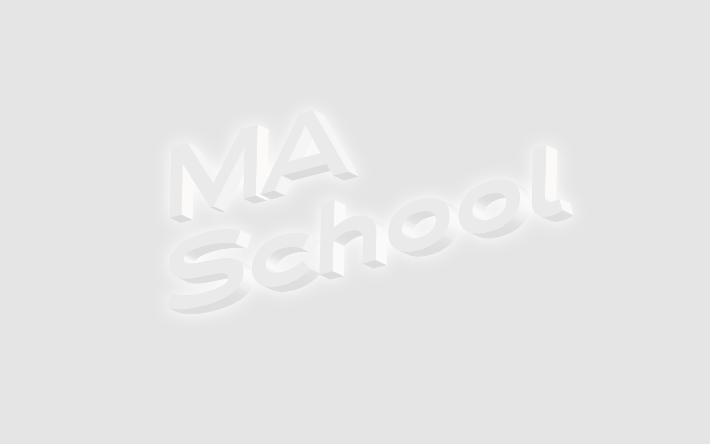
Traditionally students of BA, MA, DLA education get badges at the beginning of their studies. So far they were small barrels made out of silver with different engravings. We designed new pins, which have the same dimensions as the logo’s letter elements, and they are made out of different materials with respect to the type of education. BA students get illuminating prisms of plexi and led, MA students are given silver ones and those of DLA grade get golden ones.
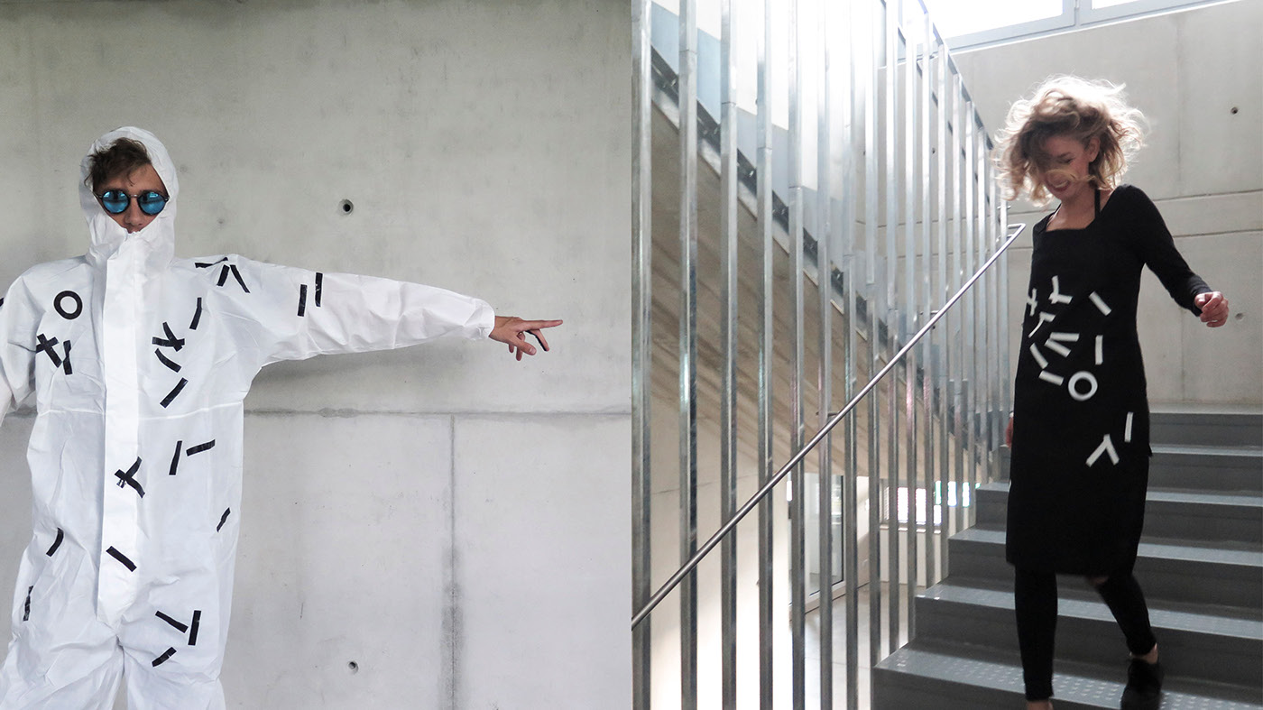
Some specific departments on the university regularly hold workshops, where protective clothing might be necessary. The pattern of the protective clothing is the manifolded and scattered version of the basic logo, characteristic of the craft-work.