GQ Taiwan Ident
GQ Taiwan 於成立20週年 (2016) 時,委託白輻射為品牌設計動態識別,並作為當屆 GQ 風格男人 (Men of the Year Awards) 頒獎開場動態影像。
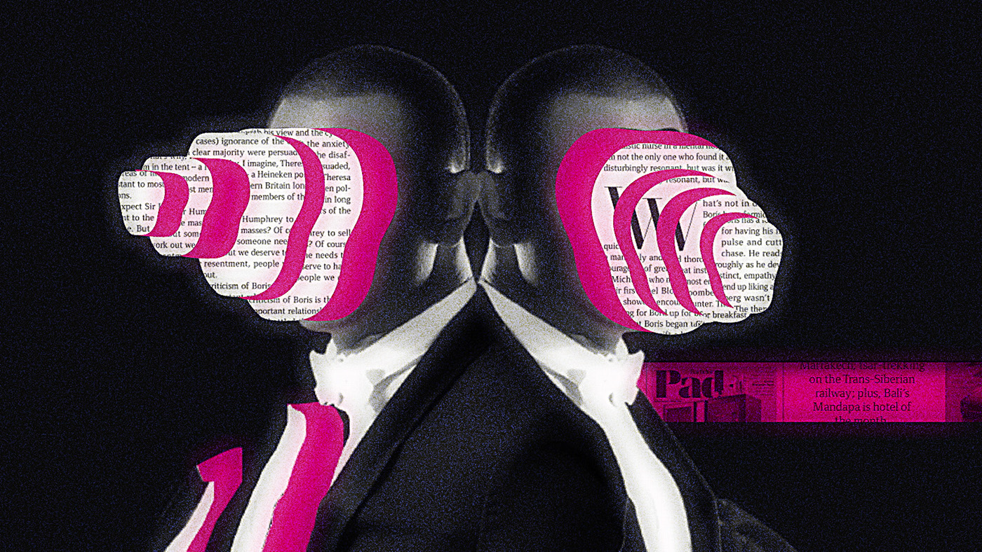
動態識別掌握品牌作為風格雜誌的兩大核心 —「封面人物」與「雜誌標題」,兩者象徵著「人們嚮往」的符號。
封面人物做為視覺主要元素,取樣過去二十年的封面並經重新設計,透過服裝/造型/姿勢/配件看見不同風格人物的宣告與主張,回應「為什麼我們需要衣著」的重要命題。同時以代表GQ Taiwan五個重要字母 GQMEN 做為載體,詮釋「雜誌標題」的精神性。而整體動態展演以拼貼組合及切割的設計語彙,企圖呼應連結品牌本質「紙本媒體」的實體觸感。
In celebration of its 20th anniversary in 2016, GQ Taiwan commissions Whitelight Motion to design its motion graphic for the brand as the promo for GQ’s “Men of the Year Awards.”
The motion graphic illustrates two fundamental elements of this stylish magazine – that is, the “cover figures” and “the title of the magazine”, presenting the “wide admiration” of the public.
Sampled the past twenty years' cover design and making the cover figures as the key visual elements, we redesign the graphic through clothes, styles, posture, and accessories showing different style figures’ statement in response to the issue of “why do we need clothing.”
Meanwhile, the iconic alphabets of GQ Taiwan “G-Q-M-E-N,” were represented in different forms to depict the core meaning of the brand. The language of design in collage and cutting reveals the touch of the core value as “print magazine.”


_ 視覺設計 Styleframes


_ 影片截圖 Final Stills


▒ Credit
客戶 Client|GQ Taiwan
設計統籌 Design Agency | 白輻射影像 Whitelight Motion
導演 Director : 洪鈺堂 Rex Hon
視覺設計 Styleframes Designer : 徐毅驊 Yihua Hsu
動態設計 Motion Designer: 徐光慧 Sylvia Hsu、李竺潔Chu-Chieh Lee
聲音設計 Sound Design: 王文星 Wenhsing Wang


