

Froots Juice Packaging 2018
Concept
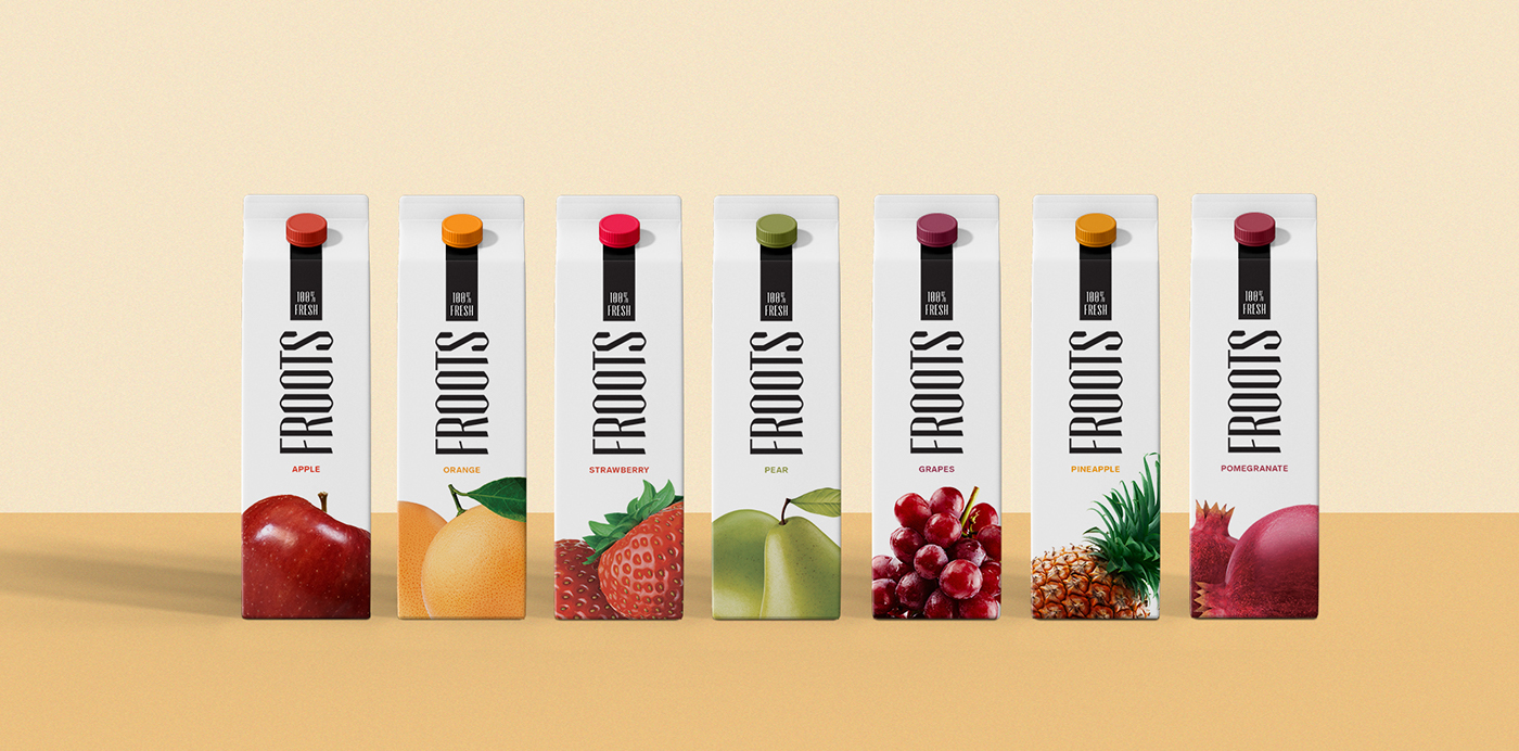
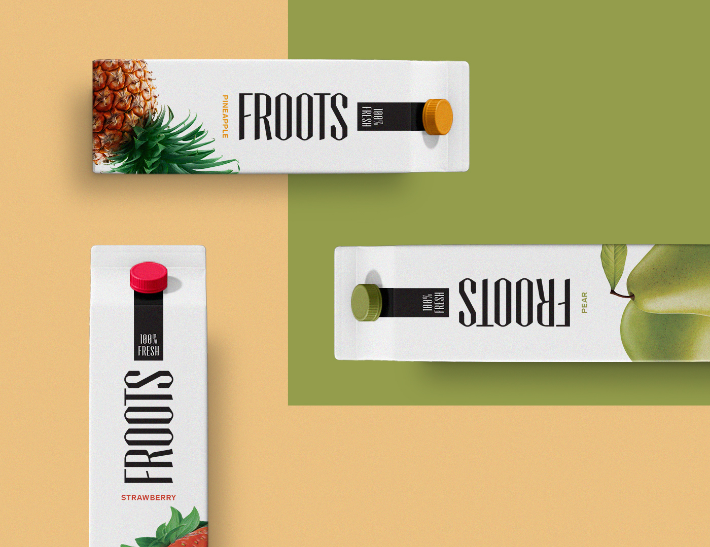
FROOTS is based on a simple yet smart idea Since fruits grow out of roots from bottom to top, we merged the two words (fruits + roots) for having the same rhyme.
Visual Identity
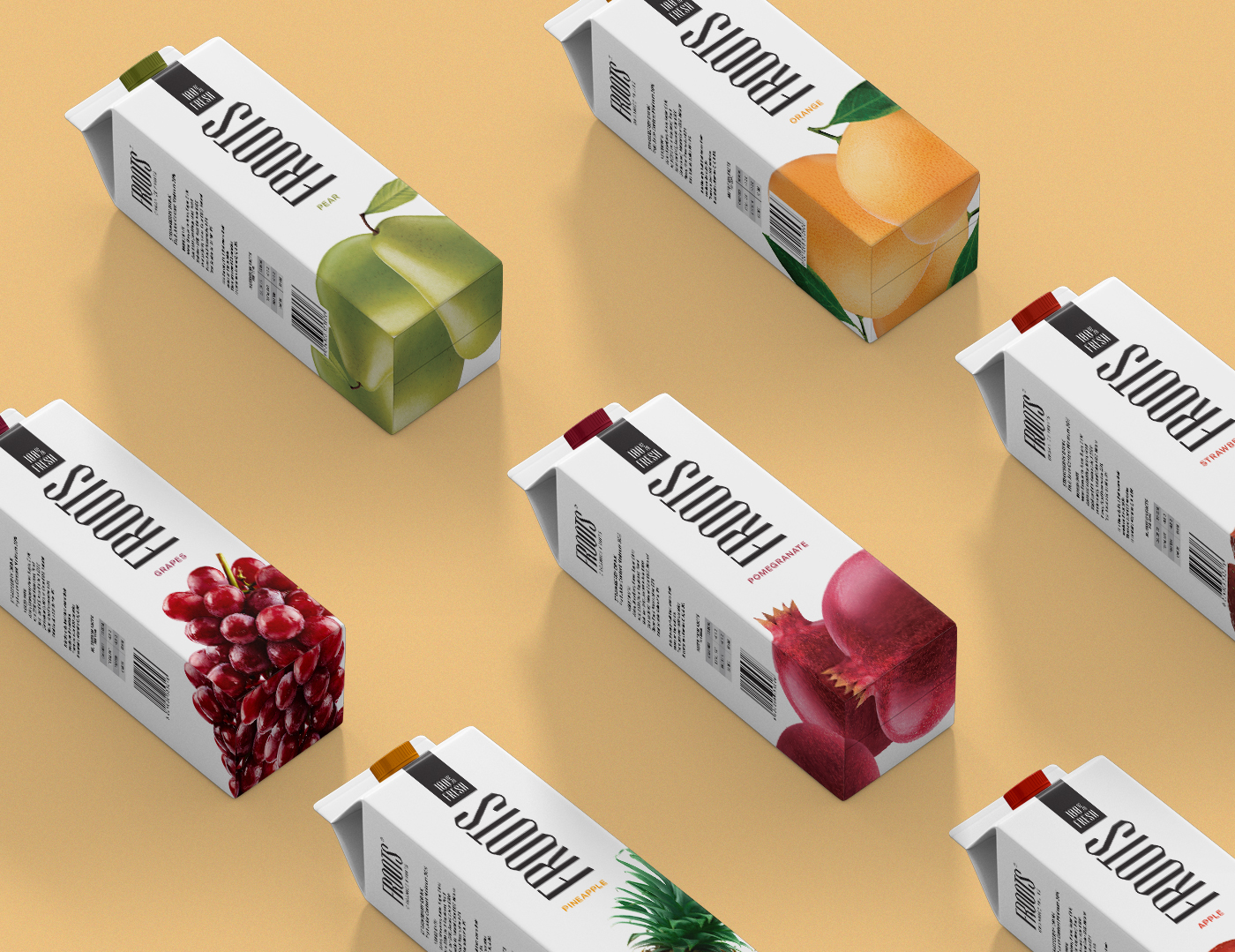
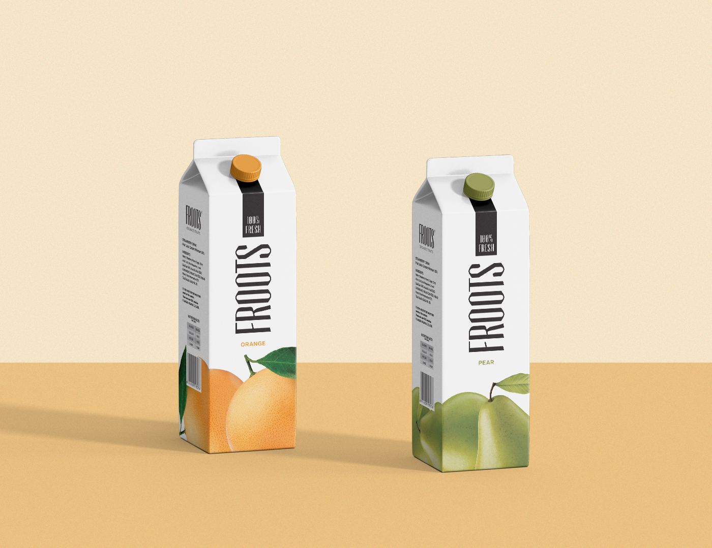
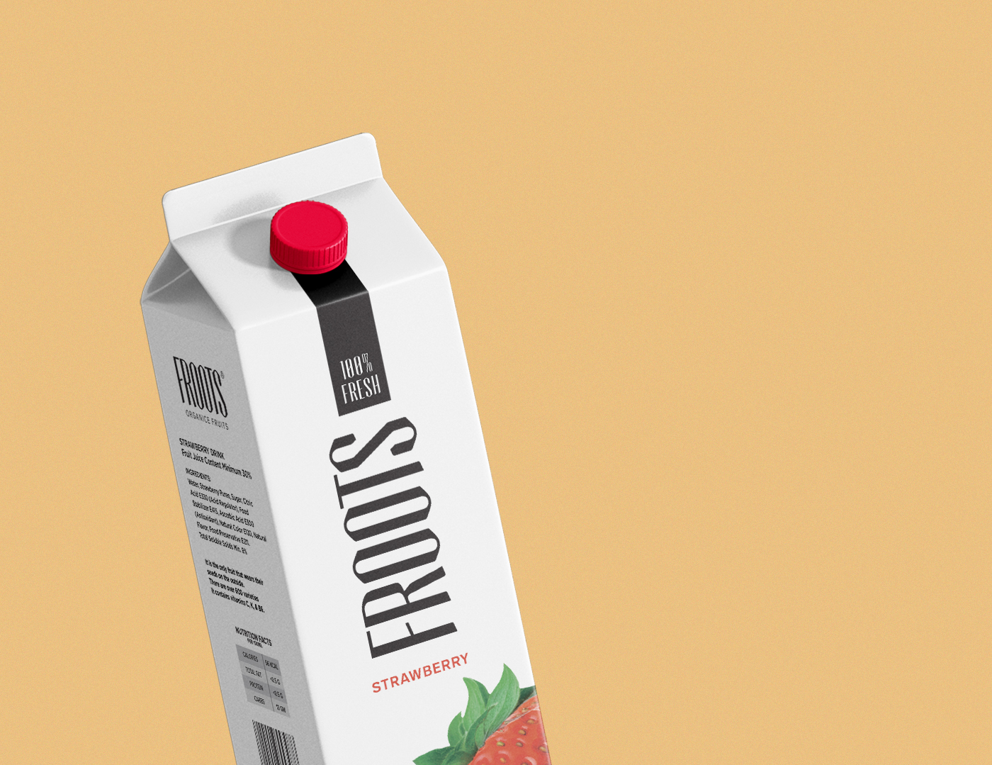
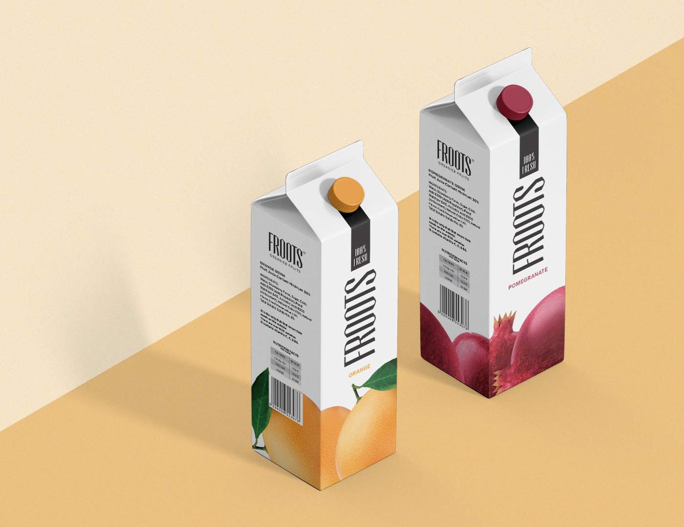
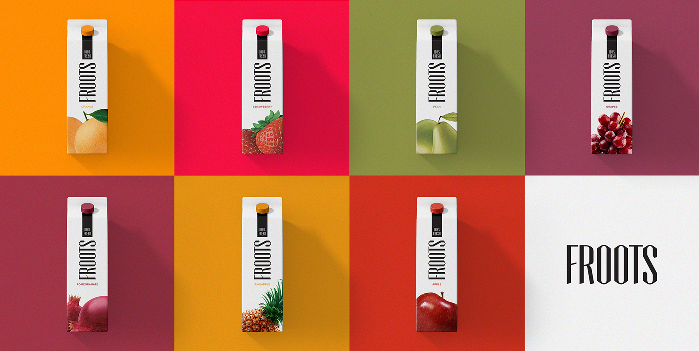
Based on the concept, fruits were distributed visually all over the packs from bottom to top in an emerging roots-like, going up with the brand name placed vertically to empower it. This identity gives the whole packs a unified look when they are put together on the shelves, and makes it easy for consumers to identify them the moment they lay their eyes on the brand packages.
* This is a personal project that I would love to see come to life, if you’re interested please contact me, All rights reserved.

THANK YOU
FEATURED ON PACKAGING OF THE WORLD HERE:


