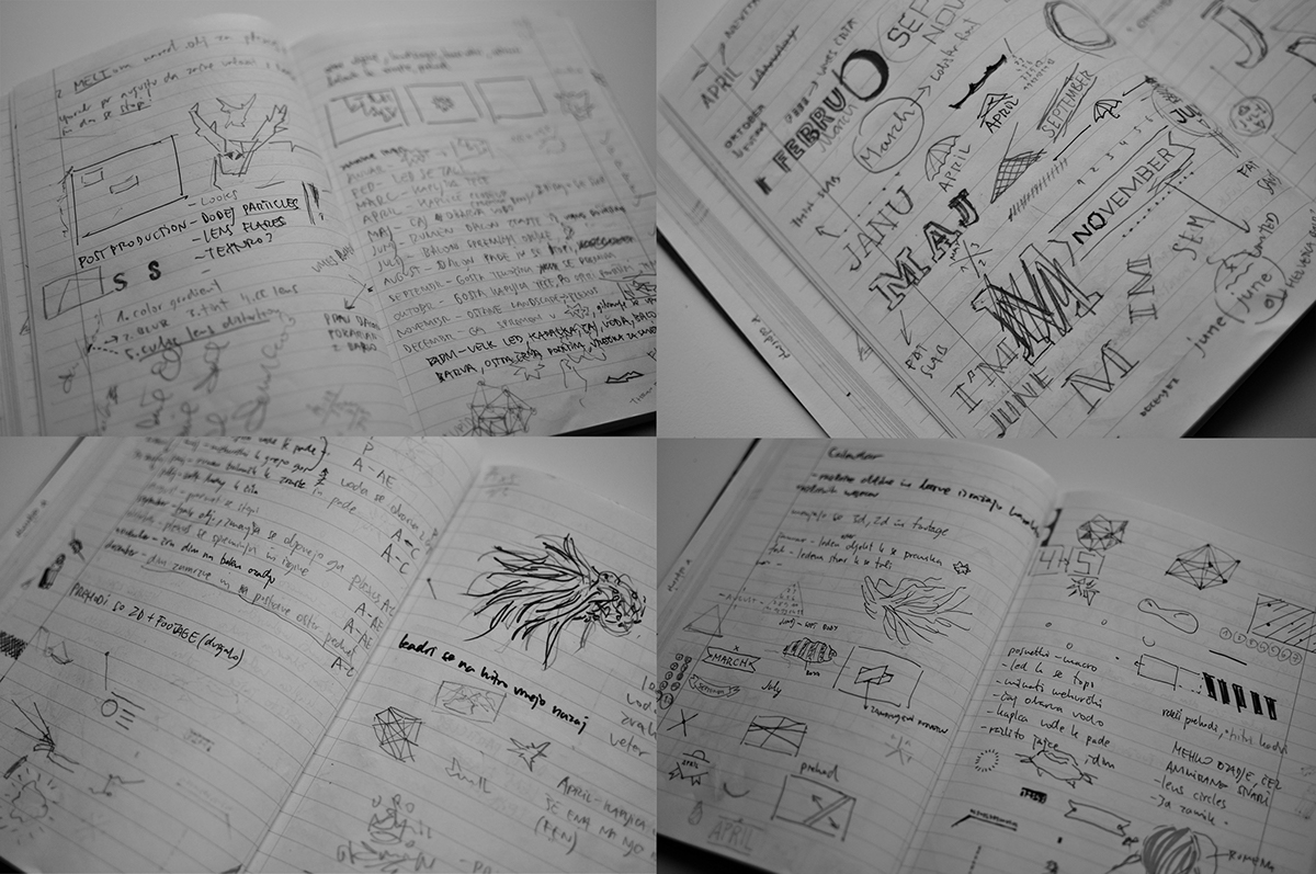
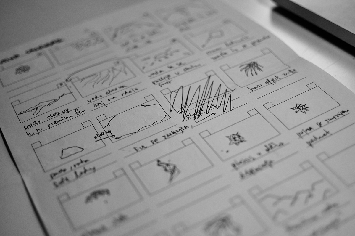
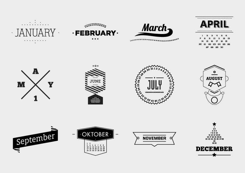
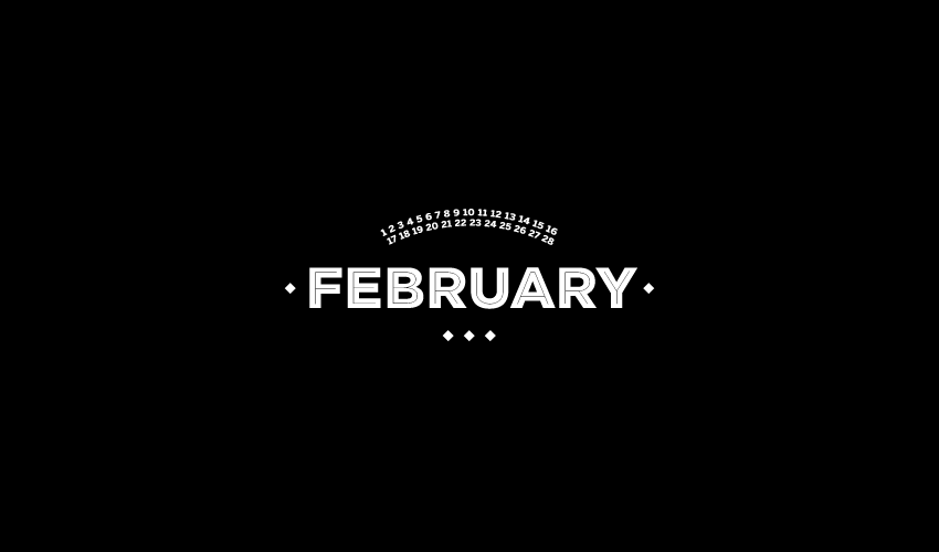
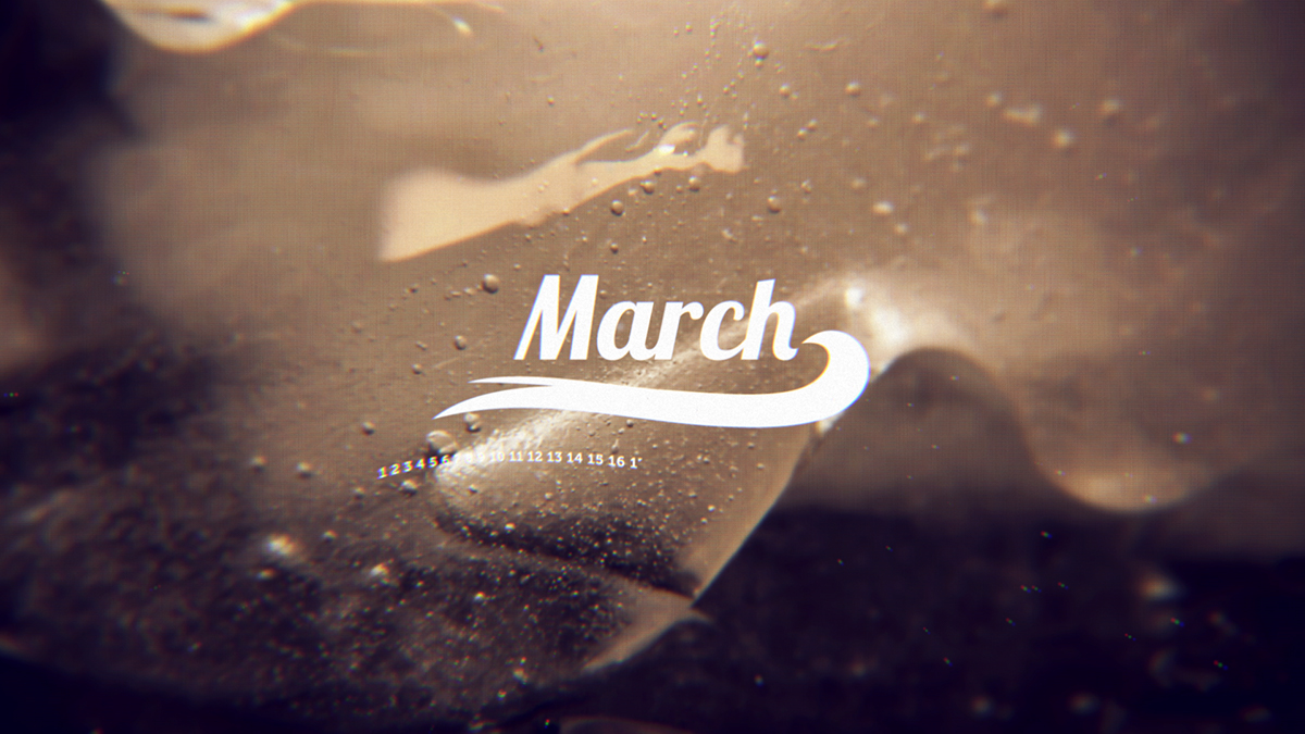
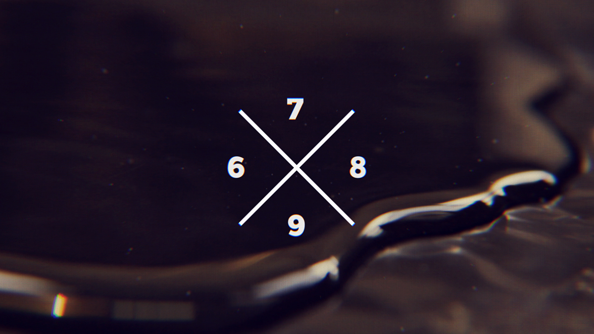
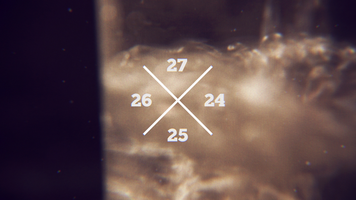
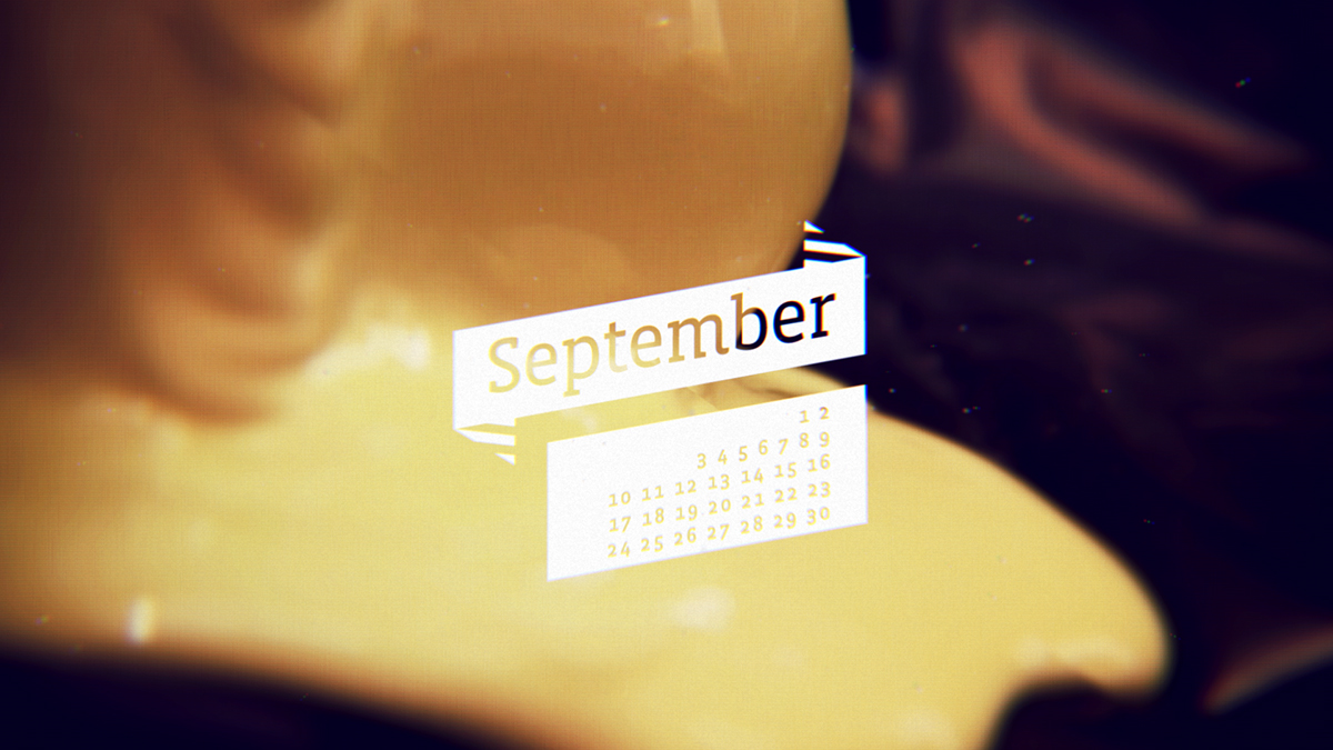
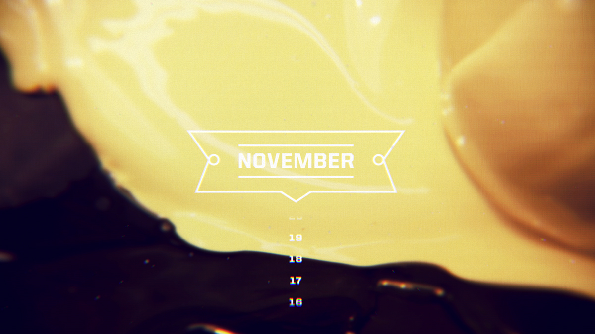
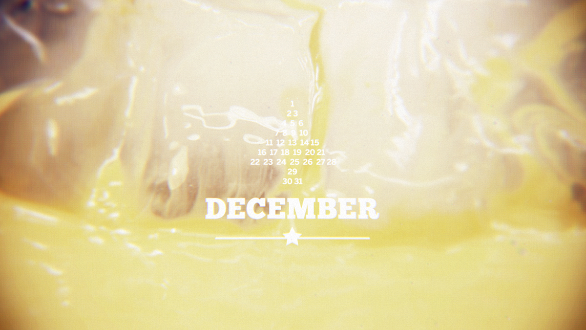
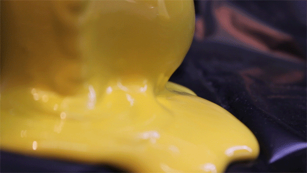
Motion calendar is about differences in a year span. It is trying to show the feeling of every month through design with colors, typography, texture and speed. Piece is a mixture of camera footage, and 2d and 3d animation. Typography is dominant, with vintage-ish logos is trying to "brand" months, through typefaces with characters and their positions. Forms look abstract but this are close up shots of everyday things, which are put in different contest and emphasize the overall feeling.
for best quality watch it on Vimeo
for best quality watch it on Vimeo