Client:
Naxos Training is a gym based in Curitiba, Paraná, Brazil. Náxos worries about the public that is left out. Chubby people and people who do not participate in the "world" of gyms. With the focus on these people, the mission of the academy is to bring and reach the goal of each customer. From weight loss, hypertrophy to competition.
Naming:
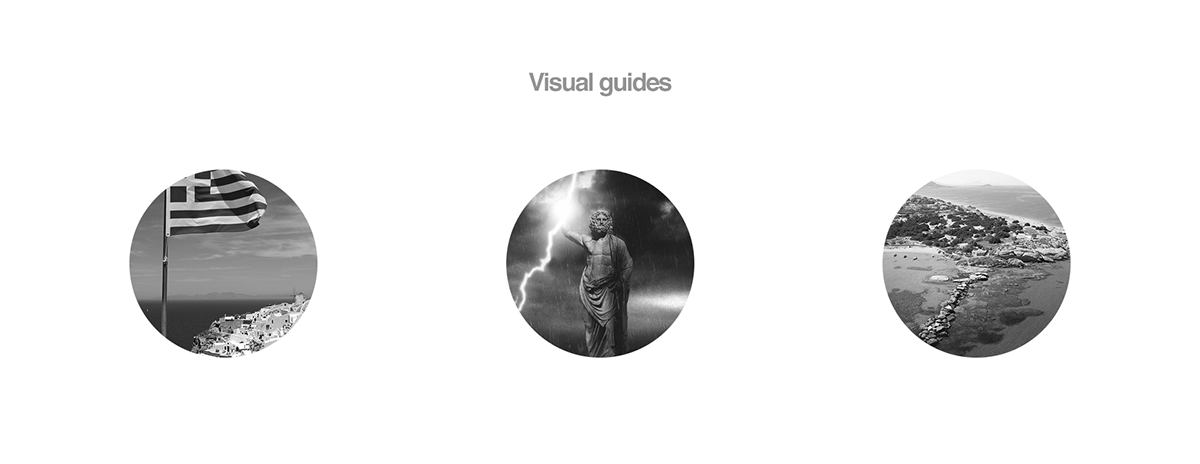
Why Náxos? Naxos in Greek: Νάξος. In mythology, Naxos is the birth city of Zeus. The God of the Gods. The main god of Greek mythology.
Challenge:
* Make the appearance attract people who do not practice physical activities, but also attract people who want to compete and who already have experience in gym.
* Brings the mythological representation (lightning) but get out of the ordinary.
* Be simple but strong
Solution:
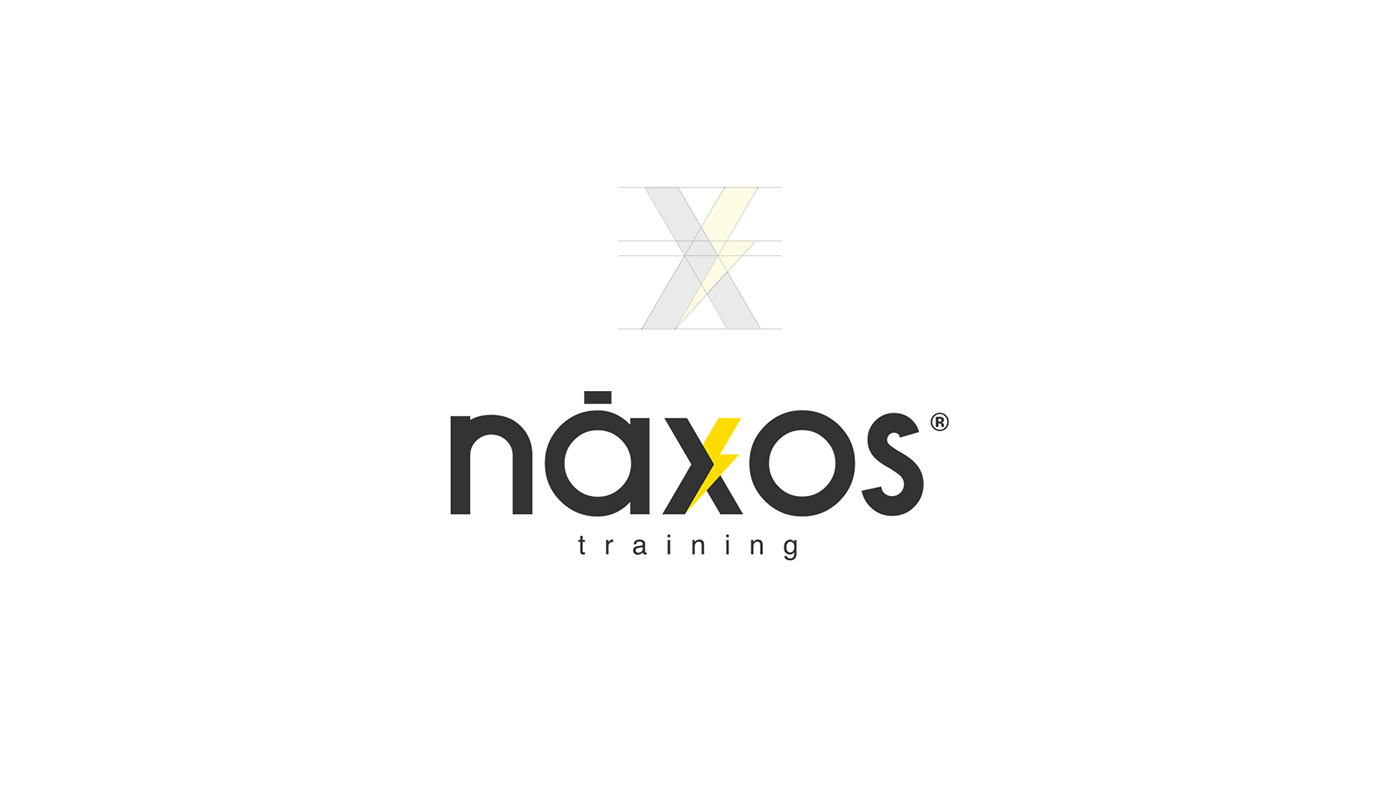
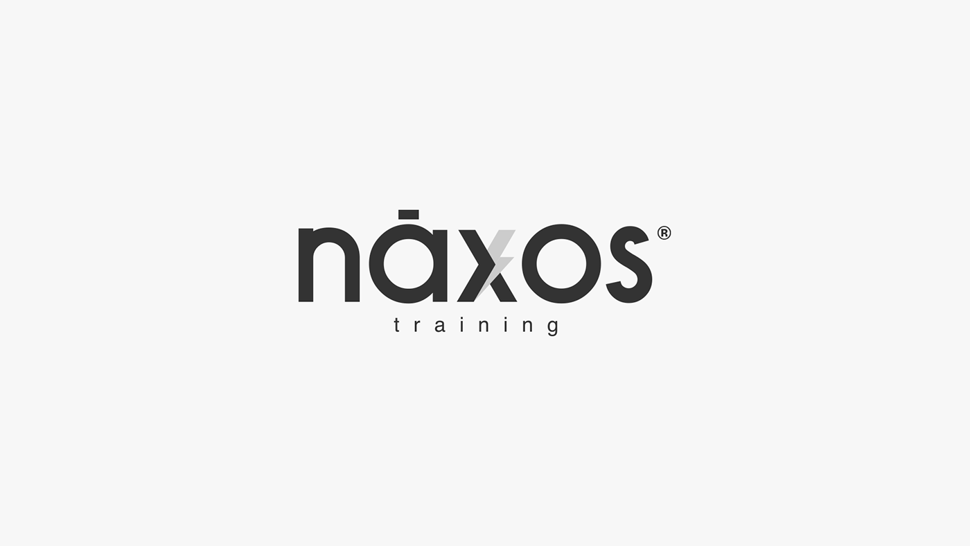
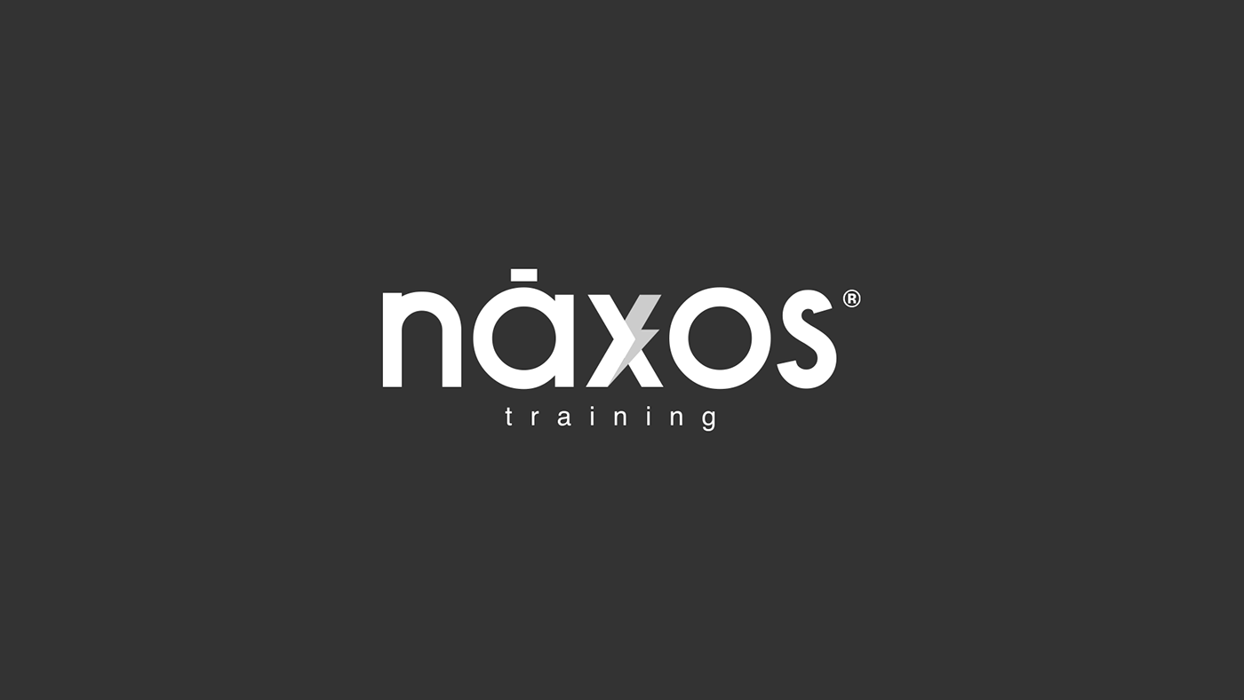
The use of customized typography in bold and straight lines translates the strength of the brand.
I chose to create a symbol that was attached to the letters and not separately. The symbol created next to the "X" is the instrument that Zeus receives in Naxos. The lightning. Strong meaning for the main God of mythology.
To give direction and represent seriousness, precision and strength, the gray (# 333333).
To complement, attract and attract attention, the yellow. (# fedd00).
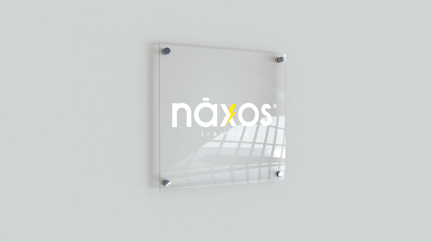
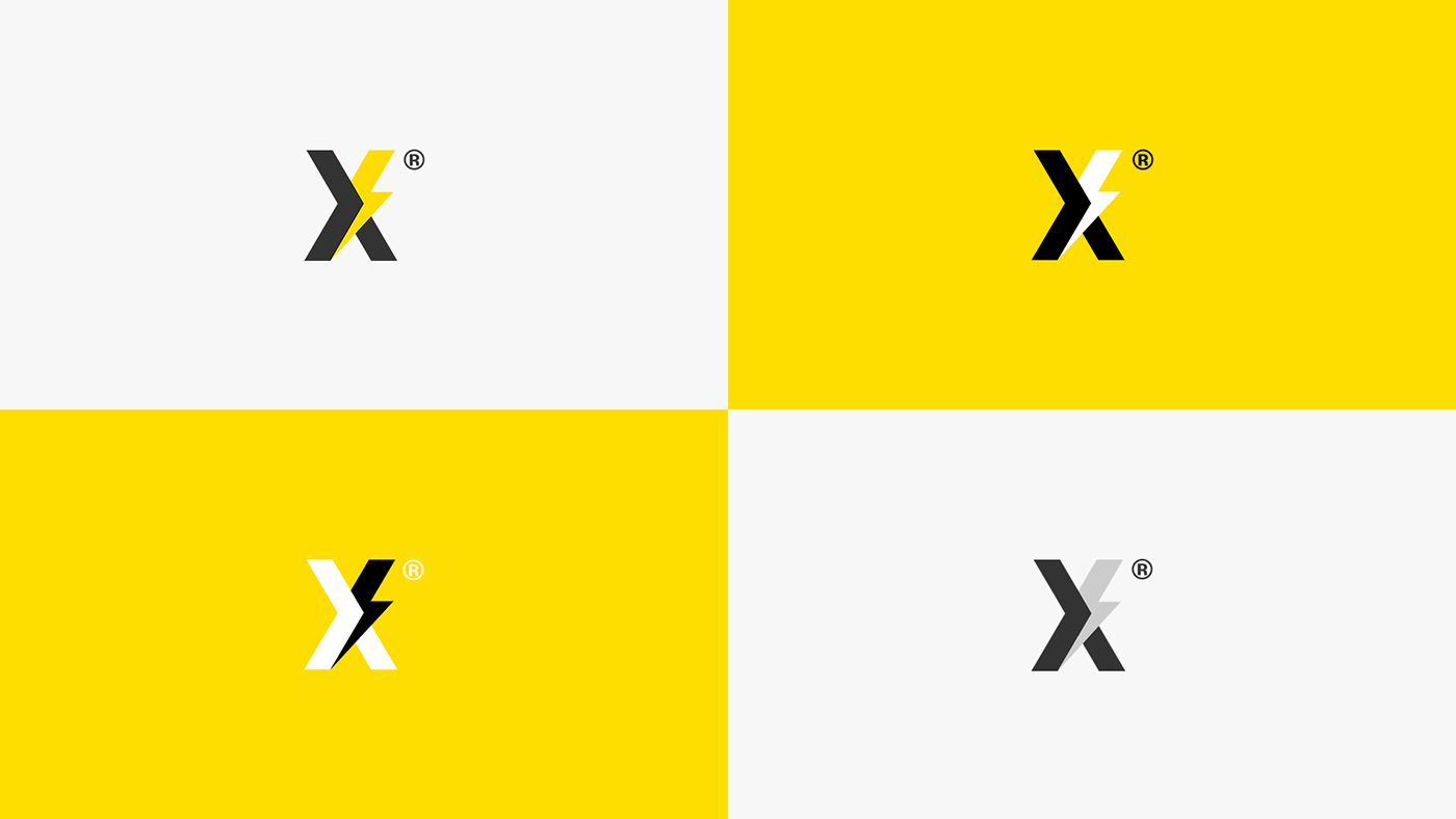
Logo reduction:
Use required for the brand to be applied in small places. The colors have variation to facilitate contrast
in different backgrounds.
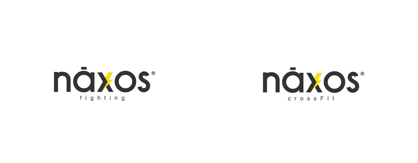
Tag-line variation:
Each modality offered by the academy can be identified with the tagline. Applications may change according to the program communicated.