

badoo_tech
badoo_tech is the technological firepower behind the family of dating products (Badoo, Bumble, Chappy, Huggle). It is a community of single-minded IT professionals, aiming to contribute to the development of the industry. badoo_tech team makes a lot of live presentations, publish technical articles, organise IT events and contribute to open source with their latest developments.
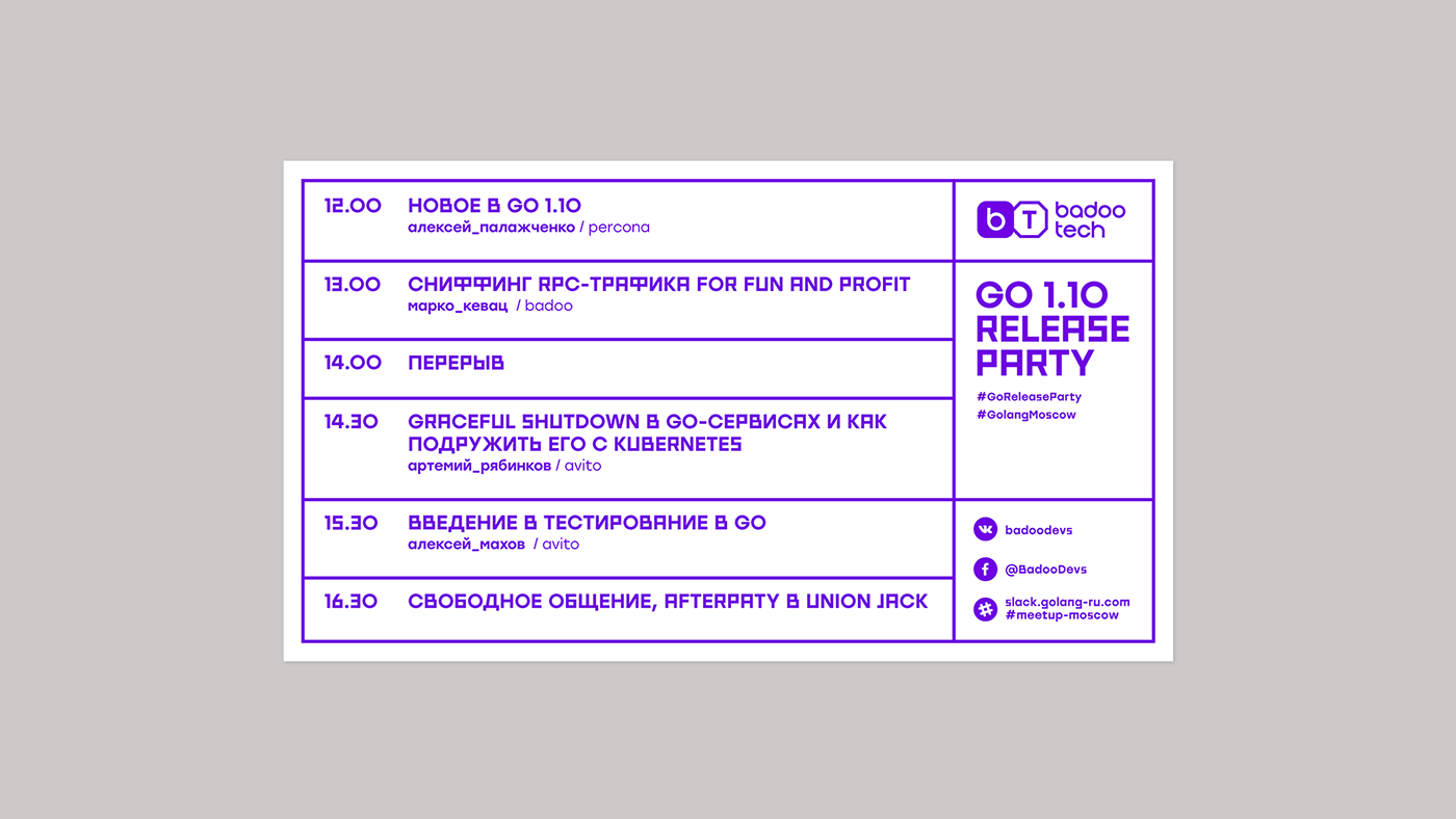
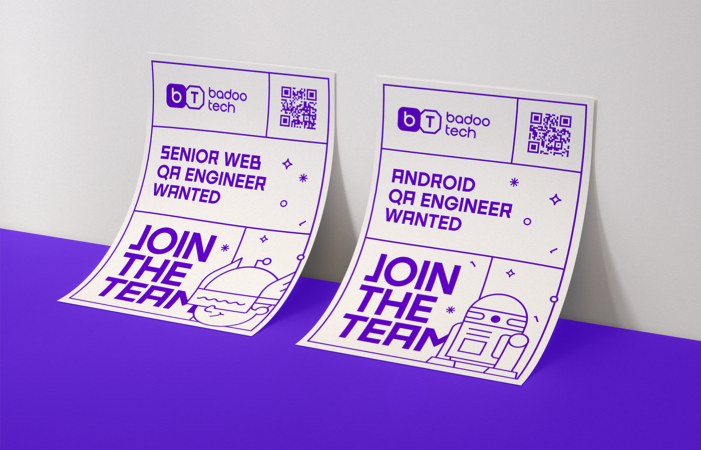
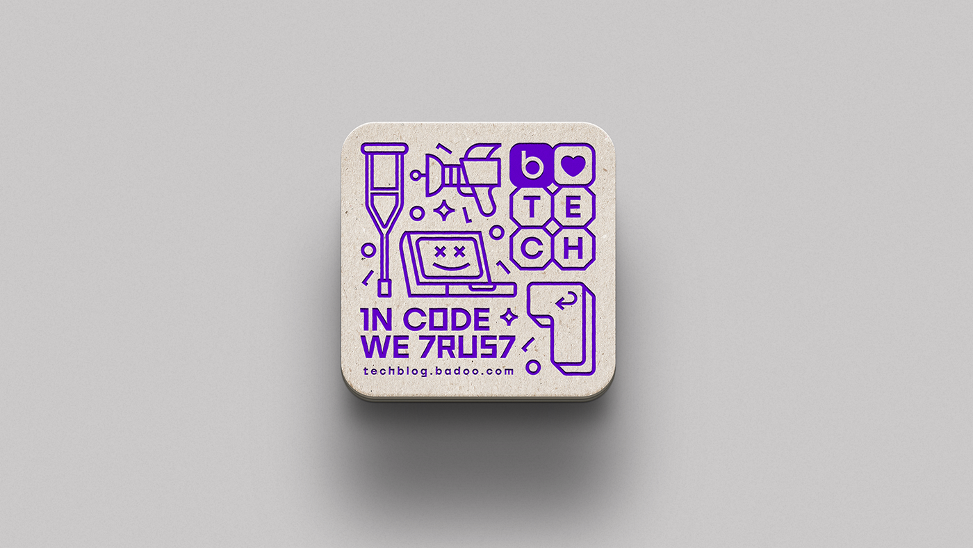
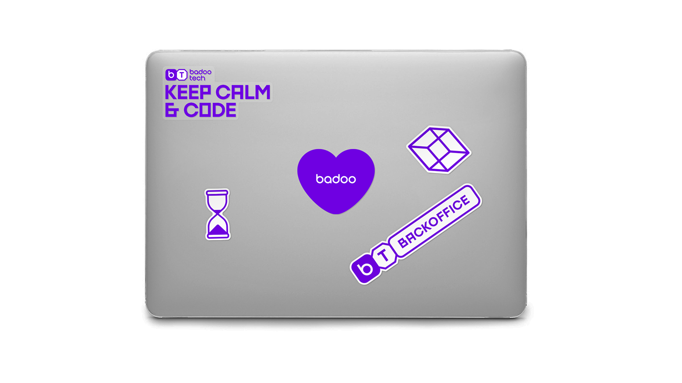
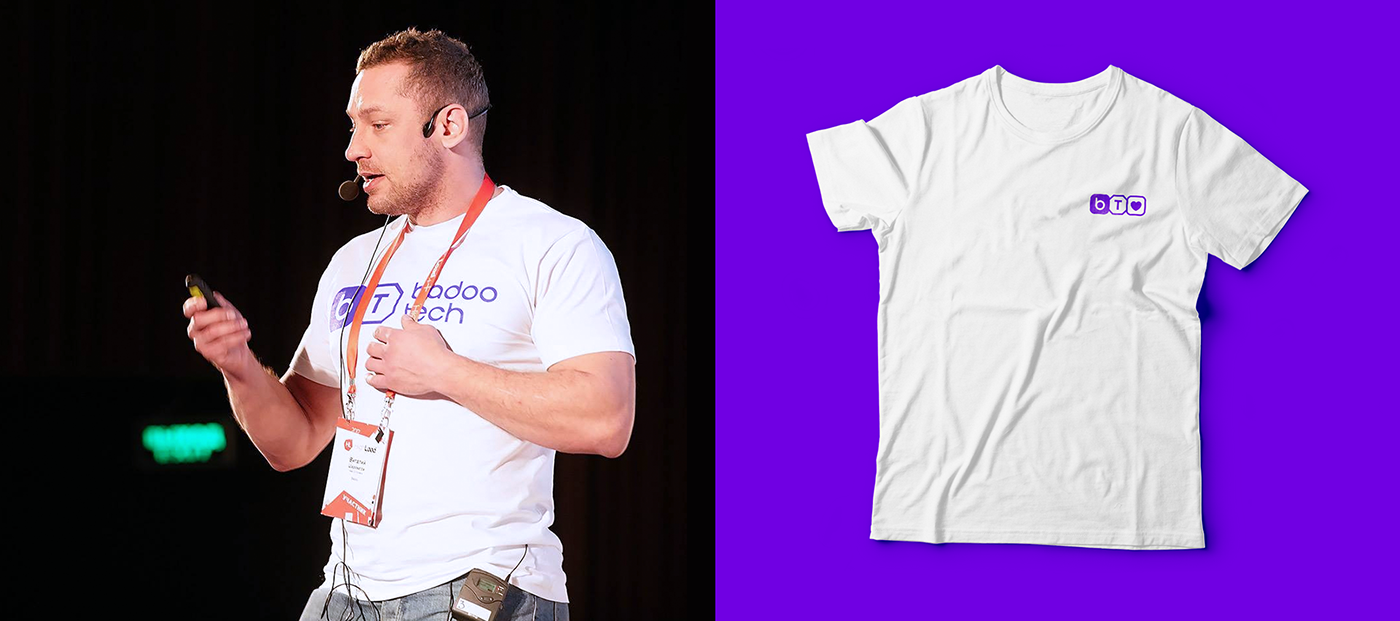
badoo_tech's identity inherits basic visual style elements of the head brand (such as colour, logotype letterforms and app icon) while delivering a geeky, technological and playful twist not deprived of self-irony.
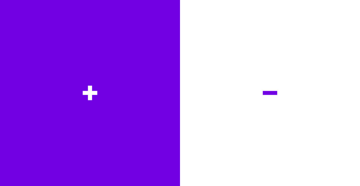
Colour code is binary — purple & white, plus & minus, zeros & ones, human & technology. No halftones nor compromises. This duality is reflected in the logo — the visual abbreviation of badoo_tech consists of the product app icon, standing for human experience and the ’T’ in the octagonal container, standing for the technology behind that experience.
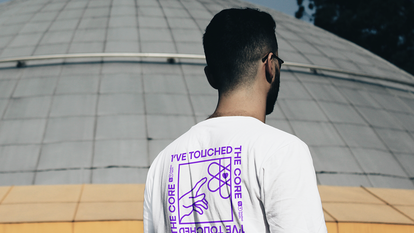
The logo is transformable and can incorporate additional elements for representing different development platforms. The same flexibility can be seen in the chosen illustration style. Simple geometric illustrations are easy to produce and scale to fit preferred mediums. They can also make up a pattern when combined.


design & art direction: roma_lazarev
illustration & motion graphics: vova_shopotov
badoo design 2017


