

NOMA is a packaging design for colour pencils targeting the colour deficient. The packaging uses a symbol-coded system to represent each colour. The overall graphics focuses on creating a smooth and uninterrupted user experience. The unique structure of the packaging allows the user to separate the colour pencils into dark and light tones. The packaging can further be a pencil stand or as flat packaging according to user preference.


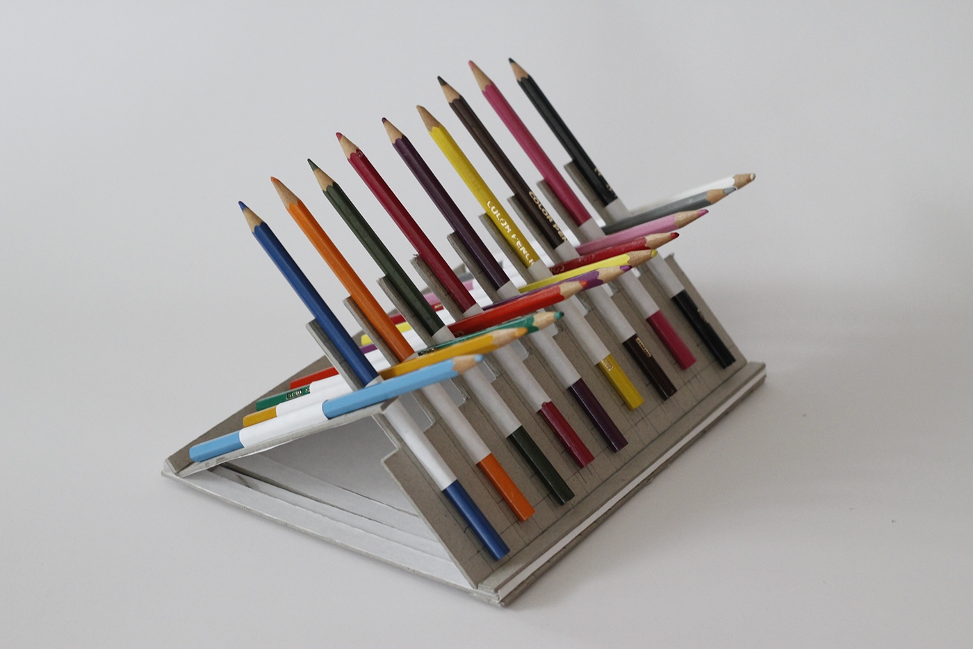
Drawing inspiration from the flat-packed designs and how box joint works, the 2 prototypes were created with the functions implemented.

The brand logo itself is based on the Ishihara’s colour blind test plate. While there are many variations to the logo sketches, the selected logo is still made on something relatable to colourblind.
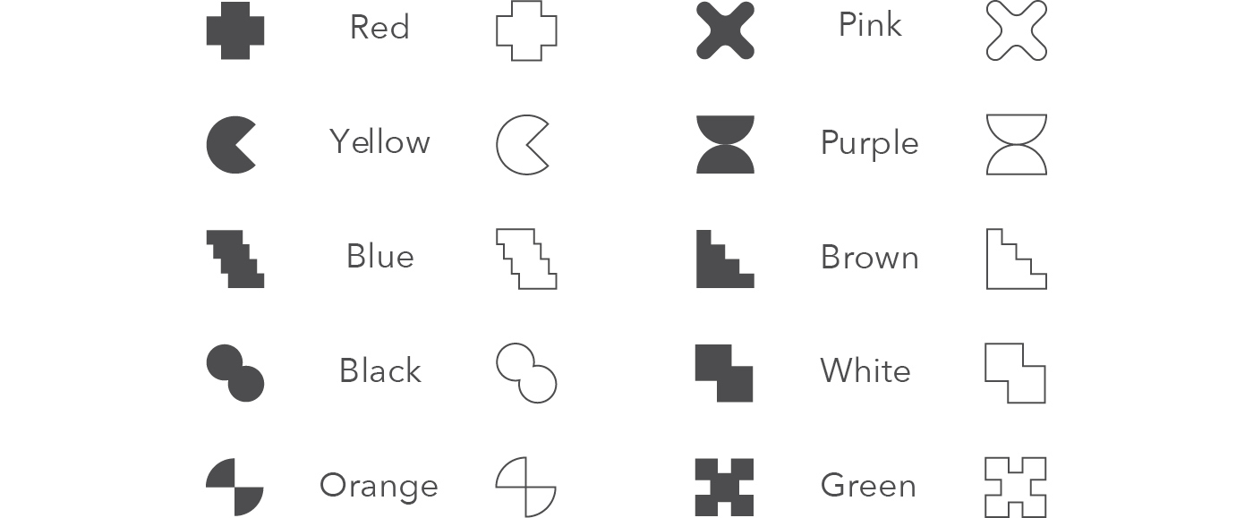
Symbols were created to be used as a system to indicate colours. A lighter shade will have a line symbol whereas a darker shade will have a solid-filled symbol.


A neutral typeface is used on the packaging so that it will not be embellished but will allow the focus to be on the product itself.
Curious Matter Andina Grey is selected for the packaging paper as it provides a sand-like texture and will help to leave a sensual impression on anyone who comes across the packaging.


Product Name: NOMA Colour Pencil
Product Dimension: 180x248mm
Materials: Curious Matter Andina Grey, 2mm Greyboard
Typeface: Helvetica
Recognition
Merit Award for the Asia Student Package Design Competition (ASPaC) in 2017.


