Sofia Valanci
The Client
Sofía Valanci is a natural enthusiast of style and design. She loves traveling and is a certified health coach. All her ideas and experiences are expressed on her blog.
The Problem
Work the user interfase design and website development of her blog in an elegant and vibrant way. Showcase her eclectic sensibility and colorful artistry.
The Solution
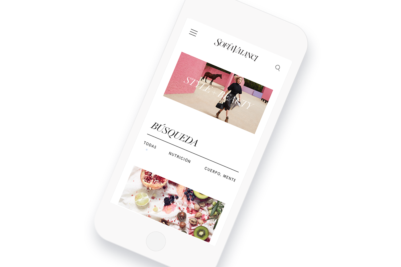
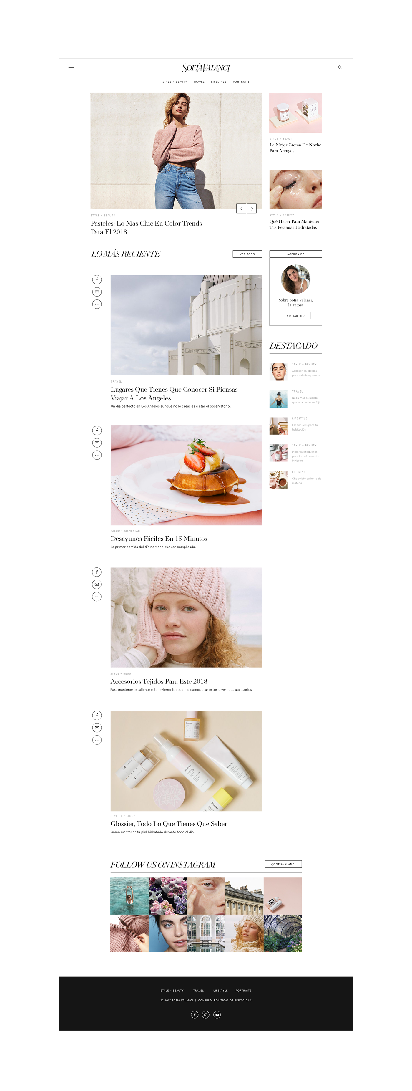
The main identity was designed as a minimal and elegant experience. We created an easy to explore website that allows the content to stand out. Each blog category was given a specific color creating the right atmosphere for each theme. The color palette revolves around the idea of femininity free of its more common social tags.
Using serif for the headlines and sans serif for the texts, we created the perfect balance between visual aesthetics and a factional typographic system. A sense of editorial professionalism meets modern simplicity, sobering it without boring it. The whole blog is, of course, mobile friendly.
Using serif for the headlines and sans serif for the texts, we created the perfect balance between visual aesthetics and a factional typographic system. A sense of editorial professionalism meets modern simplicity, sobering it without boring it. The whole blog is, of course, mobile friendly.

El Cliente
Sofía Valenci es una entusiasta natural del diseño y el estilo. Apasionada de los viajes, y certificada como health coach expresa todas sus ideas por medio de su blog.
El Problema
Diseño de interfase y desarrollo de un blog, de forma elegante y vibrante. Mostrar su ecléctica sensibilidad y colorida visión.
La Solución
Diseñamos la identidad principal como una experiencia minimalista y elegante. Creamos una página web fácil de explorar, permitiendo que el contenido sobresalga.
A cada sección del blog se le asignó un color en especial, creando la atmosfera correcta para cada tema. La paleta de colores elegida, gira en torno a la idea de femineidad libre de todas sus etiquetas sociales.
Usando una tipografía serif para los títulos y una sans serif para el texto, creamos el balance perfecto entre la estética visual y un sistema tipográfico funcional.
Logramos un sentido de profesionalismo editorial y simplicidad moderna; es sobrio sin ser aburrido. El blog entero es compatible con dispositivos móviles.