Client ___ WEINGUT KNAUß
year ___ 2016/17
___
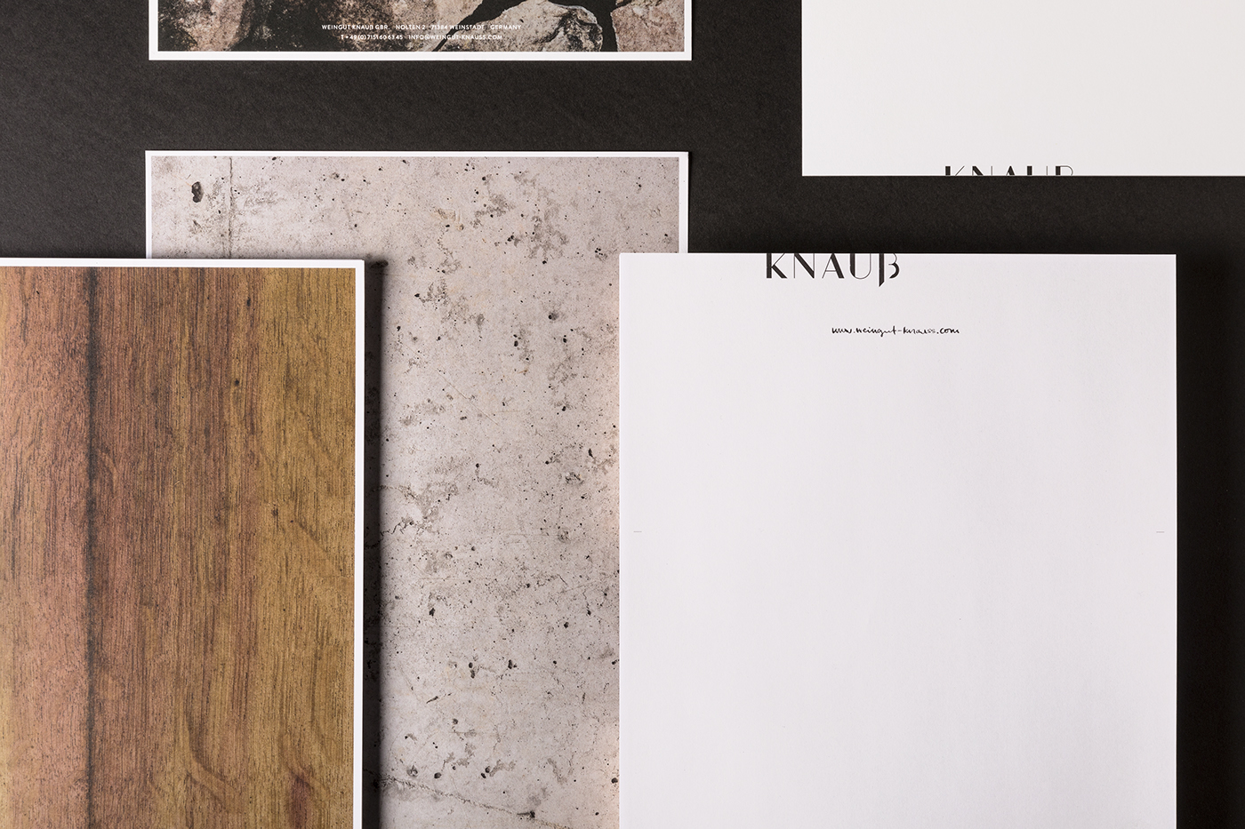
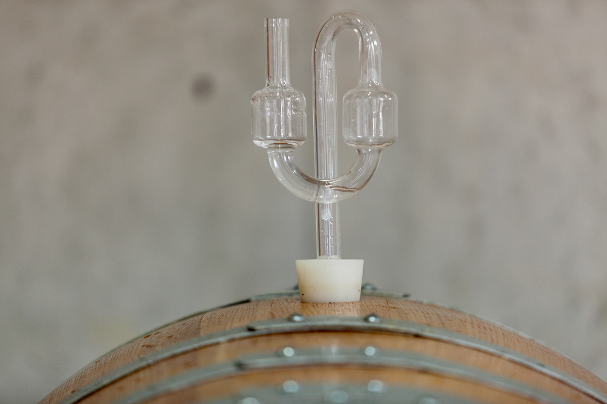
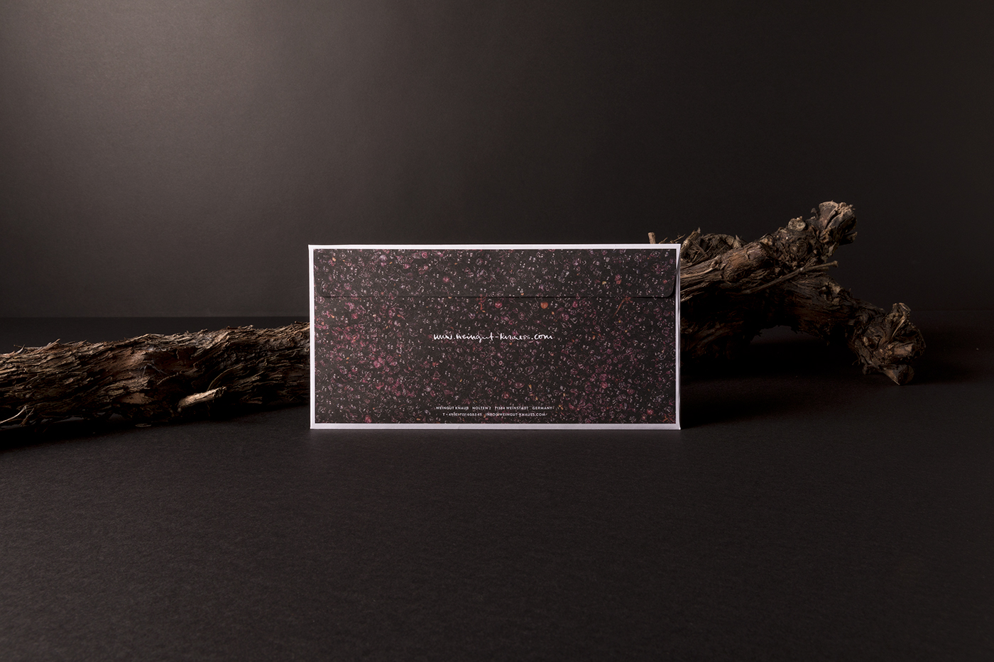
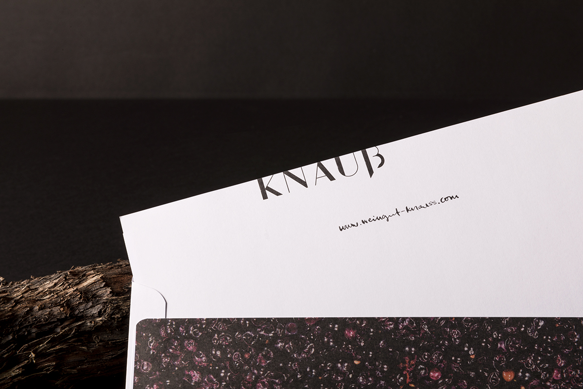
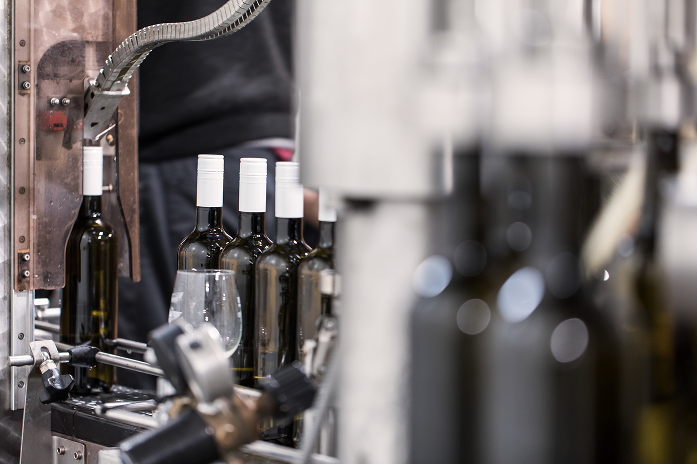
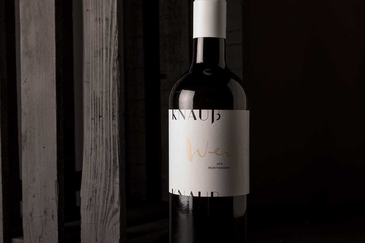
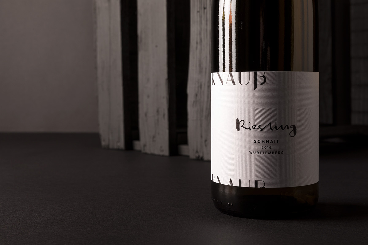
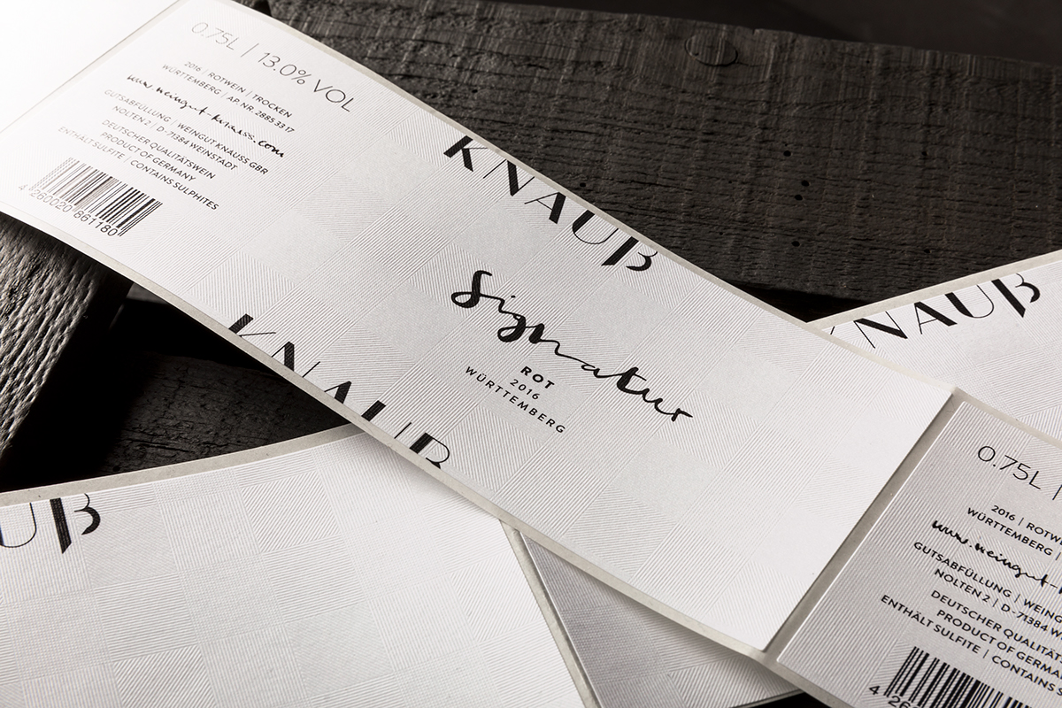
We were able to act out our love for wining and designing when it came to the vineyard Weingut Knauß. We designed a logo to match the simple architectural design of the new concrete building with its straight wood paneling, thus showing the essence not only of the vineyard but also the rows of vine and the winemaker Andreas Knauß. The manuscript type developed especially for this purpose is a reference to the craftsmanship and love for winemaking - unmistakable, individual and authentic. This is also evident in the choice of materials; the labels have a lined and strutted appearance, just as the rows of vine. The unique label is refined even more in some varieties with Gun Metal foil blocking. Thanks to the photographs on the printed media, one gets a real feel for the materials. Wood, concrete or mash - the vineyard shows its openness and sends a clear message: this is true craftsmanship!
Art-Direction ___ Christian Vögtlin
Graphic ___ Michael Adolph & Nadine Maerz
Photography ___ Frederik Laux
Printer ___ Schiller Etiketten
Paper ___ Gmund Square Label
Printer ___ Schiller Etiketten
Paper ___ Gmund Square Label