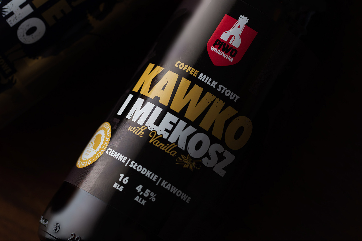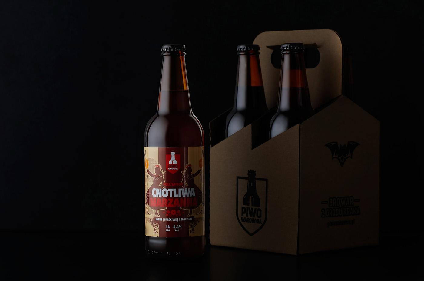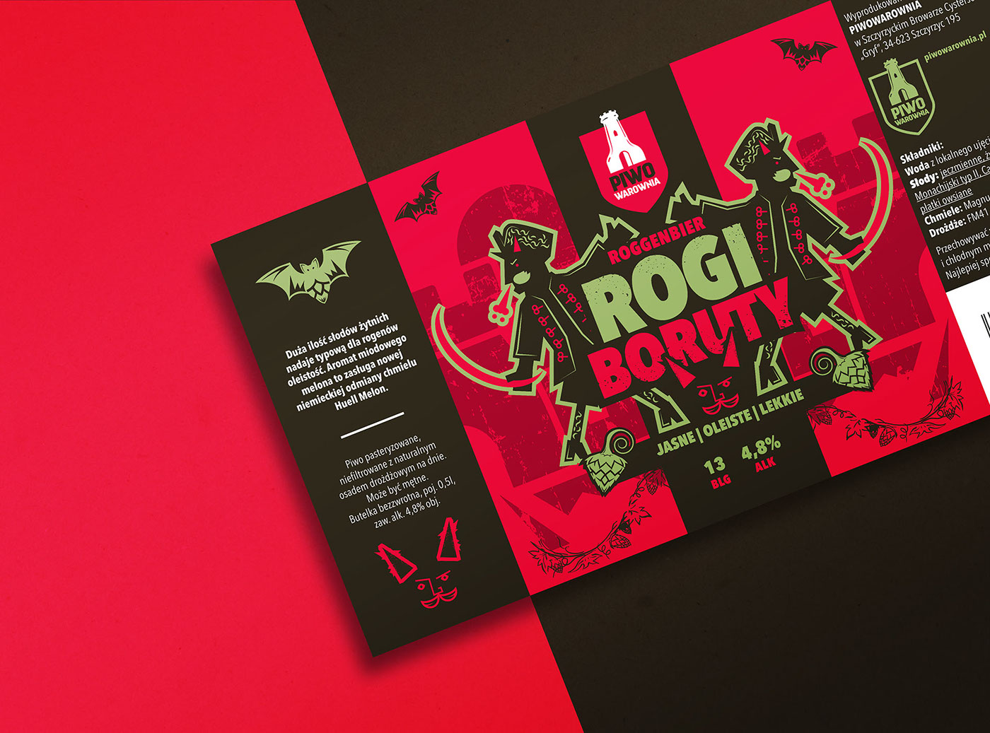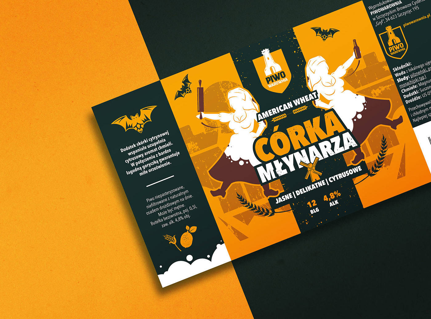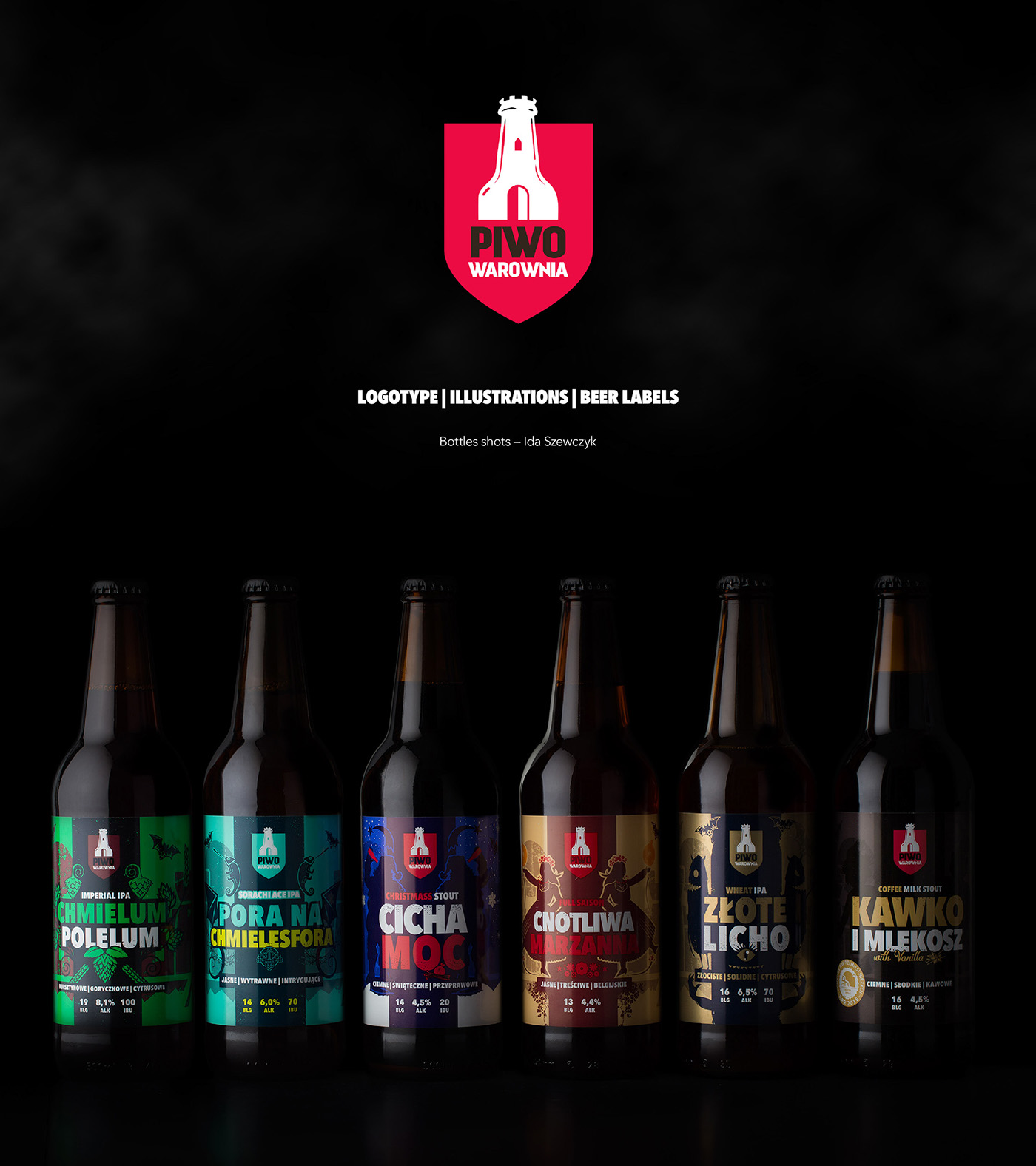
The concept behind logotype is to illustrate a wordplay hidden in the brands name.
In Polish it literally means Beer Stronghold but also has a second meaning
connected with „brewing”.
In Polish it literally means Beer Stronghold but also has a second meaning
connected with „brewing”.
Work made in Wizualni.pl studio.