


Client
ICOMOS (International Council on Monuments and Sites)
Brief
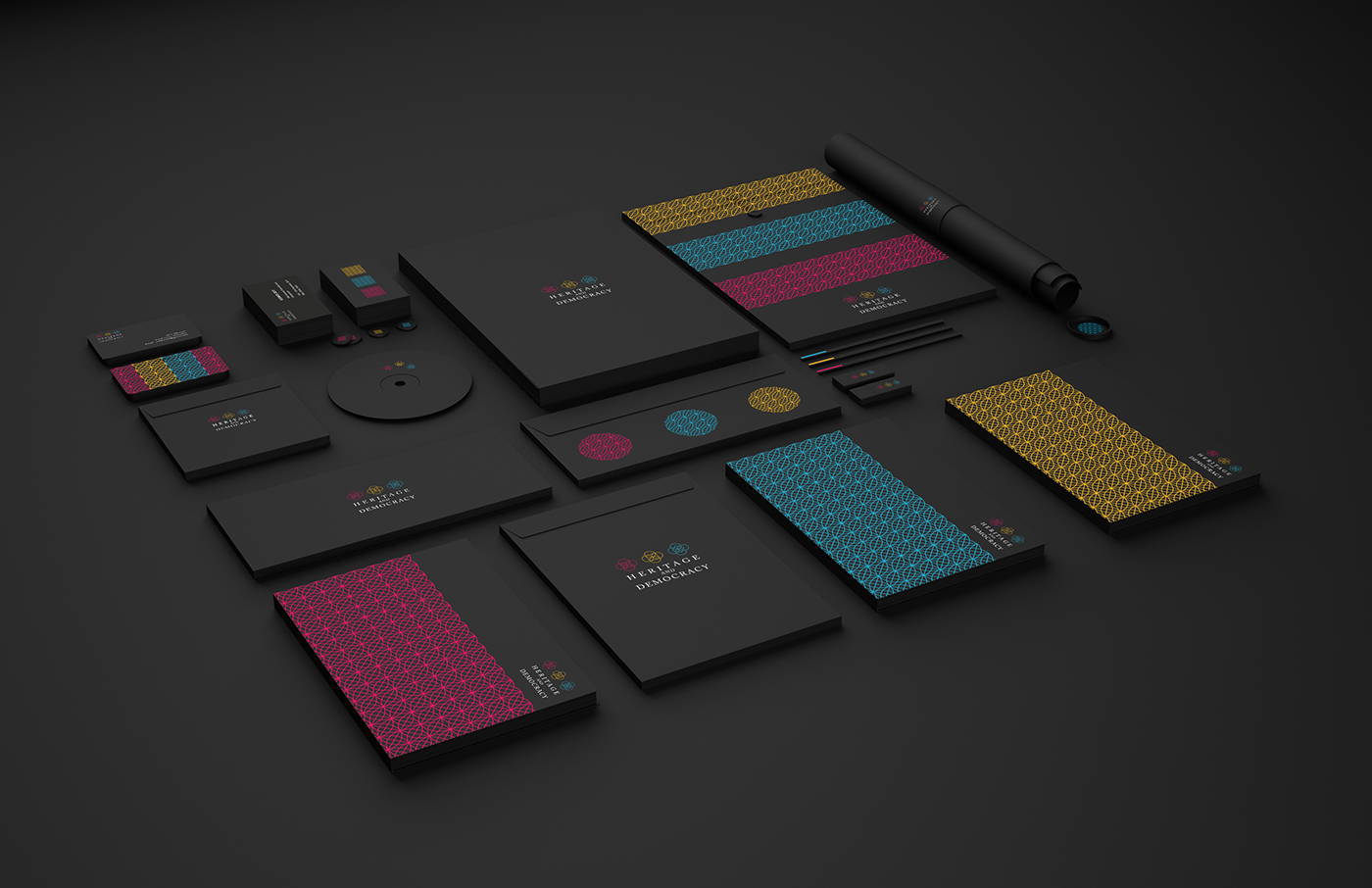
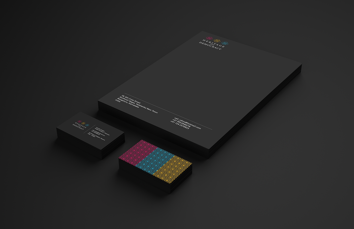
ICOMOS is an non-governmental international organization dedicated to the conservation of the world's monuments and sites . As part of their triennial conference, that was held in Delhi from the 11th of December till the 15th, we were tasked with designing the entire visual language and identity of their conference. Our goal was to start the ideation process, come up with various ways as to how we could go about developing the visual system for this conference and then consolidate and finalize the process. The final output was to be applicable on posters, banners, conference backdrops, corporate stationary, visiting cards, conference ID cards, tote bags.etc.

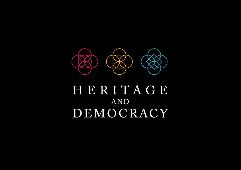
Given that the theme of the conference was Heritage and Democracy, I decided to start by introspecting the ancient monuments and sites in our country, to find some sort of a common denominator before proceeding forward. Within the foundation system for many of the sites I discovered that almost all of them follow sacred geometrical principles and thus decided that next step would be to identify a concrete system within the realm of sacred geometry to fine tune and develop into a visual system.
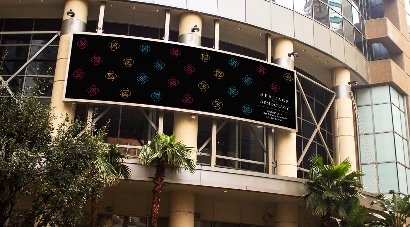
I finalized upon using the the primary grid of squares as my underlying grid for visual language development as the square has universal connotations in the realm of geometry and architecture. The concept of "fourness" (such as the four seasons or the four cardinal points) has been present in various facets of Hindu, Islamic and Buddhist architecture. Hence this was a concrete system upon which to base the logo and system. The final logo consists of 3 symbols which each contain four circles which represents the very concept of "fourness" or otherwise known in Greek as the 'tetraktys'.

Logo ideations on the primary grid of squares


While choosing the typefaces, I again kept the theme in mind and thus felt that an old style serif could help communicate the essence of the conference and would work quite well with the sacred geometrical nature of the logo symbols. Thus the principal typeface was to be Adobe Caslon Pro while a complementary typeface, for all additional text, was chosen to be Frutiger. The beautiful humanist sans serif felt a nice contrast to Caslon given its slightly geometric nature as opposed to Caslons "calligraphic" look and feel. Also it's legibility from distances would work well in terms of collateral implementation such as banners and signboards.

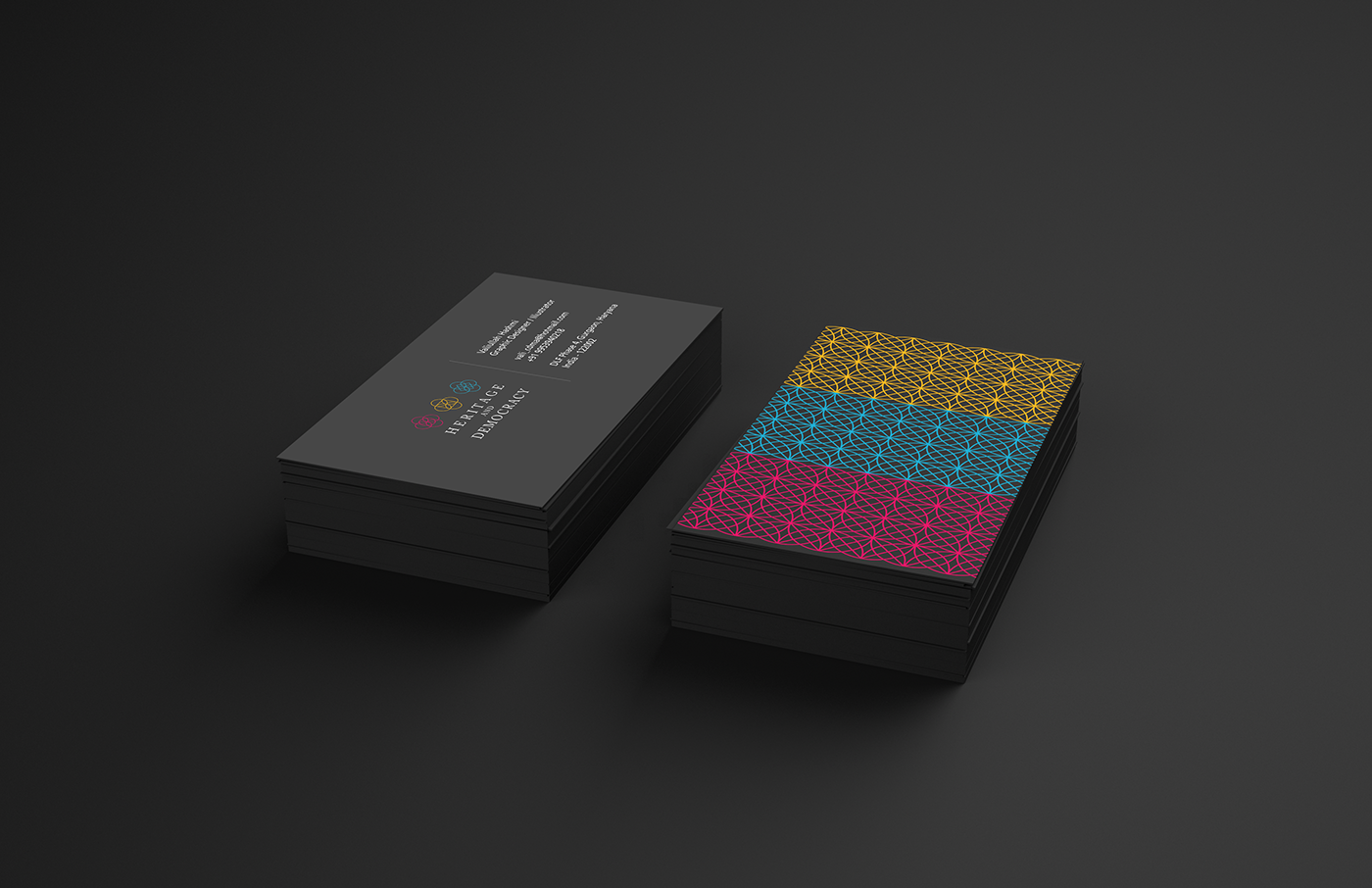
Three colours were chosen to accompany the visual language. These were based on the bricks and walls found in archaeological sites and historical monuments. The gemstone, Lapis Lazuli, was used as a reference for the shade of cyan for it had historical connections to the Indus Valley civilization, and was held in high regard. White and black were used to complement the patterns and logo along with the three main colours.


Final Note
I would like to thank all my friends and colleagues who worked with me, with a special mention to my facilitators,
Nupur Banarjee and Kumkum Nadig, for guiding me patiently throughout the entire duration of the branding project. Also I would like to thank Srishti Institute of Art, Design and Technology for being able to provide me with this opportunity to work on this project.


