All Black Everything
—Oak NYC
—Oak NYC
Background: Oak NYC is a high-end fashion brand with pure attitude. Known for their minimalist clothing, dark color palettes and chic shops, Oak NYC has become the edgiest kid on the block. Oak began in 2004, under the guidance of Jeff Madalena and Louis Terline, who built Oak out of the Williamsburg fashion scene. As the brand took shape, they expanded into multiple New York locations and later Los Angeles. Oak is distinct for its brazen personality, offering an unwavering haughty opinion on fashion.


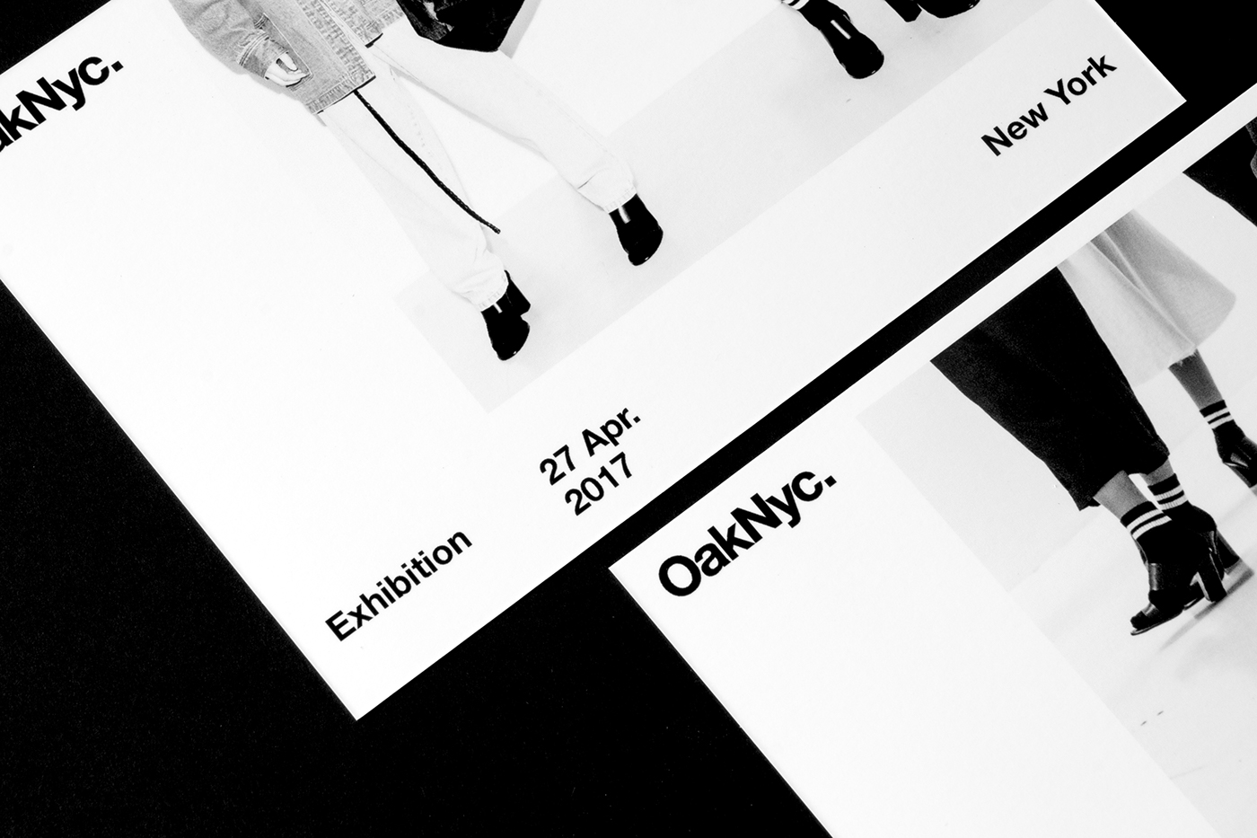
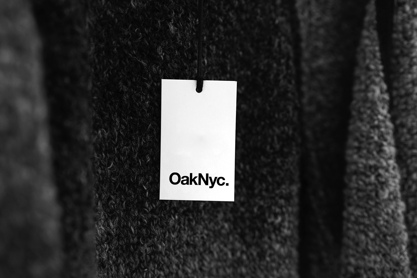
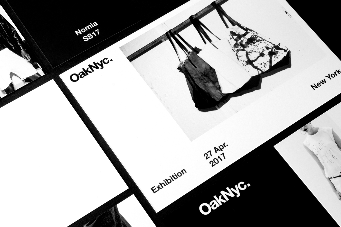
Concept: The original Oak logotype was nothing to snicker at, but its overall brand system felt low tariff and unfinished. In order to realign to the brand’s coined “edge,” a new simple logomark was created with no space for confusion. Everything from the logotype, to the layouts and art direction are intended to be straightforward and seared in black. The harsh contrast of the imagery harkens back to the dark and gritty New York streets. By taking an evolutionary approach to the type treatments and color palette unity is created between the overarching brand, and aids in connecting to its private labels.