


________
Project by Equity Design
Client: We
Work: Branding, graphic design, illustrations and architecture
Branding/Graphic Design: Gu Sobral, Sérgio Magalhães
Architecture project: Rodrigo Ribeiro
_________
We agency had greats moments in 2017. It’s finishing the year on the top 20 biggest agencies in Brazil and 4th best agency according to customer’s reviews in 2017. Equity Design was called to redesign all the agency’s branding, giving it a fresh new atmosphere to follow the great moment of growing the agency has been living.
The process was not so complicated because the whole concept was easy to find out. As one of the best agencies to work, creative people in the agency are so passionate about what they do. So the concept was made under the concept of love. We love things. So we represent this concept with a colorful elegant palette, a tiny facelift on the logo, an iconic heartbeat with the letter W and vibrant pulsating illustrations.

________
The new logo, color palette & fonts


_______
The heart rate
With the initial W of the name of the agency, we chose to form a heartbeat. This graphic element becomes a brand property in small details or forming patterns, but not as a logo symbol.


Heart rate element on presentation slide and stationary.

_______
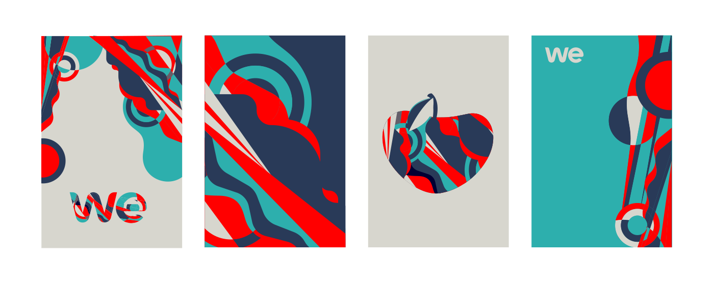
Graphic elements
The agency itself is called as a liquid agency, where it takes the form of the different situations and needs of the client.
That was our argument for these shapes for brand support.

_______
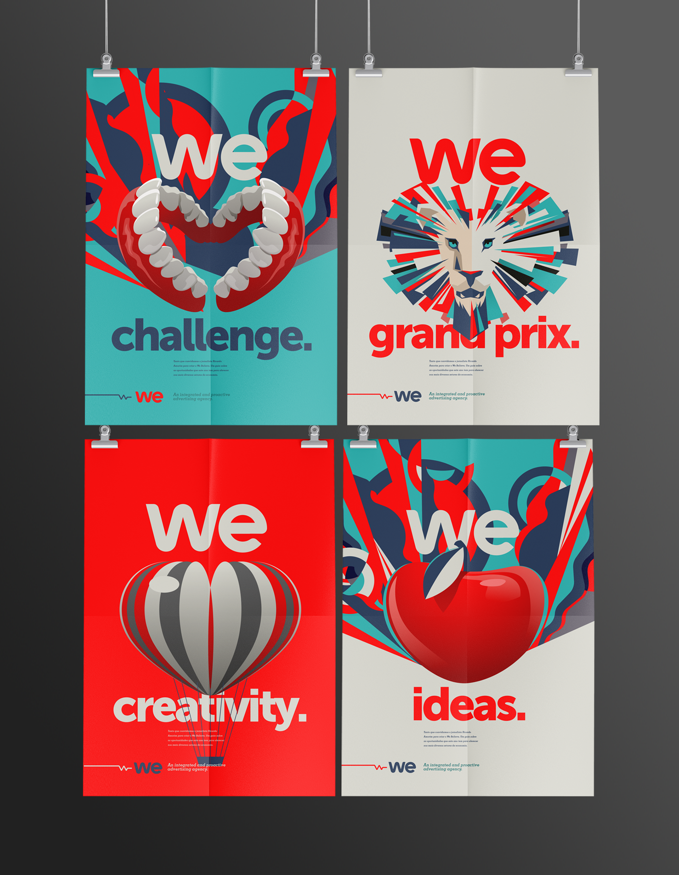
We ♡ things
The concept is clear and simple. Advertising professionals in love with what they do, communicate, create, present.
From then on, we let the imagination flow. So we did a series of illustrations with objects in the same shape as the heart.


_______
This is how We do.
A different concept showing the other agency's services,


_______
The new architecture.
Show a new moment. Visual and functional, the new architecture prioritizes the socializing and the attendance with the public.
To welcome, to add, to unite.


