


17th FINA World Championships
budapest 2017 - visual identity
budapest 2017 - visual identity
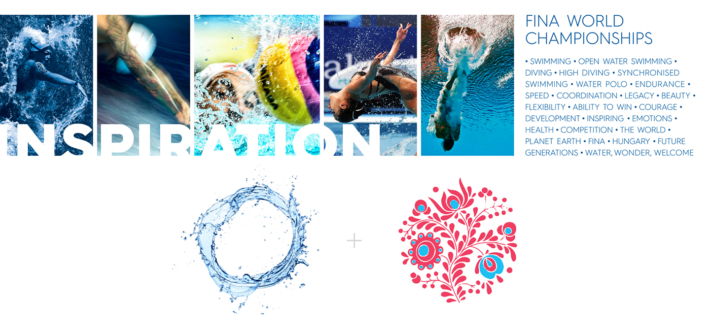
WHY US?
The finalists of the Budapest 2024 Olympic Games Visual Identity competition have been invited to participate at the visual identity competition for the 17th FINA World Championships; for this reason, we also got the opportunity. Several members of Graphasel Design Studio have been actively involved in teaching at various art schools; in 2015, regardless of the tender, we delegated the task of developing the visual identity of the world championship to one of our students, Ferenc Hetsch. The half-year freed creative work resulted in a spectacular design that we presented together with the Krea Contemporary Art School to the organizers. The graphical vision persuaded FINA’s national representatives and the development of the visual identity was launched; the BP2017 Nonprofit Kft has entrusted us, Graphasel Design Studio, to perform the task.
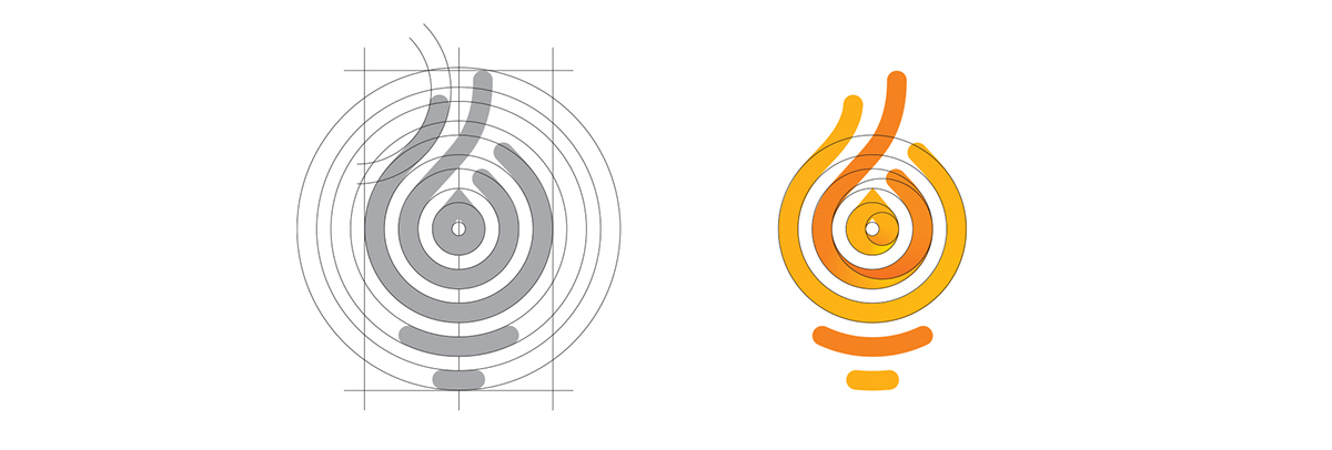
Logo
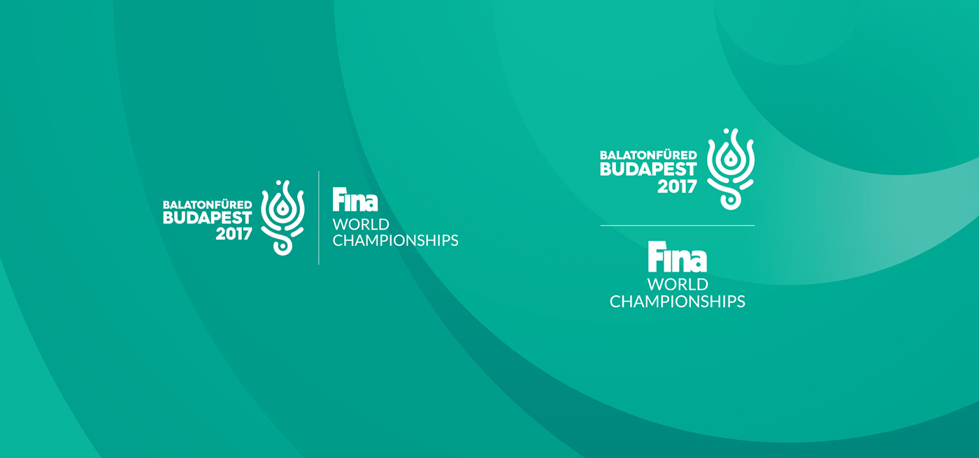
When designing the 17th FINA World Championships logo, we considered the previously submitted work, but we have thoroughly revised it due to several reasons. FINA strictly regulates the visual identities of their events, so the elements on the right side of the logo were tied. The proportions of the lilac form have been designed to best use the available space. The organizers requested to display the tricolor in the logo, which we allowed for the white background version only. In building the image, we had to keep the international FINA trademark in a coordinative conjunction with the event logo, which brought us many challenges during the graphic design. Several variants of the emblem have been prepared for different uses; for example, we have prepared an independent version for the identity of the Balatonfüred event.


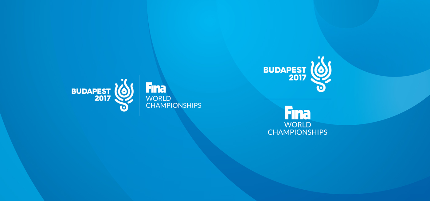


With regards to typography, we used the Hurme Geometric Sans 4 family, just as for the visual identity of the Olympic Games competition, to visually reflect a long-term sport strategy in Hungary. The task was also to design the emblem of the 17th FINA World Masters Championships, which is the championship of the age-group contestants. Since that is a completely different event organized in the same venues, we wanted to keep the different logos in a unified framework.


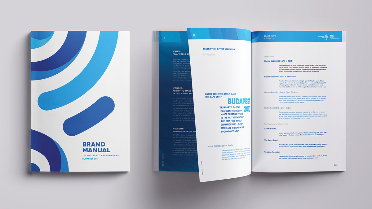
The 17th FINA World Championships Brand Book was very important because the several domestic and international teams were working on the event, and this “instruction manual” was meant to help all participants to develop a unified visual world. In addition to the commonly used visual elements, we also controlled the graphic backgrounds, which were later enlarged with lots of details. Examples include the sport icons, which were designed along with the principles of the logo, keeping the visual identity unified.


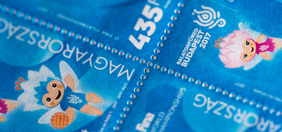
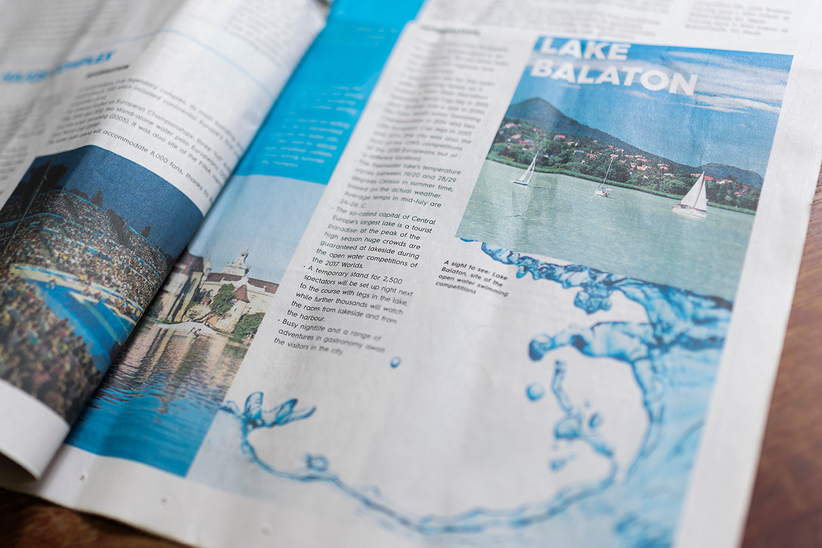
In order to promote the event, we have been asked to design a stamp and a corresponding envelope, a postmark stamp and a more complex newspaper. The latter later served as the basis for the special World Championship editions of the National Sport magazine.


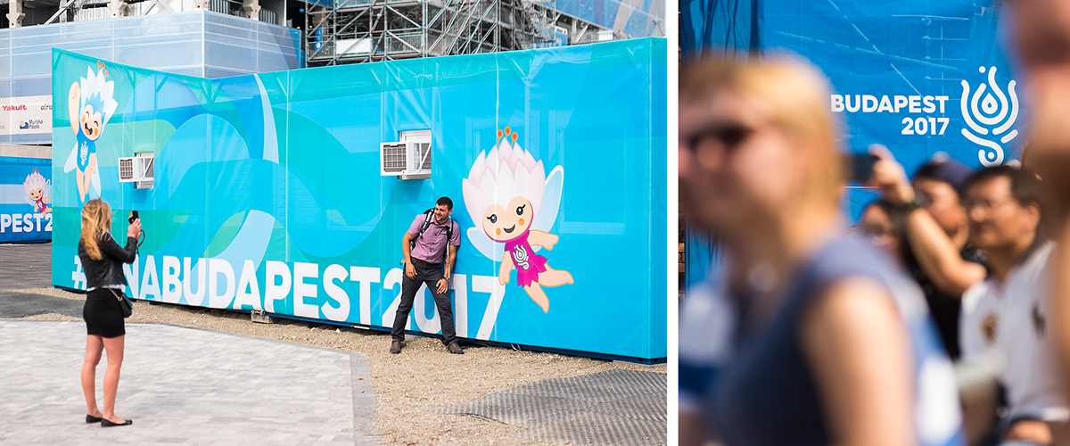
The competition for the mascot was won by Tibor Tatai; we had to blend that with our visual identity elements with respect to their colours and their graphic styles. We have prepared the 3D version of the mascot, which could have been often seen by the international audience during the broadcasts.

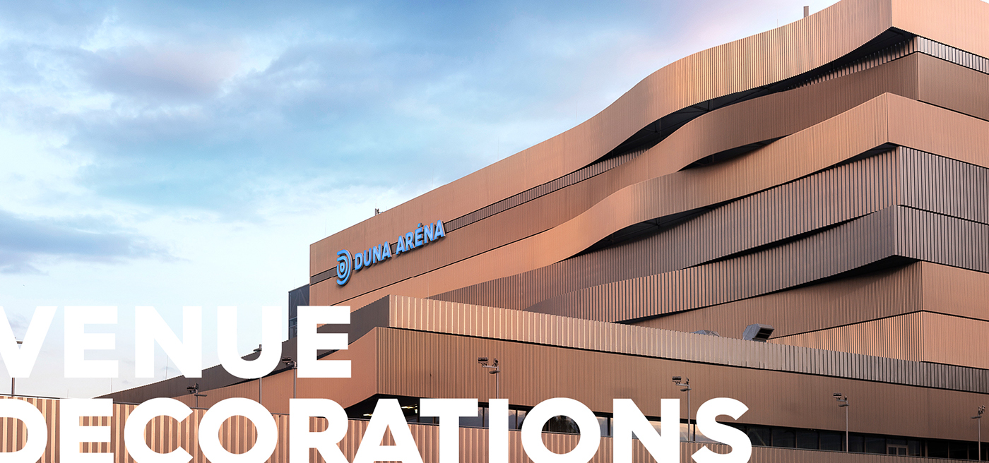
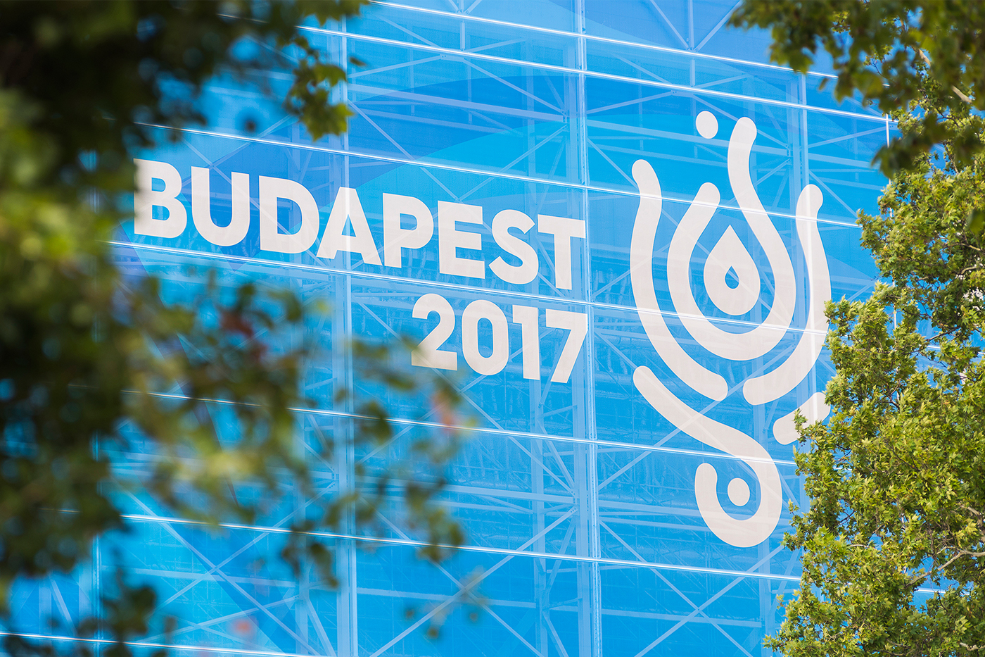
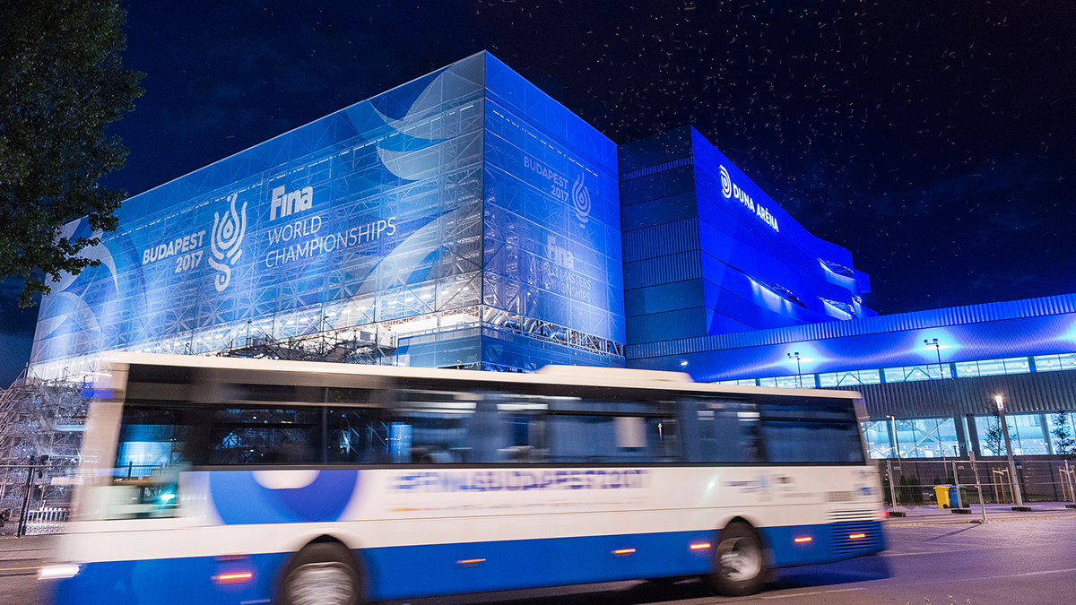
The central venue of the World Championship was the Danube Arena, which was specifically designed to hold such a world event. The building was complemented by two temporary stands, covered with a stretched, printed molino. The facade artwork was inspired by the waving architectural elements running through the building. The aluminium strips on the molino were graphically continued with different tones of grey that were split into curved arches on the northern and southern facades. With this dynamic graphical game, we tried to reach the tension suggesting that the event of the World Championship would break the facade and exit the building’s plane. When designing the immediate surroundings of the Danube Arena, this motif consistently returns to dissolve the geometry of the logo and colorize the surfaces.


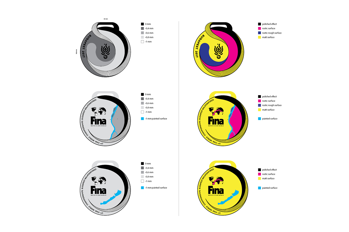
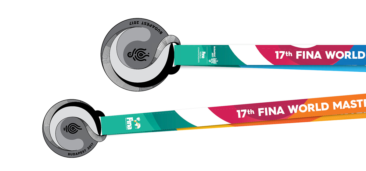
According to our original plans, the medals of the World Championships would have consisted of a combination of several colorful, plastic parts. The waves on the medals are concentrically swirling versions of the visual graphic elements used in the identity – that plan was transplanted into 3D with the Roomba team. Design Donum’s team provided assistance in finalizing the form and manufacturing the aluminium medals. Eventually, the customer had chosen another concept for the official prize for the World Cup, so this concept could only be realized as a medallion, which was used by the organizers for protocol events.


The medals were made of brass, the masterpieces were made by laminated erosion. The project was a design challenge for us as it was impossible to design a plastic transition between the depth levels, so we had to assign an erosion depth value and a particular surface treatment to the two-dimensional graphics. The curves visible on the medals were used not as a separate material, but as graphic motifs, which we tried to make more vibrant with fine grooves and polished surfaces. The medals also include the FINA and the event logos, as well as the graphics for lake Balaton and the river Danube on the medals awarded in either Budapest or Balatonfüred, respectively, as requested by the organizing committee.


The contestants were awarded not only a medal but also a certificate, which was made unique by 5 direct colour printing; we used a combination of UV reagents and metal Pantone colours.


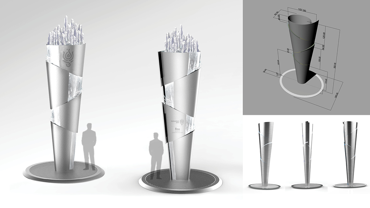
FINA has launched the Fountain project as a tradition-making event, which will be produced by every country hosting the world championship in the future. This design was very exciting because we had a complete artistic freedom and we had to develop a completely new and abstract form. After making several plans, we finally introduced a concept that we developed in collaboration with the Design Donum team. The Olympic torch floated in front of us - like a similar example, but we wanted to emphasize the features of water. Implementation was a huge challenge for the contractors. The appropriate effect was achieved by making splash, foaming and vapour dominant, and the fine glittering on the raw steel was also able to prevail.


CLIENT
Bp2017 Nonprofit Ltd
FINA - Fédération internationale de natation
PHOTOGRAPHY
Attila Balázs
Co-operating partners:
Krea Contemporary Arts School
Sweetchili
Roomba Home Culture
Design Donum
visit our website → graphasel.com
join us on facebook → www.facebook.com/graphasel
and instagram → @graphaseldesignstudio


