
In this project I chose a non profit organization that I thought could use a better logo and redesigned it.
The previous logo used an open hand and gradients and can not be easily converted into a symbol. I took the idea of hands and added the flower to convey feminism, beauty, and fertility. I also decided the closed hands was more recognizable as a hopeful and welcoming symbol.
After I had finished the logo I started creating a unified collateral package. I printed the letterhead on a cream colored linen paper, but it can easily convert to grayscale and print on simple white paper if needed to save money. The business card is double sided and I just included the basic information. I also created a color palette so the colors I used don't get lost and you can reuse them when necessary. I decided to use these colors for a few reasons. They are not gender specific so it is welcoming to everyone who needs help but it does lean towards feminine with the pink since your main target audience is young women.
Lastly I created a simple website design that took all of the information from your current website and organized it to make an easier reading experience
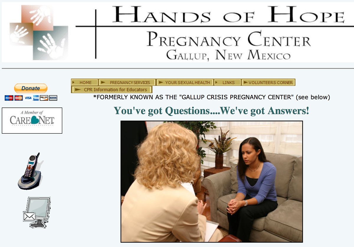
The original logo and home page of the website.
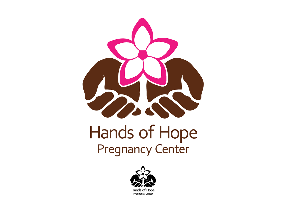
The new logo.
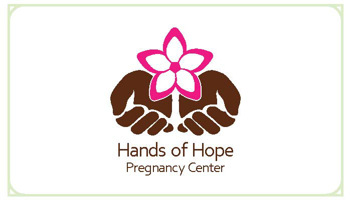
Front of the business card, the design was printed on a cream colored linen paper.
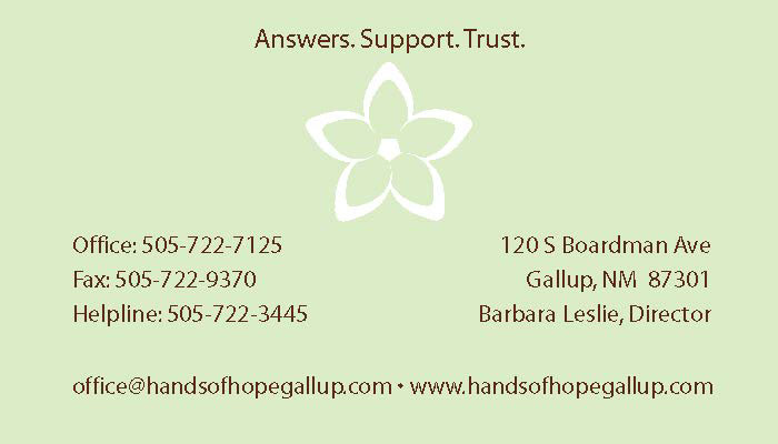
Business card back.
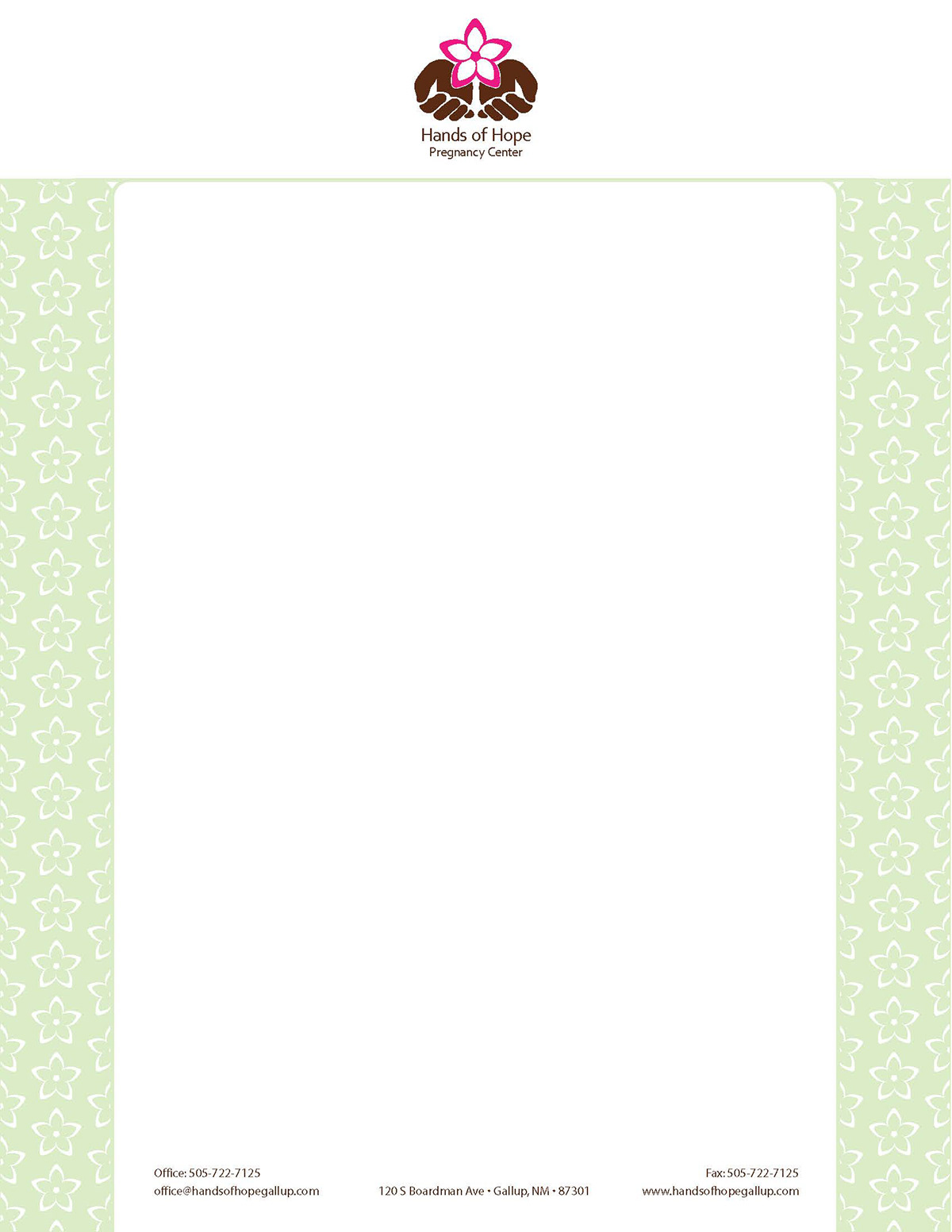
The letterhead was also printed on linen cream colored paper.
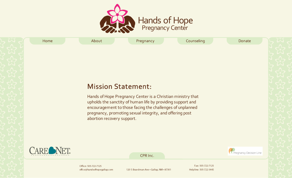
Redesigned home page.


