Often referred to as the ‘hippo’ ice-cream by children, Whippo is an ice-cream brand with products throughout Ireland.
My brief was to create a logo inspired by whipped ice-cream and if possible incorporate the symbol of a hippo.


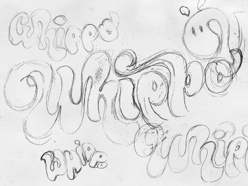
Some of the initial sketches and scribbles.
Worked up visuals from my sketches. These are roughly drawn in illustrator and I typically present around 10 to 20 variations.

Once a direction was chosen it was developed further. The hippo symbol proved a delicate balance of making it recognisable but not to the detriment of the overall legibility of the word.

The final hippo symbol.

Designed under the direction of Hamill Bosket.


