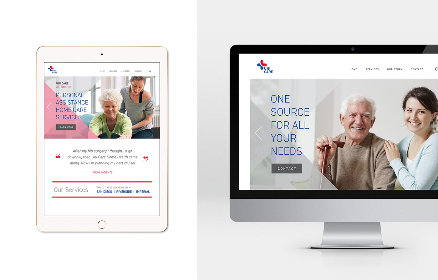
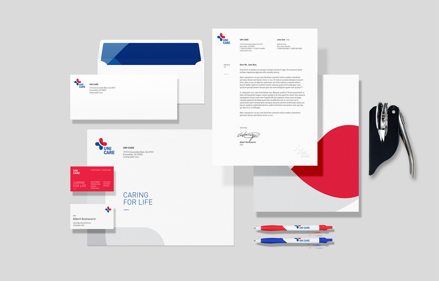
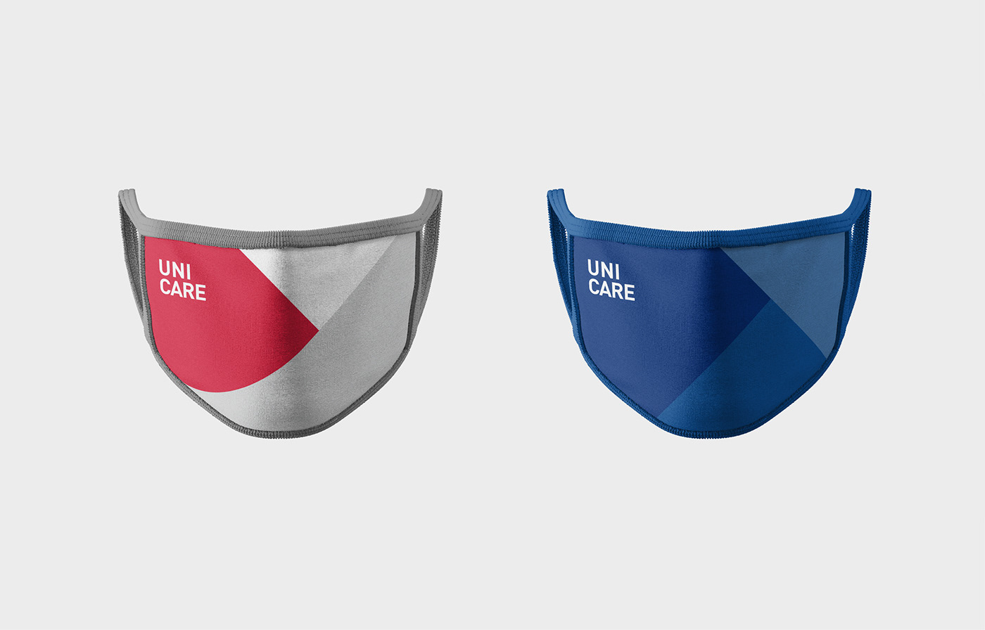
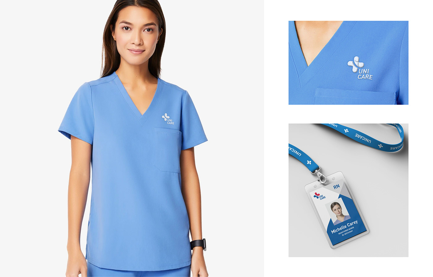
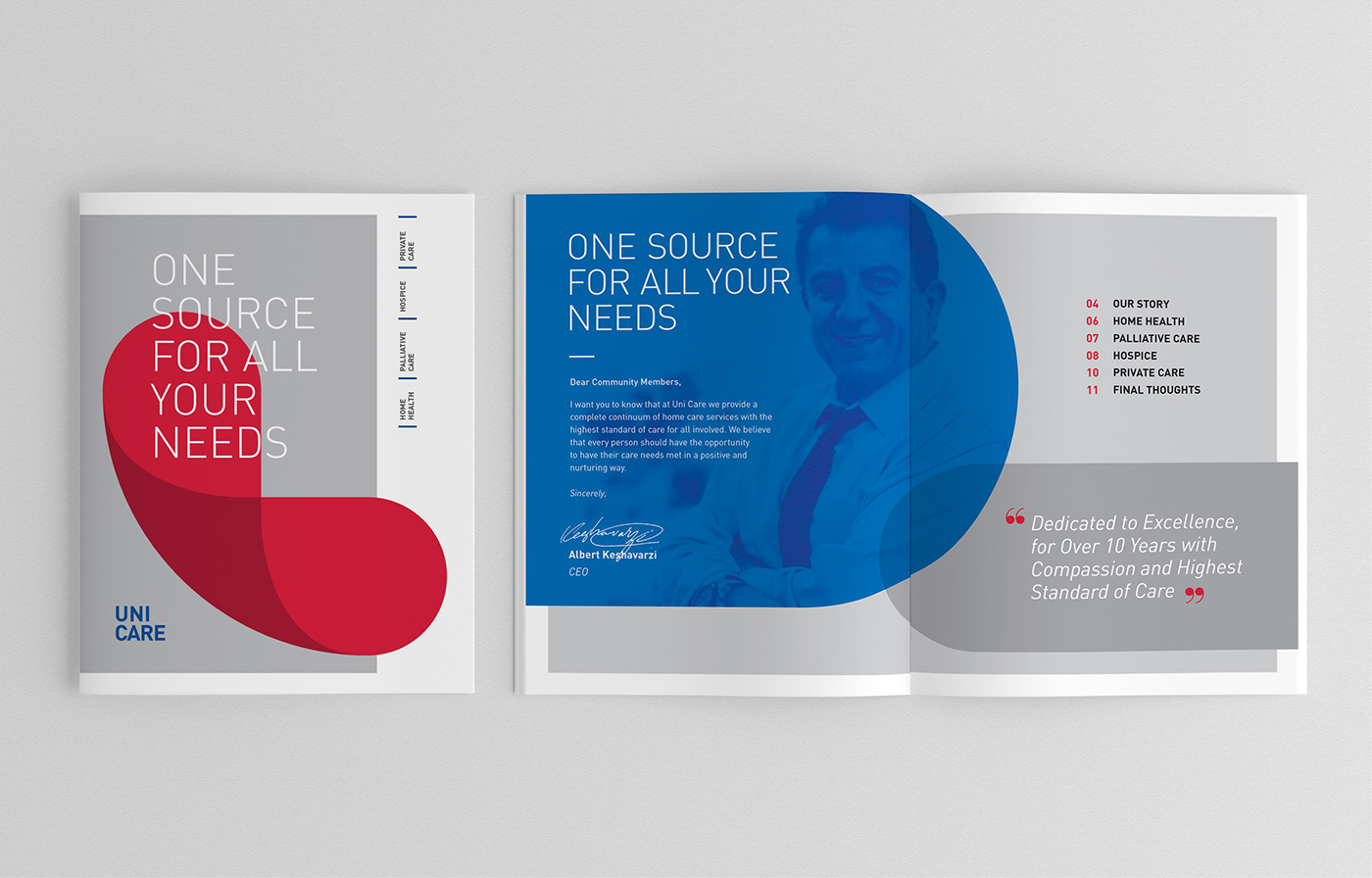
Uni Care is an Escondido based non-profit caregiving organization. As the organization has grown, they needed a refreshed visual identity that is more modern, professional, and corporate. As a solution, I created a bold symbol mark that represents the quality of their services: caring, embracing, kind, reliable, accessible, and confident.



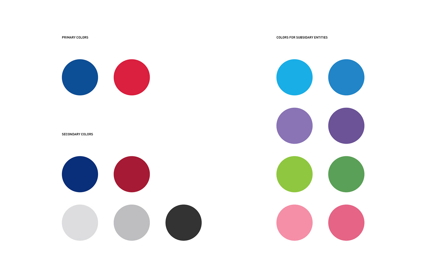
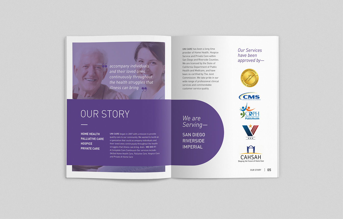
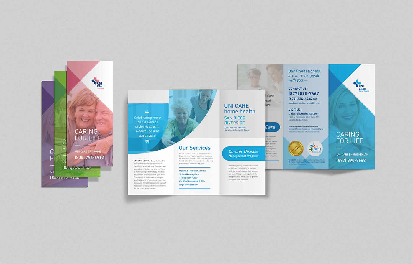
UNI CARE HAS SUBSIDIARY ENTITIES FOR PROVIDING SPECIFIC AND QUALITY SERVICES IN DEPTH. EACH ENTITY HAS ITS OWN COLORS THAT WILL BE USED THROUGHOUT THE BRAND TO DISTINGUISH EACH SERVICE: HOME HEALTH, HOME CARE, HOSPICE, AND AT HOME.



LARGE, COLOR CODED BUTTONS ASSIST SENIORS, WHO ARE THE MAJOR TARGET PATIENTS AND USERS OF THE COMPANY’S SERVICES, IN RECOGNIZING EACH SERVICE AND ACCESS THEM WITH JUST ONE TAB.THE LAST RED BUTTON IS FOR AN EMERGENCY CALL THAT USERS CAN SET UP TO BE CONNECTED TO 911 OR THEIR ASSIGNED CAREGIVER, WHO KNOWS THE PATIENT’S MEDICAL ISSUES AND G CAN CONTACT EMERGENCY SERVICES FOR THE PATIENT.
