Moschopolis is the first wine series of the homonym Moscopolis Winery. The brand is based on the premium wine quality matured in barrels, scientific approach of the owners' aged experience and thorough methodology of each production step -from the born of the grape- to the bottling.
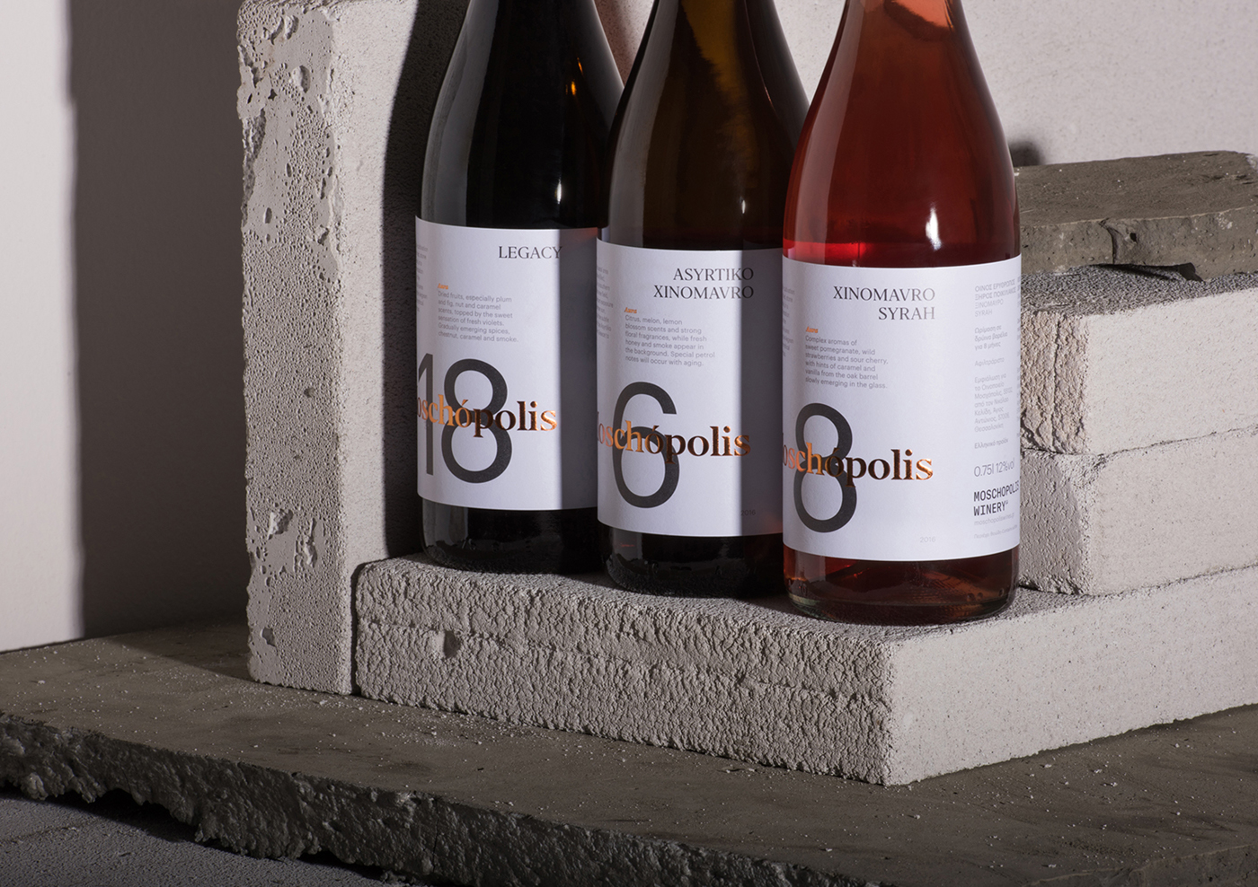
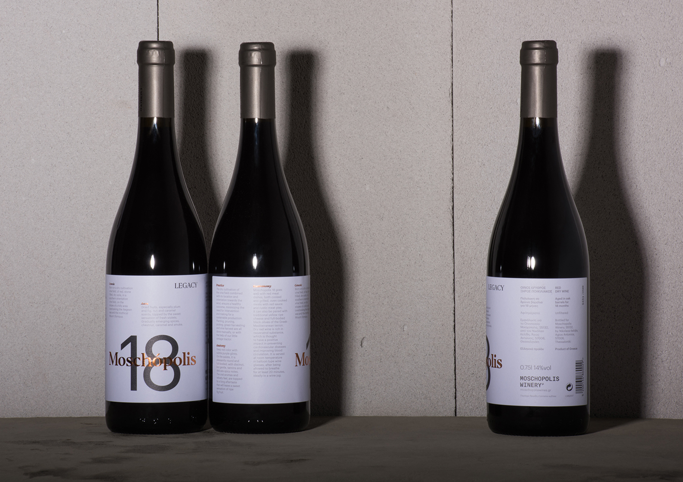
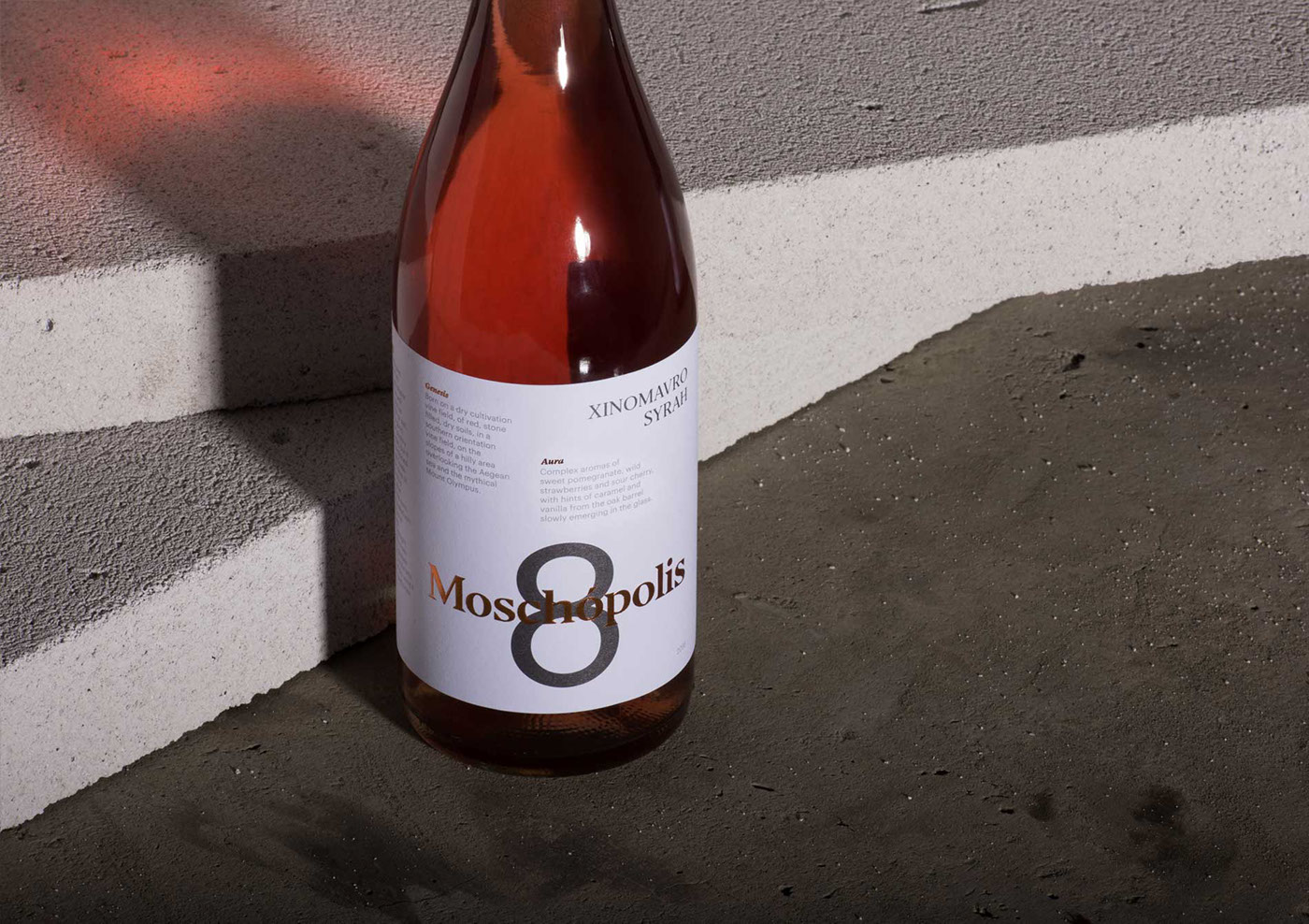
Instead of introducing a representational metaphor in the label, we created a wine-self-reference one, a label that carries only wines' internal and essential information. This was achieved by collecting, structuring and organising the most important elements. By introducing a clear typographic system on the label, extroversion has been achieved, which arrives from the decision to include all information available directly to the viewer. The label introduces the wine and the winery, as if the owner is present by himself - without being.
Secondly, methodology was accomplished visually through this system, in a way that verifies the brands' own practice. Thirdly, education, as a way of communicating all the essential elements of this product to the also non familiar to barrel wines audience. Last but not least, considering the marketplace abroad, there is a clear reference to the origin (product of Greece) by including international words routed in greek language, such as Genesis, Aura, Methodology etc.
Part of this orthological approach was to name each label with a number, so as to keep a consistency that is related and actually verified with the nature of the brand’s practices.
All of the above was carefully crafted and printed in two colours with a hot bronze foil working as a stamp of the aged barrel.


Art Direction/ Graphic Design: The Birthdays Design
Set Design: The Birthdays Design
Photography: Mary Tsouloufa & John Sachpazis
The Birthdays Design © 2017 www.thebirthdaysdesign.com
Set Design: The Birthdays Design
Photography: Mary Tsouloufa & John Sachpazis
The Birthdays Design © 2017 www.thebirthdaysdesign.com


