GENERINDO
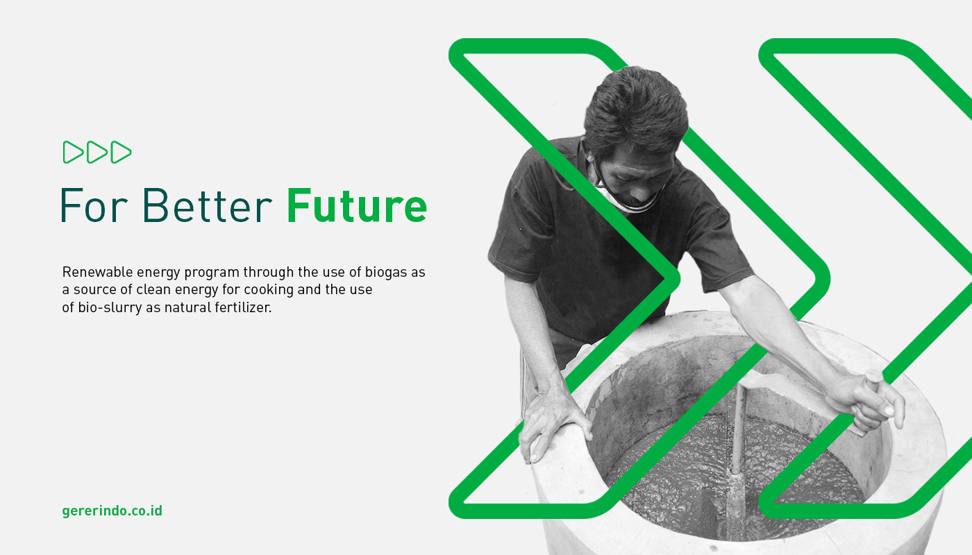
Biogas is a renewable energy source as an alternative to traditional fossil fuels, such as LPG, kerosene, or firewood. The utilization of biogas can reduce the increase in greenhouse gases caused by the release of gas emissions. Generindo is a company that aims to disseminate renewable energy programs through the use of biogas as a source of clean cooking energy and the use of bio-slurry (biogas waste) as a natural fertilizer.
Challenge
Create a visual identity to be a key competency center for energy solutions, reflecting its progressive agenda and representing its commitment to sustainability.
Concept
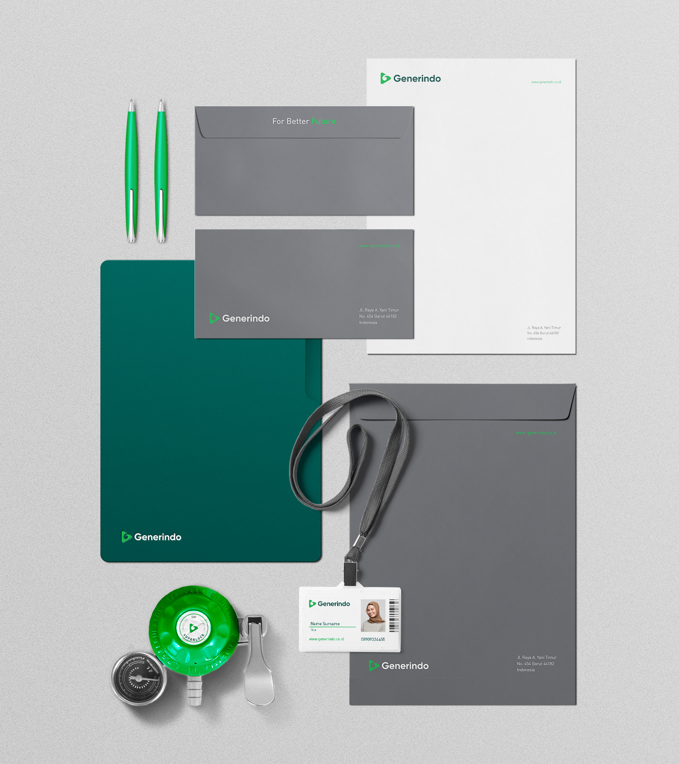
Developed a very clean and simple visual identity eco-friendly identity that uses company principles to protect the environment and sustainability, pointing to future goals (business success).
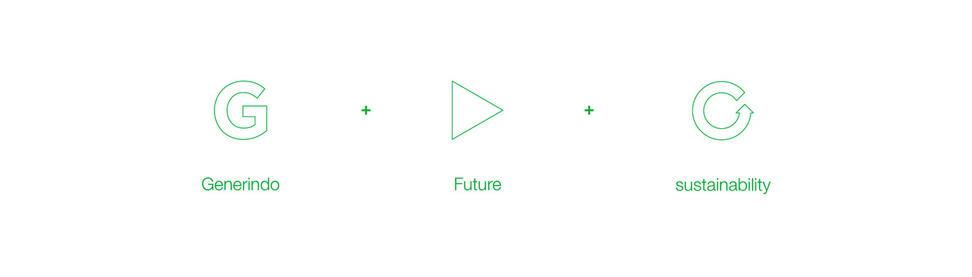
This idea emerged based on a conversation with the founder of Generindo who often said the word "for the future" then I decided to use the basic triangle shape pointing to the right which represents progress in the future, and the letter G represents Generindo itself, while circular is a symbol of sustainability, dynamic, and vibrancy. I used green to make it eco-friendly.
The use of the Golden Ratio presents a balance of nature and visual harmony and is a pattern taken from our natural surroundings, this is closely related to Generindo who pays more attention to nature. The iconography is simple and unique, while for the logotype I used a modern sans serif with a geometric touch very fresh and clean.