Moose Sans
Moose Sans started in November 2011 during Creative Typography master course at my home faculty in Slovenia and then continue the development during the Erasmus exchange in Denmark at Kolding School of Design.
The main idea was to create a mono-line sans serif typeface which would show a strong character in display sizes but remain readable in small sizes.
Special thanks to my mentors Domen Fras and Trine Rask.

Poster specimen
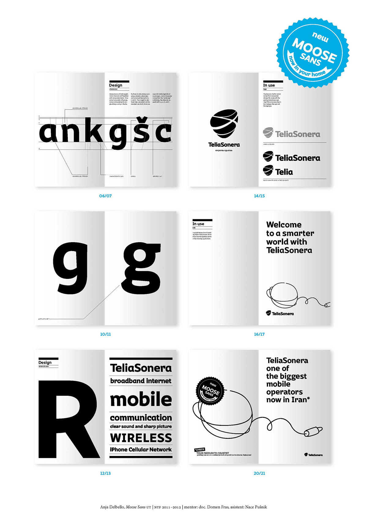
Presentation poster
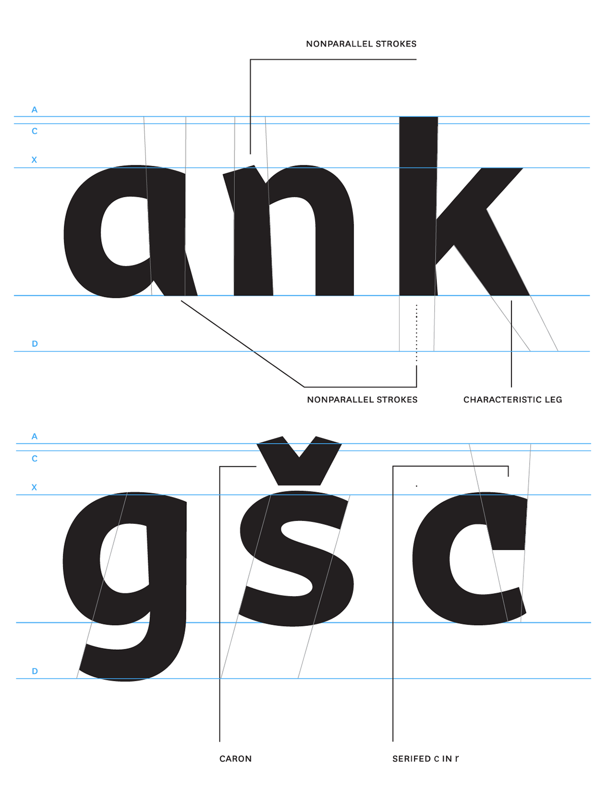
Type caracteristics
Moose Sans is of bold weight, mono-line sans serif typeface with nonparallel stems. It has some humanistic influences, some cursive elements (single-storey a and g in the default set, double-storey available as stylistic alternates) and some serif elements (C, c and r).
The x-height is relatively high, ascenders and descenders are short, forms are open (for better legibility at small sizes).
A lot of character comes from the “pirate-leg” outstrokes, the style also repeats with k, y, x, R, and K.

Moose Sans book specimen; description, presentation and usage
