

Bosco Nero
University project
The brief asked us to chose a company that you wanted to give a complete re-brand.
I chose a popular Italian restaurant in my hometown Blackwood named 'Bosco Nero', which is Italian for black wood in English. The company have been open since 1989 and kept the same logo and decor till this day. It is a very busy and top quality restaurant which I felt needed a refresh and a new modern look to go with it's reputation.
The logo itself is the idea of a chef's hat to represent that it's a restaurant, the three creases of the hat i've subtly made into three tree trunks/branches with the three mounds of the hat being the tops of the tree's, literally representing black woods (forest of tree's). The typefaces represent modern authenticity, along with the black wood effect.

logo
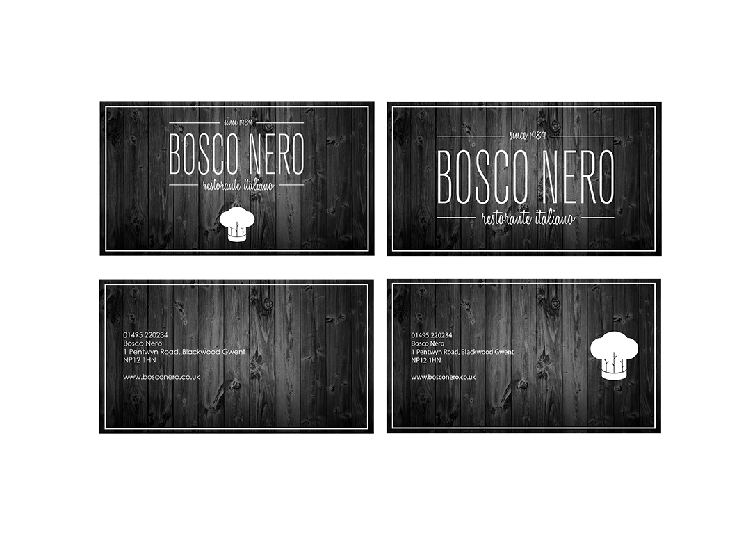
business cards

sauce jar packaging
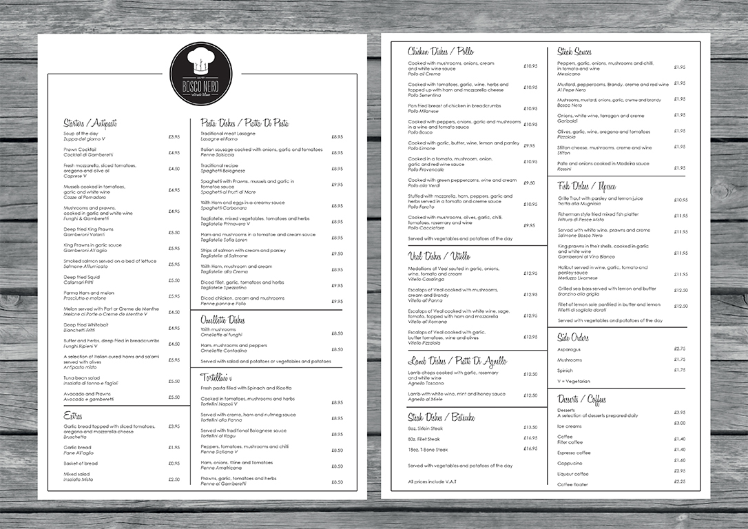
menu

menu 2


