


About the Event
Branding
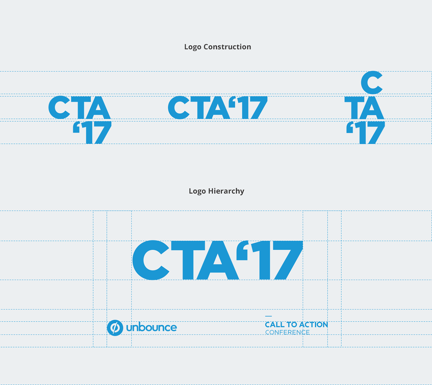
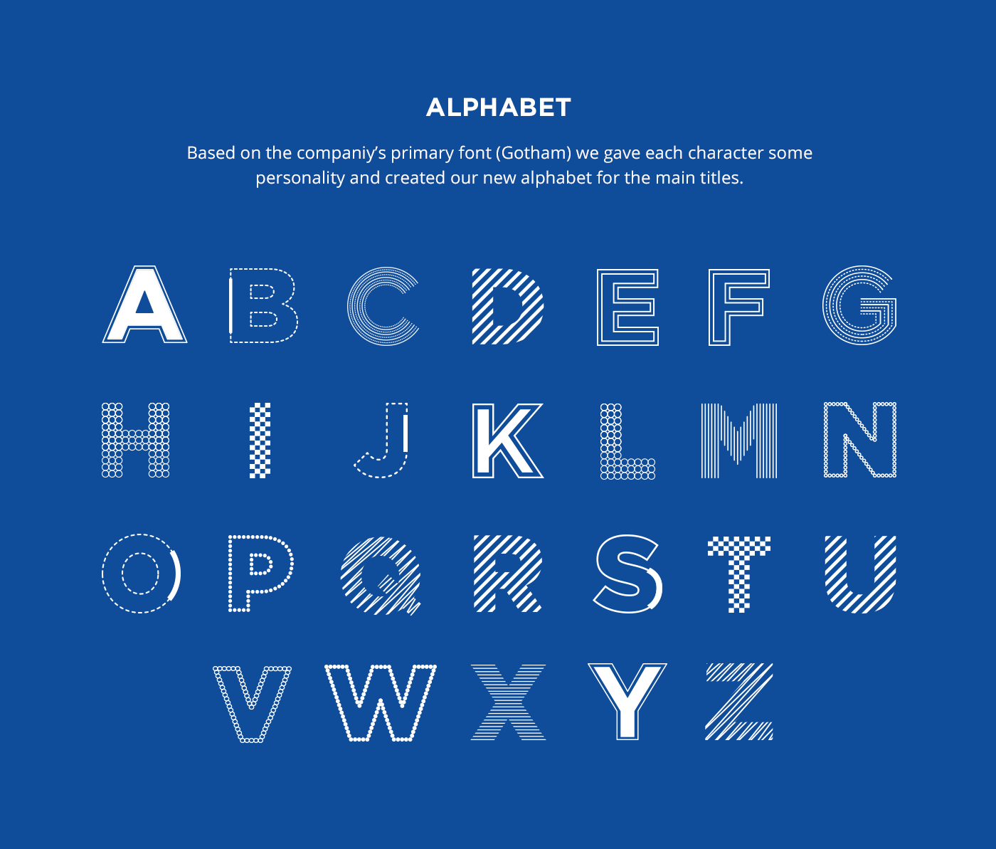
Co remind our attendees what event they were at — verbally and visually, we gave the brand a typographic approach. We illustrated an entire alphabet, applied it to the conference’s simplified name and used it as the primary element of almost every asset. The company’s and the conference’s logo passed to a secondary level in every composition.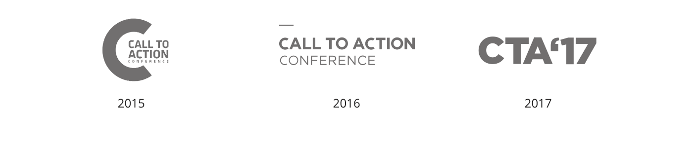
About the Event
C

The Experience
and learn how they can get the most value of it.
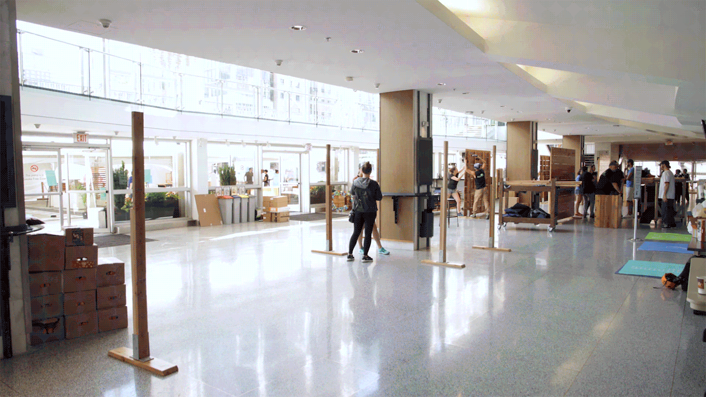
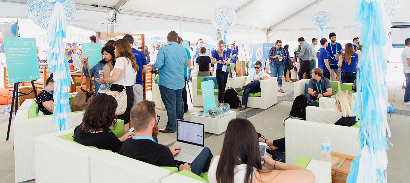
This area made us experiment with the branding language across 20+ applications. From an app to signage, to memory cards and even pins. Every piece was crucial for offering a cohesive and delightful experience.


Title Sequence
We created a title sequence with the goal to elevate our identity and to brand the space while we were kicking off the event. The conference’s letters are the hero elements while the speakers are introduced little by little with the rhythm of the music.


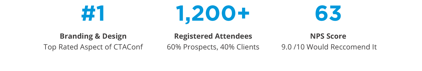
Conference's Results

Thanks for Watching!
Want to learn more about the process behind this project? Check out this article.
Want to check out all the conference’s videos? Click here.
Credits:
Ainara Sáinz | Art Direction & Design
Felix Cha | Motion Design & Videography
Rachel Scott | Events Marketing Manager
Dustin Bromley | Events Coordinator
Lindsay Elliot & Ronnie Hill | Photography
Thanks to all the CTA Conf team and the people at Unbounce.
:)
Credits:
Ainara Sáinz | Art Direction & Design
Felix Cha | Motion Design & Videography
Rachel Scott | Events Marketing Manager
Dustin Bromley | Events Coordinator
Lindsay Elliot & Ronnie Hill | Photography
Thanks to all the CTA Conf team and the people at Unbounce.
:)


