


RIOT’s task was to redesign an app for a biggest Polish network of medical labs. The goal was to create an app which is both accessible and intelligible – especially for those who may be affected by digital exclusion.

INTRODUCTION
DIAGNOSTYKA is the biggest network of medical labs in Poland. They specialize in professional medical services that include harvesting and transporting biological material, as well as precise examination and delivery of the results in the shortest time possible. Every year DIAGNOSTYKA executes 60 million of examinations for over 15 million of patients.

PROBLEM
DIAGNOSTYKA’s goal was to meet constantly growing expectations and needs of their clients and provide them with an app that presents and explains their examinations’ results. Such solution benefits both sides: DIAGNOSTYKA can save money on operating costs and clients gain a comfortable way of receiving their examination’s results.
Unfortunately, the first version of the app did not manage to meet these expectations. DIAGNOSTYKA realized that it needed to be more accessible and user-friendly, so they decided to redesign the project.
Unfortunately, the first version of the app did not manage to meet these expectations. DIAGNOSTYKA realized that it needed to be more accessible and user-friendly, so they decided to redesign the project.
PROJECT
In order to execute the project, we decided to begin with learning more about the previous version of the app and recognizing its advantages and disadvantages.

Revising previous version of the app
The second step was to define and learn more about our target group. The app was supposed to serve all of DIAGNOSTYKA’s clients, who differ not only in age, but also in the level of their digital skills. We wanted the app to be accessible and understandable for all of them – including those who might be affected by digital exclusion.
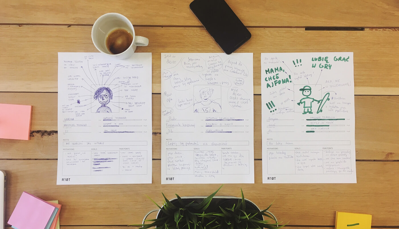
Creating UX personas
After defining all of the problems and getting to know the target group, we started working on interactive functional mock-ups.

We wanted to prevent digital exclusion by implementing WCAG 2.0 standards in typography and color palette. We have also used skeuomorphic elements, such as ordering cards and other design items resembling real life objects, so that users have no problem understanding the app.

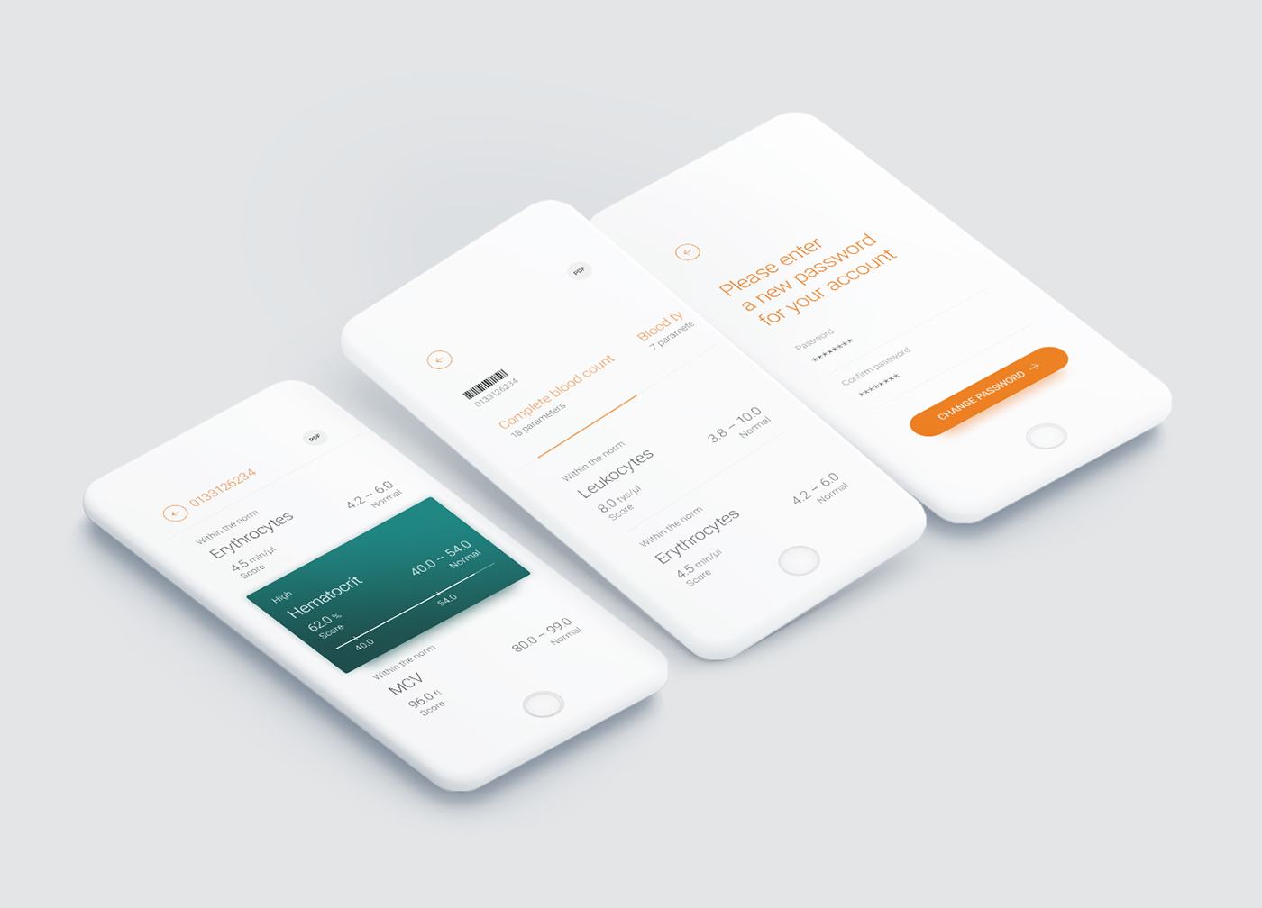
We also managed to change the way the results are presented. We decided to get rid of the complicated tables and replace them with interactive charts, which are easier to read and comprehend. All of our assumptions were fulfilled, while maintaining cohesion with visual identification and image of DIAGNOSTYKA.

Our goal was to create a Diag+ app for Android and iOS platforms. Using our experience in creating web-based solutions, we decided to lean on React Native technology. It allows us to create native solutions for both required platforms by a shared source code.


Creating an accessible mobile app
EFFECTS
The app features a logical hierarchy of information and an intuitive navigation, which allows the user to have full control of the system. Key features are properly exposed and grouped, so that the app is easy to understand.


PROMO

Location
Kraków, PL
TeamHead of Concept, Head of Technology, UX specialist, Digital designer, Creative developer, Manual tester, Digital producer
Scopeconsulting, UX design, digital design, mobile development, quality control, project managemet
TimelineMarch → August 2017
MethodologyAgifall (sprints, frequent contact with the client, Kanban, constant time frame and budget
ToolkitAdobe Photoshop, Adobe Illustrator, Adobe After Effects, Adobe Xd, Invision, React Native, Bitbucket, JIRA


