

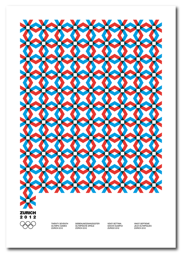
Zurich 2012
is a student project about fictionary Olympic Games
is a student project about fictionary Olympic Games
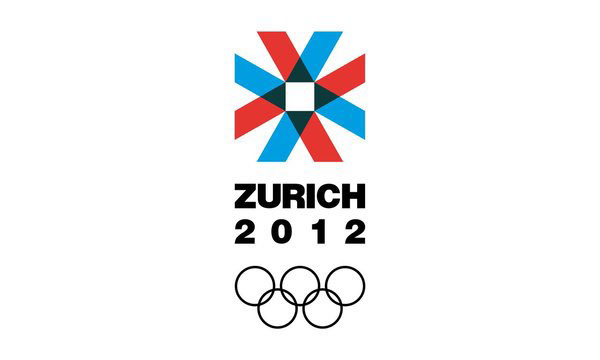
Logotype design for the Olympic Games of Zurich
Characteristics
Neutrality
Clarity
Strenght
Unity
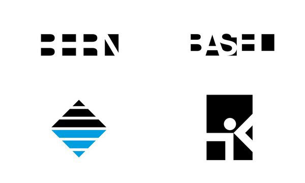
Swiss Characteristics
Trilingual
Tradition in geometrical design
Assymetry
No gradients
Vacant space
Goal
A classic trademark based on neutrality and dynamics that needs to show
the unity of people without any discriminations
Characteristics
Neutrality
Clarity
Strenght
Unity
Swiss Characteristics
Trilingual
Tradition in geometrical design
Assymetry
No gradients
Vacant space
Goal
A classic trademark based on neutrality and dynamics that needs to show
the unity of people without any discriminations
Logotype drafts
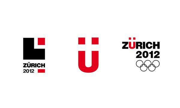
Final logotype
Logo lettering
logo grid
Documentation of the logotype
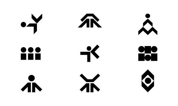
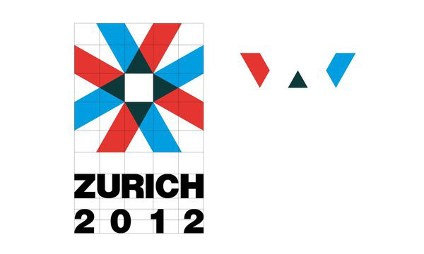
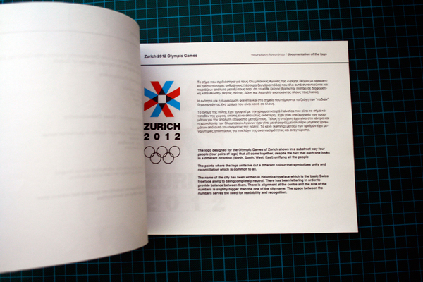
The logo designed for the Olympic Games of Zurich shows in a substract way four people (four pairs of legs) that all come together, despite the fact that each one looks in a different direction (North, South, West, East) unifiyng all the people
The points where the legs unite ive out a different colour that symbolizes unity and reconciliation which is common to all.
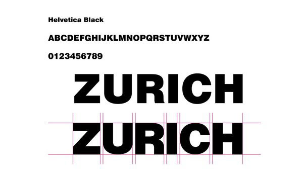
The name of the city has been written in Helvetica typeface which is the basic Swiss typeface along to being completely neutral. There has been lettering in order to provide balance between them. There is alignment at the centre and the size of the numbers is slightly bigger than the one of the city name. The space between the numbers serves the need for readability and recognition.
The logo designed for the Olympic Games of Zurich shows in a substract way four people (four pairs of legs) that all come together, despite the fact that each one looks in a different direction (North, South, West, East) unifiyng all the people
The points where the legs unite ive out a different colour that symbolizes unity and reconciliation which is common to all.
The name of the city has been written in Helvetica typeface which is the basic Swiss typeface along to being completely neutral. There has been lettering in order to provide balance between them. There is alignment at the centre and the size of the numbers is slightly bigger than the one of the city name. The space between the numbers serves the need for readability and recognition.
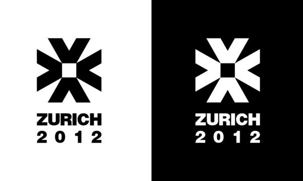
positive/ negative
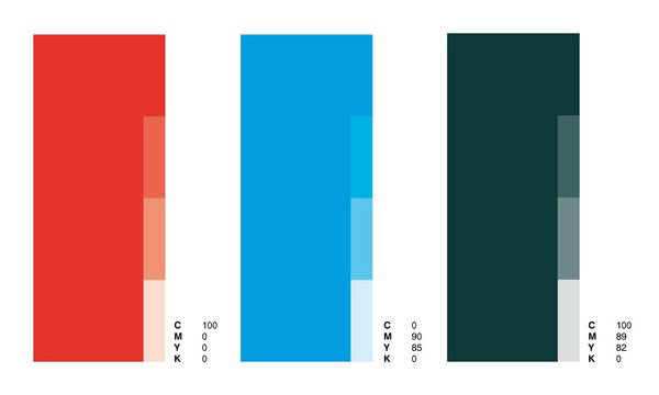
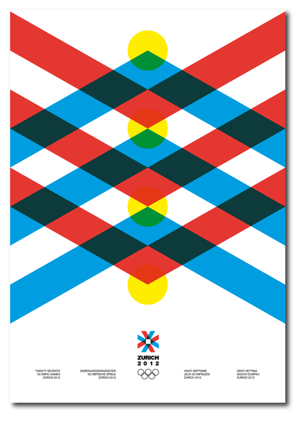
Chromatic Coding
Red
For human psychology the red colout is related to bravery, intergity, joy, good luck, intensivity and energy, as well as emotions like passion, love and sacrifice.
Red has the bigger impact as a colour due to its intensity, passion and the inner psychological response. It is the colour of celebration, clarity and integrity.
Last but not least, red is the most emotional colout of all. It stimulates the heart beats and the frequency of breathing.
Blue
Blue expresses confidence, stability, calmness and faith. Certain experiment proved that blue can affect people in a good way leading them to a peaceful psychological state. It is related to certainty and security.
Blue is the colour of the sky and the sea. Lastly, it causes the opposite reactions of red.
Petrol
Petrol stands for stability and balance. It expresses faith and power, grandiosity and strenght. It is used to bring out items of high value, given the fact that is realted to wealth
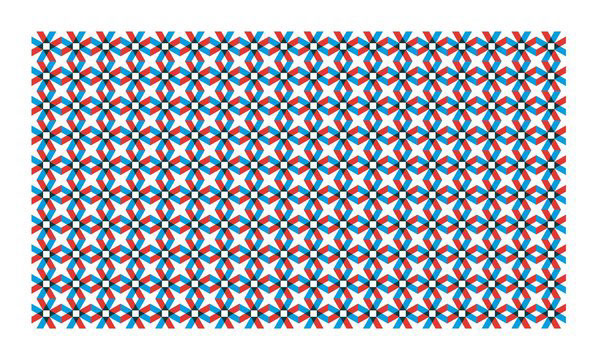
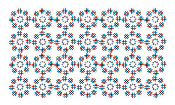
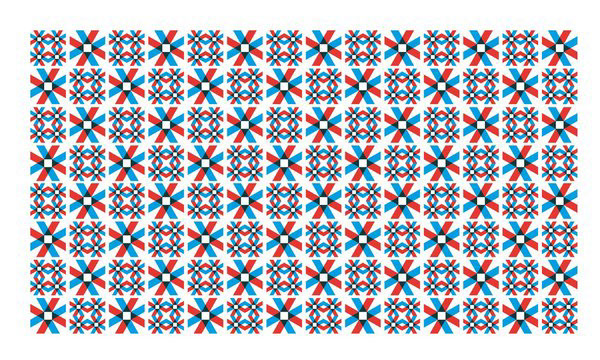
Patterns
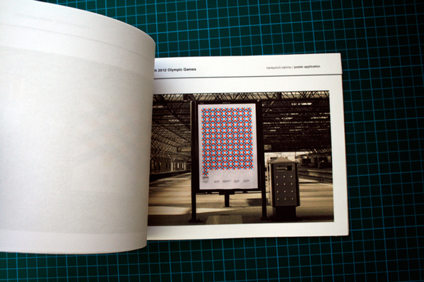
Posters
Needs
Readable and express an easily understood message.
Innovate and to rouse the interest.
Designed in a generous scale and to be effective with the fewer graphic means possible.
Designed with big forms in order to be effective even in great distances.
Easily recalled from the viewers, establishing a new connction between them and the product.
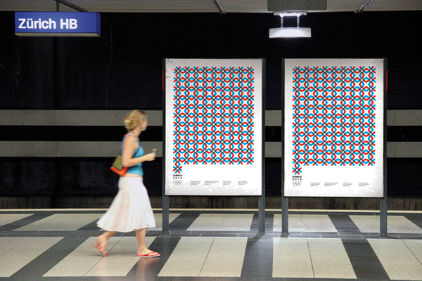
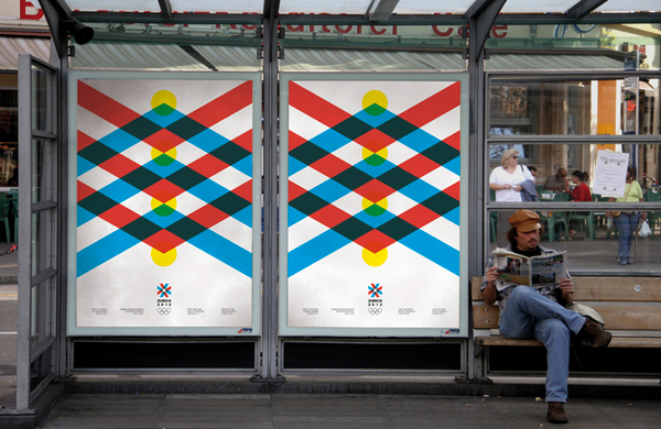
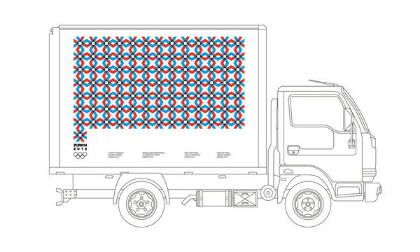
Applications
Application on truck
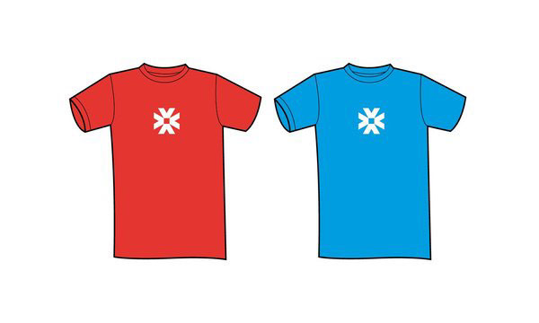
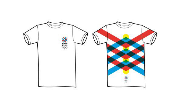
T shirts
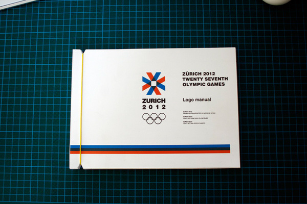
Logo manual

Thanks for Watching
Design and presentation: George Strouzas
Professor:
ΑΚΤΟ art & design
Subject class / Visual communication
Bachelor of Arts degree
February 2010
Professor:
ΑΚΤΟ art & design
Subject class / Visual communication
Bachelor of Arts degree
February 2010


