


Illustration and Repackaging Project
[ Project at school ]
FISHERMAN'S FRIEND
Fisherman's Friend là một nhãn hiệu kẹo ngậm mentol, được sản xuất bởi công ty Lofthouse ở Fleetwood, Lancashire, Anh Quốc, được phát triển bởi dược sĩ James Lofthouse vào năm 1865, nhằm khắc phục các vấn đề về hô hấp mà người ngư dân thường gặp phải khi làm việc trong những điều kiện khắc nghiệt của các khu vực đánh bắt cá ở vùng biển phía Bắc. Fisherman's Fiend hiện đang có mặt ở một trăm quốc gia trên toàn cầu với nhiều hương vị và được người tiêu dùng yêu thích.
Từ khi ra đời cho đến nay, bao bì của thương hiệu này hầu như được giữ nguyên và không thay đổi. Chúng dễ dàng được nhận biết với logo hình con tàu mang phong cách cổ điển và những dọc chéo đầy màu sắc nổi bật.
Fisherman's Friend is a brand of strong menthol lozenges produced by the Lofthouse company in Fleetwood, Lancashire, England. It was originally developed by pharmacist James Lofthouse in 1865 to relieve various respiratory problems suffered by fishermen working in the extreme conditions of the Northern deep-sea fishing grounds. It is now available in over a hundred countries, in a variety of flavors and popular with many consumers.
Since its inception, the packaging of this brand has been virtually unchanged. They are easily recognizable with the classic ship's logo and colorful stripes.

KẸO CAY CON TÀU VIỆT NAM ( Thay đổi bao bì )
Fisherman's Friend Vietnam ( repackaging )
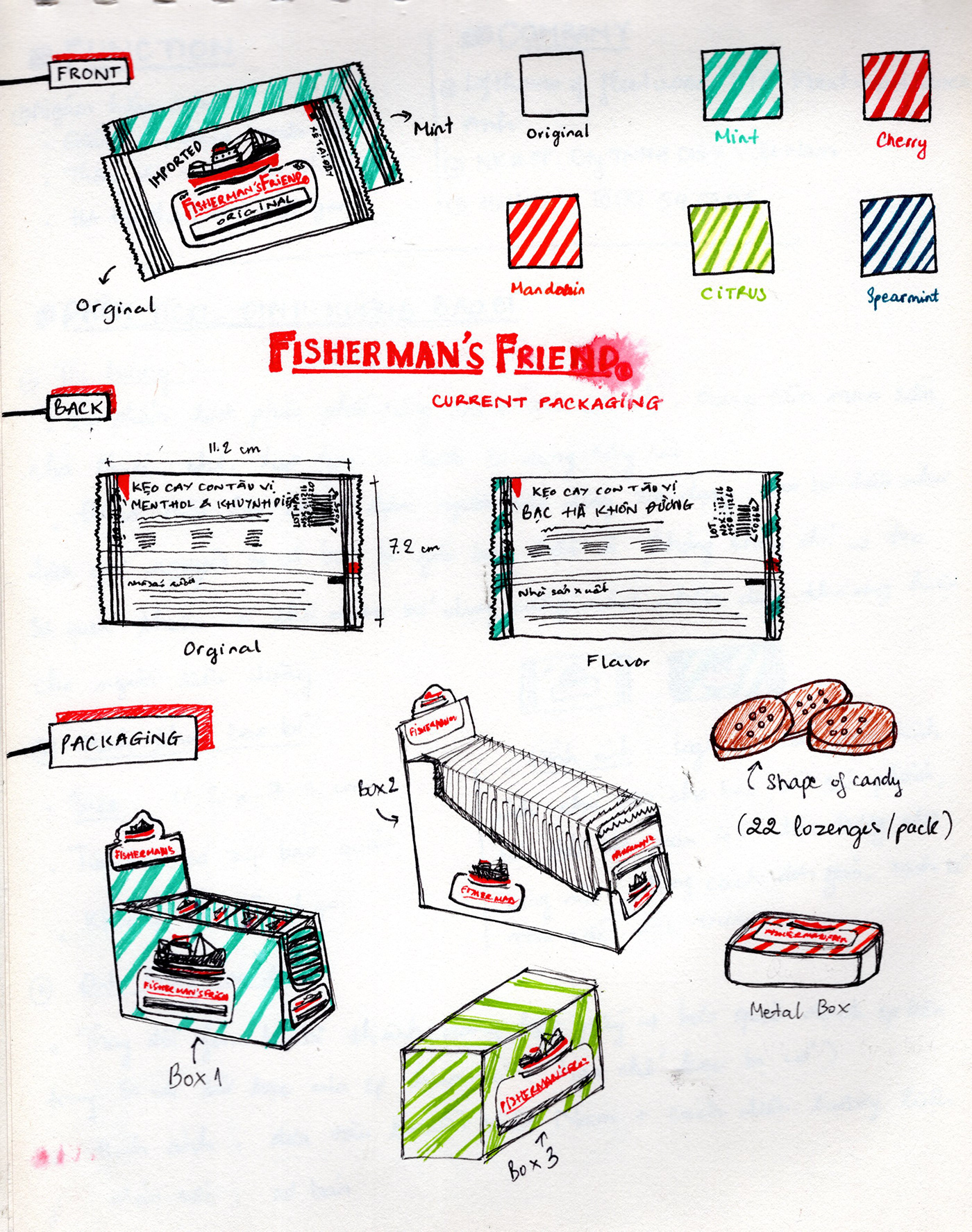
Đây là hình ảnh sản phẩm hiện tại của Fisherman's Friend. Kẹo được đựng trong túi nilong có đóng zip bảo quản. Sản phẩm đã có mặt tại Việt Nam từ rất lâu và có bao bì thống nhất với bao bì gốc của hãng, chưa có bao bì riêng cho người tiêu dùng Việt.
Bao bì được thay đổi với mong muốn người tiêu dùng sẽ cảm thấy gần gũi hơn với sản phẩm hơn. Bao bì mới này không chỉ thay đổi hình ảnh thể hiện mà còn hướng đến chất liệu mới thân thiện với môi trường.
Dự án thay đổi bao bì này gồm 2 phần:
- Sản phẩm giới hạn
- Sản phẩm thị trường
This is the current packaging of products. Candy is packed in plastic bags with zip closure. The product has been sold in Vietnam for a long time and the packaging is unity with the original, not packaged specifically for the Vietnamese consumers.
The packaging is changed with the purpose to make consumers feel closer to the product. It not only changes the visual representation but also directs to the environmentally friendly new material.
This package has two parts:
- Limited products
- Market products
The packaging is changed with the purpose to make consumers feel closer to the product. It not only changes the visual representation but also directs to the environmentally friendly new material.
This package has two parts:
- Limited products
- Market products


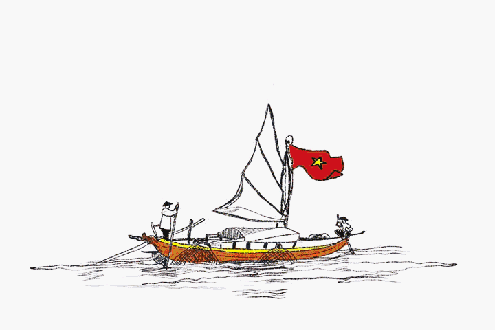
Ý tưởng chính xuất phát từ hình ảnh những chiếc tàu, thuyền, ghe... trên vùng biển và sông nước của Việt Nam. Dù ở nơi nào thì ngọn cờ Việt Nam vẫn bay phấp phới gắn bó xuyên suốt cuộc hành trình.
Những hình ảnh dưới đây đã được tôi chụp lại ở biển Ninh Thuận và sông Sài Gòn song song với đường Trần Xuân Soạn. Gam màu xanh, đỏ, vàng cùng những chiếc mắt ghe đã tạo nhiều cảm hứng cho tôi khi sử dụng chúng để minh họa cho bao bì.
Basic inspiration comes from the image of the ship, boat, ... on the sea and river of Vietnam. The flag of a country is always proudly fluttered unsullied throughout the journey. The pictures were taken in Ninh Thuan sea and Sai Gon rivers - parallel to Tran Xuan Soan Street in Ho Chi Minh city. The blue, red, yellow and boat's eyes... is the basic inspiration for illustration repackaging.


Tin box mockup of Dario Rancatore
Sản phẩm giới hạn
Sản phẩm này được sản xuất với số lượng có giới hạn ( giả định dùng để Kỉ niệm sự xuất hiện lâu dài của Kẹo cay Con tàu ở Việt Nam )
Hình ảnh con tàu chủ đạo của logo Fisherman đã được thay bằng hình ảnh minh họa chiếc thuyền và ngư dân Việt Nam, giữ nguyên phần logo chữ, gam màu và kiểu chữ được sử dụng mang phong cách hoài cổ. Kẹo đựng trong hộp kim loại để người tiêu dùng sau khi sử dụng hết có thể giữ lại để làm kỉ niệm.
Bên cạnh đó là một poster quảng cáo sản phẩm với ngôn ngữ và hình ảnh được thiết kế theo phong cách xưa.
This is produced in limited quantities (assumed to commemorate the long-lasting appearance of the Fisherman's Friend in Vietnam).
The ship on Fisherman's Friend logo has been replaced by illustrations of Vietnamese boat and fishermen, keeping primary typo on the logo, color, and style used in the nostalgic style. Candy in the metal box promotes consumers after use can be retained.
Besides, a promotional poster with advertising words and images designed in the old style.
---
Poster's content:
FISHERMAN'S FRIEND
Helps you reduce a cough, breathe deeply.
Kẹo cay Con tàu - Fisherman's Friend - A friend of fishermen was appeared with new packaging by the illustration of the ships in Vietnam ("6 flavors with 6 different ships illustration").
Hope you to support us.
BEST REGARDS!
FISHERMAN'S FRIEND
Helps you reduce a cough, breathe deeply.
Kẹo cay Con tàu - Fisherman's Friend - A friend of fishermen was appeared with new packaging by the illustration of the ships in Vietnam ("6 flavors with 6 different ships illustration").
Hope you to support us.
BEST REGARDS!


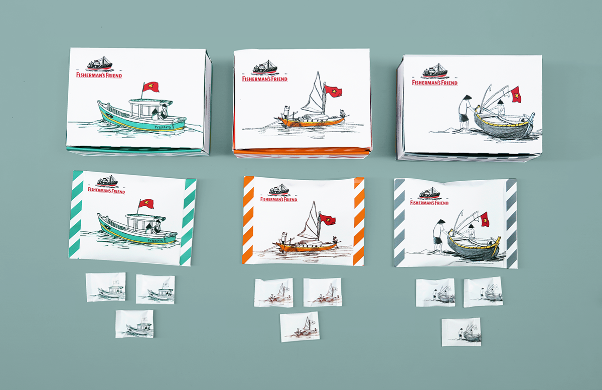
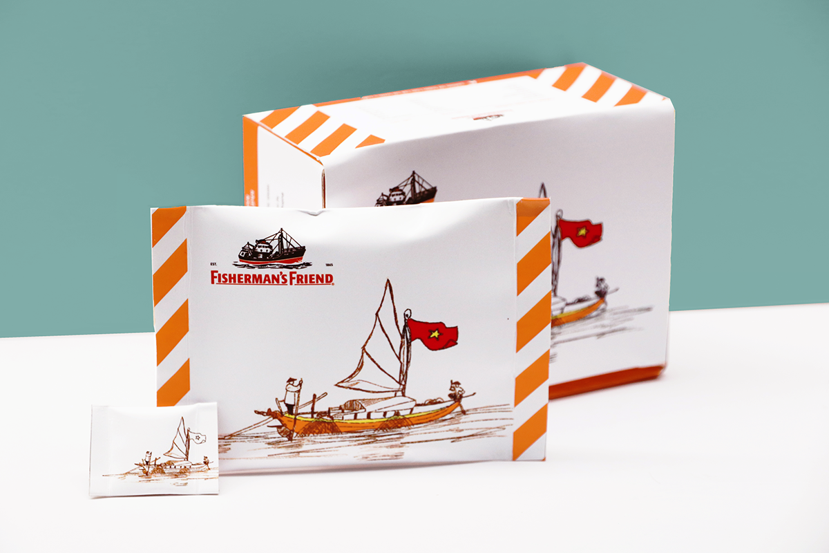
Sản phẩm thị trường
Bao bì này dùng để thay thế bao bì hiện tại của Fisherman's Friend đang được bày bán phổ biến ở Việt Nam. Hình chính của logo được thay thế bằng hình ảnh ghe, tàu Việt Nam. Dải màu sọc chéo được giữ nguyên,ứng với từng mùi vị của sản phẩm để giữ tính nhận diện cho thương hiệu.
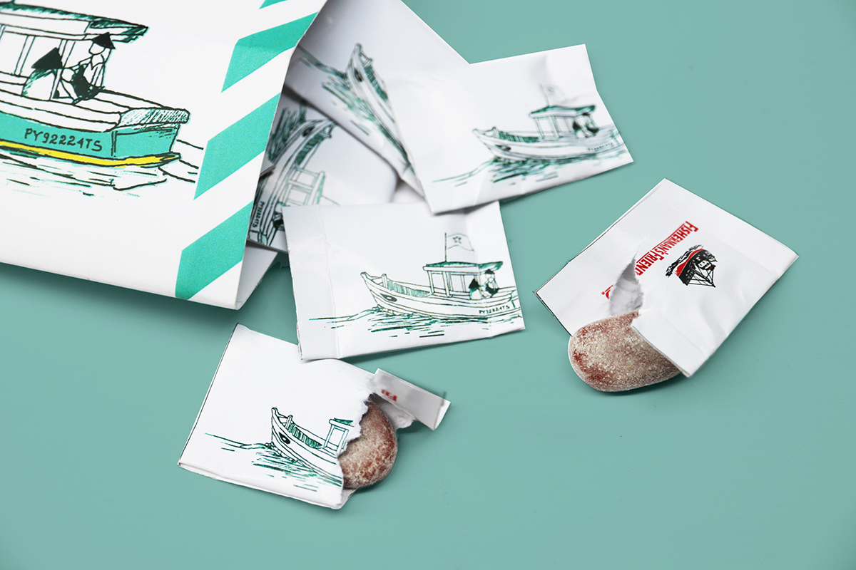
Bao bì không còn là túi nilong đóng zip mà thay bằng chất liệu giấy thân thiện với môi trường, gói từng viên kẹo trong túi giấy nhỏ giúp bảo quản kẹo tốt hơn.
This packaging is used to replace the current packaging of Fisherman's Friend which is being sold in Vietnam.
A ship on the logo is replaced with the illustration of boats in Vietnam. Striped color is kept intact, consistent with each flavor to retain brand identity.
Replace plastic bags and zip closure by environmentally friendly paper, wrapping each candy in a small paper bag helps to preserve better candy.

Motion by: Jason Hoang


Motion by: Jason Hoang


