
TASK AND SITUATION
Beer cocktail Dlight is an impulsive purchase, therefore it has to stand out on the shelves among competitors by being brighter, more innovative, modern. After analysing the market and the relevant category of beer cocktails both in terms of taste and packaging, we realised the former image of Dlight lacks a certain feel of modernity and it doesn’t respond well to the needs of its target audience.
SOLUTIONS:
EXCEPTIONAL PACKAGING
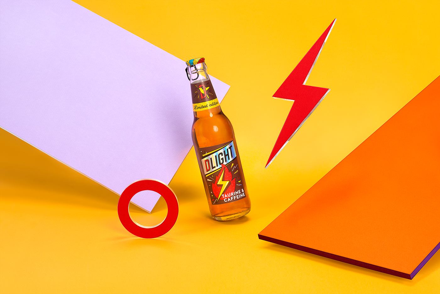
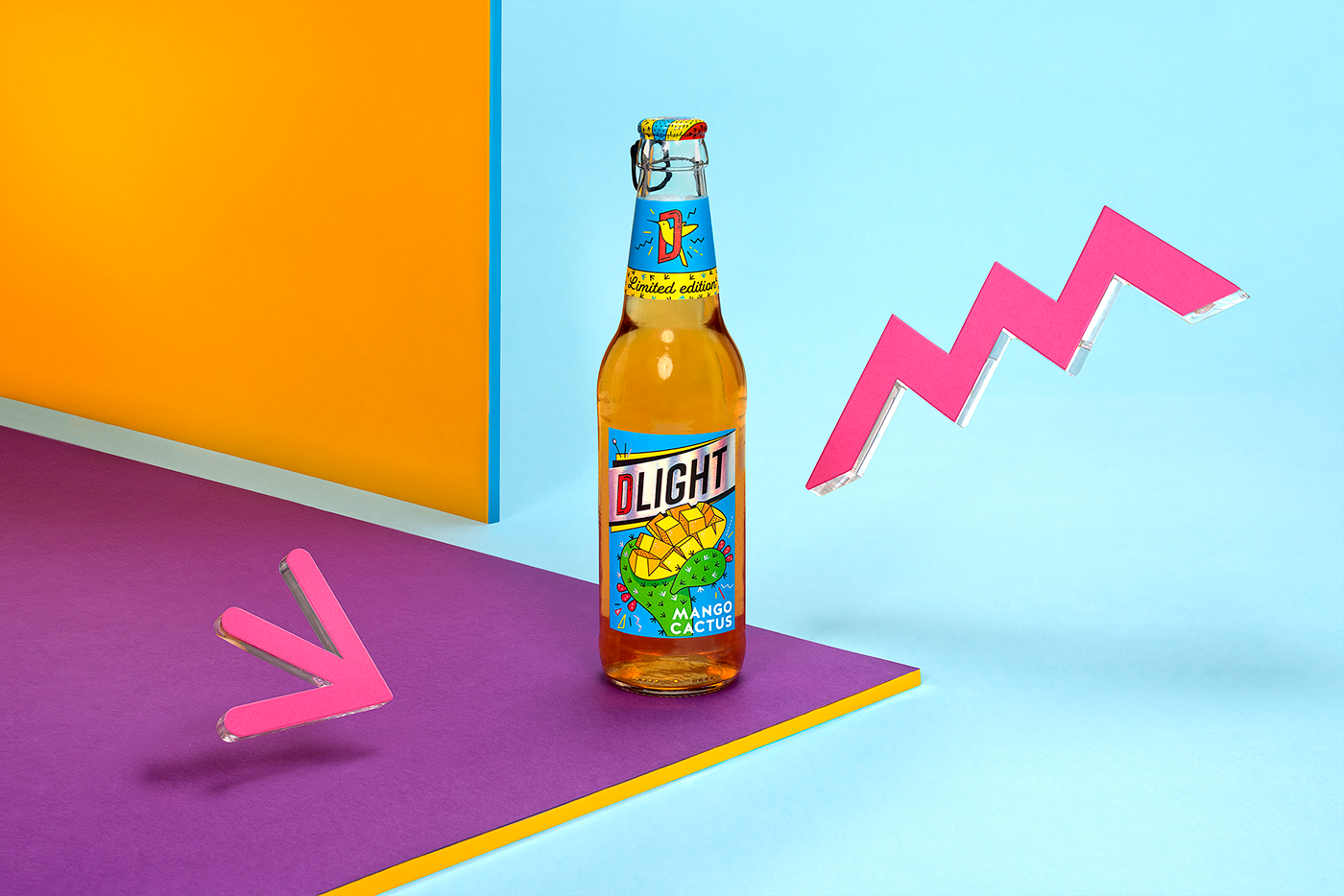
The solution we chose was a novelty in the product’s category – holographic foil. Colourful scintillating results in a unique appearance of the labels, catches the attention immediately and guarantees great noticeability on the shelves.
GRAPHIC SOLUTION
While looking for inspiration, we explored a lot of pop art, which helped us get on the right path towards the final design. Bright colours, additional graphic elements and expressive illustrations became the main elements to shape the new style and emotions of Dlight.
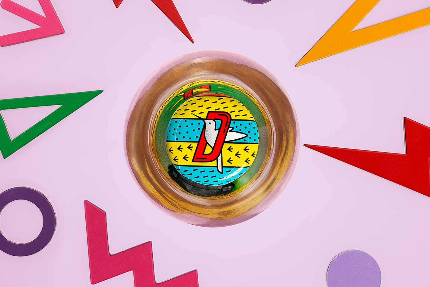
CAPS
A special bottle cap design was introduced for the limited edition range. Pull-off caps of the same style for all tastes of the range make sure the graphic elements and colours of different tastes merge into one cap design.


Client: Švyturys - Utenos alus
Agency: étiquette
Strategy: Valerija Žilėnienė
Art direction: Irmantas Savulionis
Graphic design: Gintarė Marcinkevičienė
Account management: Rita Dargytė
Printing manufacturer: Garsų pasaulis
Product photo shoot: Opiopio Creative, Tibor Galamb
© étiquette, 2017, Vilnius


