

As a huge fan of rock music, I was always excited to discover my favorite bands' websites and grab some info. Read articles, interviews watch some "behind scenes" videos and so on... But almost every time I visited their websites, I found out the same annoying things.
Landing pages with no information except for the low-res artwork of their last album and "Enter Site" button… I don’t have an idea what exactly it is. Many of the websites I came across were overloaded with widgets, embedded iframe, social network links, fan club news and of course auto-play music players that are abruptly blasting their music through your speakers.
The cluttered module based layout with terrible typography is neither attractive or user-friendly. Most of the time there is no clear hierarchy of information.
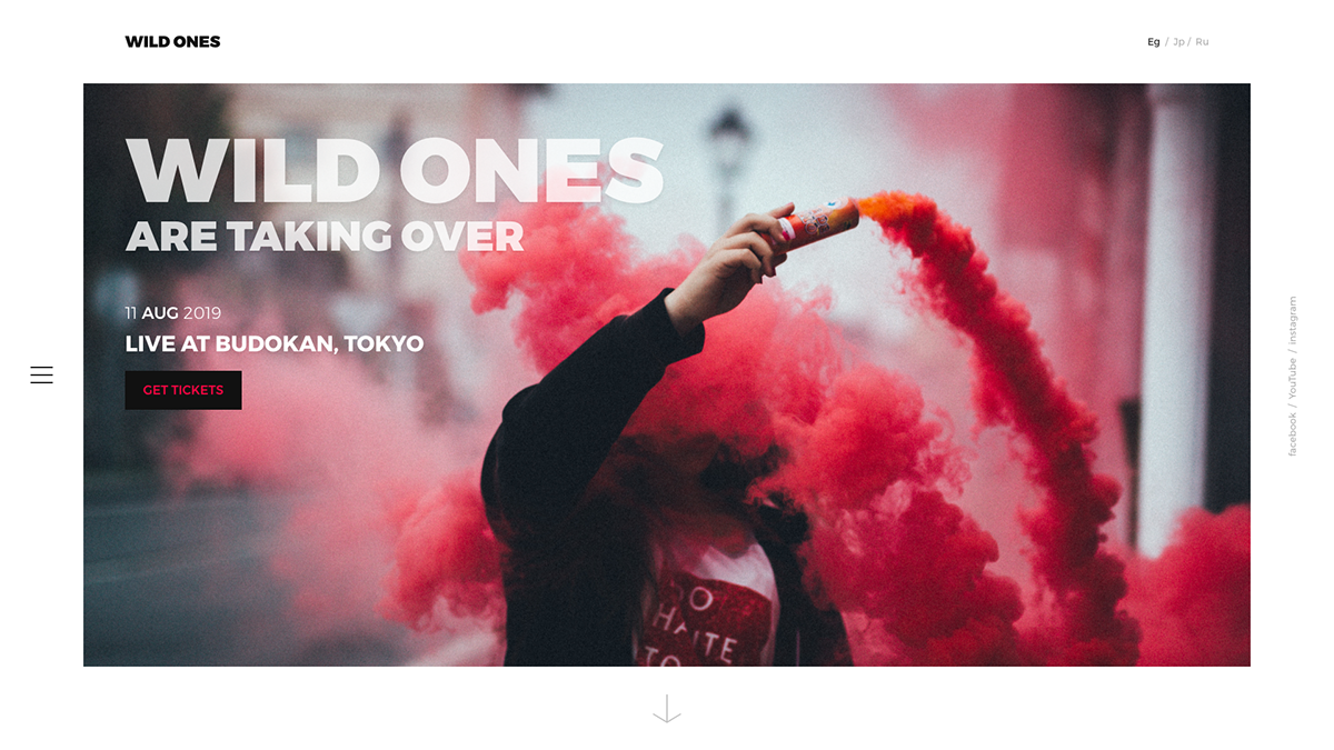
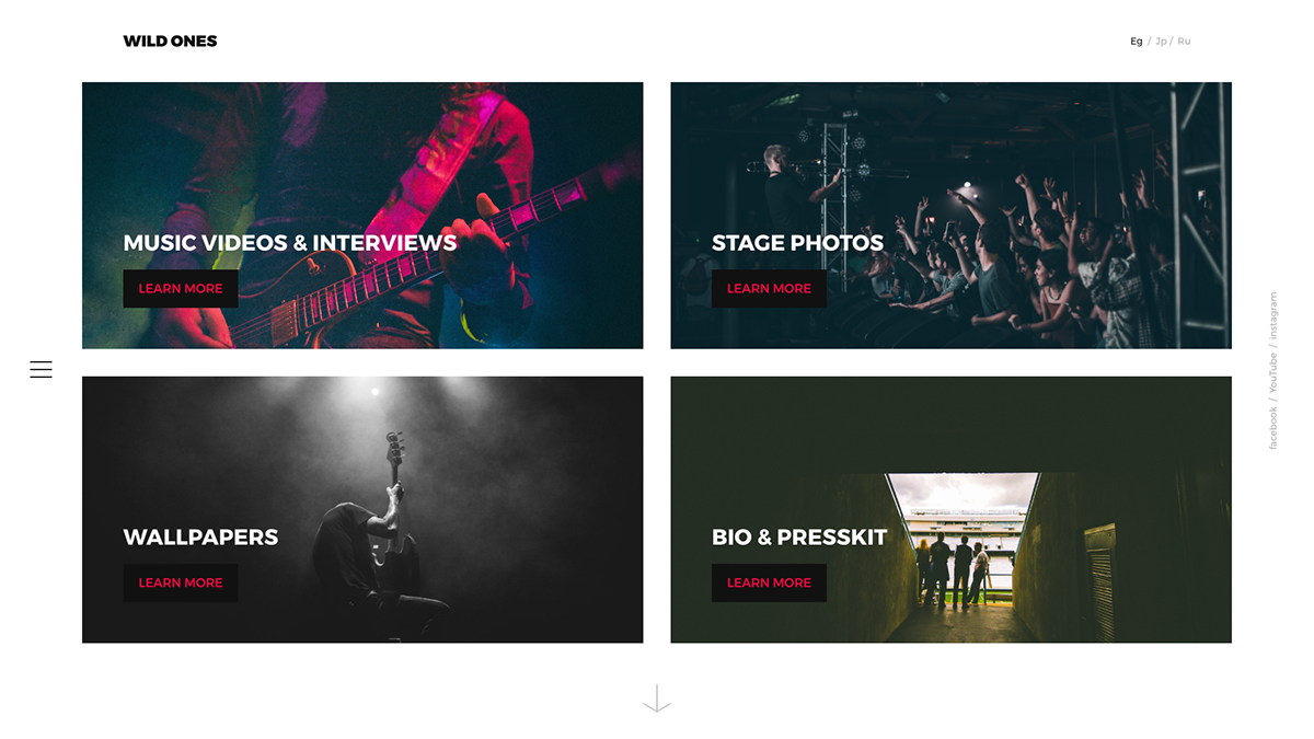
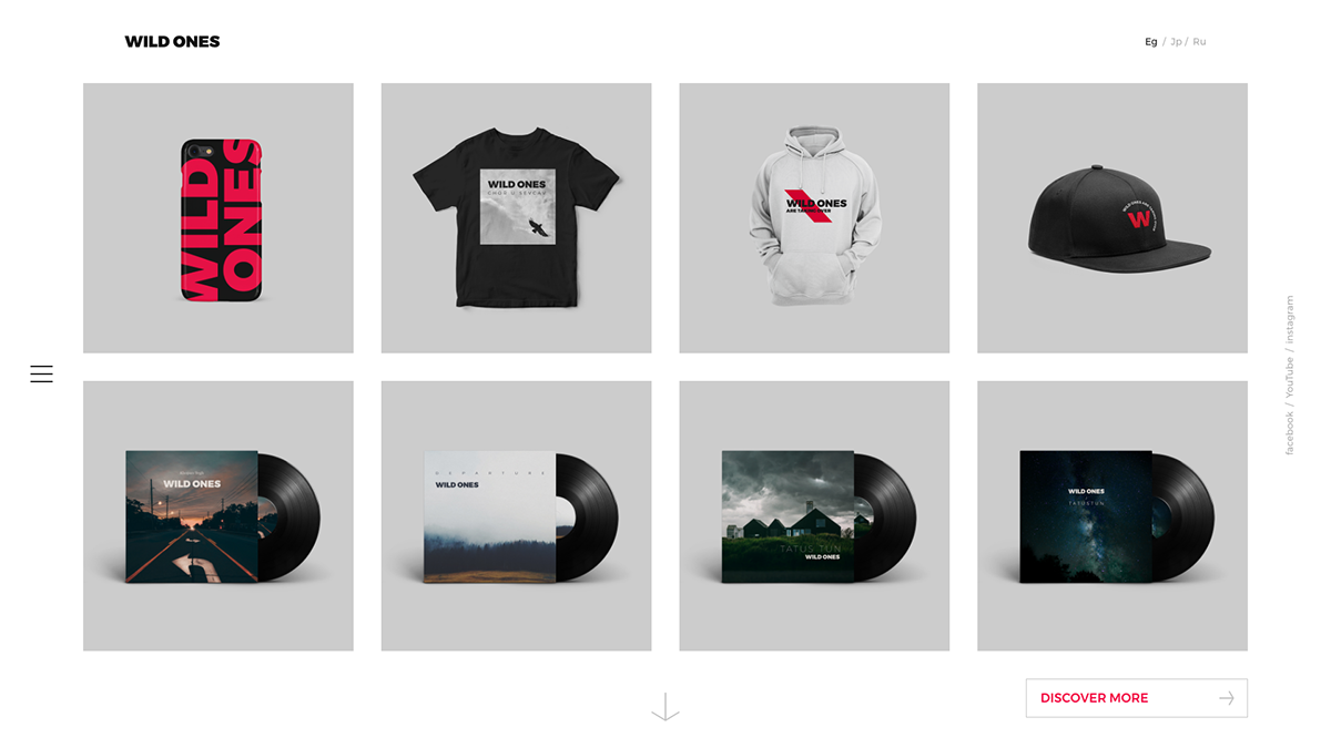
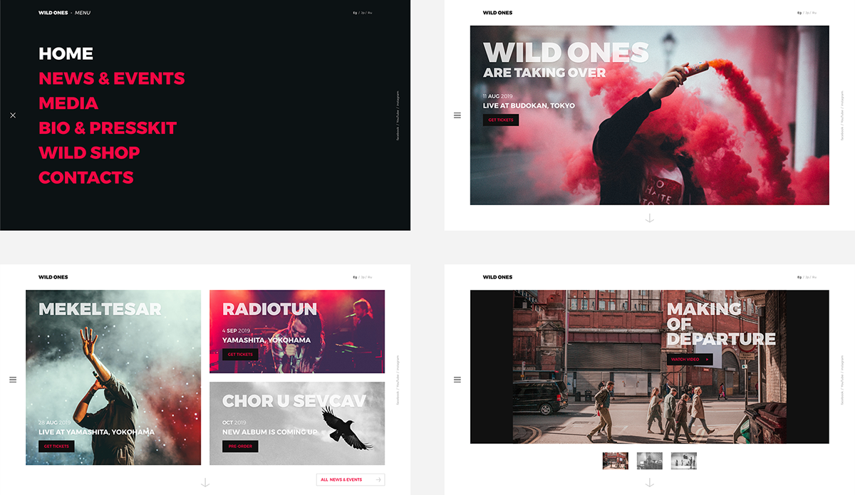
Here I want to share some ideas and experience on how can you present a band website in a modern and clean layout. And I hope it will help some of them to review their needs and goals.
Here I want to share some ideas and experience on how can you present a band website in a modern and clean layout. And I hope it will help some of them to review their needs and goals.


Thanks for scrolling


