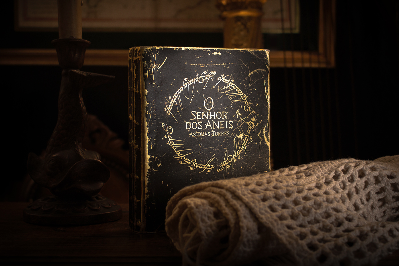
R e d e s i g n
" T h e L o r d o f t h e R i n g s : T h e T w o T o w e r s "
b o o k c o v e r
The Lord of the Rings is an epic high fantasy novel written by English author and scholar J. R. R. Tolkien. The story began as a sequel to Tolkien's 1937 fantasy novel The Hobbit, but eventually developed into a much larger work. Written in stages between 1937 and 1949, The Lord of the Rings is one of the best-selling novels ever written, with over 150 million copies sold.
This academic work consisted in redesigning the original book, from scratch. Being a story that refers back to b.C times, the goal was to represent a gold book (the ring color) with an old and used look.
The cover was designed from gold paper printed with black, that with time will wear out, making it older and older over time. The title and author's font was designed and inspired by Cinzel font.


Obrigado!
Miguel Cardoso . 2017


