The Makery
The Makery is a creative consultancy with a primary focus on hand-crafted models, installation design and art direction. Apart from commercial projects, The Makery aims to be a provider of workshops for students in a bid to spur creativity within local youths.
As a company that engages in a wide range of services, the challenge was to create a name and a modern, attractive & versatile identity that would do two things:
1. Be muted enough to be applied over a portfolio of works with varied art directions and not steal attention, and yet be strong enough to stand on its own,
2. Allude to its primary emphasis on craft, and yet avoid the common direction that other entities revolving craft would commonly take - no explicit usage of scissors, papercuts, paint, glue & so on.
By working closely with the client, we arrived at The Makery: When one thinks of a bakery, one pictures oven-baked pastries lovingly prepared by hand. The Makery, on the other hand, produces stunning pieces of hand-crafted art.

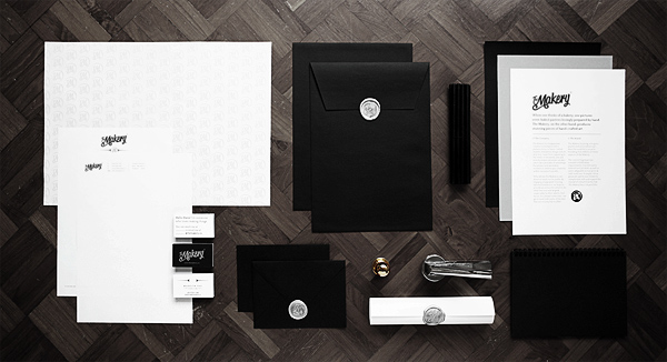


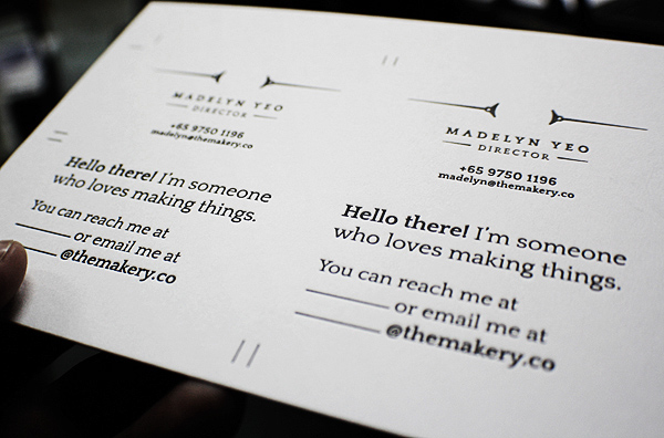
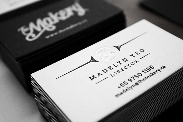
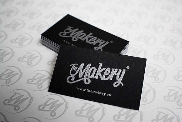
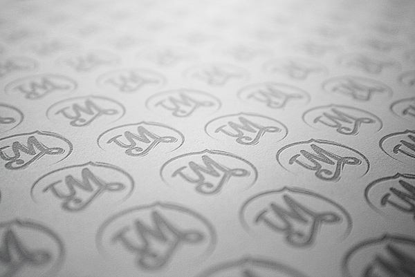
Two sided letterpressed business cards. The backs have been given an inkless press with the monogram.

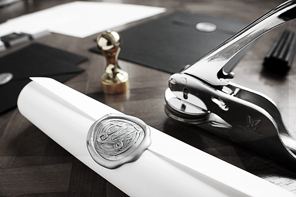
One of the moulds used for the letterpressed business cards.
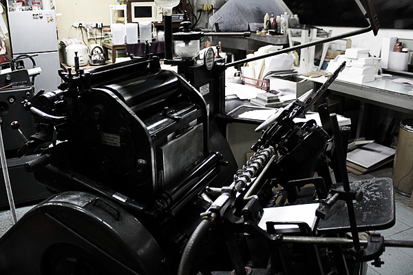
The amazingly old but capable letterpress machine. Taken at Papy Press.


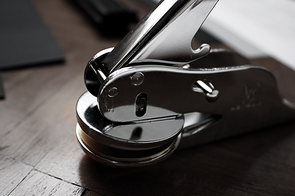
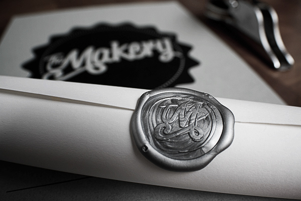
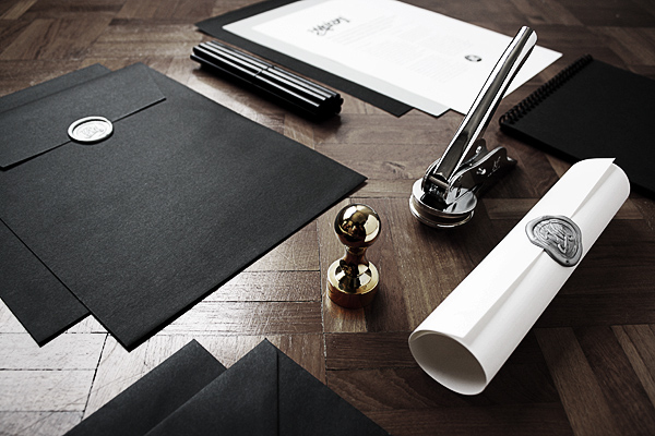
Common seal with monogram.

Common seal applied to a 150gsm paper.

Seal applied with silver coloured wax.