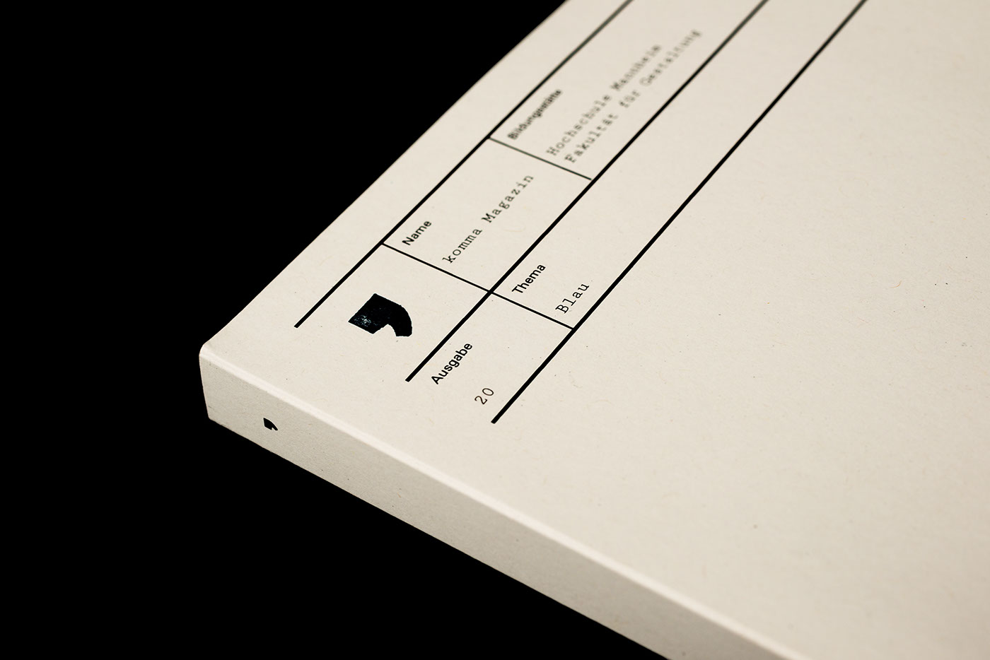
The 20th anniversary issue of komma magazine is about the topic “blue”. Blue does somehow exist and it somehow doesn’t. Blue is reflexion, blue is energetic, blue is rare. But on the other hand blue is the
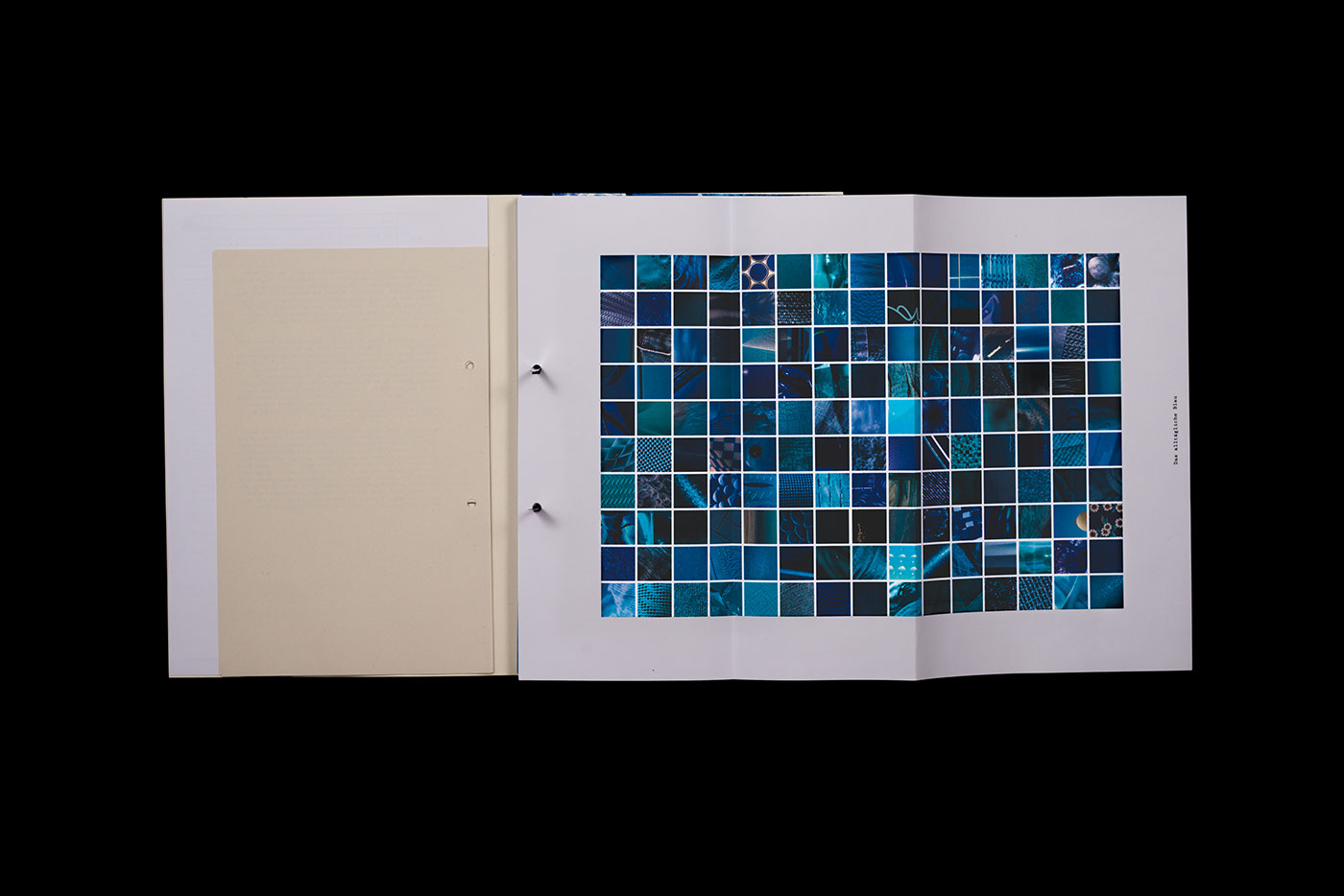
of designers. Blue is everywhere and ubiquitous. We asked ourselves: Which parts of our surrounding are
blue? What does the colour blue mean to designers in different countries? And how would the world look
like, if there wasn’t the colour blue?
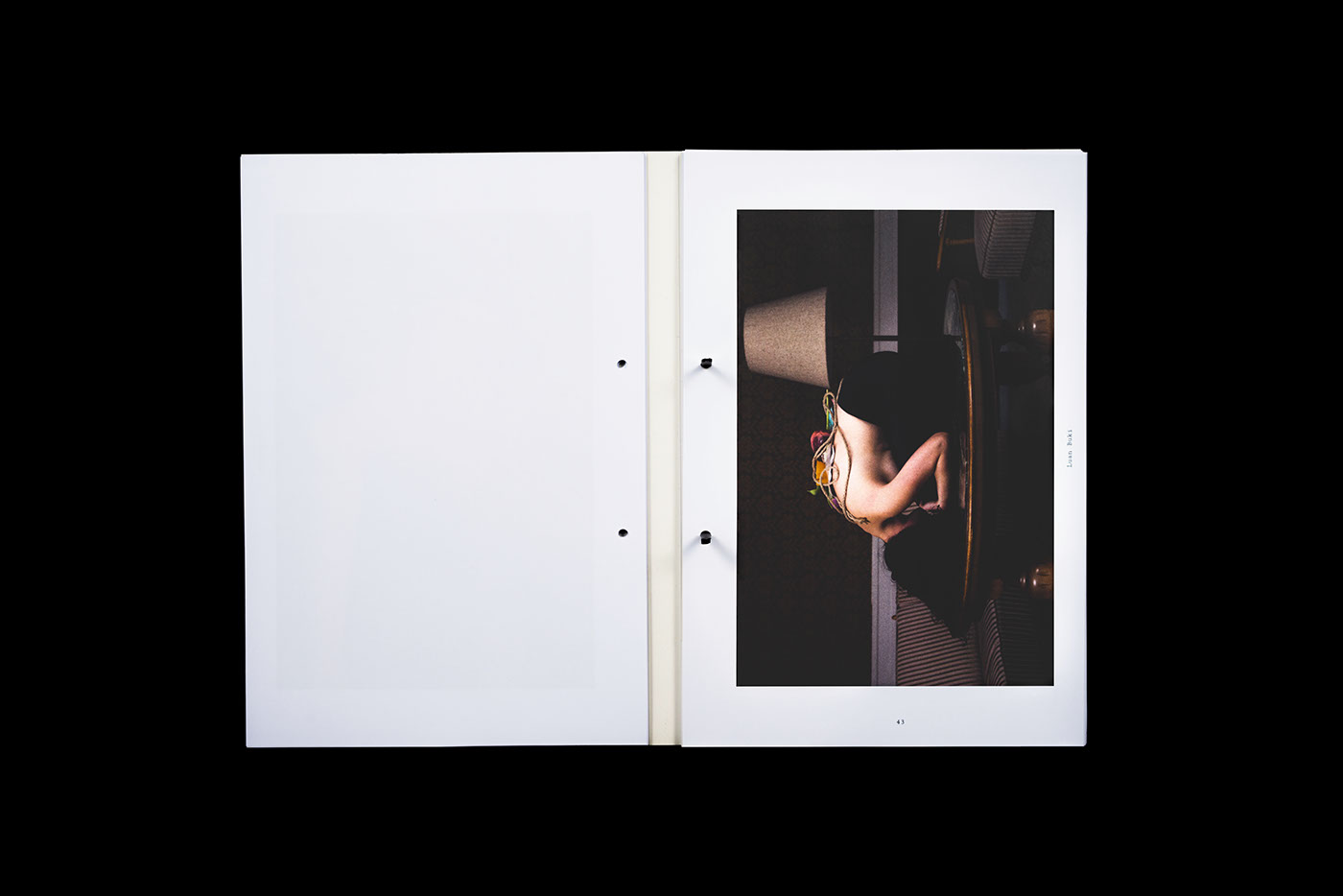
We show posters created by designers from diverse countries, foto series and illustrations from students,
guest contributions and our own contributions according to the topic “blue”. On the one hand they deal with
the colour blue in general, on the other hand they deal with the topic in an interpretative way.
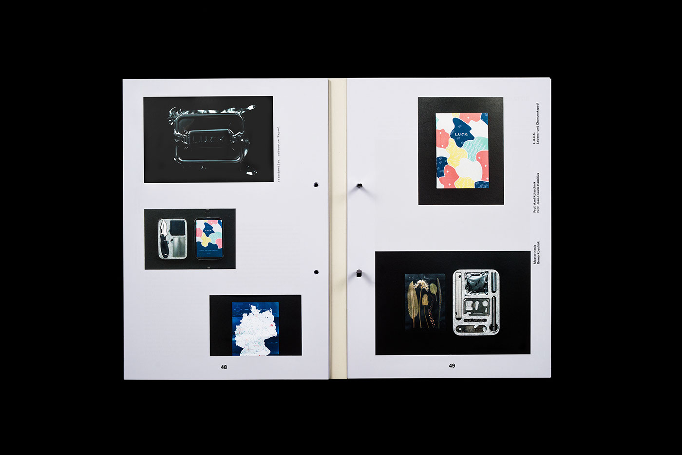
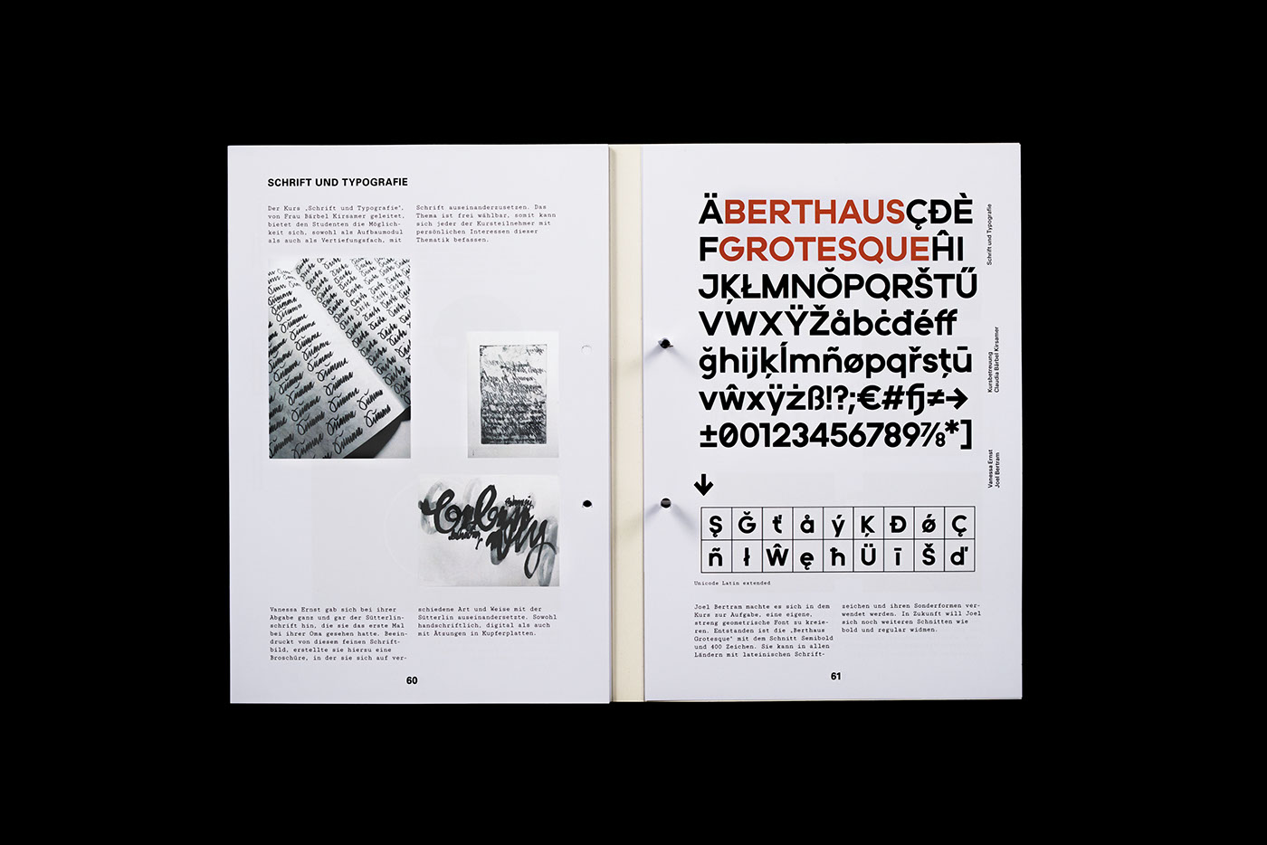
The second part of the magazine shows degree theses and student works of the Faculty for Design of the University of Applied Sciences Mannheim.
The design concept reminds of a document collection which contains various formats. Why should one de-
clare something undone as something finished? Design continuously changes. So why should one not use
this elementary character of design to create a concept for a magazine?
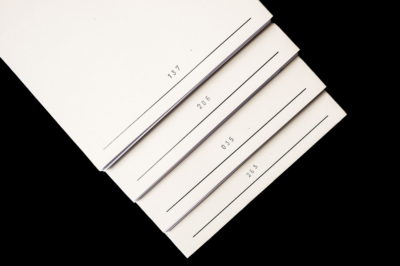
The staple binding allows to take out the separate parts, pages and posters. Each of the 500 specimens was bound and stamped by the editors. This is why every single specimen is an unicum.
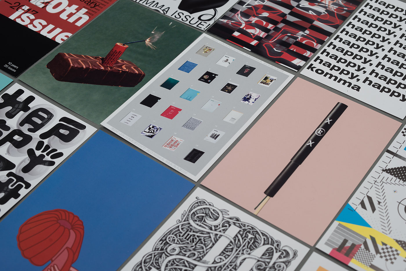
As an anniversary special former editors created birthday postcards for komma magazine.