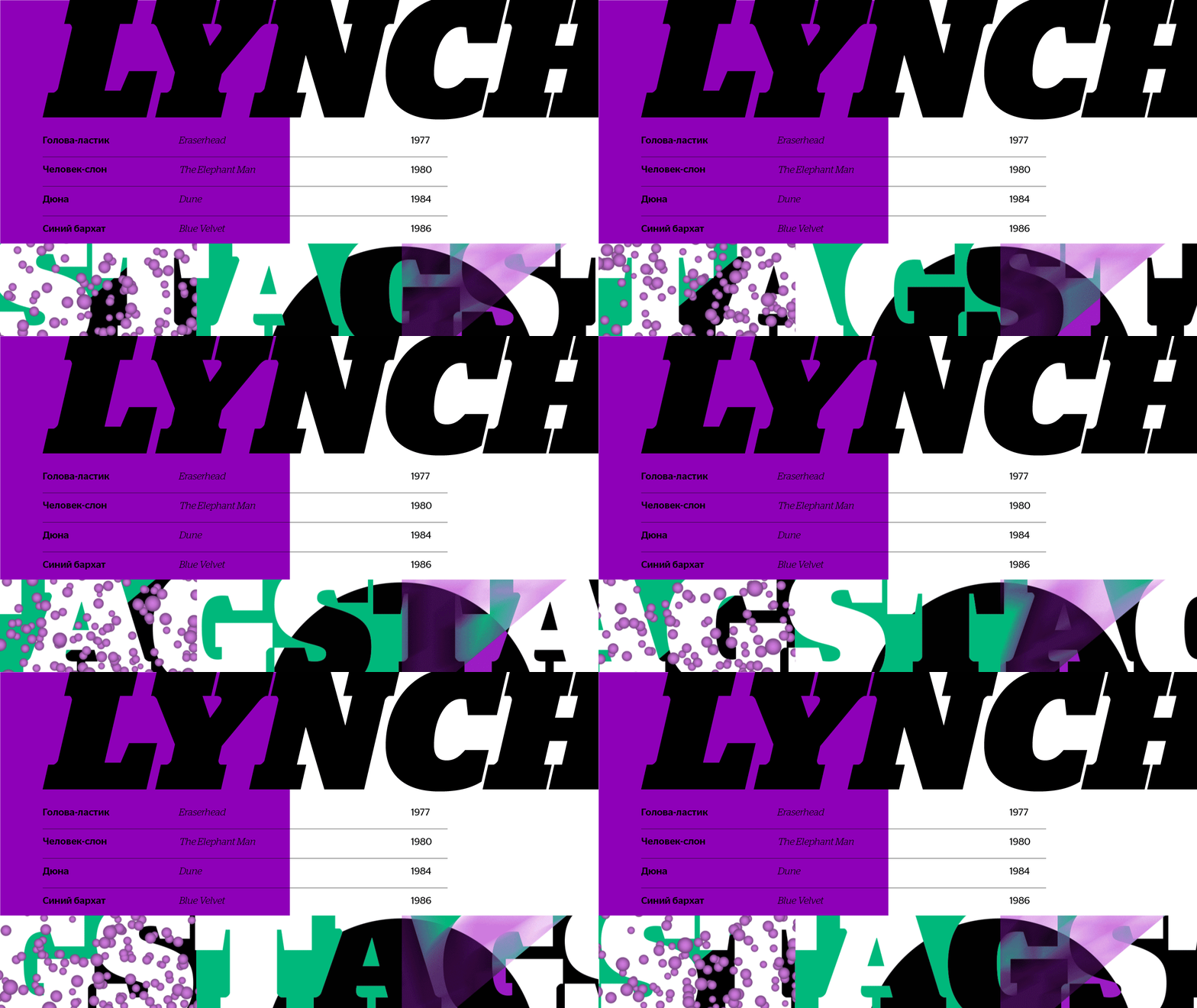
Stag mixes the contemporary taste for large x-heights and quirky details with influences from continental Egyptians of the early twentieth century. With more overt personality than a more sober family like Guardian Egyptian, Stag is perfect for situations that need a little more distinction in typographic dress. Stag was originally designed as a headline face for the US edition of Esquire in a very limited number of weights. Because it was originally intended to be used for just a handful of very large, very heavy words at a time, its designer focused on making the space between characters as interesting as the space inside them, ending up with an unusual mixed bracketing treatment on the serifs. This contrast between sharp and soft forms grew into the main design feature of the family, with the balance shifted more towards soft forms in the cursive-influenced italic.
Stag is characterized by many distinctive details, so the trick in designing a companion sans was to pinpoint the right balance between the rounded terminals, which connect it to the original Stag, and the blunt terminals, which give the family a no-nonsense muscularity. The end result is a sans that is interesting in headlines but not distracting at text sizes. Stag is emphatically a headline face, not a text face, but Stag Sans was drawn – at Esquire’s request – to bridge this gap. Extremely short ascenders and descenders are easier to swallow in a sans serif, as demonstrated by many classic agate typefaces, and Stag’s open counterforms, designed originally to faciliate heavy, blocky terminals, adapted well to readability at more normal weights in the sans.
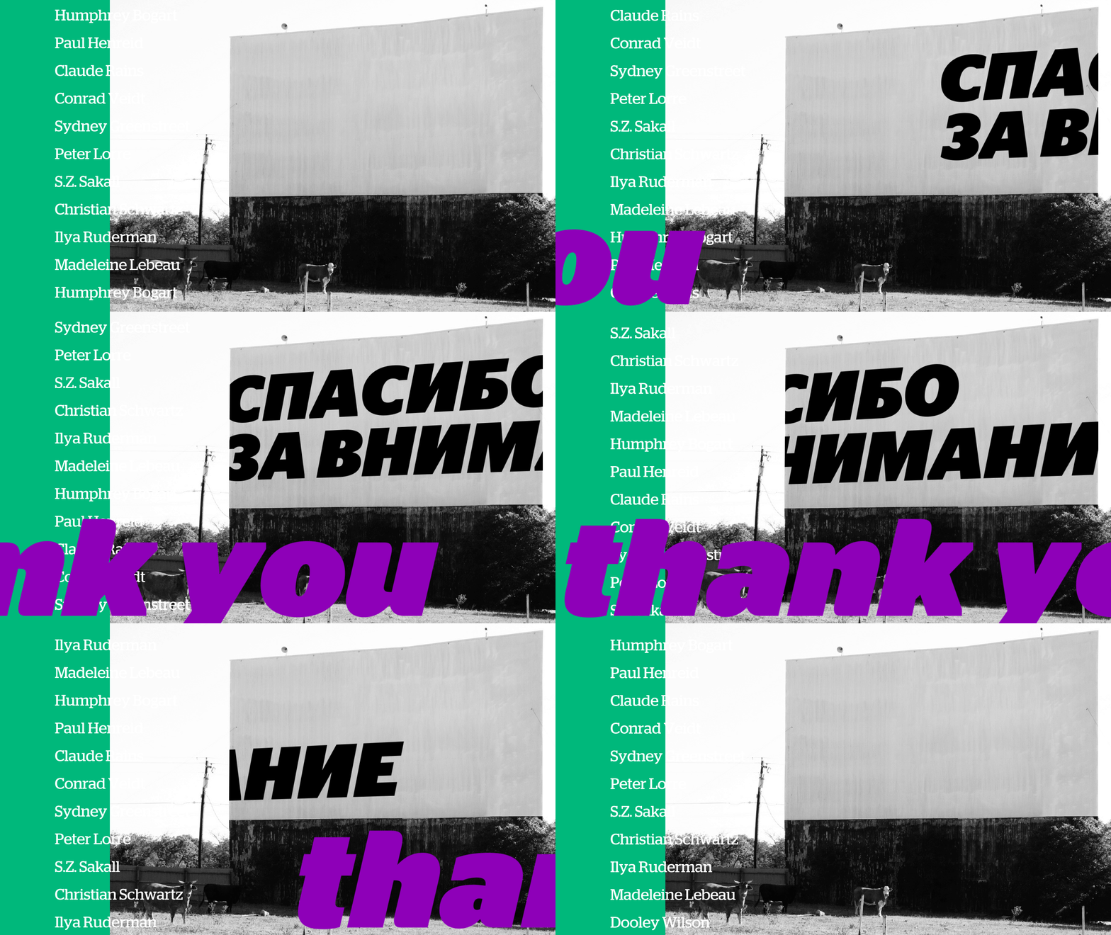
Christian Schwartz, Commercial Type, Ilya Ruderman


To buy Stag at type.today click here
To buy Stag Sans at type.today click here
This project is designed by Antonina Kozlova


