
NNNEURON Cosmetics / 原 田 製 研
Design Agency : Studiopros.work
Creative Director : Yi-Hsuan Li 李宜軒
Design Agency : Studiopros.work
Creative Director : Yi-Hsuan Li 李宜軒
Art direciton : Yi-Hsuan Li 李宜軒
Visual design : Yi-Hsuan Li 李宜軒 / Kai Ho
Logo Animation Direction : Group.G 谷汩文化
Logo Animator : Chi-Hao Chu 朱啟豪
Visual design : Yi-Hsuan Li 李宜軒 / Kai Ho
Logo Animation Direction : Group.G 谷汩文化
Logo Animator : Chi-Hao Chu 朱啟豪
Client : NNNEURON / 原 田 製 研
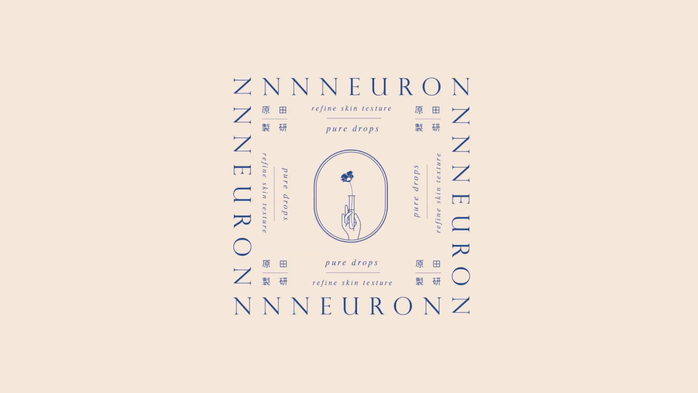
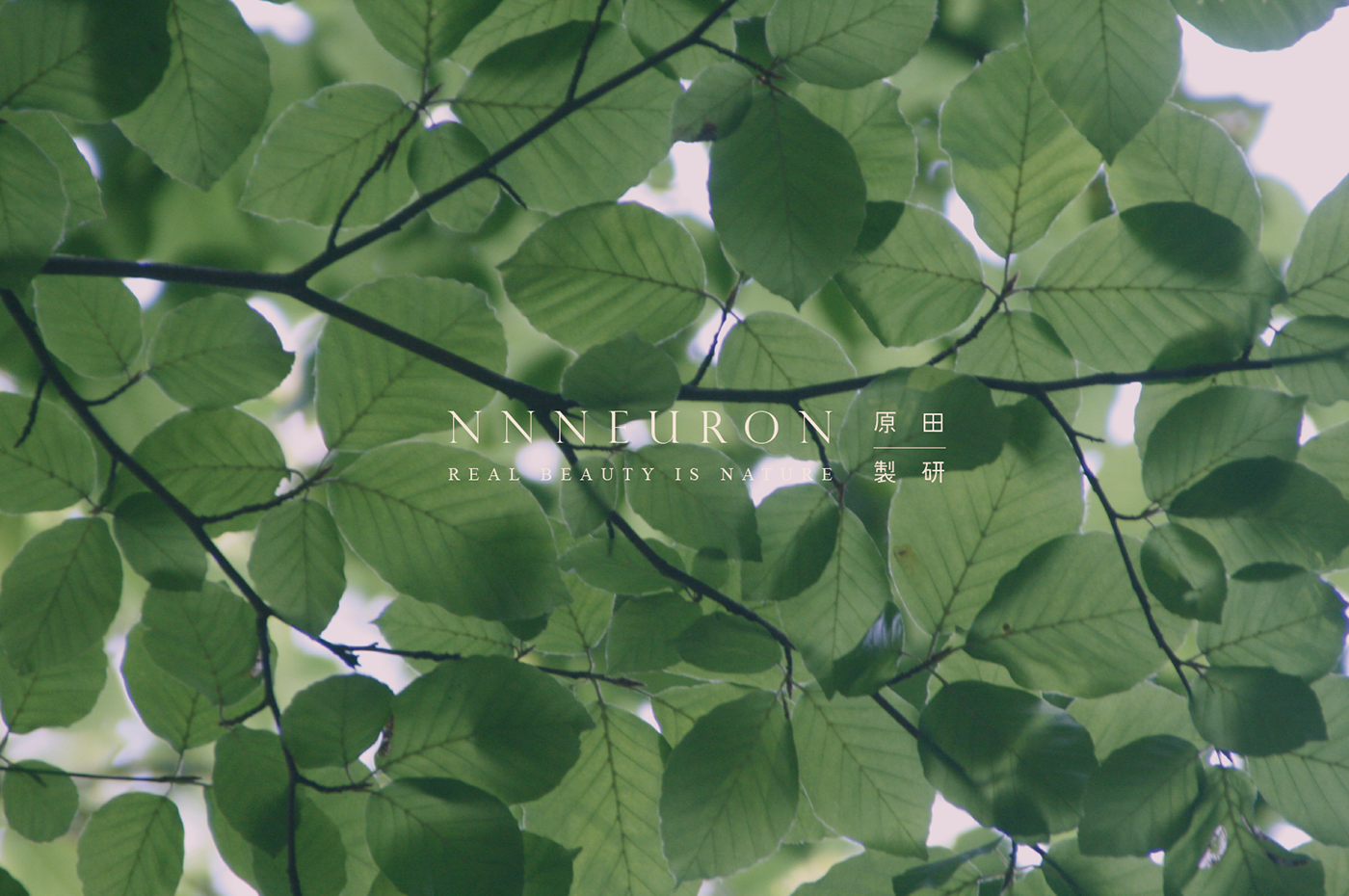
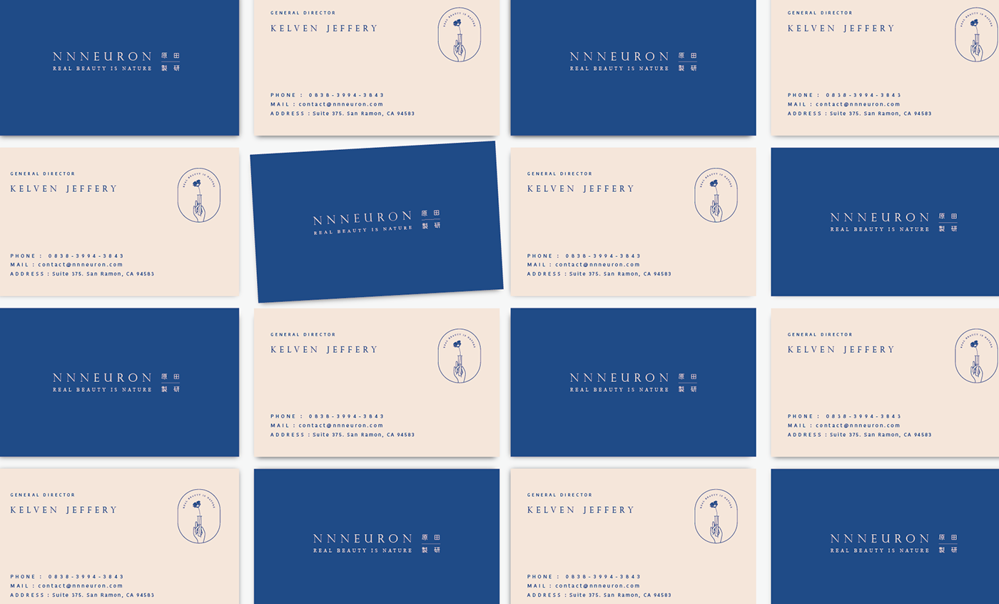
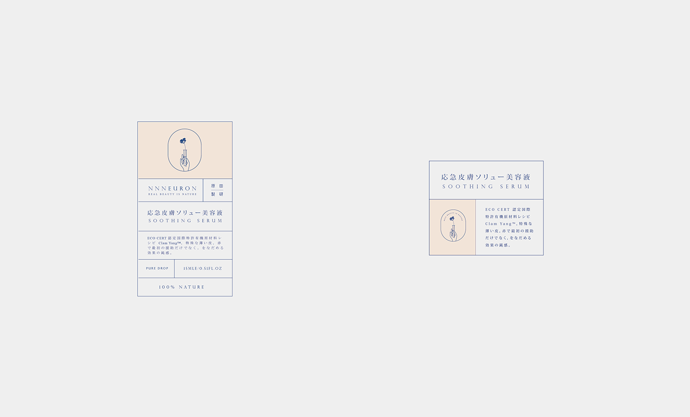
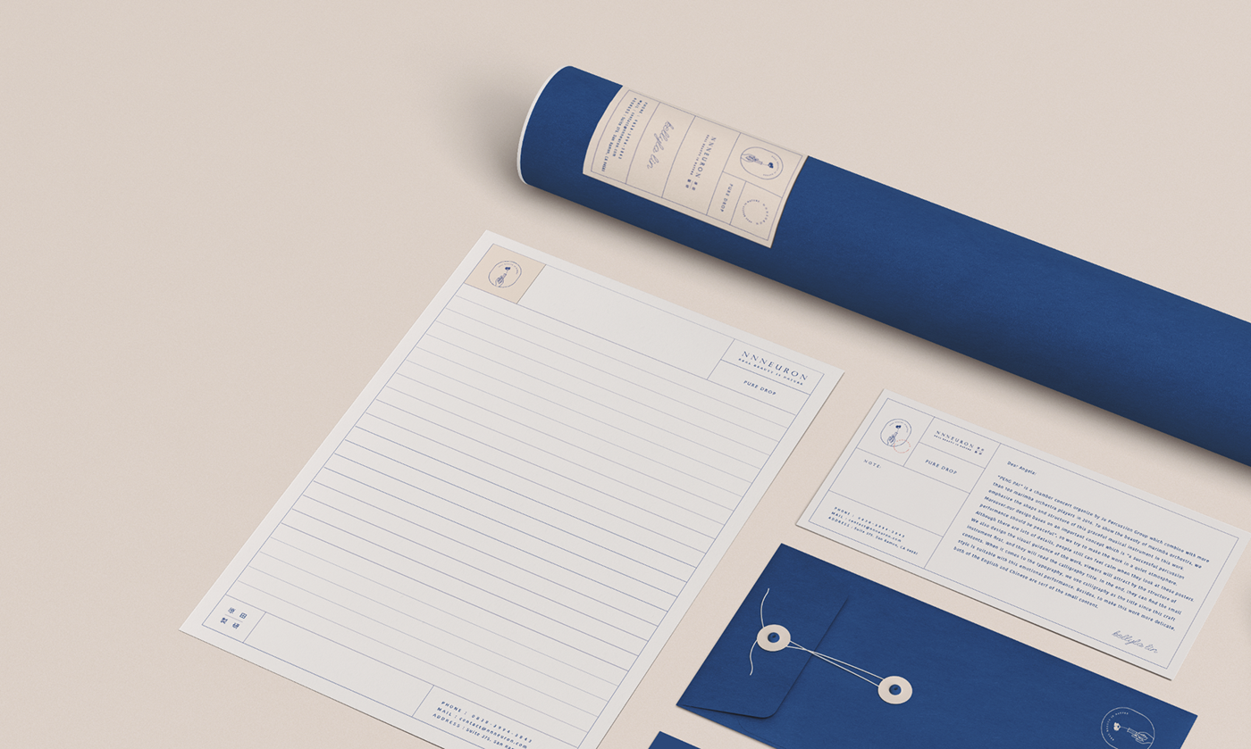
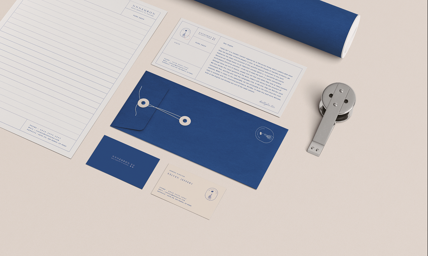
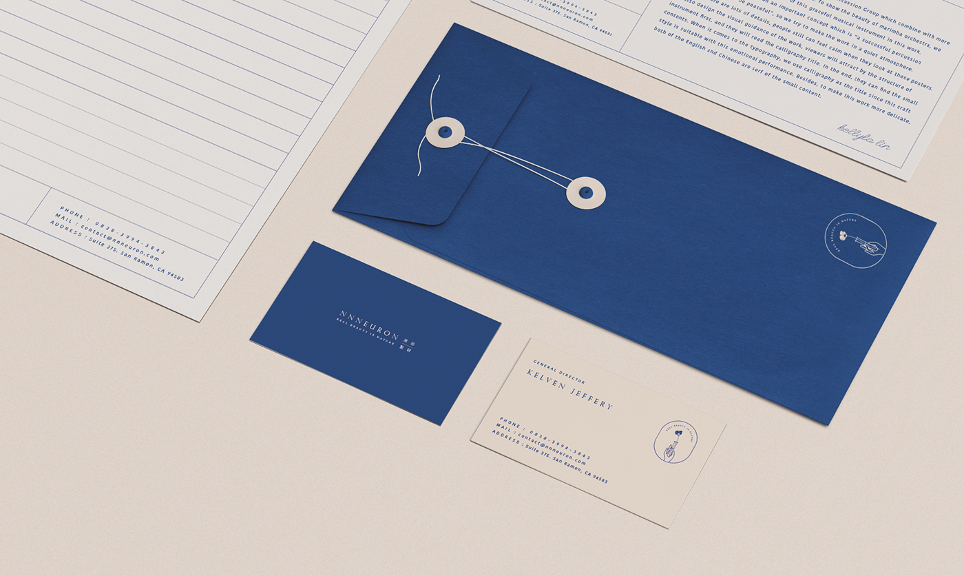
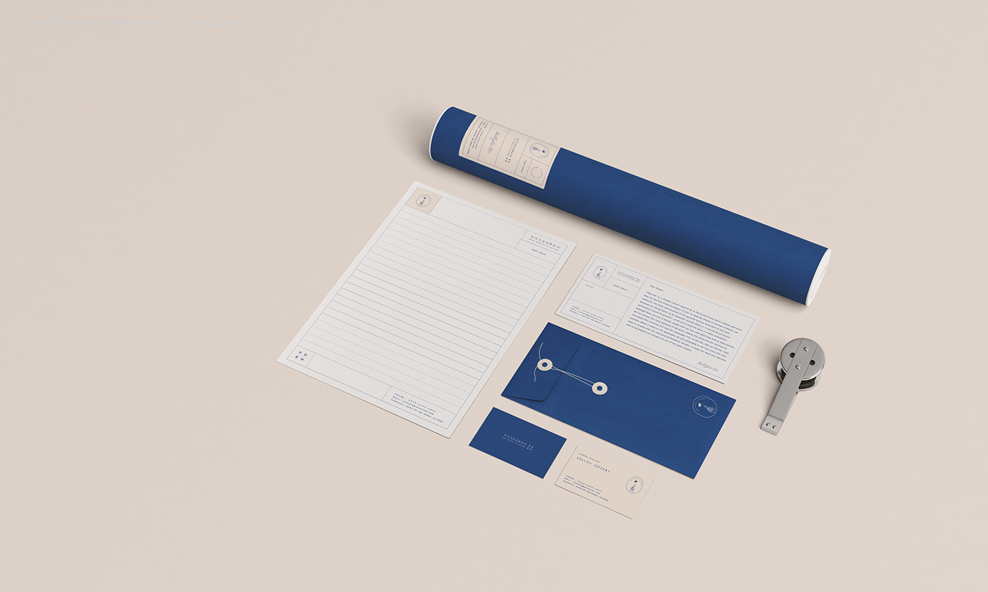
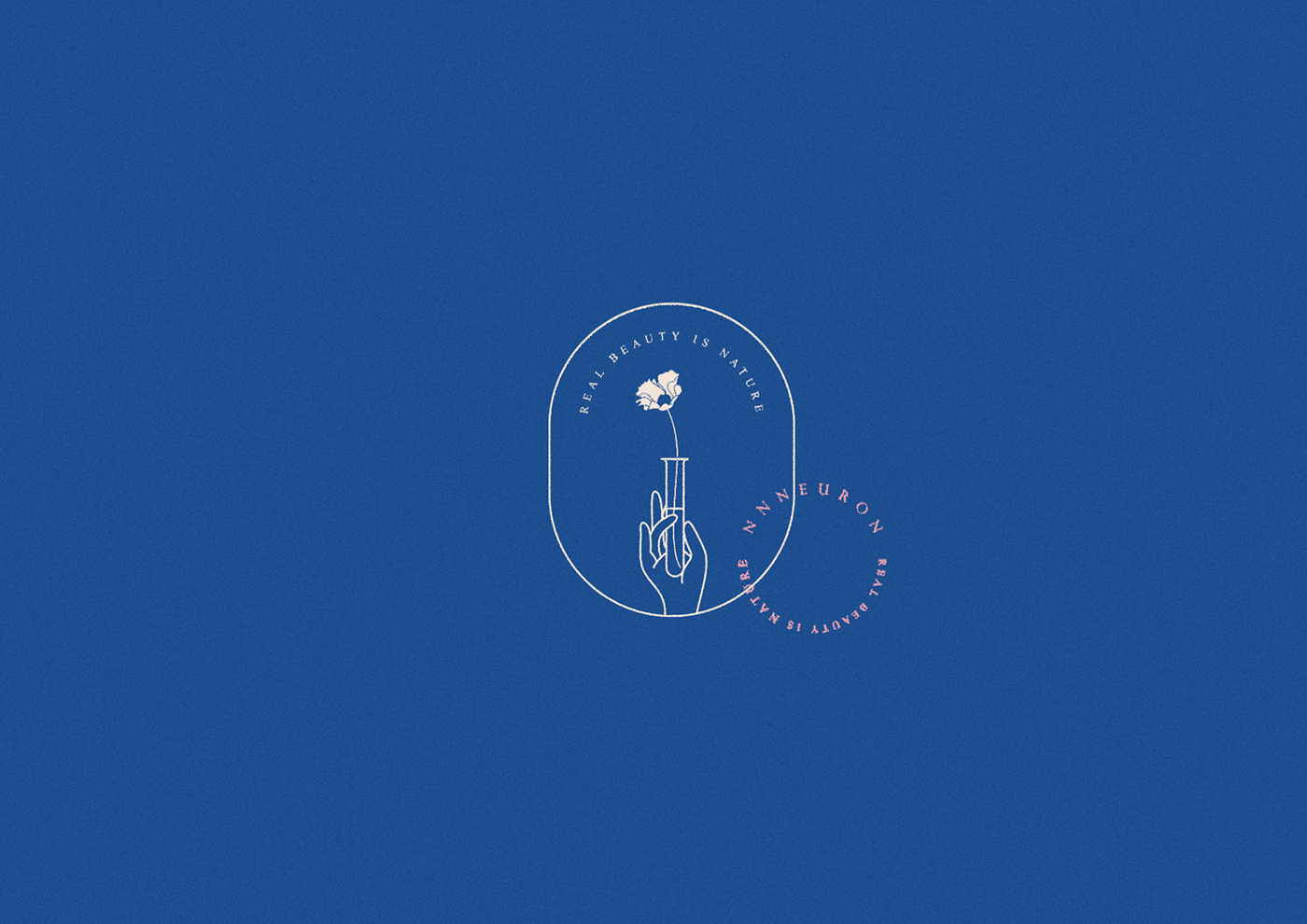
Nnneuron以妙手回春四字為主軸延伸了一系列的視覺應用,圖標中環繞試管為核心,手輕托試管,管中有ㄧ花,象徵品牌創新研發精神。Nnn的品牌色彩以帶有日式風格的配色膚色及藍色為主色調,膚色代表了肌膚,藍色則象徵純粹天然,雙色相襯出品牌獨特的美感及風格。為了凸顯品牌美學及專業,設計上以圖標內元素及標準字組成一組品牌圖騰,透過拆解圖樣成形,微妙的組成了增減自如的品牌圖案,可方便應用於各種畫面及情境。
Nnneuron uses 妙手回春 (miào shǒu huí chūn,a Chinese idiom referring to a doctor’s miraculous treatment which can bring back the dying patient) these four words as the main theme and creates a series of visual applications thereafter. The icons circle around the test tube with hands supporting it from beneath. Inside the tube stands a flower, which symbolizes the brand’s innovative spirit. Nnn’s brand features blue and peach color, matching the style of Japanese color scheme. The peach color (Chinese: 膚色fūsè,meaning “skin color”) represents the skin, and the blue color represents the pure nature. The two colors complement each other and build the brand’s unique beauty and style. To emphasize the brand’s aesthetics and profession, the elements and characters inside the icons comprise a set of brand symbols. Assembling and disassembling, the icons delicately form the flexible brand symbols that can apply to every scene and scenario.