Briefs Studio is an online based apparel company that produces luxury briefs and underwear for men. Their brand promise is maximizing the design experiences of softness, lightness and seamless.
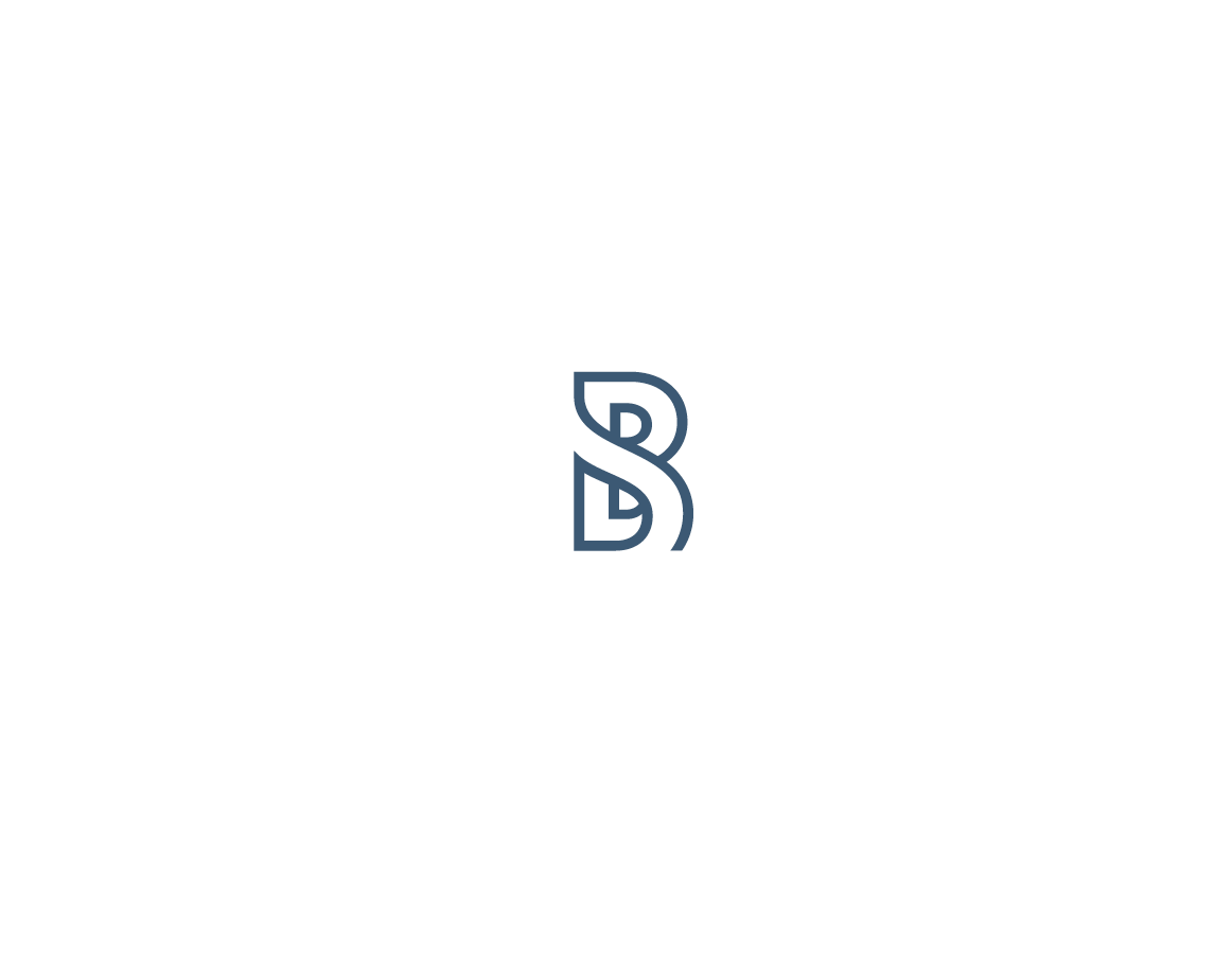
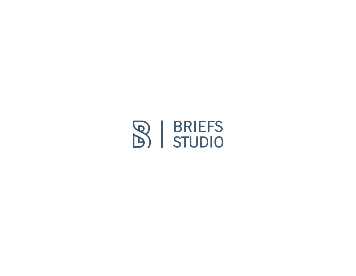
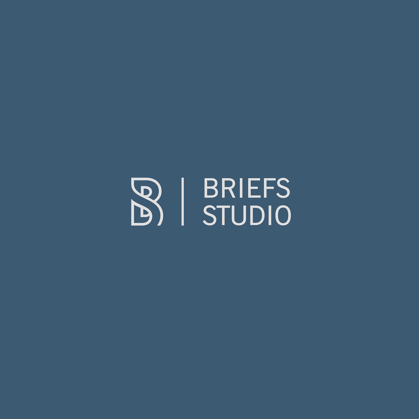
Since Briefs Studio is a dedicated brand to men, we wanted to keep the brand image of boldness while it may conflict to its product attributes: luxurious, modern, confident, intimate, seamless and light. Layering two initials, ‘B’ and ‘S’ was main idea to create a monogram to make it easy to be applied on a small tag that attached to the band of the briefs. After we studied typefaces, we decided to take Trade Gothic Bold as a based typeface. By outlining the letterform, the design satisfies both brand and product attributes successfully.


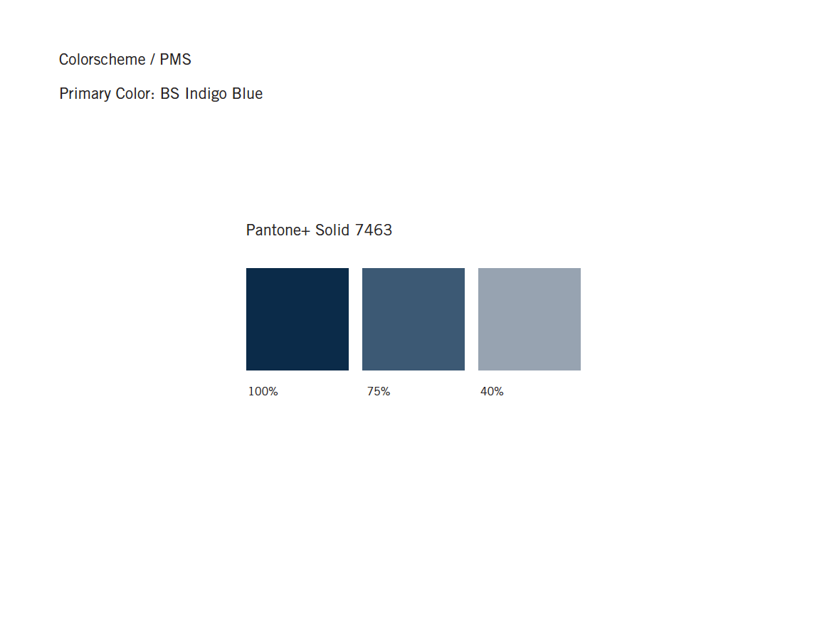

These deep dark shades of blue may appeal to the brand’s target audiences who are mid aged and appreciate high-end products for themselves. This “Indigo Blue”—inspired by interior designs of men’s bedroom and living space—brings the feeling of calm, relaxing and recharging from the bed with the finest linen back to the body by wearing their product that gives the ultimate softness.

Collection of symbol sketches from early design phases