


THE CHALLENGE
Stepping up UN Women Brand Aligmnment
Create identities for future initiatives, and campaigns while at the same time being immediately recognized as UN Women brand allowing visual diversity within the parameters of the mother brand. An incredibly diverse and global audience is one of the great challenges. It is intended to look fresh and contemporary, but can on the other hand not push the envelope too far to avoid alienating the more conservative segments of their actual audience.
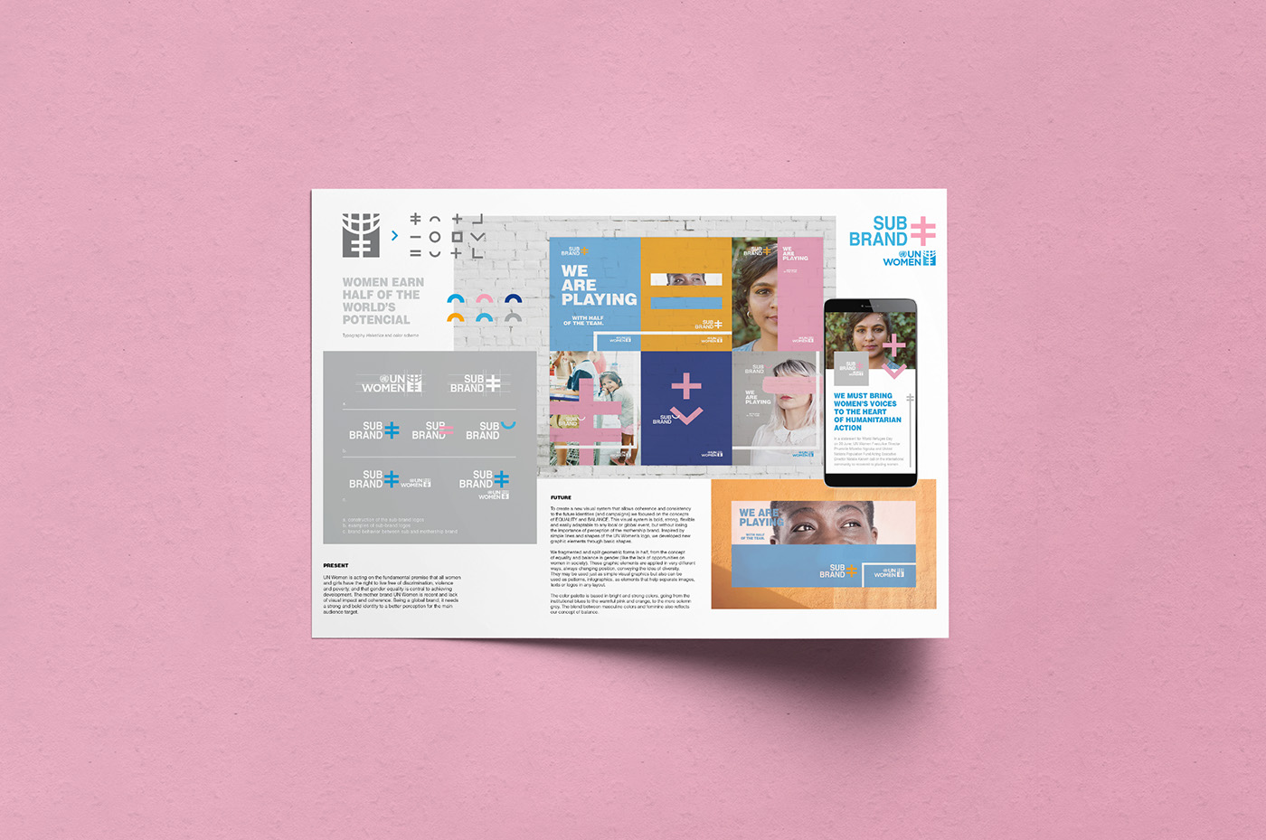
PRESENT
UN Women is acting on the fundamental premise that all women and girls have the right to live free of discrimination, violence and poverty, and that gender equality is central to achieving development. The mother brand UN Women is recent and lack of visual impact and coherence. Being a global brand, it needs a strong and bold identity to a better perception for the main audience target.
FUTURE
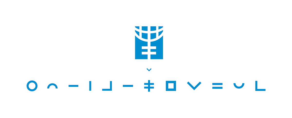
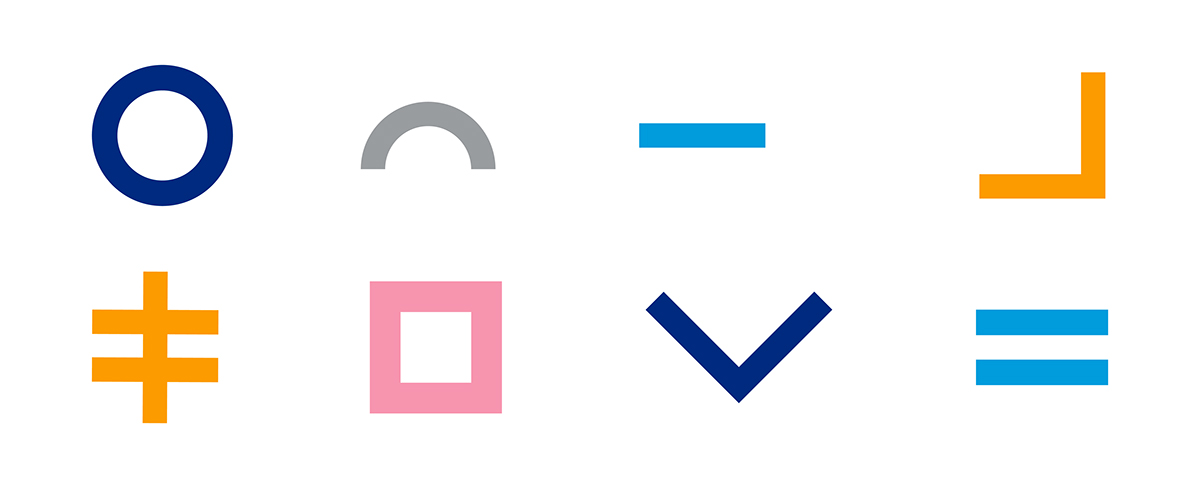
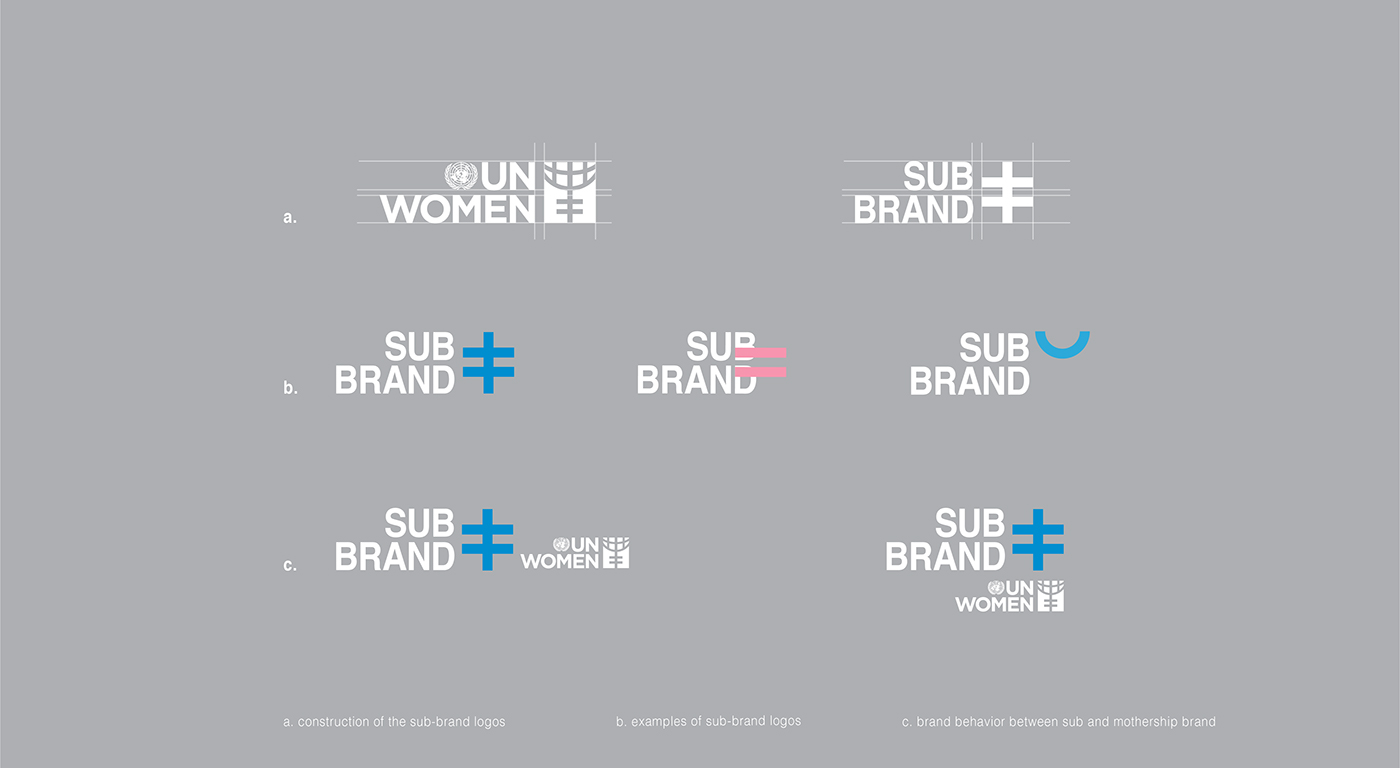
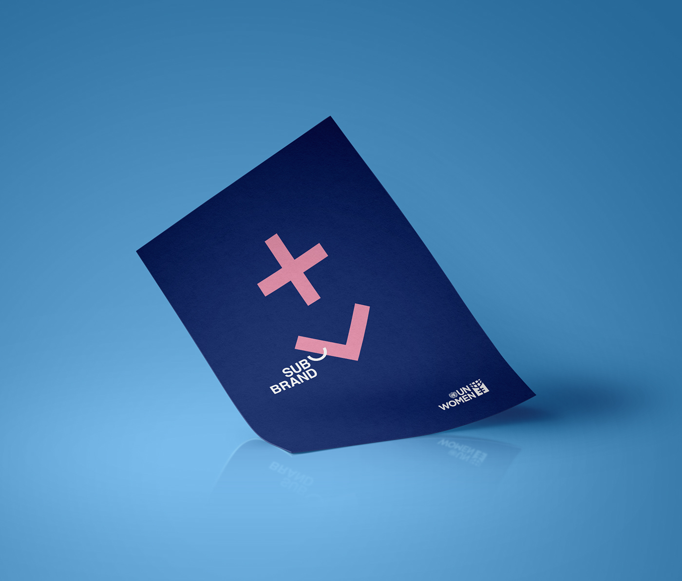
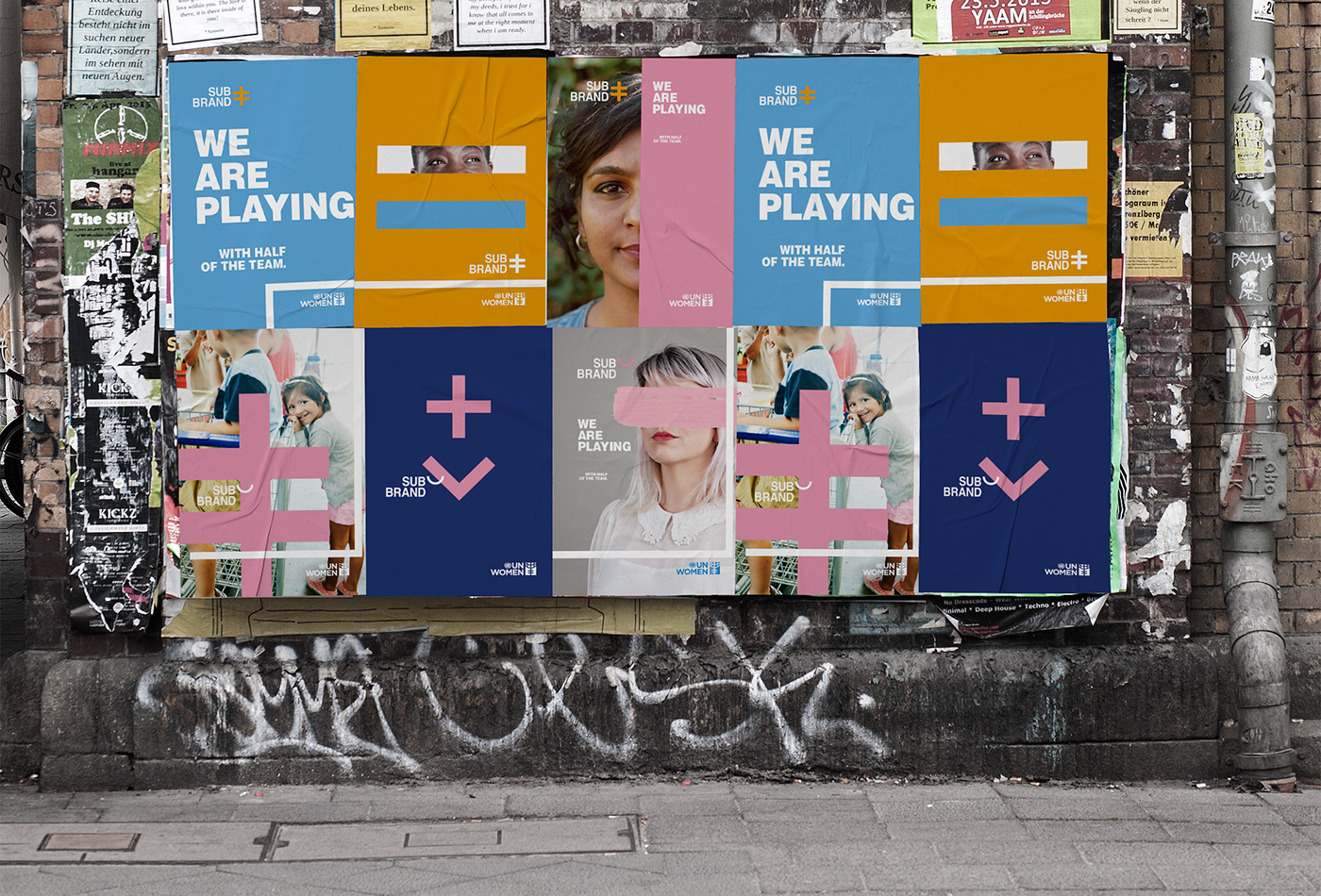
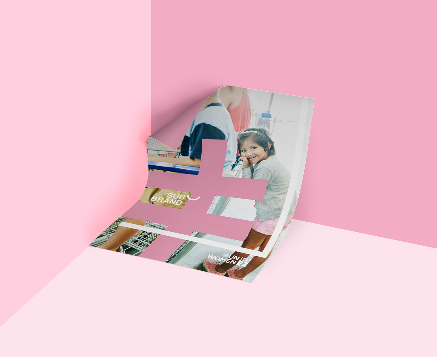
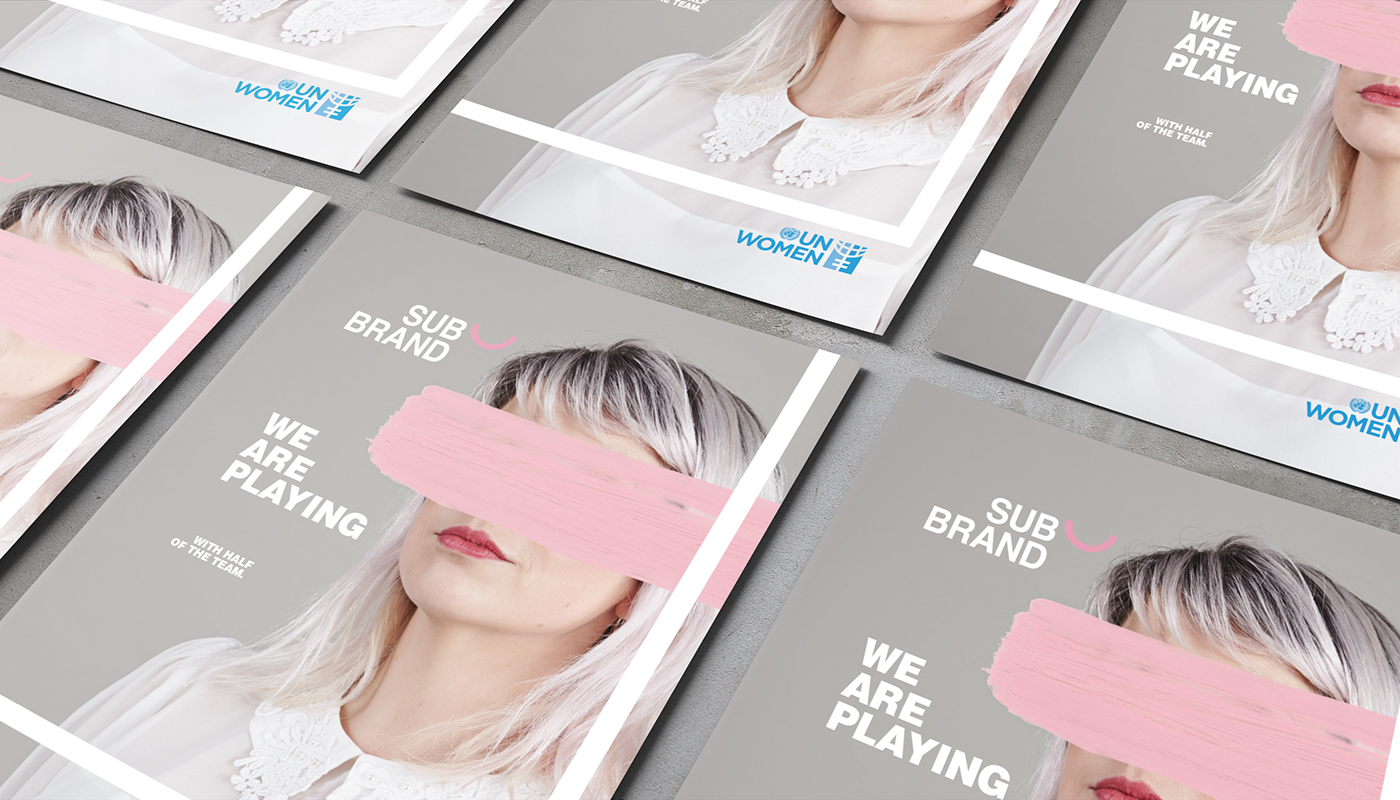
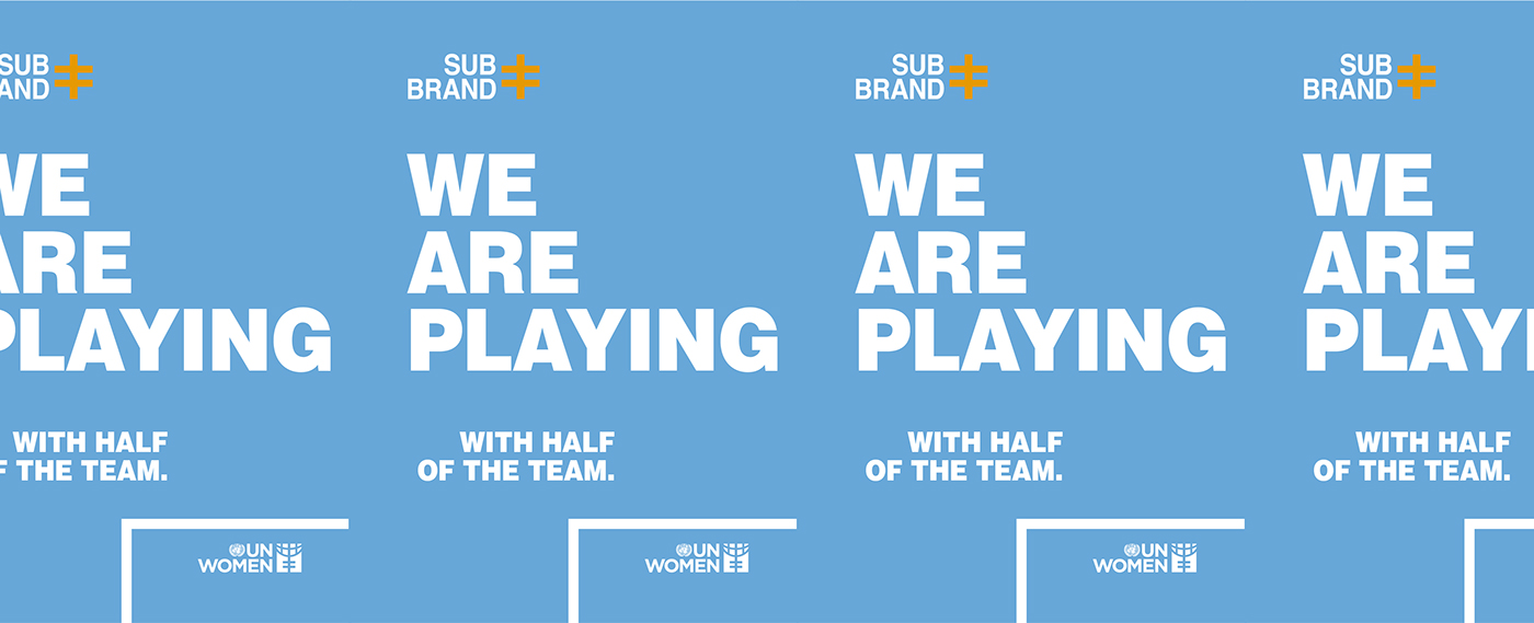
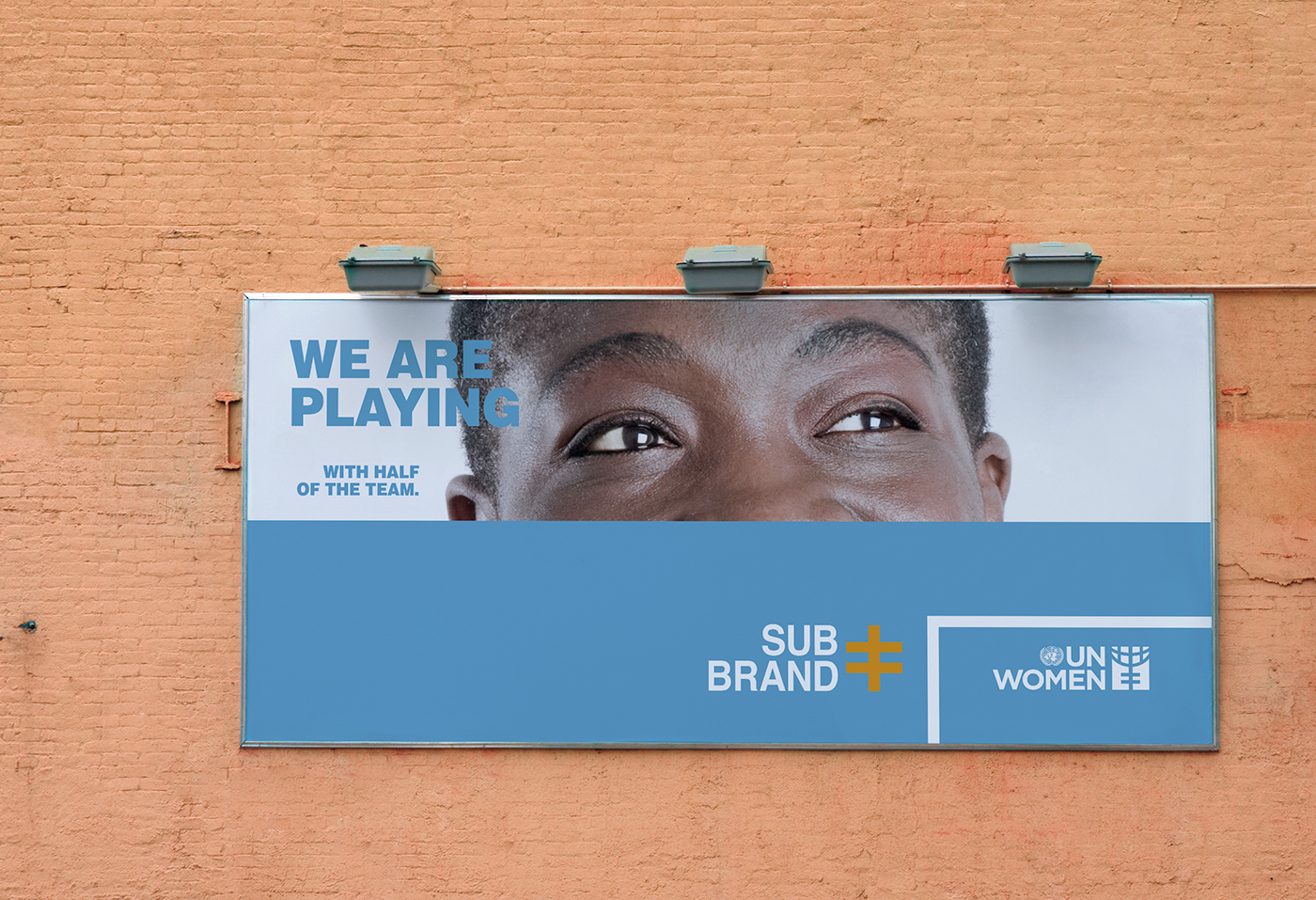
To create a new visual system that allows coherence and consistency to the future identities (and campaigns) we focused on the concepts of EQUALITY and BALANCE. This visual system is bold, strong, flexible and easily adaptable to any local or global event, but without losing the importance of perception of the mothership brand. Inspired by simple lines and shapes of the UN Women’s logo, we developed new graphic elements through basic shapes. We fragmented and split geometric forms in half, from the concept of equality and balance in gender (like the lack of opportunities on women in society). These graphic elements are applied in very different ways, always changing position, conveying the idea of diversity. They may be used just as simple visual graphics but also can be used as patterns, infographics, as elements that help separate images, texts or logos in any layout. The color palette is based in bright and strong colors, going from the institutional blues to the warmful pink and orange, to the more solemn grey. The blend between masculine colors and feminine also reflects our concept of balance.
Cannes Young Lions Design 2017
BRONZE
© gettyimages


