Punk Iberico
University Project / 2017
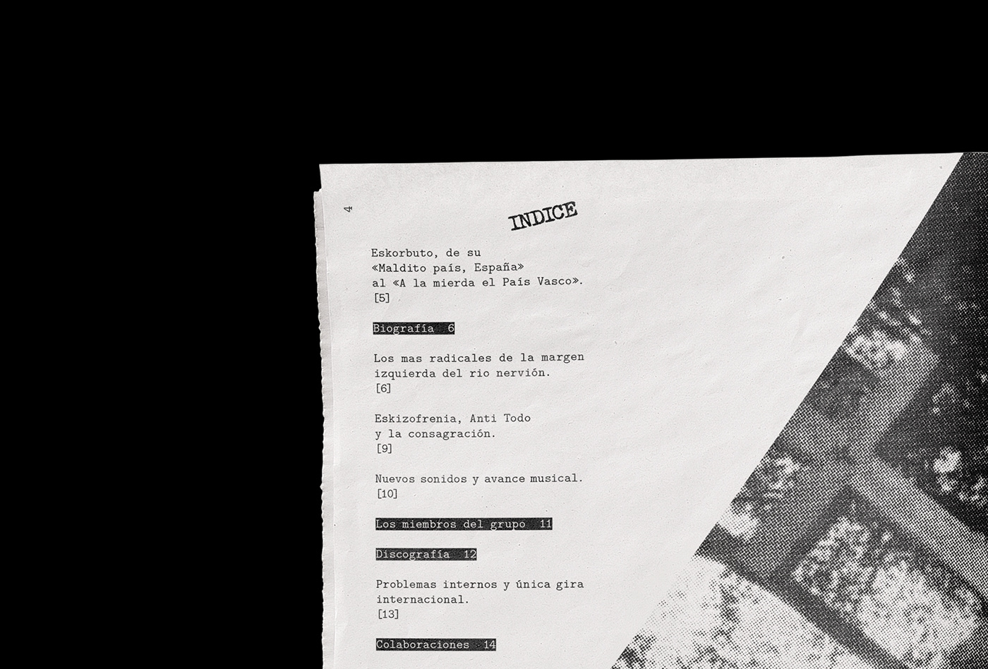
The work consisted of making a zine of a particular theme. I chose Spanish Punk ( Punk Iberico). As it is a musical style with a very distinctive aesthetic, it was easier for me to represent its essence through graphic resources and get the form out of the content.
The typeface choice for the cover refers to the punk concert posters, where they used to cut out the letters of newspapers and magazines to form the titles. The choice of a monospaced typeface for the featured articles refers to the punk zines, where the texts were written with typewriters. The layout tries to communicate another characteristic of punk: the chaos. The headlines, footers and photographs are crooked, giving the sensation of imperfection. The look of the photos imitates the typical moiré effect of a bad printing, to reinforce this chaos.


