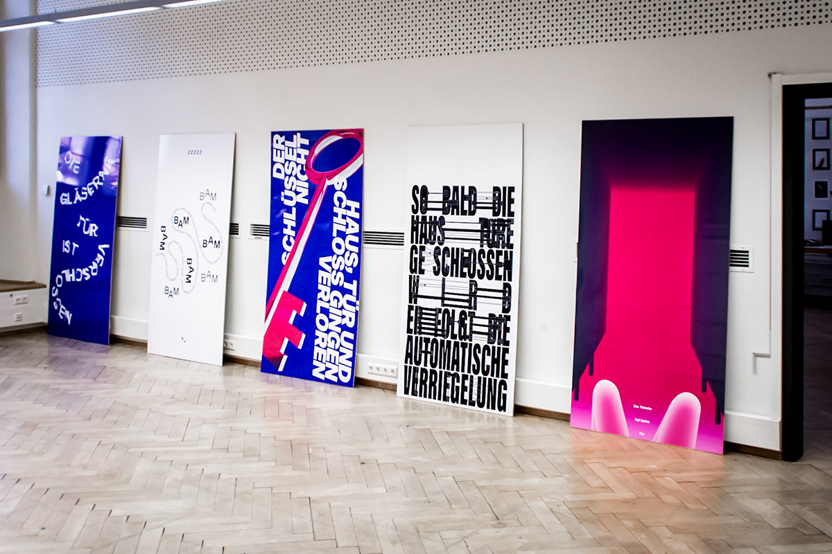
»Die Wichtigkeit des Banalen — Die Tür« (The importance of the trivial — The door) is a project about an object we encounter everyday in many different ways: we pass them, we decorate them, we make them safe and safer, we bang them. It is a project about the door, what it means to us and our lives.


The project consists of ten posters in the size of 1 × 2 meters. These posters are stacked behind each other and every now and then the poster shown changes. Every design is based on a found text fragment from various sources (for example ZEIT Magazine), which are used without the context of the original text. The fragment is selected by the way it tells about the door: sometimes it's a metaphor, sometimes it's a peculiar situation happening at doors, sometimes it just describes the object. The text is then translated into typography and graphics, always using the colors black, white, blue-violet and magenta.

These ten are part of a series of 56 other poster designs, which are presented in a white book. This layflat book is bound by hand and designed in a very simple way. The books main part is the typography (Sequel Sans by Oliver Jeschke), a typeface in the fashion of Swiss design. By using a purposeful, modernist type the poster designs come to the front — the editorial design is reduced to a bare minimum in order to not distract from the actual graphics. It's furthermore produced to not close fully: it's always a bit open, like some doors tend to do. The white paper imitates the daily usage of a door. After a while, it becomes dirty and looks like being opened many times — as does the door.


»Die Wichtigkeit des Banalen — Die Tür« was created as my bachelor degrees work from May to September 2017
Art Direction Felix Buhler
Consultants Prof. Herbert Moser, Prof. Dr. Holger Lund, Christian Mariacher, Florian Tscharf