美玲體 | Mei-Ling Font
AD+D | Rong-Chen, Wei
Project|Personal
Sep. 3, 2017
-
創作背景 Background
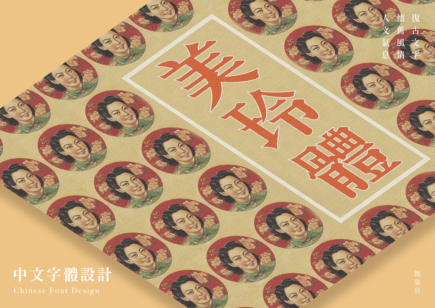
自己一直很喜歡復古的文字與風情,也在網路上收集收集許多民初年代的海報以及印刷品,開啟決定做復古文字的動機。
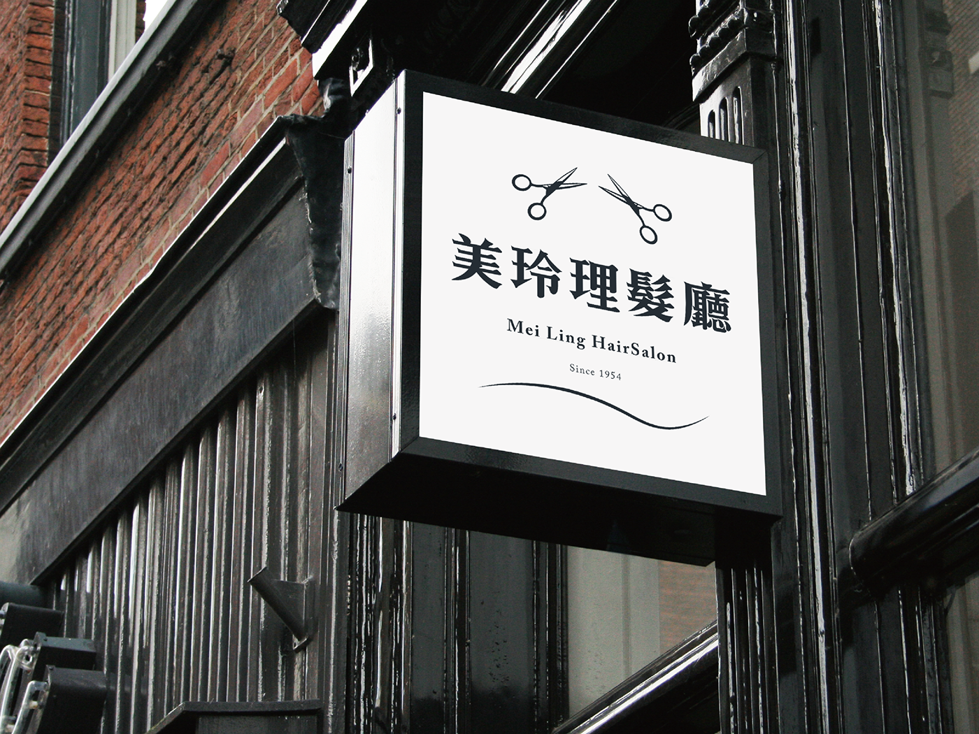
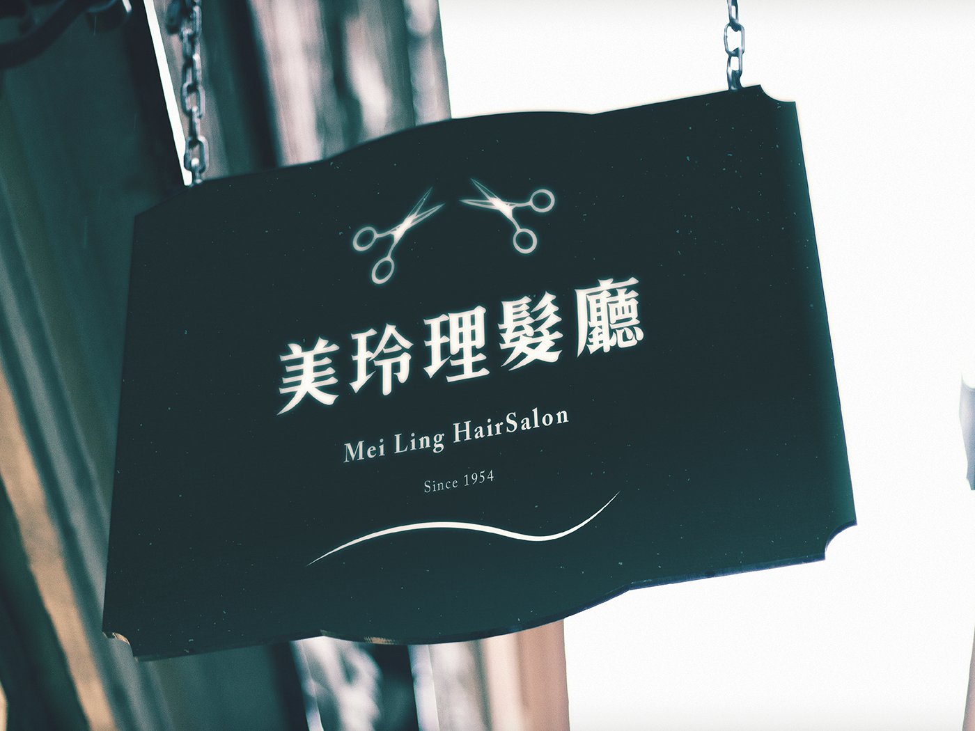
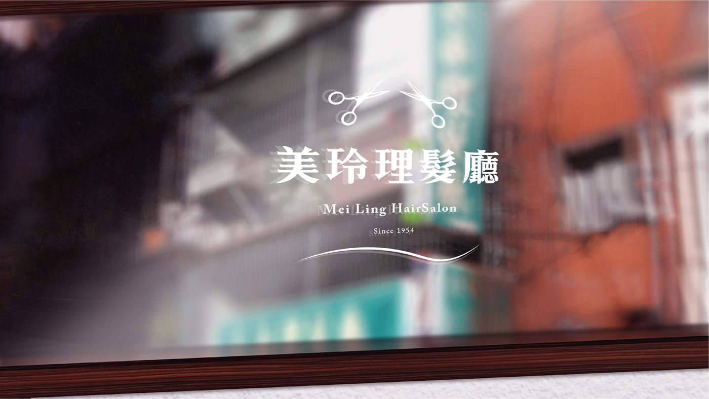
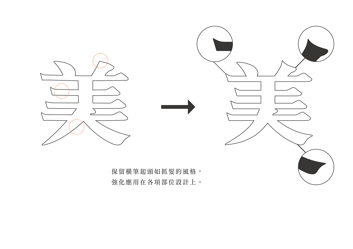
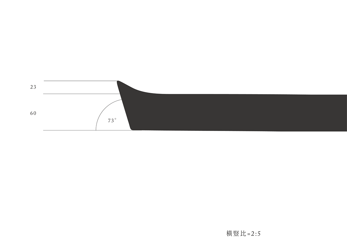
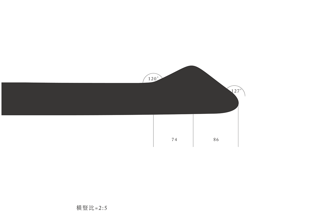
美玲體的想法來自街道文字(下圖),橫筆起頭如抓髮為主要特色,重心偏低與舒展的中宮,給人一種沈穩、親切、復古、大方的感覺。美玲體的名稱由來,是從圖片的『美』字出發,因此我保留了『美』這個字。之後思考美體或美明體,似乎好像沒什麼特色,就想到父母那代的菜市場名字美玲、美和、美麗,最後就定出了美玲這個名稱,代表了過去時代,漂亮且大方親切的韻味。
I really like vintage stuff and culture. Also, I collected a lot of the 40's & 50's poster and printed matter.
The idea of Mei-Ling Font originated in Handwriting from the street(the following image). The main feature of Mei-Ling font is at the beginning of horizontal stroke which is like hair standing up.The name of font came from the most usual Chinese name of ladies in 40s' & 50s', called Mei-Ling, Mei-Ho, Mei-Li. Therefore, Mei-Ling Font represents the old-style fashion, beauty and kindness.
觀看更多:美玲體應用
註:美玲體為概念性設計,尚未進行字庫發展,目前僅以客製方式製作。


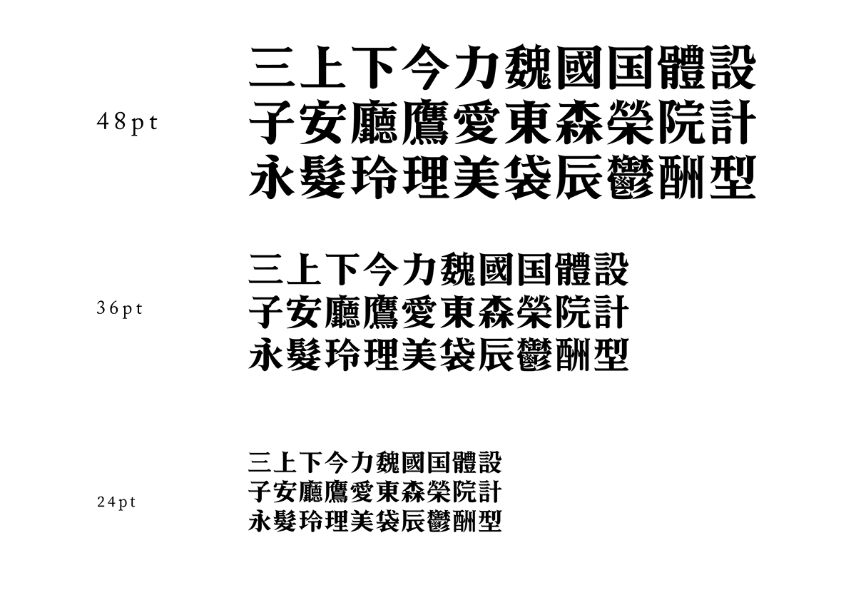
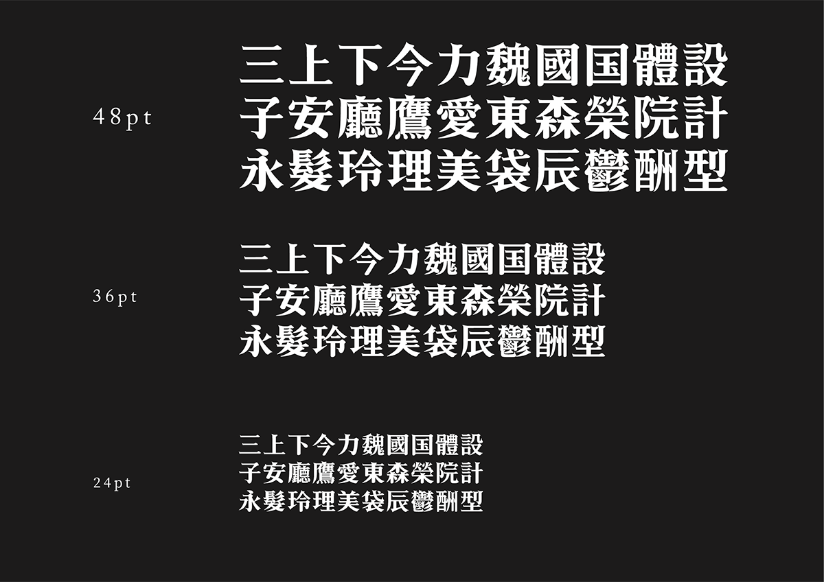
第一階段字型成果 Demo I
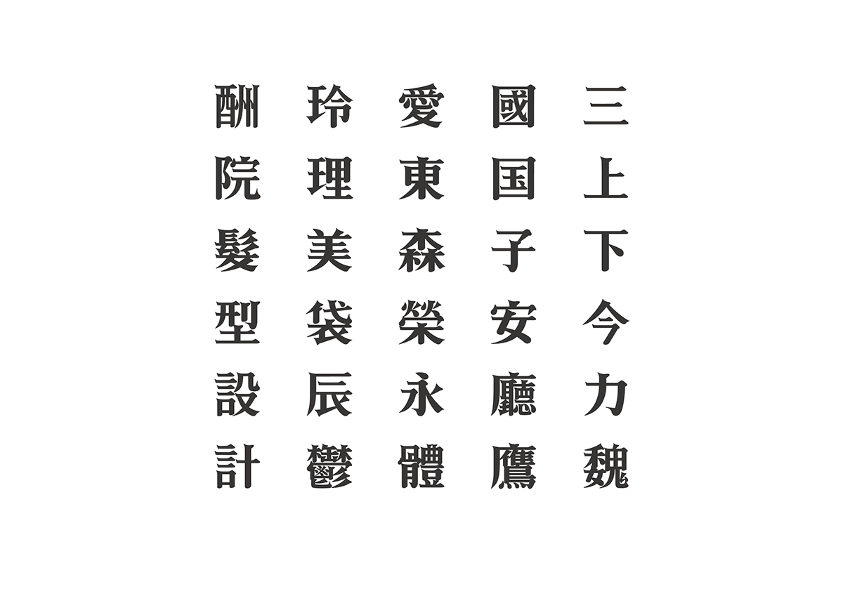
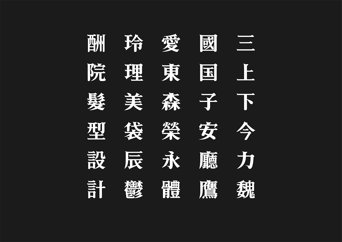
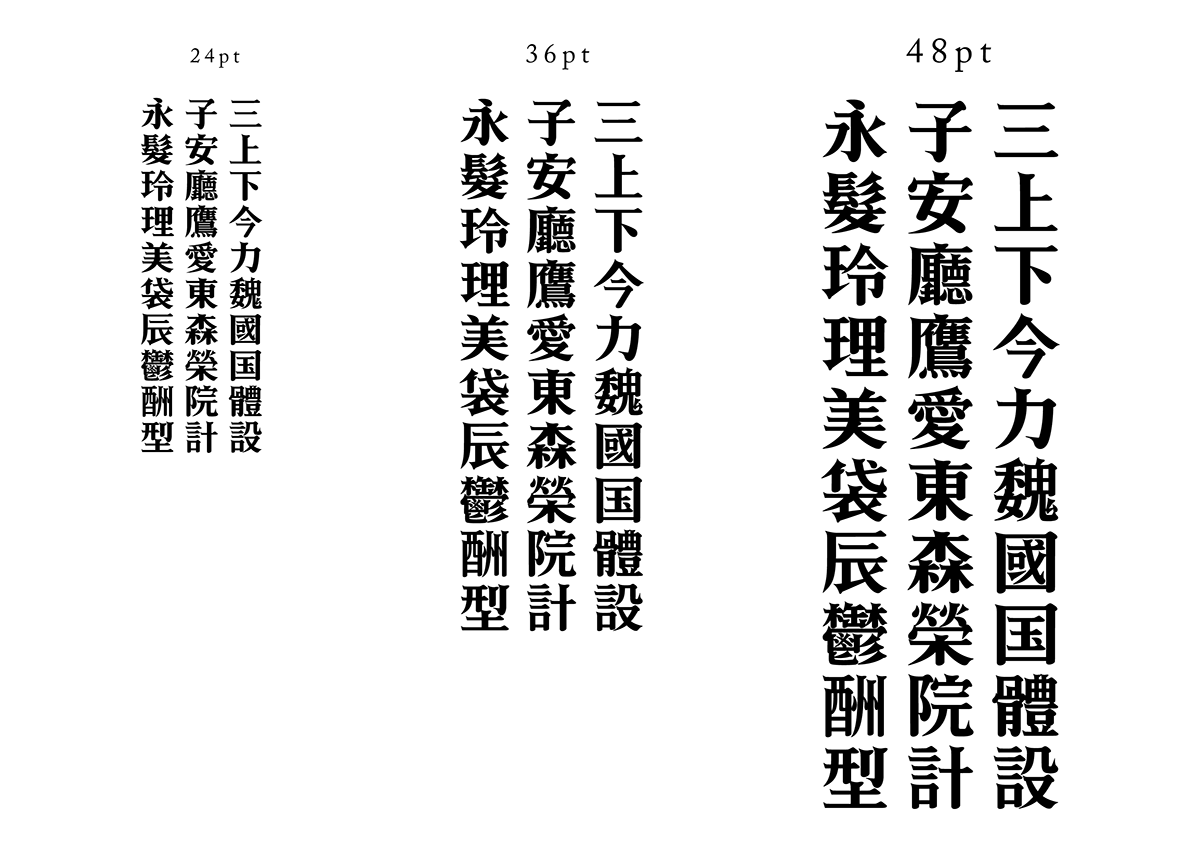
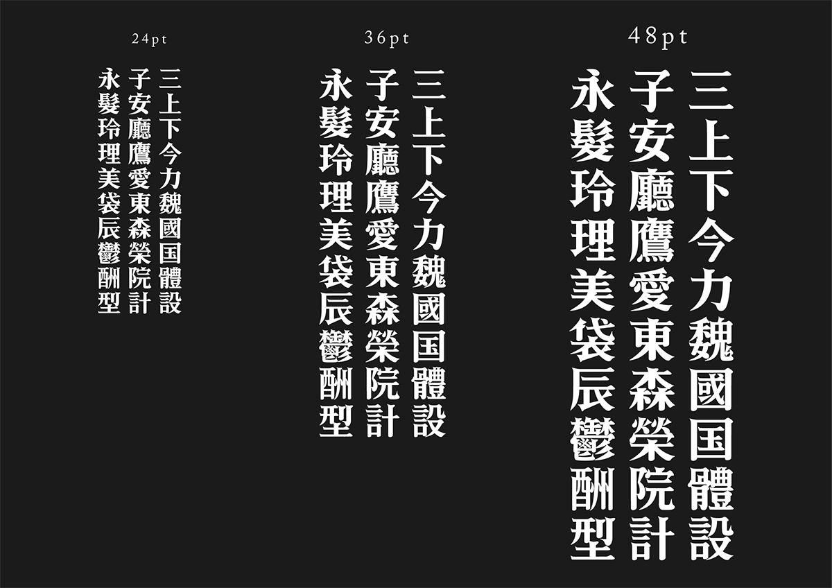
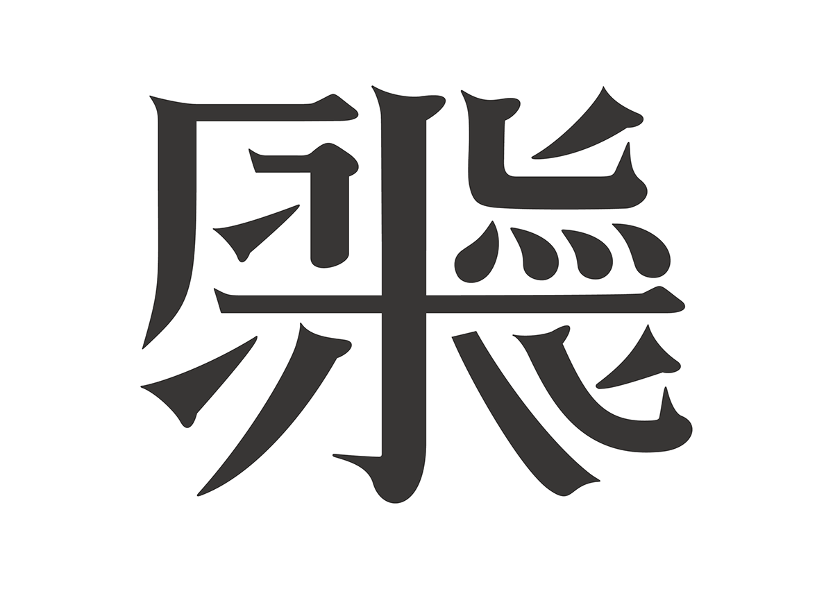
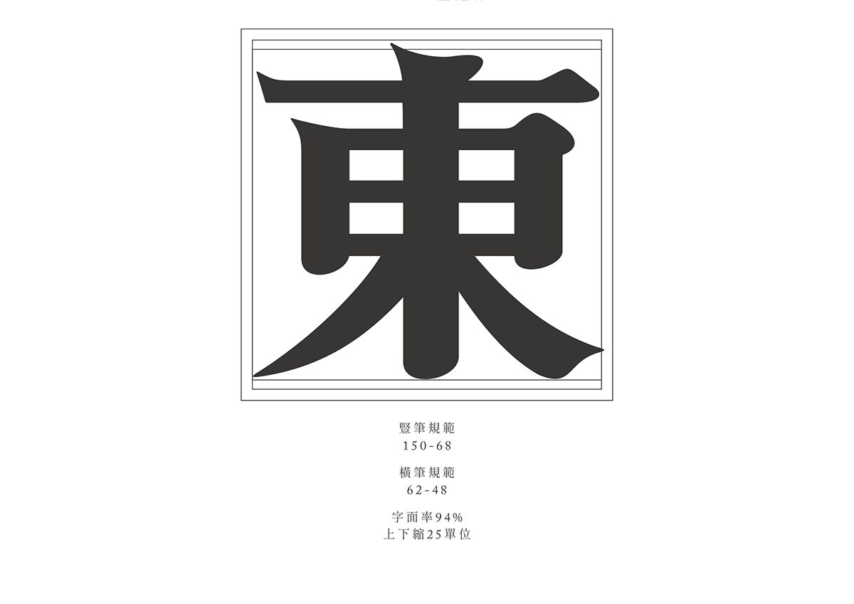
從15個基本造字(東、國、今、力、三、子、安、鷹、愛、永、袋、鬱、酬、上、下)開始,另外15個字則是自己的名字以及當初為理髮廳設想的招牌字樣。