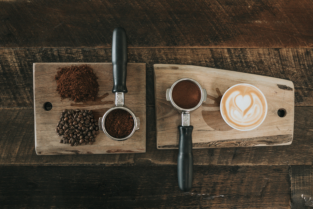


The first steps in designing the brand identity for Brightcup cafe was to create the logo. It had to reflect the main values of the brand which are warmth, energy, relax and comfort. I began thinking about the name Brightcup and how I can convey the meaning of it. After many iterations I decided to create a mark combining 3 elements – sun, cup and coffee bean.


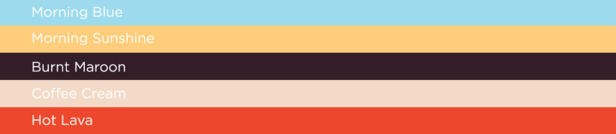
Choosing the colour scheme was the next decision I had to make again in coherence with the brands values. I chose pastel tones of yellow and blue that convey relaxation, beige and brown as earth tones for comfort and an accent orange for that spike of energy coffee gives you.


The final part of the identity was to create the cup and packaging design. Brightcup roasts coffee on their own and they needed a stand out packaging for it that shows how much they appreciate and value coffee.

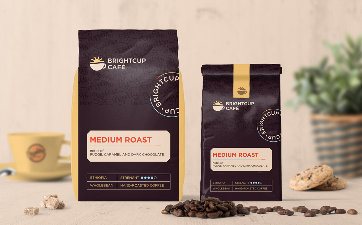


One of the most engaging and unique brand touchpoints of Brightcup Cafe was their special edition coffee beans line called Origins. Here they offer 3 types of coffee beans – Arabica, Robusta and Racemosa (one of the rarest coffee variety). Coming from the name Origins they wanted each packaging to reflect the origin of the coffee variety. To gain deeper undestanding I had to research and study the specifics of each of the countries the coffee came from. The graphics had to be instantly associated with the country of origin so I got inspired by the brazilian carnivals, the vietnamese Non la (leaf hat) and the african savanna.