


About
HS Medical is the polish company that sells automated external defiblirators (AED)
Story
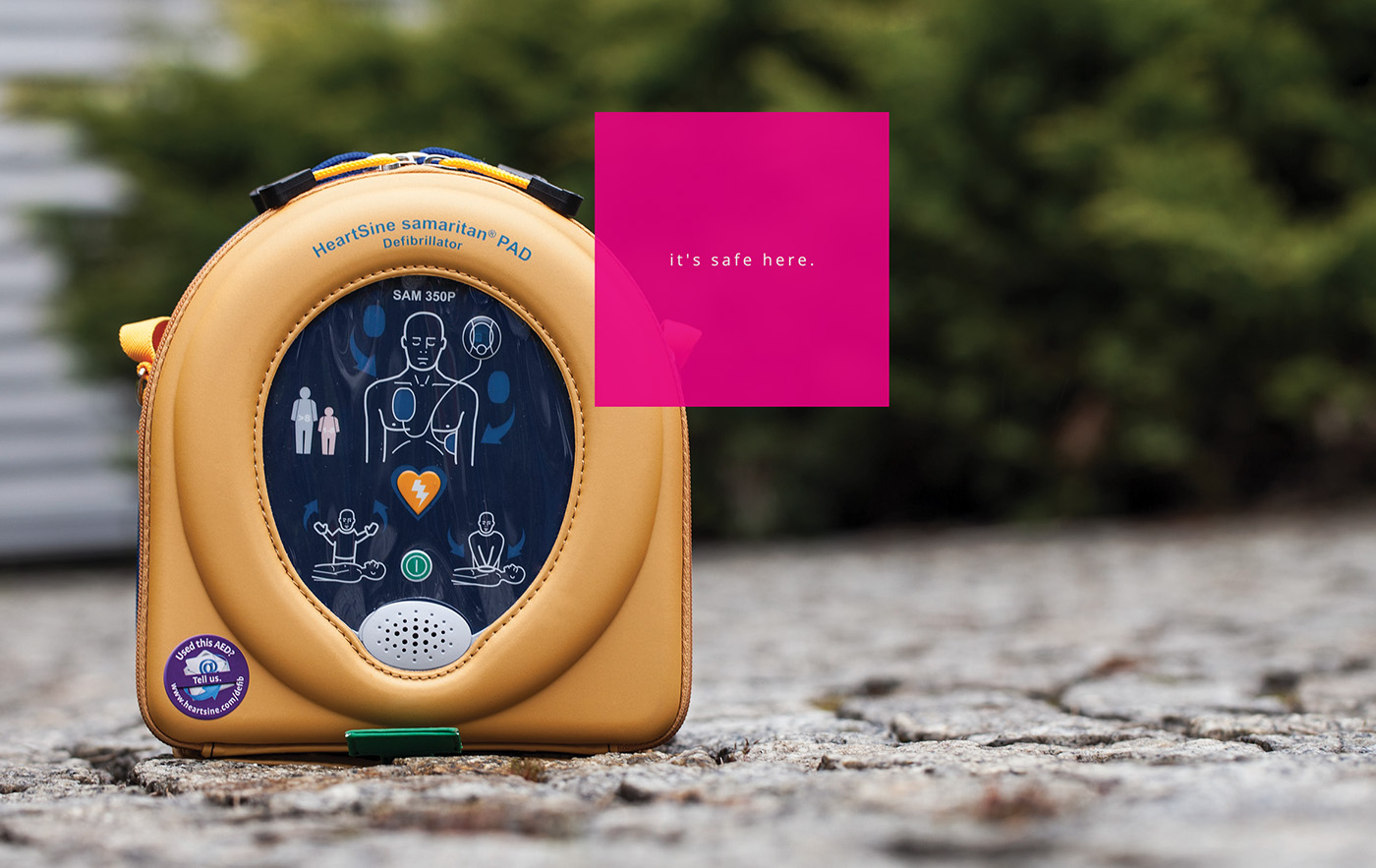
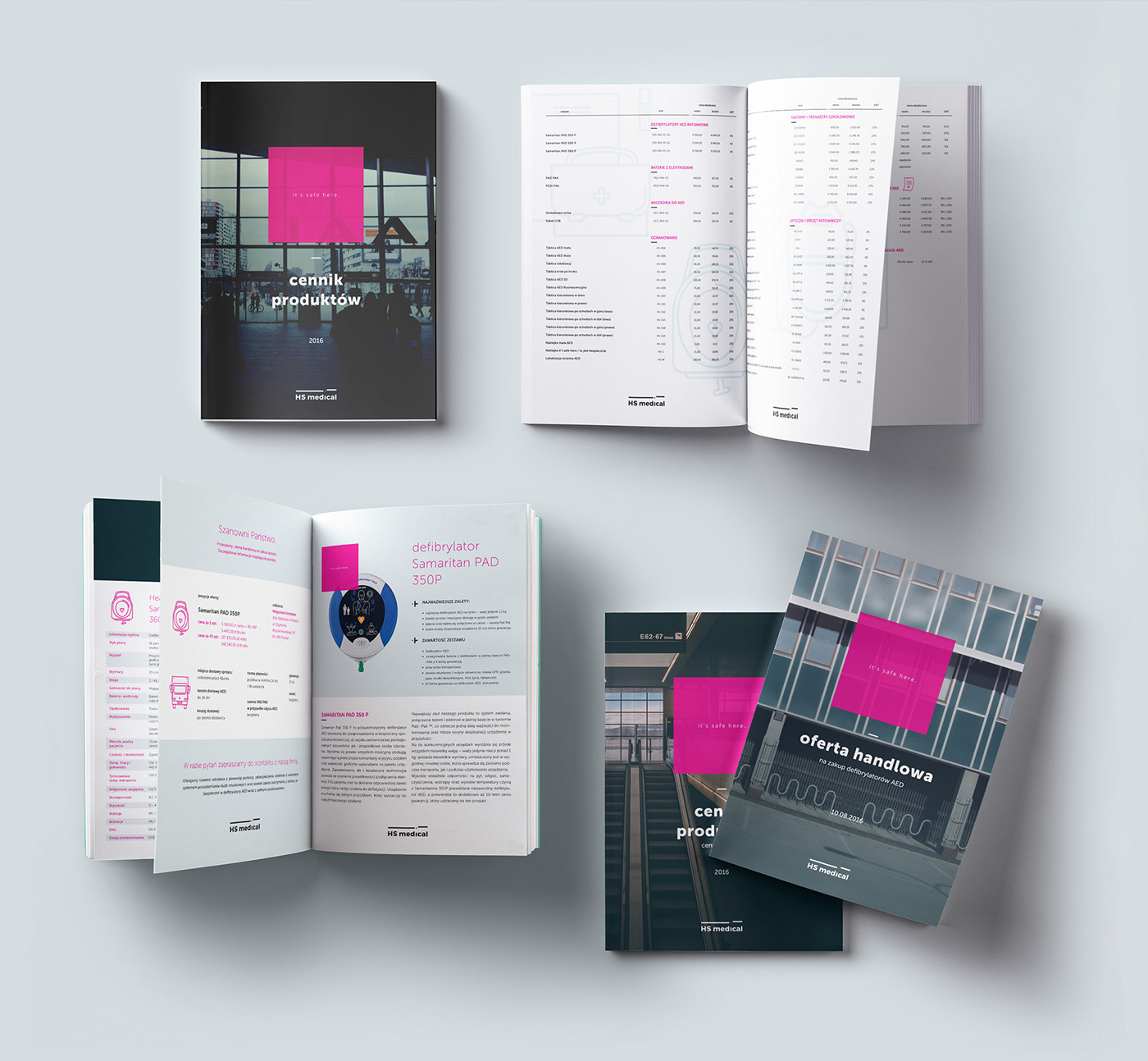
Safety of the place is the core idea of our brand strategy for HS Medical. However simple this may seem, on AED polish market this approach is an innovation. Instead of focusing on the people, we use photographies of the different places with magenta square on them saying “it’s safe here”.
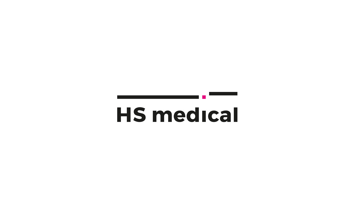
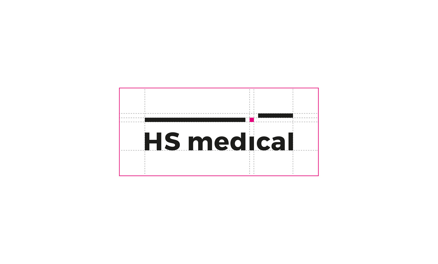
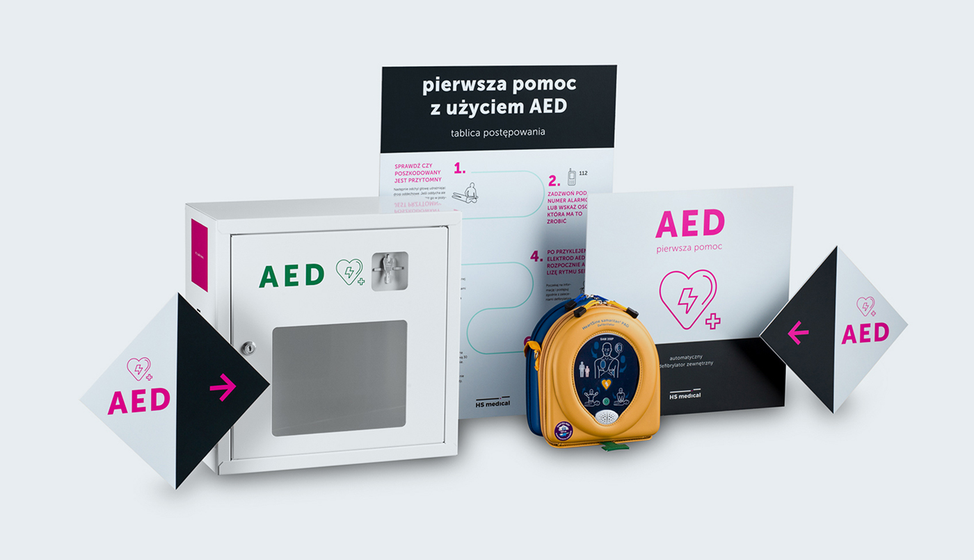
Logo was inspired by EKG line and “wayfinding moodboard”. It represents the line of life energized by “pink square” to go up. Sygnet is also a part of wayfinding showing where the AED is on location map. (pink square).
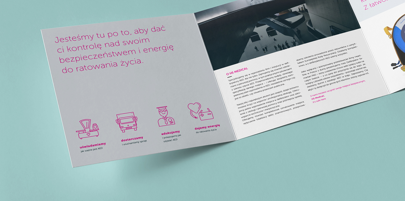
In projects, we use combination of dark blue, mint color and magenta. The strong magenta represents HS Medical energy to safe life. On other hand, mint color calms the whole visual identity and it refers to medical market.


Creative & Art Direction: Paweł Krzciuk
Graphic Design: Aleksandra Badura, Agata Bogomaz
Web Design: Mateusz Streszewski
Graphic Design: Aleksandra Badura, Agata Bogomaz
Web Design: Mateusz Streszewski


