
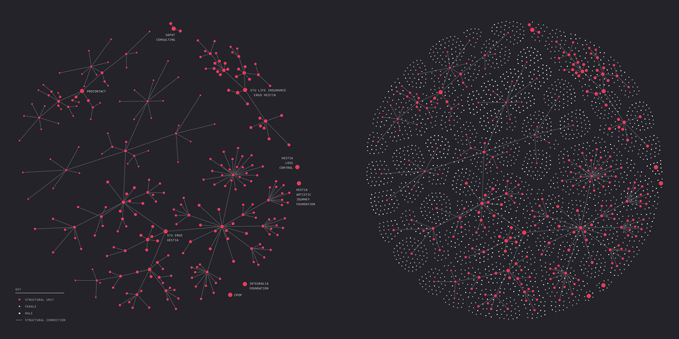
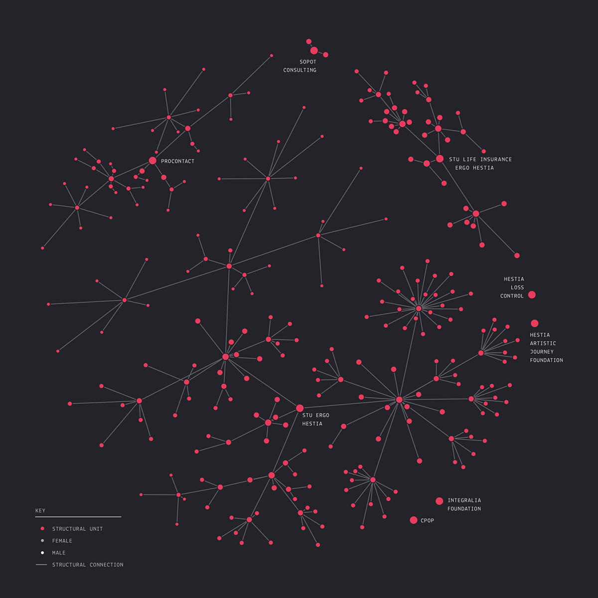
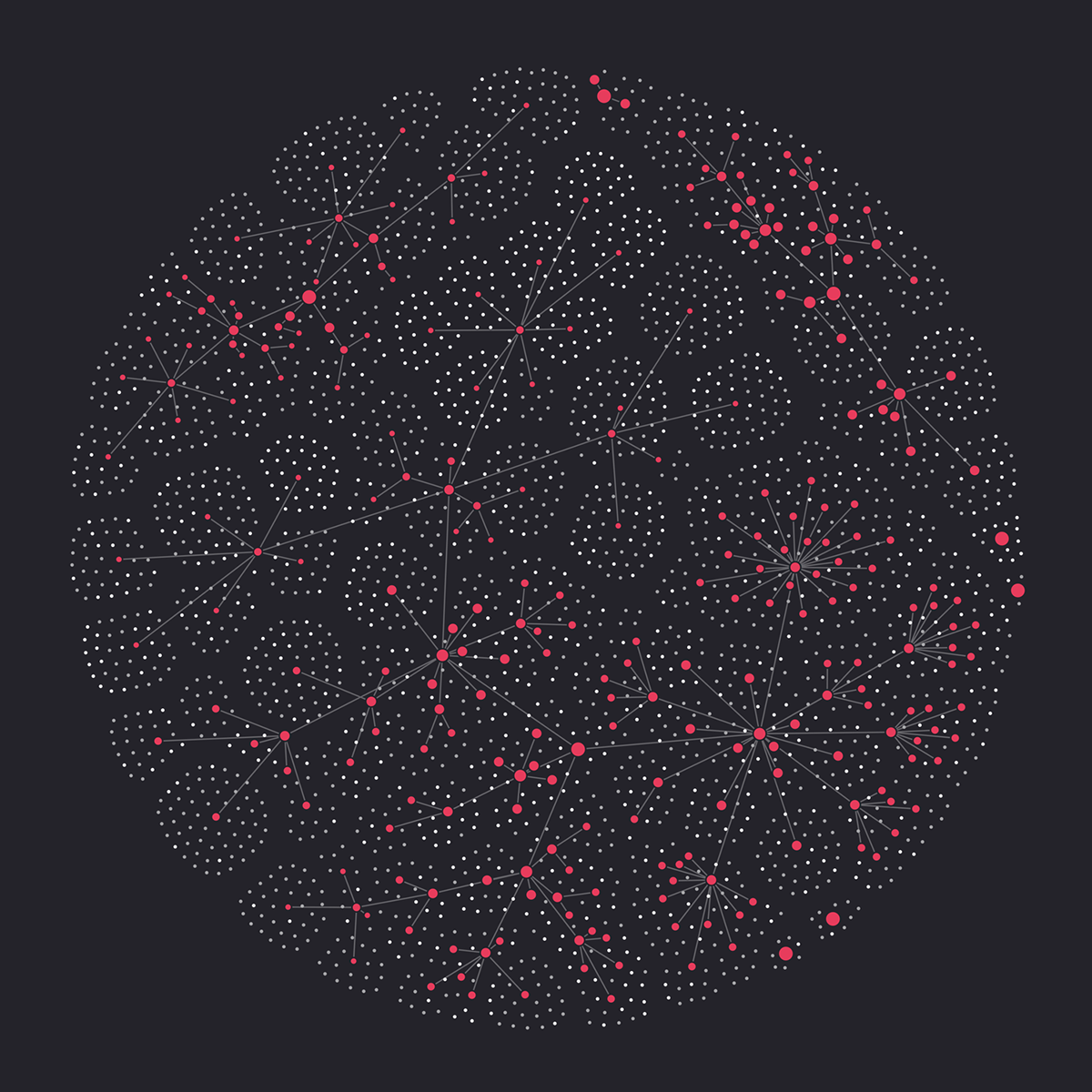
This work is a part of my design for the Annual Report of the ERGO Hestia Group, which involves a range of complex data visualizations concerning the notion of Network.
This visualization relates to the Network in the context of structural connections within the company. Red dots represent particular partnerships and foundations, divisions, offices and teams, branching off to smaller units. Their size corresponds with their place in the hierarchy (division being larger than office, office larger than team etc.). The lines, in turn, symbolize the connections between them.
The sphere on the left represents only the structural units, while the second one includes the people into the image. The employees of each office are symbolized by the smallest dots – grey (women) or white (men). By distributing them regularly, I wanted to bring out symmetrical relations on a human to human level. The whole picture resembles a cell – a precisely structured, necessary, but still only a small part of a larger organism of the company.
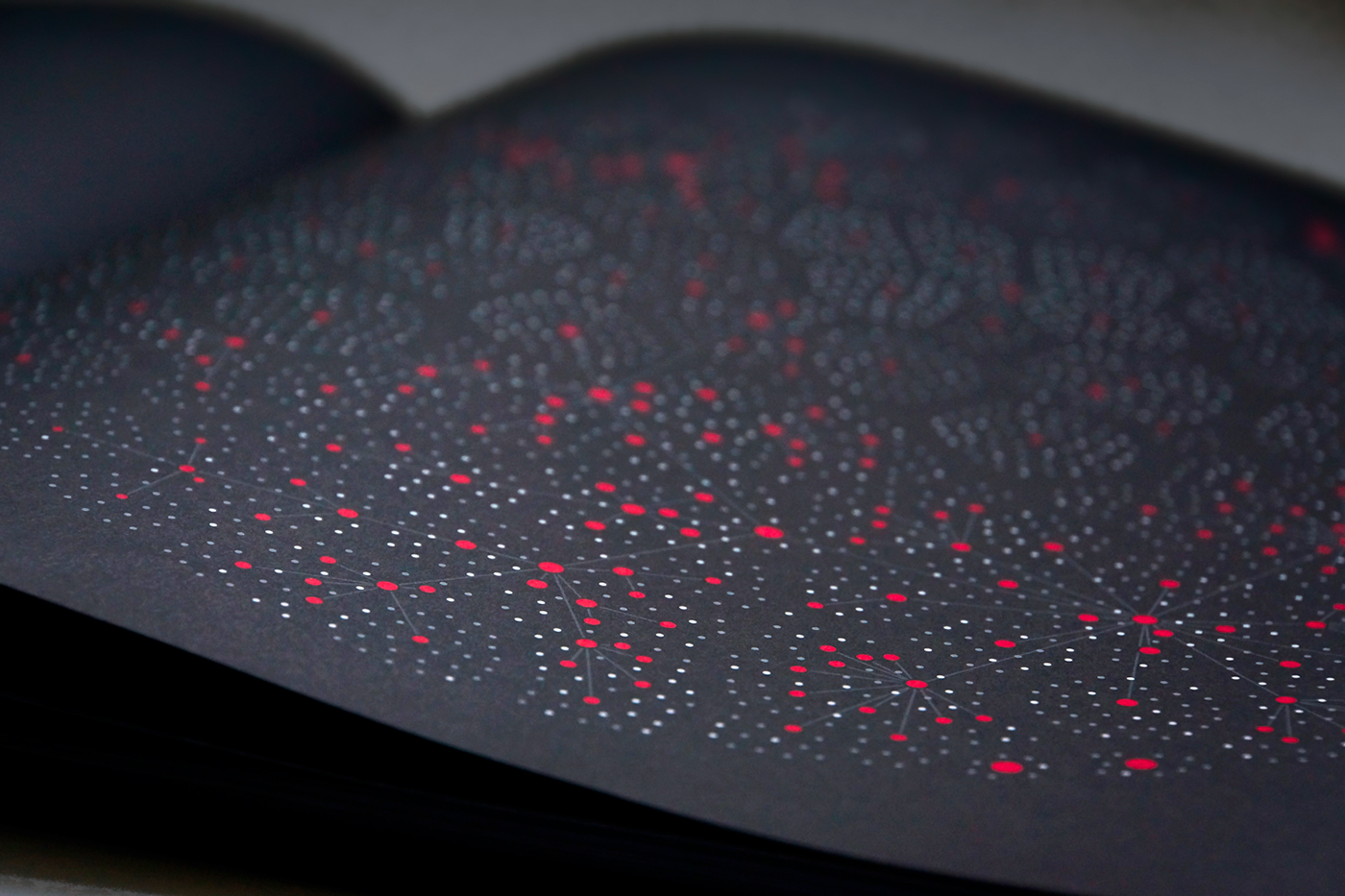
It was printed and exhibited as a part of the ERGO Hestia Annual Report. You can see other visualizations and the printed book here.