K+
The brand encompasses a gallery space, a retail space, and a workshop space. K+ works with different collaborators to present an ever changing line-up.
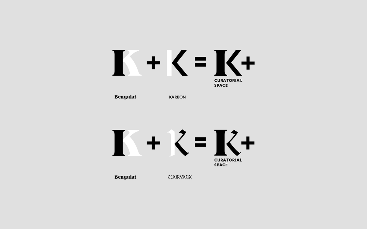
As a new brand, we had the chance to work on its branding from the very start, on a clean slate. For the name we proposed "K+". The letter "K" is derived from Kinetic, the name of the company curating the space. The "K" is the paired with a plus sign to signify collaboration.
In application, when "K+" is placed side by side with a partners name/logo, it clearly spells a joint effort. The same thoughtfulness is reflected in the typography of the K+ logo which consists of a constant and varying element to better complement the varying styles of varied collaborators.