


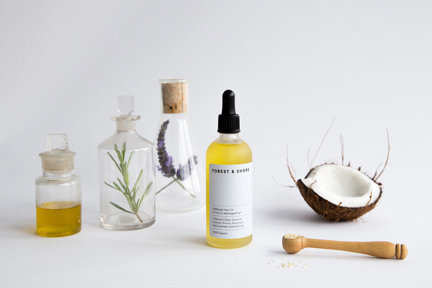
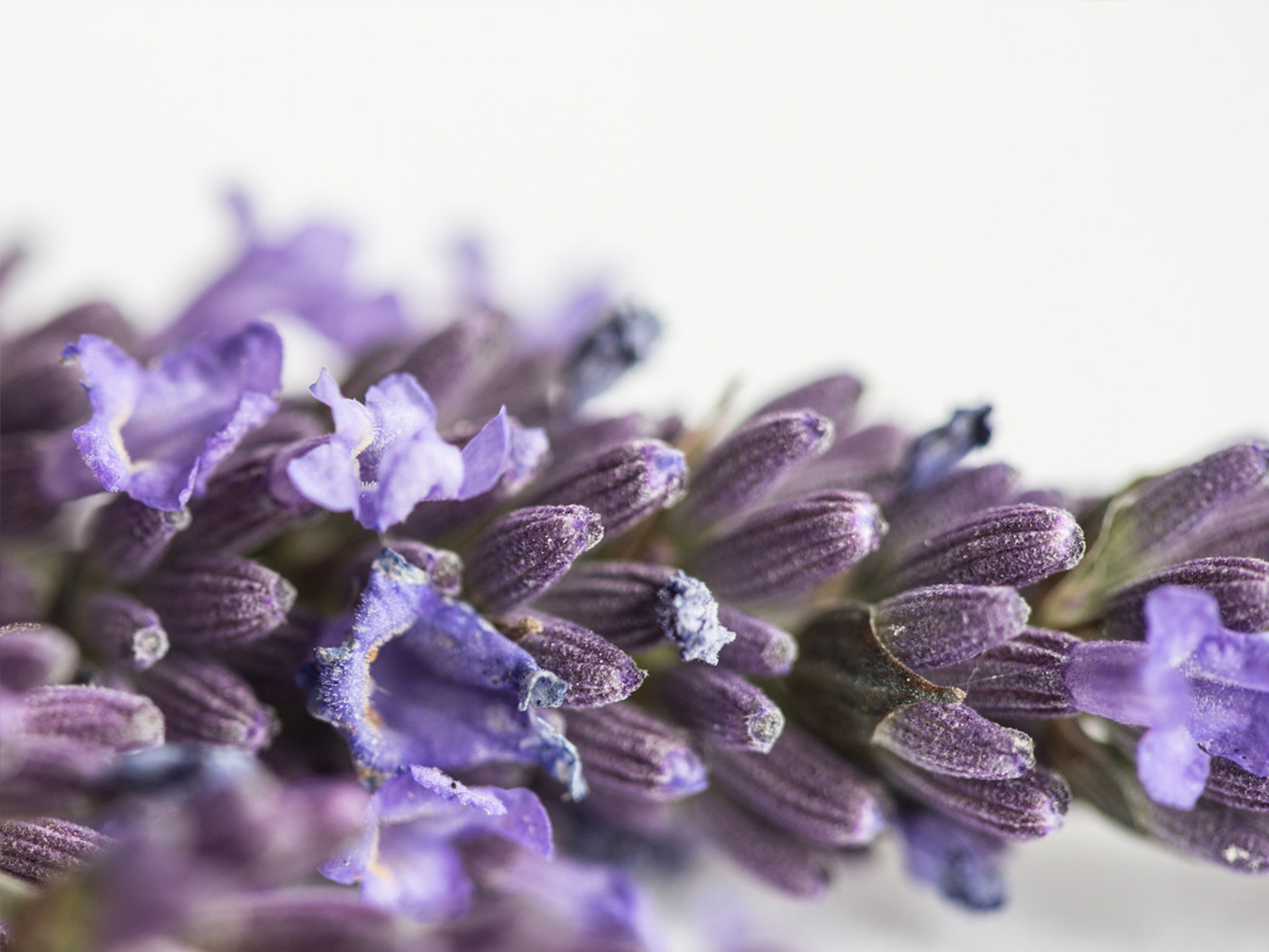


Forest & Shore is a new organic skincare company producing 100% natural products for use on the face, body and hair. Believing in the pure plower of plants — each blend is gentle on the skin, vegan friendly and always ethically sourced.
____________________
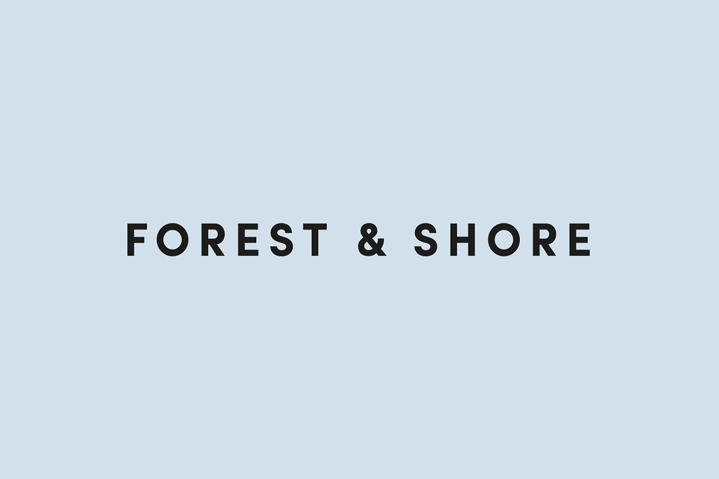
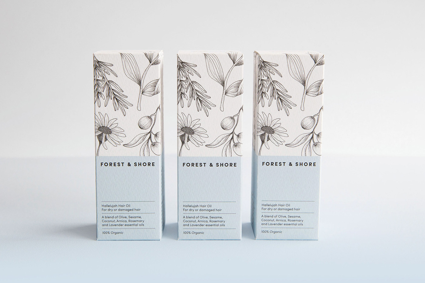
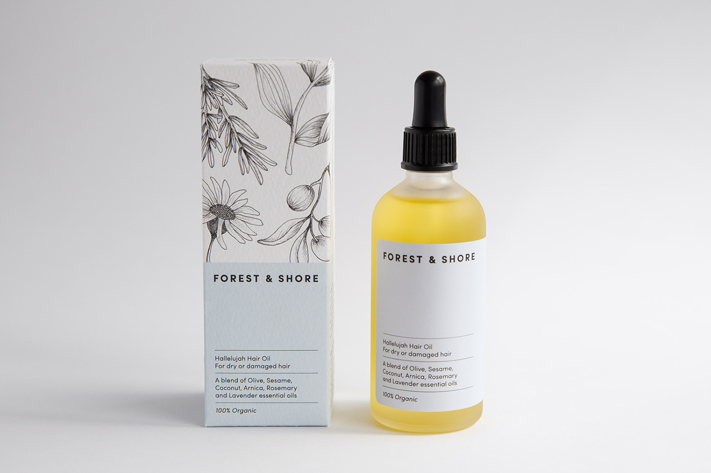
The brand identity needed to be reflective of their organic approach and packaging designed to feel beautifully natural and premium. Simplicity was key, with a soft colour palette taking inspiration from both the forest and shore — paired with clean typography and delicate illustrations.
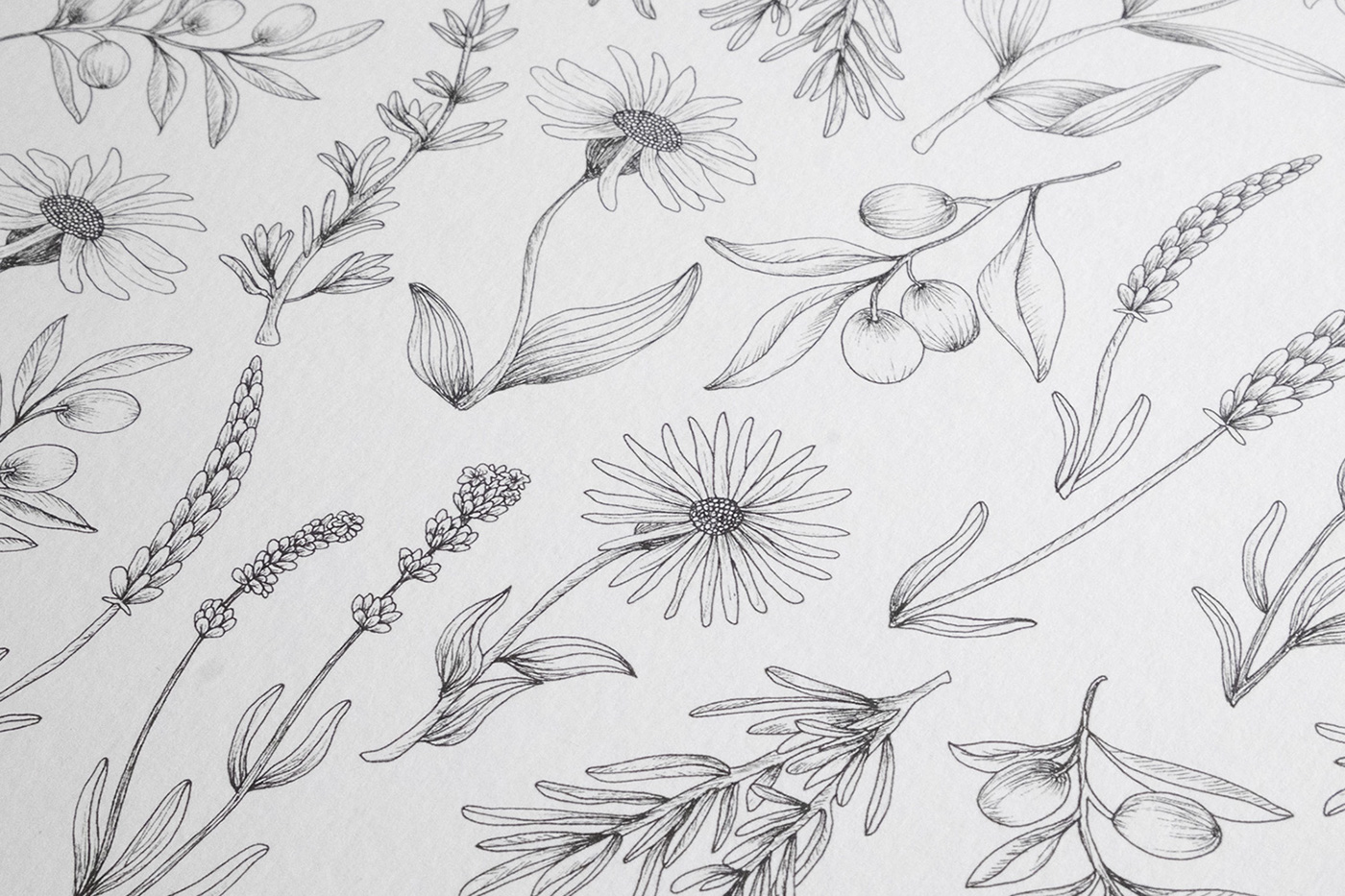
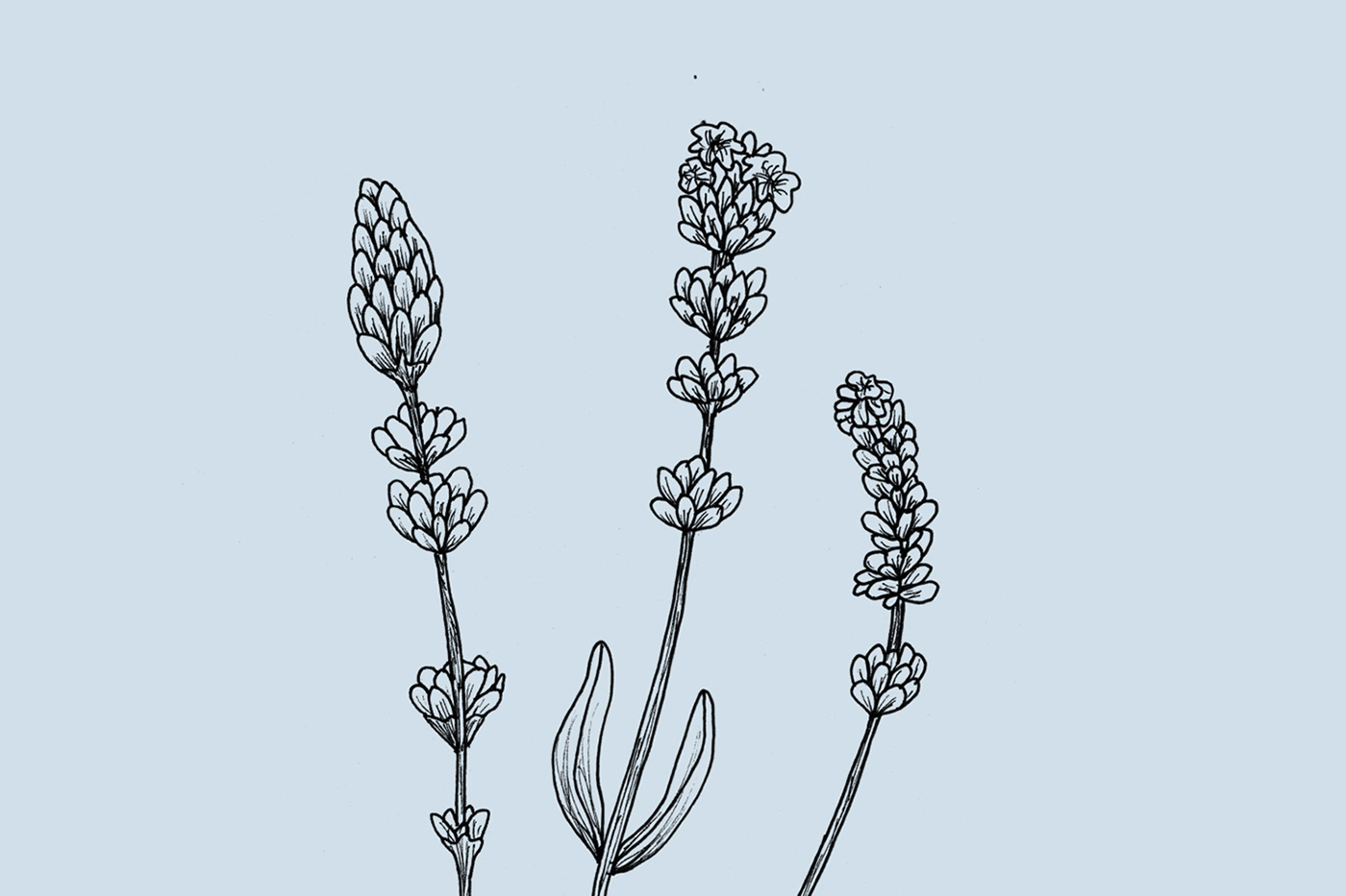
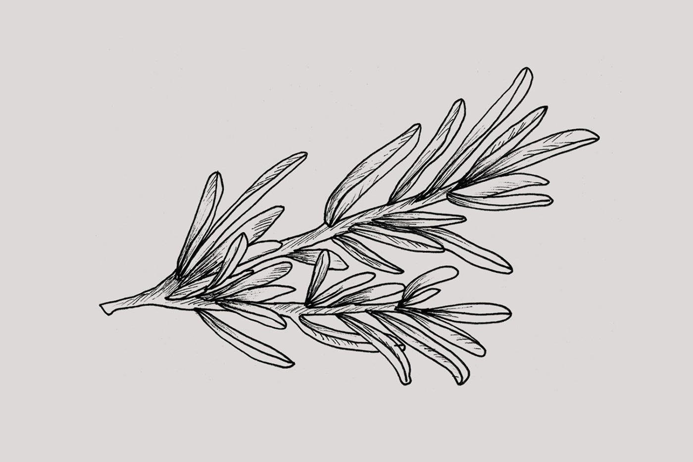
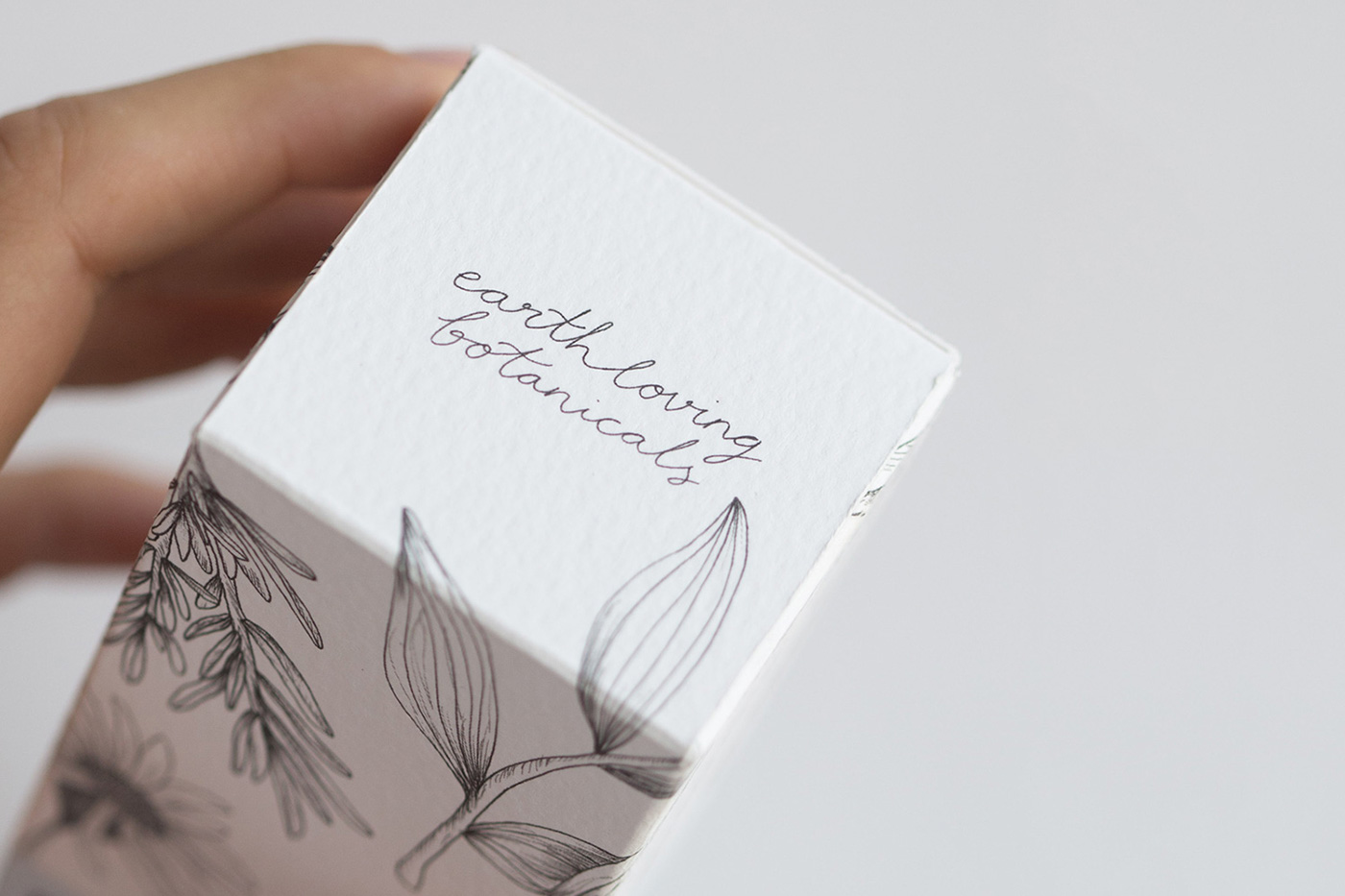
Inspired by nature, we created a library of hand drawn botanicals. With each product having a unique list of ingredients we created a bespoke pattern for each blend’s packaging — allowing each box to be subtly different, but part of a collection. Delicate lines and small imperfections in the hand illustrated details reinforce the purity of the brand.
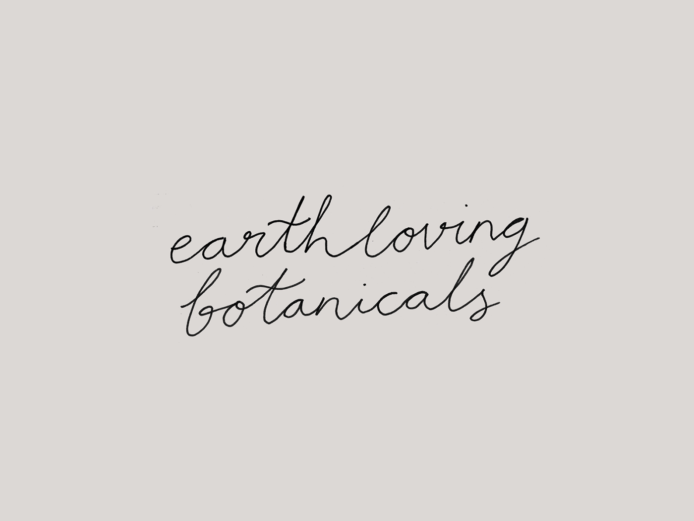
To balance the illustrations we needed a simple typographic approach. The logo and text is minimal with plenty of room to breathe. A hand lettered tagline on the top of each box adds a personal touch.
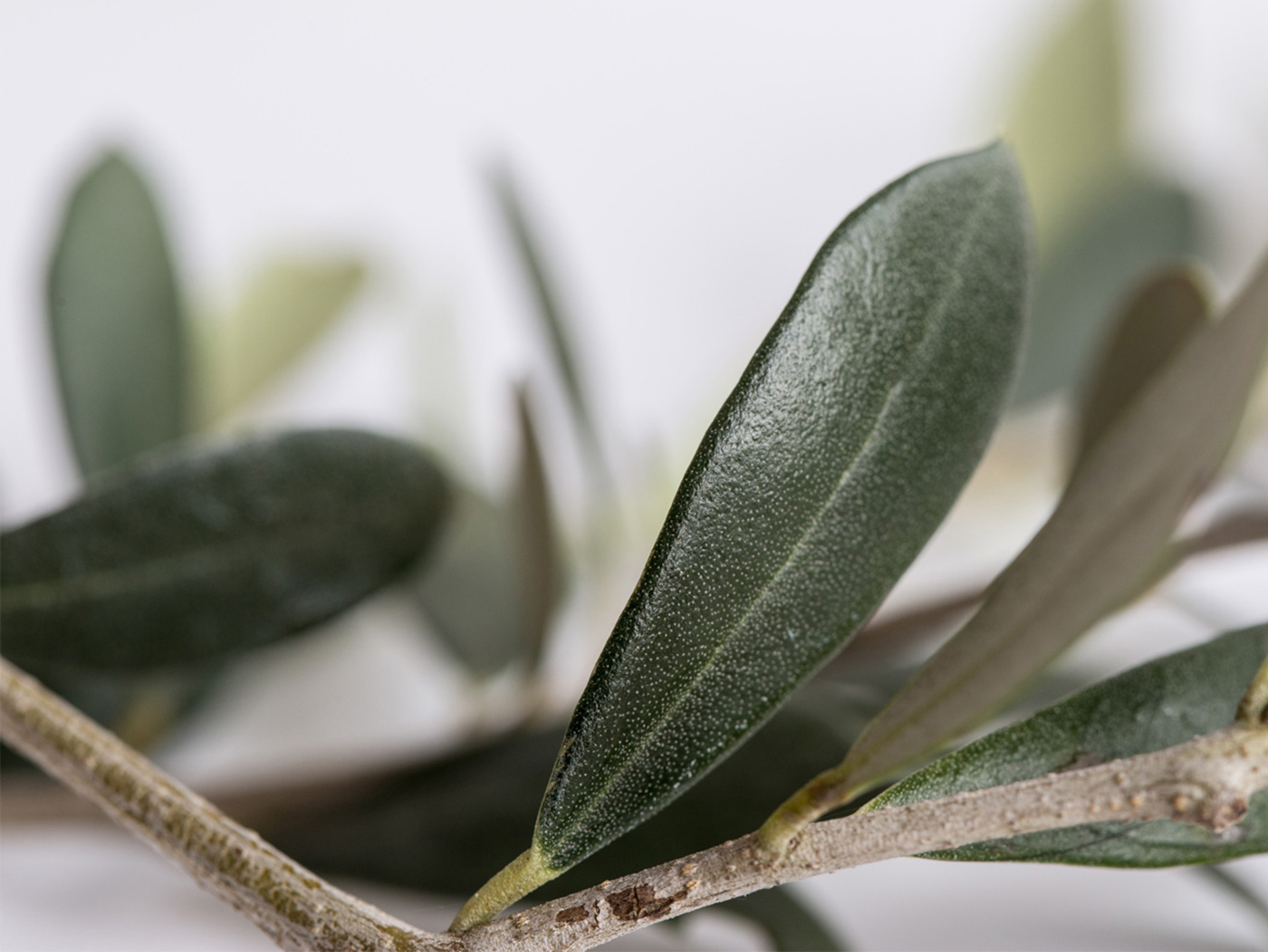
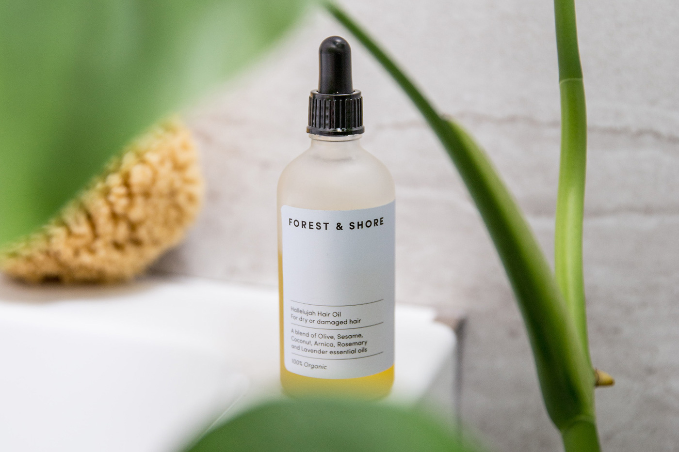
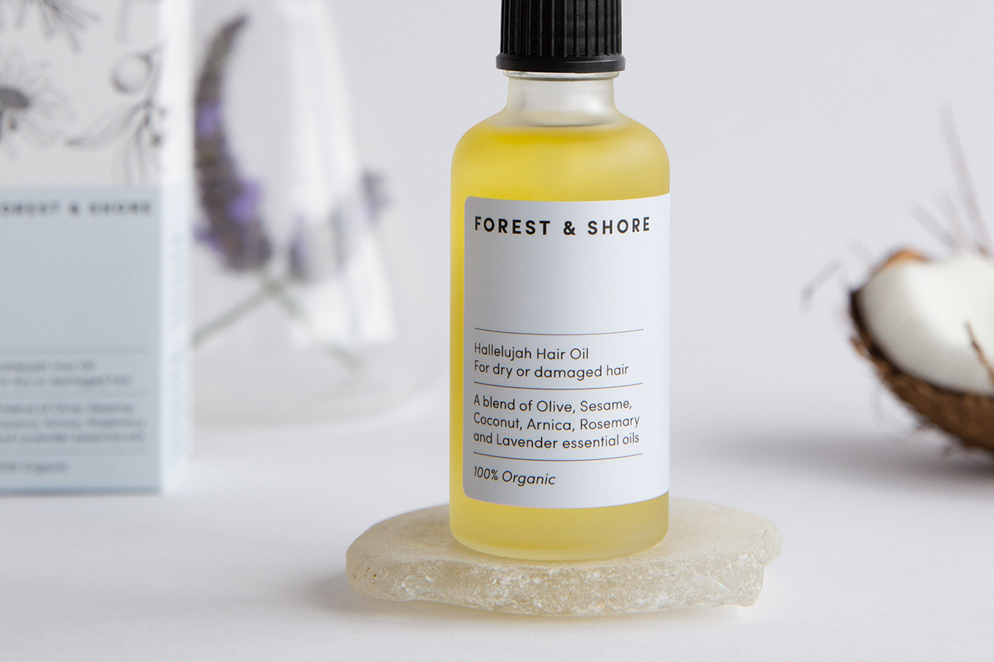
To launch, we worked with photography and styling studio Fork & Dram to create a collection of product and lifestyle images for the brand.
____________________
Instagram | Twitter | Website
Inspired by nature, we created a library of hand drawn botanicals. With each product having a unique list of ingredients we created a bespoke pattern for each blend’s packaging — allowing each box to be subtly different, but part of a collection. Delicate lines and small imperfections in the hand illustrated details reinforce the purity of the brand.
To balance the illustrations we needed a simple typographic approach. The logo and text is minimal with plenty of room to breathe. A hand lettered tagline on the top of each box adds a personal touch.
To launch, we worked with photography and styling studio Fork & Dram to create a collection of product and lifestyle images for the brand.
____________________
Instagram | Twitter | Website


