

This work is a part of my design for the Annual Report of the ERGO Hestia Group, which involves a range of complex data visualizations concerning the notion of Network.
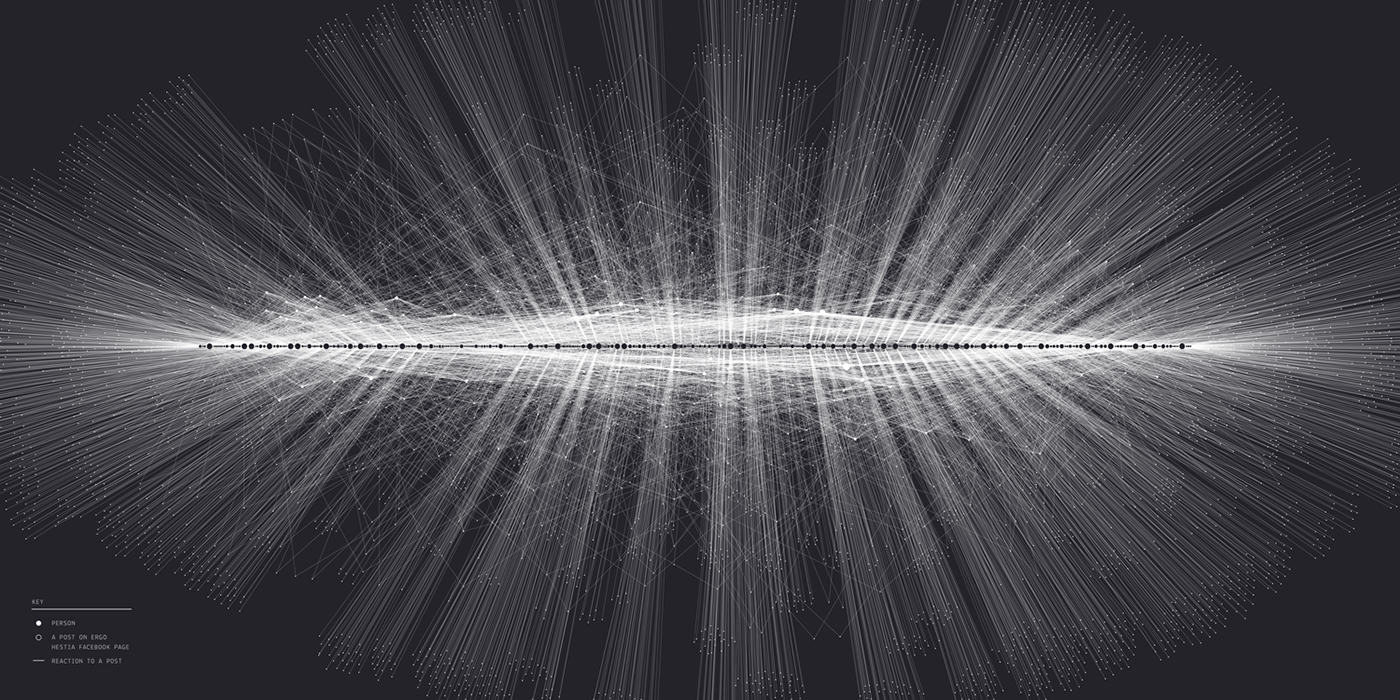
This visualization relates to the Network in the context of social media. It shows the activity of users on the ERGO Hestia Facebook page. Black dots on the horizontal axis represent all posts on the page for each day of 2016, placed in chronological order. Each white dot represents a person who reacted to the post by “liking” it or by choosing one of 5 available emojis. Such reactions are represented by the lines linking a person with a post. The size of dots depends on the number of such connections – so it represents the level of popularity of a post or the activity of a person.

In order to obtain all needed data, I used the Facebook's Graph API. This let me build a 21.248 unit spreadsheet with all the posts and their reactions.
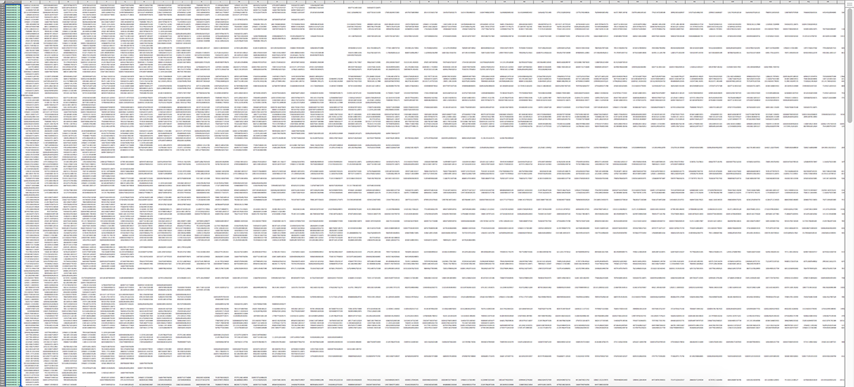
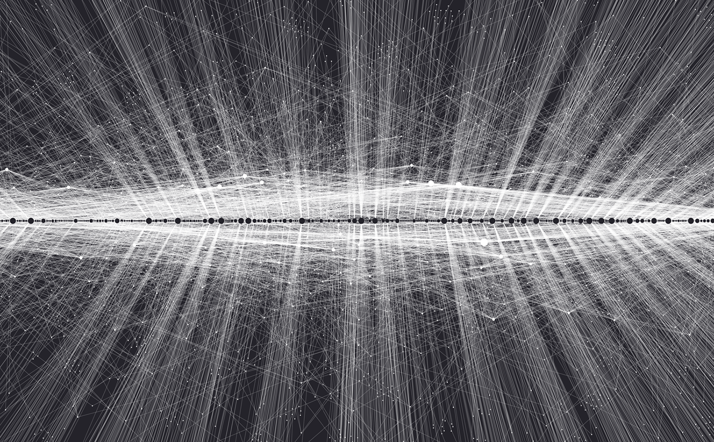
After rearranging them into separate nodes and source-target tables I used Gephi to construct the visual representation of the network. Having tried different parameters I finally decided to put emphasis on the aspect of time and to place the posts in the chronological order. Below you can see two of unused versions, which were created with focus on the gravity – the more links the node has, the stronger it attracts other nodes.


The final image is the result of editing it with graphic design software to make it consistent with the layout and with other parts of the Report.


It was printed and exhibited as a part of the ERGO Hestia Annual Report. You can see other visualizations and the printed book here.


