


Ghetaldus Optics
Rebranding // Identity Implementation // Advertising // Signage


About
Ghetaldus Optics is the largest manufacturer and distributer of all types of prescription glasses, sunglasses and contact lenses on the Croatian market. Ghetaldus Optics Ltd. was founded in 1957 and used to be a synonym for ophthalmic optics in Croatia. In the transition process with the emergence of young and modern brands on the market, the company has lost its distinctiveness as a result of poor and confusing communication.
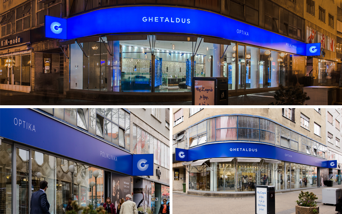
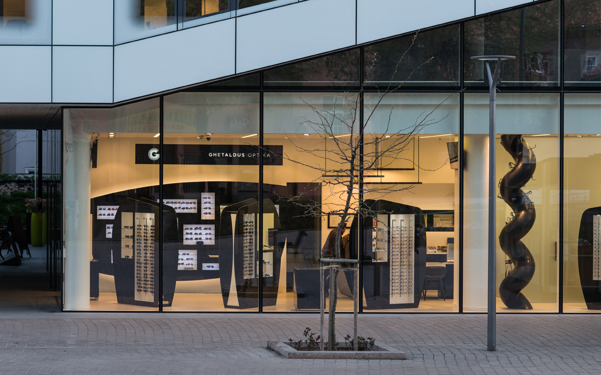
The aim of the new visual identity is not only for the client to "pop out" as something new, fresh, active and visible, but also to restore customers’ confidence with clear communication of professionalism, quality and tradition.
The aim of the new visual identity is not only for the client to "pop out" as something new, fresh, active and visible, but also to restore customers’ confidence with clear communication of professionalism, quality and tradition.
Concept
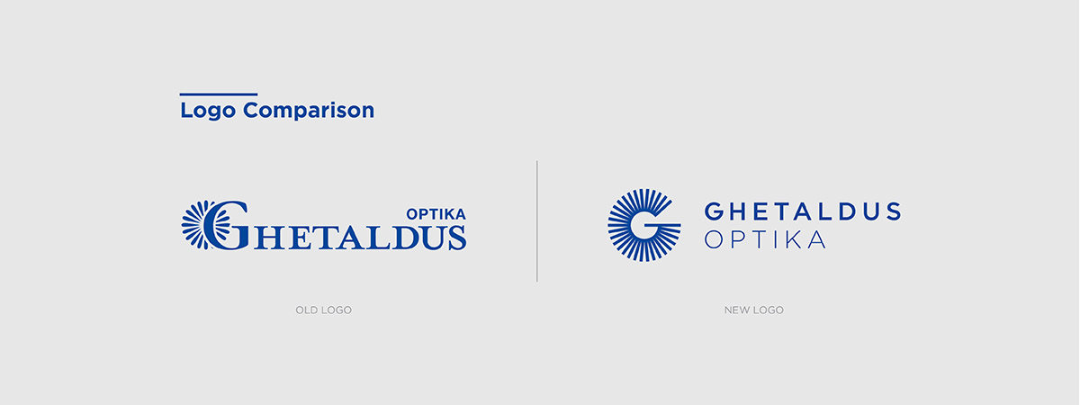
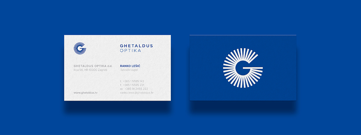
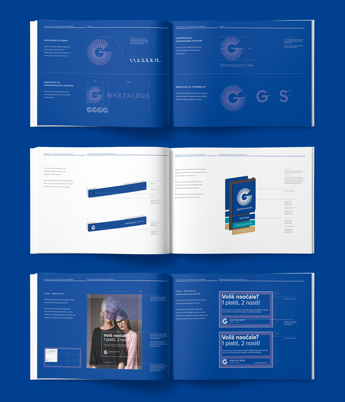
The character "G" represents the initial of the company, as well as the visual link to the graphical element from the old visual identity. However, this time around it has a completely different function, with modern visual expression.
The primary activity of the company Ghetaldus is related to the eye and eyesight. The symbolism of the logo that wants to achieve a high-quality transmission of vision, mission and functions of the brand must clearly present the brand’s purpose and scope.


______
Credits
Client // Ghetaldus Optika d.d.
Agency // Studio 33
Design and Art Direction // Leo Vinkovic, Igor Penovic
Design // Mario Majkic
Signage Photography // Marija Gasparovic
Campaign Photography // Young & Lovely Production // Tina Verhas / Dea Lazar
______
Awards
BRONZE // A'Design Awards, Como - Italy // 2018
BRONZE // WINA World Independent Advertising Awards, Barcelona // 2017
Honorable Mention // International Design Awards Los Angeles // 2017


